Le Manoir a l’Envers

envers.jpg

The only place of amusement which was an unqualified success was Le Manoir a l’Envers (The Upside-Down Manor). One entered this building through the roof. The furniture was suspended in the air and in the drawing-room people could walk round a chandelier whose lamps illuminated their feet; through the ventilator holes of the cellar there was a view of the surrounding district.

Philippe Jullian, The Triumph of Art Nouveau (1974).

A slight return to the Paris Exposition Universelle of 1900; don’t think you escape so easily. Complaints will be referred to the word “obsessions” at the top of this page.

To date this is the only decent picture I’ve seen of the Upside-Down Manor and I’ve yet to find a credit for the architect. This seems surprising considering Philippe Jullian’s remarks about the success of the attraction but something of this nature wouldn’t feature prominently in the official guides or catalogues. Most of the printed matter produced for the exposition exudes the high seriousness of nations posturing and preening before each other, frivolities and entertainments were pushed to the margins.

For more upside-down houses, go here.

Previously on { feuilleton }
Suchard at the Exposition Universelle
Esquisses Décoratives by René Binet
Le Palais de l’Optique, 1900
Exposition Universelle films
Exposition jewellery
Exposition Universelle catalogue
Exposition Universelle publications
Exposition cornucopia
Return to the Exposition Universelle
The Palais Lumineux
Louis Bonnier’s exposition dreams
Exposition Universelle, 1900

Gilded volumes

thomson.jpg

The cover of an 1894 edition of Jane Austen’s novel designed by Hugh Thomson (1860–1920). The so-called “Peacock Edition” is illustrated throughout and a copy can be yours for £845 should you be so inclined. Or you can go to the Internet Archive and download the same edition for free. Thomson’s lavish cover design is absolutely right for the 1890s and as such would have suited Oscar Wilde far more than Jane Austen. AbeBooks drew my attention to this with a feature on rare books with gilded covers where, needless to say, all the titles are very expensive. A lot more reasonable but just as lavish is I Wonder by Marian Bantjes, the perfect gift for anyone who enjoys the art of book design.

Elsewhere on { feuilleton }
The book covers archive

Previously on { feuilleton }
I Wonder by Marian Bantjes

Ten titles and a cover

cdlcover.jpg

The Very Best of Charles de Lint. Art by Charles Vess.

Over the weekend I found the time to finally update the book design section of the site, adding new pages for most of the titles I’ve been working on recently. There’s still a couple of things missing but I’ll add those in due course. Many of these design jobs have been for the interiors only so what follows is a comparison of title spreads from books I’ve worked on that have been published this year. Lest it seem that I have an army of clones at my service it should be emphasised that I was working on several of these last year (and Engelbrecht was completed in 2008) but the nature of release schedules means they all carry 2010 publication dates.

sr.jpg

Steampunk II: Steampunk Reloaded, edited by Ann & Jeff VanderMeer.

I invariably make a feature of title pages, usually creating them as a spread in order to heighten their impact. The title page is a kind of gateway to the rest of the book which gives you an opportunity to establish a mood for what follows. It’s also the area where you can be most lavish with your graphic treatment and, where necessary, add illustrative material without worrying too much about intruding on the content. With a number of these designs I was following typographic choices from pre-designed covers so the challenge was to find something that would match the cover and connect to the rest of the interior. The Charles de Lint book was a variation on this process in that the author had chosen a Charles Vess drawing for the cover art. I designed a cover to accommodate the drawing then carried the design inside. The colours were chosen to match Vess’s artwork while the general Art Nouveau style came from an Alphonse Mucha poster he’d placed on the wall. With a different cover picture the entire book would have had a very different design.

pkd.jpg

The Search for Philip K Dick by Anne R Dick.

Continue reading “Ten titles and a cover”

Weekend links 38

lovecraftbaw.jpg

Arriving in the post this week was Lovecraft Black & White, an Italian book whose contents are spelled out in the title, black-and-white illustrations based on the work of the Providence master. Among the featured works is my 1999 rendering of Azathoth. There’s more about the book here and here.

Also on the work front, one of the books I designed interiors for a couple of months back was The Search for Philip K. Dick, a sombre biography and memoir by Anne R. Dick, the author’s third wife. Ms Dick discussed the book with the NYT a few days ago. The design was mostly straightforward layout but I did make a quick ASCII portrait of PKD from one of Anne Dick’s photos.

Farewell, the documentary film about Lady Grace Drummond-Hay’s flight around the world in the Graf Zeppelin, can be viewed here.

• “I personally think that the pages look better on the iPad than they do in real life.” Artist Tom Phillips again on the Humument iPad app.

The Birds Are Flying Elsewhere: singer/songwriter Linda Perhacs. Related: Parallelograms – A Short Film About Linda Perhacs.

St Eia, guitar improvisations by Zali Krishna, “Keywords: jazzgazing; entropy circus; st ives; cornwall; psychogeography”.

Moon Wiring Club and DD Denham: music for children, by children. Related: Moon Wiring Club’s Jayston Mix.

kirkland.jpg

The 1970s was another country, they did things differently there. One of a number of illustrations for science textbooks by Phil Kirkland at A Journey Round My Skull.

• “Fellatio has become a recurrent theme in your work hasn’t it, I say.” Alan Bennett sheds some inhibitions.

Talking To The Sci-Fi Lord: Regenerations & Ruminations With Michael Moorcock.

Time and the Gods (1906) by Lord Dunsany, illustrated by Sidney Sime.

City of Silence, a calendar for 2011 by Thom Ayres.

Scientists glimpse universe before the Big Bang.

• Photography by Josef Sudek (1896–1976).

Aurora photo gallery, November 2010.

The Last Tuesday Society.

Parallelograms (1970) by Linda Perhacs | Six AM (1979) by Thomas Leer & Robert Rental | Rockin’ Back Inside My Heart (1989) by Julee Cruise.

Peter Christopherson, 1955–2010

coil.jpg

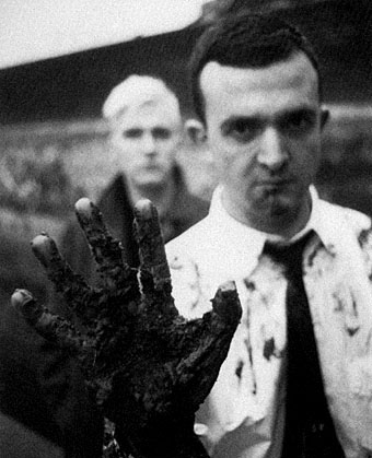
Coil, circa 1984. John Balance (left) & Peter Christopherson (right). Photo by Lawrence Watson.

The depths of the night sky
Reflects in his eye
He says “Everything changes
And everyone dies.”

Coil, Blood From The Air (1986)

Yes, everyone dies but you don’t always expect it this soon, six years after the sudden loss of John Balance. Coil and Throbbing Gristle were refreshingly direct about the transience of existence so we should no doubt regard these moments with the necessary degree of philosophy. And yet… I’ve said for years that we lack an adequate complement of innovators, genuine creators, rare minds, and what Robert Anton Wilson used to call Intelligence Agents; such people always seem too few, especially in a world where hatred and ignorance are encouraged by those eager to keep us unfulfilled, the easier to manipulate and control. There’s a natural desire each time you discover a like-minded soul to want them to stay around for as long as possible, to help shine a thousand lights in a darkened room.

I never met Peter Christopherson but I saw him on stage with Psychic TV in Manchester in 1983, and as part of Coil for their thrilling performance at the Royal Festival Hall, London, in 2000. We corresponded sporadically via letter and email throughout the 1990s, and spoke on the phone a couple of times. Coil wanted me to create a cover for one of their releases and we talked about this on and off for several years but nothing ever came of the plans, something I regret to this day. Peter bought a drawing off me ten years ago (this one), and he remains one of the few people I’ve sold any artwork to. I broke my usual rule on that occasion out of respect for his work. That work is mostly acknowledged as being musical, and it’s the music—as a member of Throbbing Gristle, Psychic TV, Coil, and TG again—that other obituaries will rightly celebrate. But he was also a talented photographer and graphic designer whose earliest public works were for the design group Hipgnosis in the 1970s. He joined Storm Thorgerson and Aubrey Powell as an assistant in the mid-70s and became a full partner in 1980. As a freelance photographer he shot the first promo pictures of the Sex Pistols in 1976, photos which (if I remember correctly) Malcolm McLaren decided not to use because they looked too heavy. Or maybe too queer…see this appraisal by John Gill from his book Queer Noises. It was Peter Christopherson’s design authority that gave the Throbbing Gristle releases a quality many other independent productions lacked in the post-punk era. He brought the same visual finesse to Psychic TV in 1982 and it was painfully obvious when that finesse was withdrawn after he and John Balance left PTV in 1983 to form Coil. I owe Coil more than I can easily articulate. I’ve spent hours and hours listening to their music whilst working; the full range of their interests probably matched mine more completely than any other group I’ve encountered. It was a real shock when everything crashed to an end in 2004. It’s good to know that the Coil site at Brainwashed has a wealth of interviews and articles going back through the years. And there’s still the music, of course.

Fellow TG members Cosey Fanni Tutti and Chris Carter issued some words of remembrance a few hours ago which they end by saying: “Peter was a kind and beautiful soul. No words can express how much he will be missed.” A few examples of his photography and design work follow.

Update: Full Guardian obituary by Alexis Petridis | Genesis P-Orridge Pays Tribute To Sleazy.

Continue reading “Peter Christopherson, 1955–2010”