Weekend links 168

bell.jpg

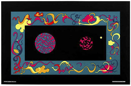
Window to the Universe (1967) by Roberta Bell. From Summer of Love: Psychedelic Posters from SCMA currently showing at the Smith College Museum of Art, Northampton, MA.

Sympathy for the Shoggoth: China Miéville’s Revolution of the Weird Tale, an essay by Christina Scholz which features one of my Cthulhu pictures among its embellishments. Related: “‘New Strange’ stories hold a chilling mirror to life” says Rick Kleffel discussing Robert Aickman and others. And speaking of Aickman (so to speak), Reese Shearsmith has recently recorded Aickman’s Cold Hand in Mine for Audible.

• An erotic alphabet book from the Soviet Union circa 1931, created to promote adult literacy. Who says porn can’t be educational?

Angelystor is a new 39-minute composition by Phil Legard which he describes as “often heavy, Saturnine and melancholic”.

• James Ward’s postcards of the Post Office Tower. Related: film of the revolving restaurant at the top of the Tower in 1967.

•You Might Never Find Your Way Back: Shirley Jackson’s Hangsaman by Nicholas Rombes.

satty.jpg

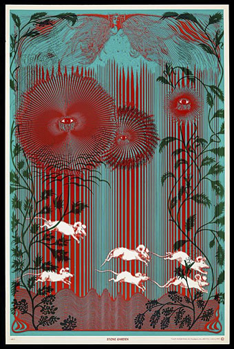
Stone Garden (1967) by Wilfried Sätty.

High Over Blue is “a mind-warping 20-minute freakout” by Moon Duo.

• Queer Visual Splendour: Jon Macy discusses his erotic comics.

The Origin of the Pilcrow, aka the Strange Paragraph Symbol.

• Mix of the week: the Kranky 20th Anniversary Mixtape.

Ten Amazing Cheeses and their Literary Counterparts.

PingMag looks at the past and present of Ginza.

Mind Gardens (1967) by The Byrds | The Garden (1981) by John Foxx | The Toy Garden (2006) by Helios

Design as virus 16: Prisms

dsotm1.jpg

The Dark Side Of The Moon (1973) by Pink Floyd. Design by Hipgnosis.

Dark Side of the Moon is one of seven or eight suggestions we submitted to Pink Floyd. It relates to the Floyd’s concerts and their use of light shows. Specifically it was sparked off by Rick Wright who wanted something very simple, clinical and precise. It’s not a particularly original design but I do feel it is very appropriate and highly effective.

Storm Thorgerson in An ABC of the Work of Hipgnosis: Walk Away René (1978)

Continuing an occasional series. Album cover designer Storm Thorgerson died in April, a month after the 40th anniversary of the release of The Dark Side of the Moon by Pink Floyd. Thorgerson may have downplayed the originality of the cover design but it remains the most well-known of the many covers produced by Hipgnosis, a combination of the enormous commercial success of the album and the success of the design itself.

The variations below are post-Hipgnosis productions by Thorgerson and his various assistants for reissues of the album. I did have the idea of collecting a few of the better unofficial variants and pastiches but a quick image search turns up a daunting quantity of homages, parodies, imitations and other derivations. This is partly down to the way the internet stimulates an accelerated recycling of cultural signifiers, but it still shows how this simple design continues to affect people beyond its original application.

The 2011 Immersion Box Set featured further variations, some of which have been used to promote the 40th album anniversary. There’s a poster available with even more variations. If you’re still not sated after that lot then deviantART is the place to go for endless collisions between the Floydian prism and all the hottest emblems of pop culture. Just keep scrolling…

dsotm2.jpg

30th Anniversary reissue. Design by Storm Thorgerson & Peter Curzon.

dsotm3.jpg

The Dark Side Of The Moon: The Making of Pink Floyd’s Masterpiece (2005) by John Harris. Designed pseudonymously by Storm Thorgerson.

dsotm4.jpg

Immersion Box Set (2011). Design by Storm Thorgerson & StormStudios.

Previously on { feuilleton }
Design as virus 15: David Pelham’s Clockwork Orange
Design as virus 14: Curse of the Dead
Design as virus 13: Tsunehisa Kimura
Design as virus 12: Barney’s faces
Design as virus 11: Burne Hogarth
Design as virus 10: Victor Moscoso
Design as virus 9: Mondrian fashions
Design as virus 8: Keep Calm and Carry On
Design as virus 7: eyes and triangles
Design as virus 6: Cassandre
Design as virus 5: Gideon Glaser
Design as virus 4: Metamorphoses
Design as virus 3: the sincerest form of flattery
Design as virus 2: album covers
Design as virus 1: Victorian borders

Weekend links 167

field.jpg

Poster by Luke Insect & Kenn Goodall.

In recent years I’ve had little patience for British cinema: too much dour “realism” with little of Alan Clarke’s vitality, too many comedies that aren’t funny, too many Hollywood calling cards, too much Colin Firth… So it’s been a pleasure to see Peter Strickland’s Berberian Sound Studio followed this month by Ben Wheatley’s A Field In England, a pair of films that stand out by daring to be different in a medium which seems to grow more creatively conservative with each passing year. A Field In England adds to the micro-genre of weird British films set around the time of the English Civil War. In place of witchfinders and devil worshippers we have magic, murder, madness, and a field of hallucinogenic mushrooms. Wheatley, like Strickland, takes risks that wouldn’t be allowed with a bigger budget which makes me excited to see what they’ll be doing next. A Field In England is already out on DVD & Blu-ray. The trailer is here. The director talked to Mat Colegate about the genesis of the film (spoiler alert). There’s more big hats and cloaks in this list of ten 17th century films.

• “I like to look at men…the way they look at women,” photographer Ingrid Berthon-Moine says about her pictures of sculpted testicles.

Roger Dean has finally sued James Cameron over the designs for Avatar. Will be interesting to see how this one turns out.

• Google has taken its Street View cameras to Battleship Island, “the most desolate city on earth“.

• The strange fantasy novels of Edward Whittemore are available again in digital editions.

Julia Holter talks about her forthcoming Gigi-inspired album Loud City Song.

• At Pinterest: Maneki-neko, the beckoning cat of good fortune.

Beautiful Books: Decorative Publishers’ Cloth Bindings.

• The abstract paintings of Hilma af Klint (1862–1944).

Lee Brown Coye illustrates August Derleth in 1945.

Bill Laswell’s discography intimidates the collector.

• Mix of the week: Kit Mix #23 by Joseph Burnett.

• The Soundcarriers: Last Broadcast (2010) | Signals (2010) | This Is Normal (2012)

Strange Days

doors1.jpg

Strange Days was the second album by The Doors, released in October 1967. It’s the album that veers the closest to what people think of today as a psychedelic sound—which puts it in my favour—and is also unique in the group’s catalogue for minimising their presence on the gatefold sleeve, something Jim Morrison was always eager to do even as the record company were trying to turn him into a pop star.

doors2.jpg

The cover photo by Joel Brodsky of street performers was intended to be reminiscent of a scene from Fellini. For years I was under the impression that this street was European, it certainly doesn’t look typically American, so it was a surprise to read earlier today that the location is Sniffen Court, a small mews in the heart of New York City. New York or not, I’ve always wanted to live in a place like this. You can keep your gardens and empty lawns, I’d be quite happy to see those wonderfully eroded flagstones every day. Contemporary views of Sniffen Court show that much of its atmosphere on the cover derives solely from Joel Brodsky’s skill at capturing the light as it reflects from the paving stones. The place today looks neater, cleaner and a lot less attractive, but that’s not too surprising for a historic area in one of the most expensive cities on earth.

doors3.jpg

sniffen.jpg

Sniffen Court, NYC, in 2012. The plaques at the rear were sculpted by Malvina Hoffman.

Elsewhere on { feuilleton }
The album covers archive

Fiendish Schemes

fiendish.jpg

Now that this cover has appeared on Amazon I can mention it here. As usual, the machinery of publishing grinds slowly: this cover was commissioned in November last year, and worked on from the end of that month up to Christmas. Fiendish Schemes is a sequel by KW Jeter to his Infernal Devices, one of the original steampunk novels which was first published in 1987. In 2011 I created covers for reprints by Angry Robot of that title and the author’s earlier Morlock Night. Both those covers were very well received so Tor Books asked me to match their designs with a cover for the new book. This is quite unusual in publishing. Unless they make a real impact, cover designs seldom last beyond a couple of editions before being updated, and they rarely travel to other publishers.

jeter.jpg

As with the earlier designs, the artwork is pieced together from very small pieces of period engravings, mostly from product catalogues or design books. In the novel, the steampunk weapon below is more alluded to than described but I was pleased with the way the illustration of it came together. Even though it’s composed of pieces of guns, fountain pens and clock parts it looks like something that could physically exist. One of the challenges I enjoy with this kind of collage illustration is trying to make something which doesn’t appear collaged at all.

Fiendish Schemes will be published on October 15th, 2013.

fiendish2.jpg

Previously on { feuilleton }
Ghosts in Gaslight, Monsters in Steam
Steampunk Revolution
The Bookman Histories
Aether Cola
Crafting steampunk illustrations
SteamPunk Magazine
Morlocks, airships and curious cabinets
The Steampunk Bible
Steampunk Reloaded
Steampunk overloaded!
More Steampunk and the Crawling Chaos
Steampunk Redux
Steampunk framed
Steampunk Horror Shortcuts