Eduardo Paolozzi at New Worlds

paolozzi00.jpg

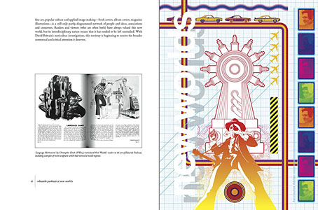
I was working on this book throughout the autumn, and it could hardly be more different to some of the visual extravagance that came before and after. Eduardo Paolozzi at New Worlds is published by Savoy Books this month. Predominantly an examination by David Brittain (no relation to David Britton) of the connections between artists such as Paolozzi and Richard Hamilton with New Worlds magazine in the 1960s, the book is also a rare study of the science fiction magazine when it was making its greatest impact in the late 60s and early 70s.

Brittain highlights many examples of Paolozzi’s sf-influenced art of the period, and examines the development of the magazine under Michael Moorcock’s editorship during which time New Worlds evolved from being a slightly moribund sf title in the early 60s to what JG Ballard later called “one of the most exciting magazines of any kind in this country”. An appendix features interviews with some of the key creators and contributors: editor Moorcock, designer Charles Platt, art editor Christopher Finch, contributor Michael Butterworth, and critic John Clute. Writer and illustrator Pamela Zoline created some original artwork for the endpapers. The introduction is by Rick Poynor.

paolozzi01.jpg

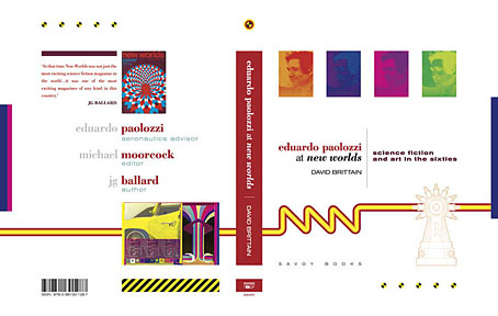
Despite being pressured for time I was very pleased to be designing this book. I’d liked Paolozzi’s work since I first encountered it in the Tate Gallery in the 1970s; a couple of years later I was buying up anthologies featuring New Worlds stories (I was too young for the 60s magazine), so discovering that Moorcock had made Paolozzi the magazine’s “Aeronautics Advisor” made perfect sense. In the past I’ve said that New Worlds ruined my taste for hard sf but that’s not really true since I never really liked the stuff beyond a few Arthur C. Clarke books. Too much bad writing, too many cardboard characters shuffling around between chunks of explanation about made-up technology. The discovery of New Worlds merely demonstrated that there were other ways of approaching sf, and you didn’t have to put up with the rubbish.

I also enjoyed the magazine’s bolshy attitude, a quality shared by Harlan Ellison in his Dangerous Visions anthologies. Moorcock says in Brittain’s interview that NW sympathised with the Underground of the late 60s but also tried to be more disciplined in its approach, especially where the design was concerned. You couldn’t have treated fiction to the semi-legible printing that Oz and Frendz often deployed. But the radical attitudes of the Underground can be discerned in the stance NW adopted. Some of the reviews and polemical articles by Moorcock (often under his “James Colvin” pseudonym), M. John Harrison and John Clute are bracingly vitriolic to a degree which if delivered today would probably see them ostracised for life.

paolozzi02.jpg

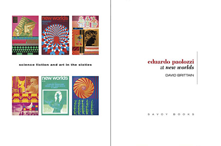
With the design the main intention was to present the information clearly and let the visuals speak for themselves. The book is heavily illustrated throughout, with many examples of Paolozzi’s marvellous prints. The layout nods obliquely to the period; before getting started I spent some time looking at the work of Erik Nitsche. I like the way Nitsche laid out the books he designed in the 1960s, and there’s also a connection in his work as a designer for the General Dynamics corporation: one of Paolozzi’s print series of the period is entitled General Dynamics F.U.N.

Being full-colour throughout, the print run for this book is smaller than usual so anyone interested is advised to move swiftly. Official publication is December 16th but it’s on sale now at Savoy and at Amazon.

paolozzi03.jpg

Continue reading “Eduardo Paolozzi at New Worlds”

Steampunk Calendar

00steampunkcalendar.jpg

This one arrives two months late, the months of October and November being overly preoccupied with other work. I chose a steampunk theme for this year since this has been a productive area recently. The idea was one of those simple notions—rework some book covers into calendar pages—that in practice ended up taking much longer than anticipated. Larger copies of the pages may be seen here while the CafePress purchase page is here. My thanks to everyone who’s been buying things recently.

For those who dislike over-decorated 19th-century science fiction but may still want a Coulthart calendar there’s the Cthulhu Calendar (still a popular item), the Psychedelic Wonderland calendar, and the Through the Psychedelic Looking-Glass calendar. Note: Calendars at CafePress can now be purchased throughout the year so make sure that you select January as the starting month if you want the months to run for a single year only.

01steampunkcalendar.jpg

02steampunkcalendar.jpg

03steampunkcalendar.jpg

Continue reading “Steampunk Calendar”

Ulysses versus Maldoror

covers.jpg

Ulysses (1934), designed by Ernst Reichl; Complete Works of Isidore Ducasse (1967), designed by Pierre Faucheux.

On the design front, that is, not the writing one. Ernst Reichl’s design for the 1934 Random House edition of James Joyce’s Ulysses (the first US edition) has a cover which isn’t so different to the many Art Deco-style bindings from around this time. Inside, however, there’s a significant innovation with his title spread, and the dramatic imposition of a huge capital letter. Random House was presenting Ulysses as a major artistic statement, a quality which Reichl’s design reinforces when the page-filling capitals recur at the openings of each of the novel’s three sections.

ulysses1.jpg

I encountered the huge S on the opening page in a book about Joyce shortly after I’d started reading the novel for the first time, and for years was under the impression that this had been a specific instruction of the author’s, a typographic flourish to add to the rest of the formal manipulations. I’d suggest—insist, even—that all editions of Ulysses should adopt Reichl’s design. Martha Scotford at Design Observer looks at the book in more detail.

ulysses2.jpg

maldoror1.jpg

Les chants de Maldoror-Poésies-Lettres (1950) by Lautréamont. Le club français du livre.

Pierre Faucheux went one further with his grandiose opening for Les chants de Maldoror-Poésies-Lettres by filling the opening of the book with Didot capitals which spell out M-A-L-D-O-R-O-R on each page before the title is reached. This is the design equivalent of shouting in the reader’s face when the book is opened; given the nature of the text I can imagine the author approving. I’ve no idea whether the idea was borrowed from Reichl but Faucheux was a very inventive designer who was quite capable of arriving at such a layout on his own. His cover for a 1967 reprint of the book (above) spells out the title by tearing up the earlier Didot capitals. Rick Poynor at Design Observer (again) looked at more of Faucheux’s covers for the Livre de Poche imprint, while at Eye magazine there’s an essay by Richard Hollis about Faucheux’s innovations.

Continue reading “Ulysses versus Maldoror”

Koloman Moser bookplates

moser3.jpg

Ex libris Fritz Waerndorfer (1903).

I could happily post things by the indefatigable Koloman Moser (1868–1918) all the time but he’s not exactly an unknown figure even if his work does get overshadowed by his colleague in the Vienna Secession, Gustav Klimt. This handful of ex libris plates almost all date from the Secession period, and include one for Adele Bloch-Bauer, a woman whose name is familiar these days for her being the subject of a very well-known Klimt portrait.

moser7.jpg

Ex libris Fritz Schwartz (1900).

moser6.jpg

Ex libris Rudolf Steindl (1900).

Continue reading “Koloman Moser bookplates”

The art of A. Reinheimer

reinheimer02.jpg

Who was A. Reinheimer? That’s a good question to which I have no answer other than telling you that he or she was an illustrator for German humour periodical Fliegende Blätter circa 1900. These drawings caught my eye for being rare examples of the Art Nouveau style deployed for comedic purposes. The intent was no doubt to poke some fun at the style itself—most of these pictures depict contemporary scenes in the “modern style”—but they’re also good compositions which could easily work as more typical Art Nouveau illustrations if their cartoony qualities were reduced. All the pages are from the University of Heidelberg digital archives which has a complete run of the magazine from 1844–1944.

reinheimer03.jpg

reinheimer04.jpg

Continue reading “The art of A. Reinheimer”