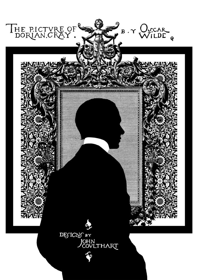
Picturing Dorian Gray

dorian1.jpg

It’s taken a while but here at last are some of the pages from my series of illustrations based on The Picture of Dorian Gray, as featured in volume 2 of The Graphic Canon (“The World’s Great Literature as Comics and Visuals”) edited by Russ Kick. I agreed with Russ not to run everything so there’s some incentive to buy the book (or books…there are three volumes altogether). Now I’ve seen the printed edition the whole project seems even more remarkable: 500 large illustrated pages in a variety of media and art styles. Volume 2 runs through the 19th century and ends with my contribution; I opted to do this story in black-and-white but there’s colour used throughout the books. I especially like the Moby-Dick sequence by Matt Kish, a very different take on a very familiar tale.

As with many of the things I’ve been doing recently I opted for adapting materials of the period. Since I have a lot of Oscar Wilde-related reference material I was able to go further and incorporate details that relate directly to the book and Wilde’s life. All the text is taken from a scan of the first printing of the novel at the Internet Archive, the title lettering being drawn originally by Wilde’s friend, publisher and illustrator Charles Ricketts. A heavy black square on each page provides some continuity as well as resembling the frames of comic pages. (Or a picture frame.) The silhouette on the opening page is another of Wilde’s friends, the writer Max Beerbohm, taken from a drawing by William Rothenstein. The pair were dandyish Café Royal regulars throughout the 1890s.
dorian2.jpg

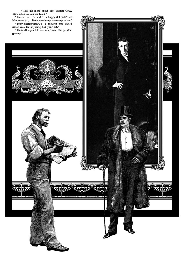
This is my favourite page. I liked the way the composition came together and also enjoyed being able to use John Singer Sargent’s portrait of W. Graham Robertson as the picture of Dorian. I’ve noted in an earlier post the similarity between this painting and the portrait seen in the BBC’s adaptation of the novel by John Osborne. Robertson was a theatre designer and illustrator who Wilde consulted when planning stage designs for what would have been the London debut of Salomé. Robertson was also (so far as we know) homosexual which adds an extra resonance.
dorian3.jpg

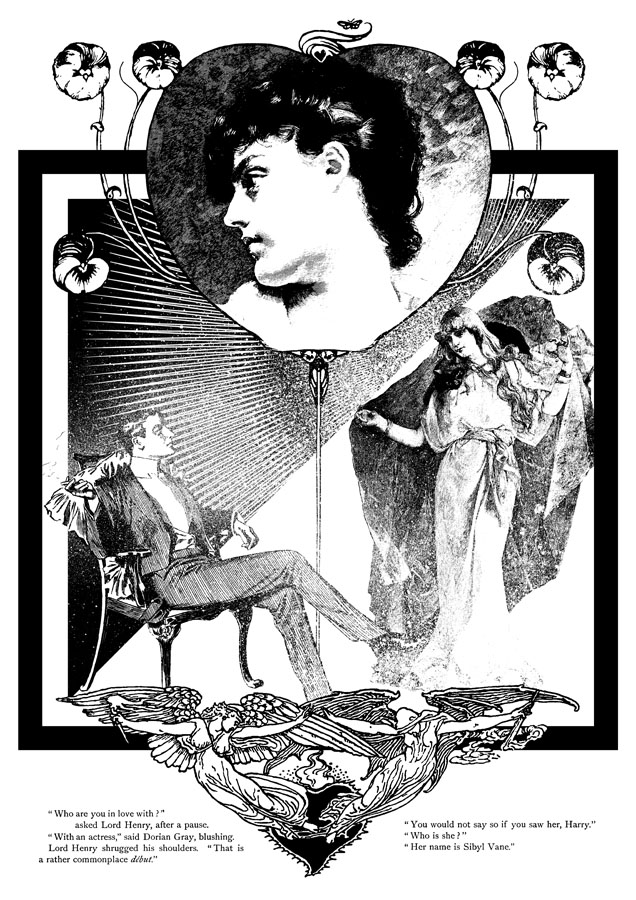
The Sibyl Vane page: a combination of details from The Studio, The Strand and The Magazine of Art. The motif at the foot of the page is by Walter Crane. Nothing of Wilde’s appeared in The Strand but that magazine’s most popular writer, Arthur Conan Doyle, had his second Sherlock Holmes adventure, The Sign of Four, commissioned at the same dinner that saw the commissioning of Dorian Gray, both novels being published by Lippincott’s Monthly Magazine in 1890.
dorian4.jpg

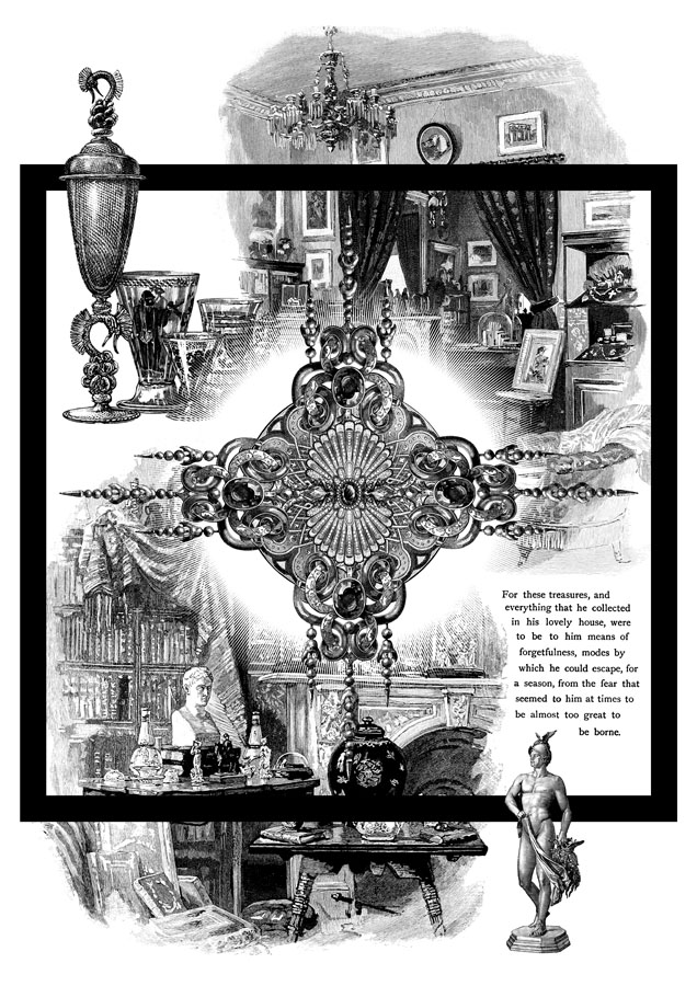
A page depicting Dorian’s distracting obsession with jewels and luxurious goods. This chapter can seem somewhat superfluous unless seen in the light of Wilde’s intention to write something like Huysmans’ À rebours (1884).
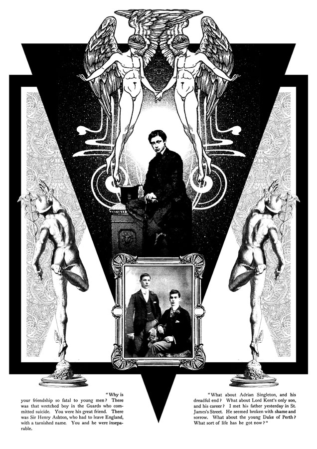
dorian5.jpg

The “Love that dare not speak its name” page. This makes explicit the subtext of the book although if you read the two paragraphs I selected it’s evident enough why Dorian is causing a problem for so many young men. The blindfolded Eros was a drawing by Walter Crane which I doubled then re-drew slightly so the pair were holding hands. The boy below is a picture from The Strand of the young Edward VII, a robust heterosexual in later years but with a son, Prince Albert Victoria, who became linked to the notorious Cleveland Street Scandal which involved a male brothel catering to aristocrats. The two young men in the picture frame are described as a pair of “panthers” in Neil McKenna’s The Secret Life of Oscar Wilde (2003), by which he means that they were fin de siècle rent boys (as in Oscar’s remark about “feasting with panthers”); McKenna doesn’t give any further details about the photo but it suited the picture.

In addition to this series of illustrations, volume 2 of The Graphic Canon includes two of my Lewis Carroll illustrations in a section by different artists based on the Alice books. I’d be recommending The Graphic Canon even if I wasn’t a contributor, as I said above it’s a remarkable achievement. Watch out for it.

Elsewhere on { feuilleton }
The Oscar Wilde archive

Zimbu Xolotl Time

wb1.jpg

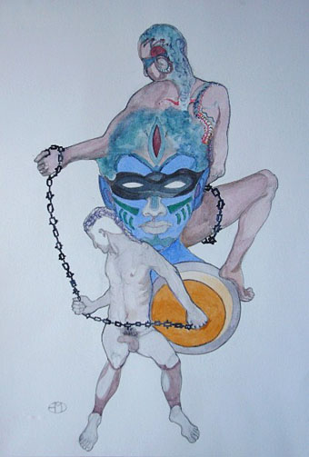
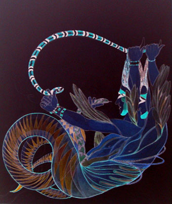
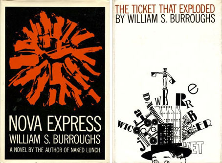
Or The Wild Boys revisited. These are two of Emma Doeve’s Wild Boys paintings from the Academy 23 book which was published in October by WhollyBooks to coincide with the recent London event remembering and celebrating The Final Academy, a William Burroughs-themed series of events held in London and Manchester in 1982. I’ve mentioned before that the book contains an edited version of my post about the event at Manchester’s Haçienda club. The book is now sold out but I expect some copies will find their way into the secondhand market eventually. Had Emma’s pictures been around a year ago I would have included them in my post about The Wild Boys and the various music and art inspired by Burroughs’s novel. They’re also a reminder that I ought to finish my own Wild Boys portfolio which has languished this year while I’ve been engaged with other things, not least finishing the Reverbstorm book. Something for the future, then. As for Zimbu Xolotl Time, Phil Hine can explain.

wb2.jpg

Elsewhere on { feuilleton }
The William Burroughs archive

Early British Trackways

watkins01.jpg

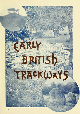
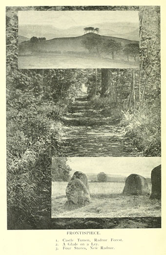
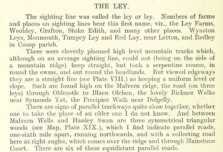
Continuing the Earth mysteries/megaliths theme, Early British Trackways: Moats, Mounds, Camps, and Sites (1922) by Alfred Watkins (1855–1935) was the first book in which the ley lines theory was proposed. Watkins was an amateur archaeologist (more a kind of early psychogeographer), photographer and writer who theorised that ancient Britons had marked the land with pathways connected by a variety of natural and man-made features: hills, mounds, trees, ponds, hillside notches and (of course) standing stones. Watkins coined the term “ley” after noticing that many of the lines connecting these features ran through villages or areas of land whose names ended in “-ley”, “-lay” or similar. The thesis was developed more fully in The Old Straight Track (1925), a book which became the ur-text for subsequent ley hunters. I’ve never seen any of Watkins’ books so it was interesting finding this short volume at the Internet Archive, not least because several of the photos appear in Mysterious Britain (1972) by Janet & Colin Bord, a classic guide to Britain’s sacred sites and folk rituals.

watkins02.jpg

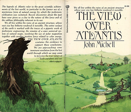
Watkins never regarded ley lines as having any mystic significance, he thought they were probably old trade routes. Archaeologists have never agreed with his suppositions, however, and Watkins himself might have disapproved of the conjectures added to his theories by John Michell in The View Over Atlantis (1969) which wedded ley line theory to feng shui to create the whole “lines of energy” idea. Whatever one thinks of Michell’s theories, that book and subsequent volumes put ley lines firmly into popular culture, and without them we wouldn’t have the references in Children of the Stones, Steve Hillage’s Green (1978) (pretty much a Michell-inspired concept album), Nigel Kneale’s Quatermass (1979) and so on. But this slim book is where it all begins.

tvoa.jpg

Illustration by Roger Dean (1972).

watkins03.jpg

Continue reading “Early British Trackways”

Weekend links 135

kuhlman.jpg

Two Grove Press covers by Roy Kuhlman. From Arden Kuhlman Riordan’s Pinterest page collecting her father’s cover designs.

• “When people asked me what boylesque was, I’d say I’m doing burlesque and I have a penis,” said Mr. Ferguson.

Sequence5: 42 tracks of new, atmospheric/ambient music. A free download in a variety of formats.

The trailer for Jimmy’s End, the forthcoming film by Alan Moore and Mitch Jenkins.

As a porn performer, I can say from experience and with confidence that I’ve never been objectified by other performers. Nor have I been objectified by viewers. At least not in a way that seemed to confuse them into thinking I was an object. What happens instead is that I shift in and out of object-hood. Athletes do this too—they engage with their bodies for a specific task. At the end of the game or the shoot, the context changes.

Conner Habib on The Virtues of Being an Object

Secret Weapons (1972), David Cronenberg’s lost TV movie resurfaces.

Joseph Burnett reviews Nude, the new album by The Irrepressibles.

Over a third of e-readers are used just once before being set aside.

The guarded, the cautious, the small-scale, the modest, the well-crafted—such books may be rewarded (in our own time, at the national level), but they are rarely preserved. They are not preserved because guardedness, caution, smallness, modesty, and craft can be replaced in any given generation. What is irreplaceable is excess: Of verbal kinesis, religious intensity, intellectual voracity.

Amit Majmudar on Entertainment and Excess: The Great Literary Audiences

Miniature Book Interviews with Louis Wain Bound by Hand.

A Tour Inside Salvador Dalí’s Labyrinthine Spanish Home.

• Horror fiction should be deep, not cheap, says Nina Allan.

• RIP Peter Kuhlmann aka Pete Namlook

More is More by Alex Trochut

The Useless Web

Lost In The Sea (1992) by Sequential (Pete Namlook & DJ Criss) | Angel Tech (1994) by Bill Laswell & Pete Namlook | Yenlik (Part II) (1996) by Burhan Öçal & Pete Namlook

Reverbstorm in print

rev1.jpg

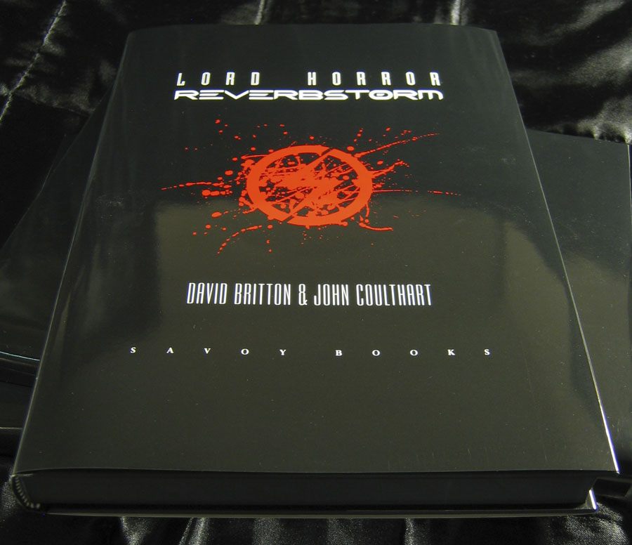
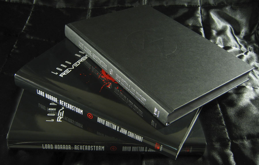
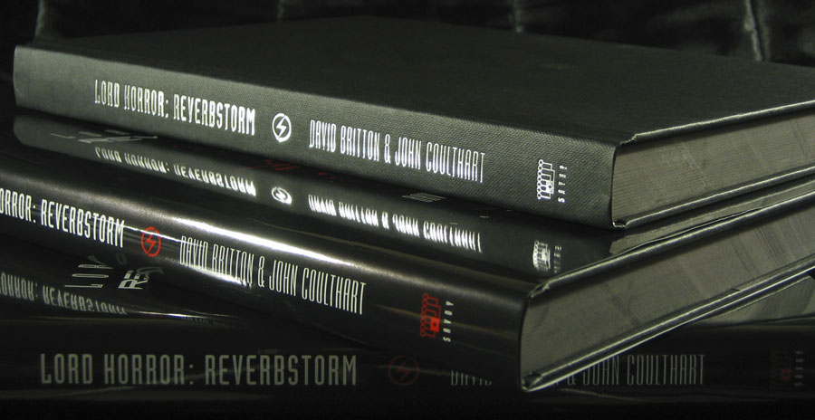
A couple of months ago I was starting to wonder whether I’d ever see this book printed, the production process became so tortuously drawn out. But Reverbstorm is finally in print and looking exactly the way I intended with black boards, black endpapers and black ink on the page edges. The latter proved to be a costly extra which explains why it’s an uncommon effect.

rev2.jpg

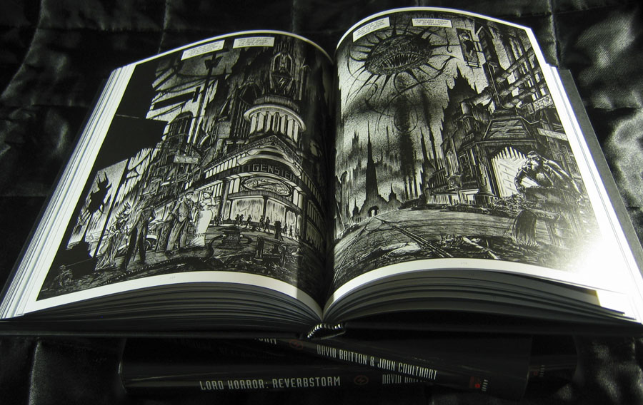
More important than the book design is that the printing of the artwork is excellent, with rich blacks and pin-sharp detail throughout. You’d think that printing black-and-white pages was a fairly straightforward business but the first set of proofs were pretty disastrous, the ink bleeding over the edges of many panels and detail elsewhere being blacked in. A combination of copious cross-hatching, spattered ink and—on later pages—brush shading and monochrome painting proved to be too much when the A3 artwork was reduced to half its size. This was particularly galling since these pages had never been properly printed since they were drawn: the original comics looked glossy enough but were all produced by back-street printers who didn’t bother too much about quality, and even made mistakes. They were a necessary evil at a time when other Savoy books had been refused by printers who objected to the material they contained. The relief at finally seeing the series completed and printed to this standard is considerable.

rev3.jpg

However, I’m afraid would-be purchasers still have a slight wait before they can buy a copy. The official publication date will now be early February but copies will be available to buy from the first week in January after distribution details have been finalised. I tried to persuade Savoy to relent on this and let a few copies go out prematurely but that won’t be happening. Sorry to anyone who’s been waiting since April (!) for the book but the decision is out of my hands. I believe it’ll be worth the wait. This is a better book than The Haunter of the Dark, and the best (and last) thing I’ll do in the comics medium. Next up is Axiom, a different world entirely. More about that later.

rev4.jpg

Previously on { feuilleton }
Reverbstorm update
James Joyce in Reverbstorm
A Reverbstorm jukebox
Reverbstorm: Bauhaus Horror
Reverbstorm: an introduction and preview