Burroughs: The Movie revisited

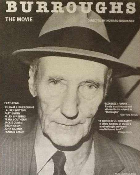
burroughs.jpg

Photo by Kate Simon.

Howard Brookner’s 86-minute documentary Burroughs: The Movie (1983) has been mentioned here on several occasions, and with good reason since it’s the best film anyone has made or will make about William Burroughs and the Beat circle he emerged from in the 1950s. Brookner’s documentary is a model film biography, opening with the writer’s appearance on Saturday Night Live in 1981 then backtracking to his childhood in St. Louis, his family life, the Beat period, the Bunker years, and so on, ending with his move to Lawrence, Kansas in the early 1980s. It’s intimate, frequently very funny, and reveals a human side to Burroughs too often buried by the weight of a sinister reputation. Brookner spent several years working on the film which features appearances from, and interviews with, a priceless range of friends, relatives and collaborators: Allen Ginsberg, Herbert Hunke, John Giorno, James Grauerholz, Brion Gysin, Patti Smith, Terry Southern, Mortimer Burroughs (William’s brother), William S. Burroughs Jr (William’s son who died while the film was in production), Francis Bacon, Jackie Curtis and many others. Tom DiCillo and Jim Jarmusch helped with the camera and sound duties.

The BBC screened the film as part of their Arena arts strand during the miraculous run of that series in the 1980s, since when it’s become difficult to see unless you have a copy on tape. So it’s been good to hear that Aaron Brookner is intending on restoring and reissuing his uncle’s debut film, having found the original print along with many outtakes. Howard Brookner died of AIDS in 1989 so Aaron is launching a Kickstarter fund to restore the film today, December 1st, which is World AIDS Day:

Burroughs: The Movie is a very special film: with in-depth interviews from Allen Ginsberg, Brion Gysin, and many more; intimate scenes such as Burroughs and James Grauerholz with Burroughs’ son Billy Jr.; and it is the only time on camera Burroughs speaks candidly about the tragic shooting accident that left his wife Joan dead.  As Janet Maslin wrote in The New York Times Review: “Rarely is a documentary as well attuned to its subject as Howard Brookner’s Burroughs, which captures as much about the life, work and sensibility of its subject as its 86 minute format allows. Part of the film’s comprehensiveness is attributable to William S. Burroughs’ cooperation, since the author was willing to visit old haunts, read from his works and even playfully act out a passage from Naked Lunch for the benefit of the camera. But the quality of discovery about Burroughs is very much the director’s doing, and Mr. Brookner demonstrates an unusual degree of liveliness and curiosity in exploring his subject”. (more)

Given that so many of the film’s participants are now dead this project has historical as well as aesthetic significance. If you have some spare cash and a more than passing interest in William Burroughs than I’d urge you to lend your support.

Elsewhere on { feuilleton }
The William Burroughs archive

How It Works

hiw1.jpg

Yes, it’s all happening this month… Unlike other work that’s surfaced recently the cover art for issue 41 of How It Works magazine was completed less than a month ago. Headlines obscure much of the artwork but the picture is also run full-page inside, something I wasn’t expecting. How It Works has major newsstand distribution so people in the UK may see this on shelves in newsagents and supermarkets throughout December.

The theme is the Industrial Revolution but the brief was for something similar to a couple of my recent steampunk illustrations, with a request for a colour scheme like that used for the Bookman Histories cover. The main visual requirement was the train looming out of the picture. I thought this wouldn’t be a problem, I have the old Dover Publications’ Transportation book which features many copyright-free engravings of trains, in addition to other books and source material downloaded from the Internet Archive. One of these would be sure to have a decent front elevation of a steam locomotive, right? Wrong. When you start looking for pictures of locomotives you quickly find that 99% of them show the machines from the side or from an angle, as on the Bookman cover. I downloaded three entire books of over 500-pages each from the Internet Archive, fantastic volumes in themselves, especially Modern Locomotive Construction (1892) which contains meticulous descriptions of every last part of a steam locomotive, down to the smallest screw. But none of their drawings were usable.

Continue reading “How It Works”

Athanasius Kircher’s pyramids

kircher.jpg

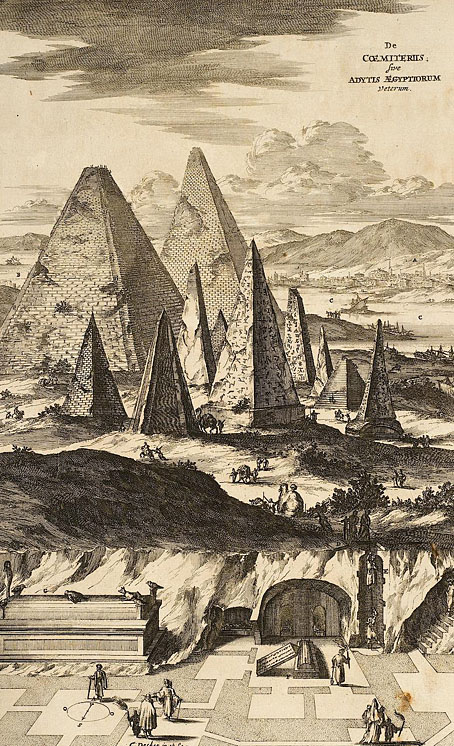
Athanasius Kircher’s pyramids aren’t as vast as Thomas Cole’s dream construction—for size you need Kircher’s Tower of Babel—but they’re still eccentric inasmuch as they don’t correspond to any group of Egyptian structures. One of the great things about the etchings in Kircher’s books is the way their detail gives a sense of veracity to their depictions. Go slightly further back in time and you’ll find scenes that are just as eccentric but much more crudely rendered; go forward a few years and too much was known about ancient ruins to ever depict them this way again. The illustration is the frontispiece to Kircher’s Sphinx Mystagoga (1676) which can be seen in full at the University of Heidelberg. The details in Kircher’s illustrations benefit from the high-resolution scans.

Steve in the comments to yesterday’s post mentions another painting featuring an impossible view of architecture through the ages (pyramids included), The Professor’s Dream (1848) by Charles Robert Cockerell. BLDGBLOG ran a post about Cockrell’s paintings a couple of years ago.

Elsewhere on { feuilleton }
The etching and engraving art archive

Previously on { feuilleton }
Athanasius Kircher’s Tower of Babel
China Monumentis by Athanasius Kircher

On self-imitation

divinecomp.jpg

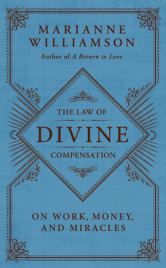
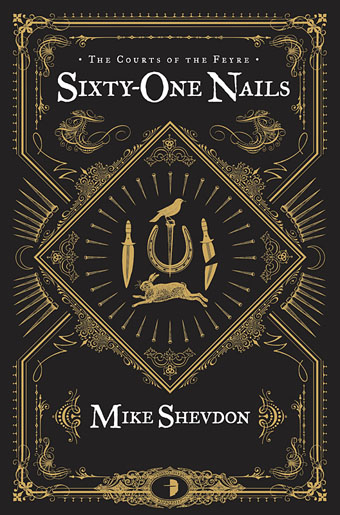
Or where Angry Robot leads, HarperCollins follows… The Law of Divine Compensation by Marianne Williamson is published today in the US by HarperOne, an imprint of HarperCollins, and if the cover looks similar to Mike Shevdon‘s recent edition of Sixty-One Nails it’s because I designed both of them. Harper’s contacted me earlier this year asking if I could adapt the Sixty-One Nails design for their new Marianne Williamson title. I was a bit unsure about accepting this at first but Ms Williamson isn’t a novelist so the books wouldn’t be appearing on the same shelves; I also said I’d prefer to create new decorative elements so there was enough difference between the new design and the earlier one. In the end the design was pared back considerably during the usual to and fro between art department and marketing people. Harper’s previous titles in this series have quasi-Victorian border designs on plain backgrounds so there needed to be some continuity. I haven’t seen a copy of the book itself yet but the last I heard the design was going to be given a foil treatment on textured paper.

shevdon1.jpg

It’s always an odd feeling being asked to imitate something you’ve done before. The new work often lacks the sense of accomplishment and exploration you felt earlier because you know exactly how it’s going to end up. When I started work on Mike Shevdon’s covers all I had in mind was that basic frame shape; everything else was improvised. I still prefer those earlier designs, I like the way all the details came together, and the way they look against a black background. Mike told me recently that someone picked up one of the books in a shop to look at the cover then bought the book; that’s exactly the kind of thing a cover designer (and author!) likes to hear.

Elsewhere on { feuilleton }
The book covers archive

Previously on { feuilleton }
Book talk
The Courts of the Feyre

Weekend links 136

tintenfisches.jpg

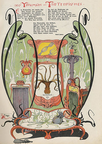
Der Triumph des Tintenfisches from Meggendorfer-Blätter (c. 1900). Via Beautiful Century.

Much dismay this week at the news that Coilhouse—the web and print magazine founded in 2008 by Nadya Lev, Meredith Yayanos and Zoetica Ebb—was closing its doors for the foreseeable future. I always loved what they were doing, and was delighted when S. Elizabeth interviewed me for the website two years ago. Looking at the list of their featured articles is like seeing the contents of my head laid bare. Have a browse and see what you may have missed. And fingers crossed they return soon.

• “I think we are just used to seeing naked women because they are used as objects of desire in advertisements and TV. Naked men are not that common—we are not used to seeing a penis. I think that is the main problem for people.” The shock of the (male) nude.

Michael Clarke asks “What Can Publishers Learn from Indie Rock?” Also: Michelle Dean on the value of used books.

Queers find themselves on both sides of the free speech question. Those of us who are writers want the freedom to write and say what we want. I know I do. Yet a preponderance of LGBT people have become part of the larger wave of those who would limit free speech. Because while we want to be able to say whatever we want about “them,” we do not want “them” to say whatever they want about us.

Victoria Brownworth on The Case Against Censorship

• Caspar Henderson re-reads The Book of Imaginary Beings by Jorge Luis Borges.

One hundred classic minimalism, electronic, ambient and drone recordings.

• BLDGBLOG visits the Chand Baori stepwell in Abhaneri, India.

Brion Gysin’s Dreamachine is launched in the UK.

Ken Hollings visits Ludwig II’s Venus Grotto.

• A guide to Meredith Monk‘s music.

• RIP Boris Strugatsky.

Maldorora: a Tumblr.

Stalker: Meditation (1979) by Edward Artemiev | Undulating Terrain (1995) by Robert Rich & B. Lustmord | Stalker (2004) by Shackleton.