JK Potter and HP Lovecraft

hm1.jpg

American artist JK Potter is another photo-montagist whose work since the 1970s has been very popular as illustration for books of horror, fantasy and science fiction. Potter’s portrait of HP Lovecraft on the October 1979 issue of Heavy Metal was my first introduction to his work. The original version of that picture can be seen below. Despite Potter’s flair for horror imagery there’s fewer Lovecraft illustrations than you might expect, certainly fewer than I used to hope there might be, although tentacles—real ones—do feature in a number of his other pictures.

While we’re on the subject, HPL continues to dog my footsteps. I recently autographed an enormous block of contributor signing sheets for a new doorstop anthology from Centipede Press. A Mountain Walked is a 636-page collection edited by Lovecraft scholar ST Joshi which will be published in March, 2014. Be warned that like many other Centipede volumes it won’t be cheap! Meanwhile I’m currently working on a new series of illustrations for a completely different anthology of Lovecraftian fiction. That will also be out early next year. It’s going to be a good one but I’ll say more about it at a later date.

potter1.jpg

potter2.jpg

potter3.jpg

Tales of the Cthulhu Mythos (1990).

Elsewhere on { feuilleton }
The Lovecraft archive

Digital Grotesque

3d1.jpg

These organic forms are details of an architectural environment produced in sandstone using a 3D printer. The project is a collaboration between Michael Hansmeyer and Benjamin Dillenburger who use a series of algorithms to create the shapes the printer produces:

In the Digital Grotesque project, we use these algorithms to create a form that appears at once synthetic and organic. The design process thus strikes a delicate balance between the expected and the unexpected, between control and relinquishment. The algorithms are deterministic as they do not incorporate randomness, but the results are not necessarily entirely foreseeable. Instead, they have the power to surprise.

The resulting architecture does not lend itself to a visual reductionism. Rather, the processes can devise truly surprising topographies and topologies that go far beyond what one could have traditionally conceived.

3d2.jpg

The diagram below shows the scale of the completed structure. Regular readers won’t be surprised to hear that the first thing that came to my mind when looking at these photos was “Lovecraft!” This unpredictable rendering process immediately solves the problem of how to depict or construct a non-human architecture without resort to anything Earth-bound. Those ridged and fluted columns could be R’lyeh or they could equally be the vast and ancient buildings that Dyer and Danforth discover in At the Mountains of Madness. I’ve been waiting for a while for 3D printing to start moving beyond the mere replication of existing objects; this is a very promising development. There’s more detail about the process and construction at the Digital Grotesque site.

3d3.jpg

Previously on { feuilleton }
At the Mountains of Madness

Weekend links 174

ikuma.jpg

Dress (2012) by Nao Ikuma.

• Two of my Cthulhu artworks can currently be seen in the Ars Necronomica exhibition at the Cohen Gallery, Brown University, Providence, RI. The exhibition is part of NecronomiCon, and runs to September 13th. In related news, my steampunk illustration has been nominated in the Visual category of this year’s Airship Awards. Winners will be announced at Steamcon V in October.

• “…the story of how a small cabal of British jazz obsessives conducting a besotted affair with the style arcana of Europe and America somehow became an army of scooter-borne rock fans…” Ian Penman looks back at the culture of Mod for the LRB.

• “What is it about the writer in the First World that wants the Third World writer to be nakedly political, a blunt instrument bludgeoning his world’s ills?” Gina Apostol on Borges, Politics, and the Postcolonial.

If someone had designed a work regime perfectly suited to maintaining the power of finance capital, it’s hard to see how they could have done a better job. Real, productive workers are relentlessly squeezed and exploited. The remainder are divided between a terrorised stratum of the, universally reviled, unemployed and a larger stratum who are basically paid to do nothing, in positions designed to make them identify with the perspectives and sensibilities of the ruling class (managers, administrators, etc) – and particularly its financial avatars – but, at the same time, foster a simmering resentment against anyone whose work has clear and undeniable social value. Clearly, the system was never consciously designed. It emerged from almost a century of trial and error. But it is the only explanation for why, despite our technological capacities, we are not all working 3–4 hour days.

On the Phenomenon of Bullshit Jobs by David Graeber

Ron Rosenbaum talks to Al Pacino about all the usual stuff, and reveals some detail about the actor’s obsessive interest in Oscar Wilde’s Salomé.

• More queer history: The Brixton Fairies and the South London Gay Community Centre, Brixton 1974–6.

• At Dangerous Minds: Anthony Burgess and the Top Secret Code in A Clockwork Orange

• Every day for 100 days, Jessica Svendsen redesigned a Josef Müller-Brockmann poster.

LondonTypographica: Mapping the typographic landscape of London.

• Mix of the week: Secret Thirteen Mix 083 by Demdike Stare.

• At Strange Flowers: Alfred Kubin the writer.

Derek Jarman’s sketchbooks.

Rick Poynor on Collage Now.

• Thomas Leer: Private Plane (1978) | Tight As A Drum (1981) | Heartbeat (1985)

Weekend links 172

thielker.jpg

Complete Stop (2008), an oil painting by Gregory Thielker from his Under the Unminding Sky series.

• For Halloween last year I watched a very poor copy of a BBC Play For Today production, Robin Redbreast, a piece of rural horror by John Bowen which received a single screening in 1970. That poor copy—black-and-white, timecoded, multi-generation video—has been circulating for years, so it’s good to know that the BFI will be releasing Robin Redbreast on DVD in time for this year’s Halloween. This might be news enough but the following month the BFI also releases Leslie Megahey’s stunning adaptation of Schalcken the Painter in a dual DVD/Blu-ray edition. I wrote a short review of the latter film last October.

• Mixes of the week: August Sun High from The Advisory Circle, and John Wizards’ Quietus Mix “African music, R&B and chamber pop, filtered through gentle electronic arrangements that cross-pollinate with South African house, Shangaan electro and dub”.

• A trailer has surfaced for The Counselor, a film by Ridley Scott from an original screenplay by Cormac McCarthy. Trailers are too spoilerish so I’m refusing to watch it but for those interested Slate has the details.

Luckhurst makes an admirable attempt to link Lovecraft’s most frustrating writing tic to this theme of the unknown when he claims that Lovecraft’s “catachresis”—deliberate muddling of language through the use of mixed metaphors and the like—is a tool he uses to bolster the atmosphere of futility in the face of “absolute otherness.” The trauma of encountering something so far outside the realms of imagination triggers a collapse of logic in the language itself.

Cate Fricke reviews The Classic Horror Stories of HP Lovecraft, a collection from Oxford University Press edited by Roger Luckhurst.

• “Contemporary audiences found it too weird, too wonky and even borderline distasteful…” Xan Brooks goes looking for the locations from Powell & Pressburger’s 1943 film, A Canterbury Tale.

• Two songs from Julia Holter’s forthcoming album, Loud City Song: World and Maxim’s I. Also unveiled this week: Evangeline, a new track by John Foxx & Jori Hulkkonen.

• Have Ghost, Will Find: Colin Fleming on William Hope Hodgson’s Carnacki, The Ghost Finder.

• At PingMag: Urban Calligraphy: Turning the Streets into Big, Loud Canvases.

• Sex, Spirit, and Porn: Conner Habib talks to Erik Davis.

Serendip-o-matic: Let Your Sources Surprise You

The Pronunciation of European Typefaces

Twilight (2004) by Robin Guthrie & Harold Budd | Luminous (2009) by John Foxx & Robin Guthrie | Cling (2011) by Robin The Fog

The horror

Last year I was asked to write something about my favourite horror comics for Nørd Nyt, a Danish comics zine. I’d pretty much forgotten about this until the printed copy arrived, so here’s my piece in English, a choice of three favourite horror stories.

breccia.jpg

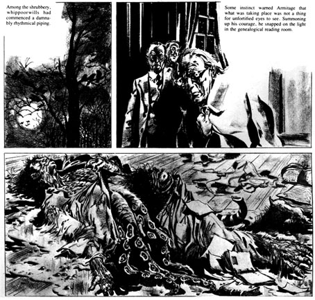
The Dunwich Horror by Breccia (1973)

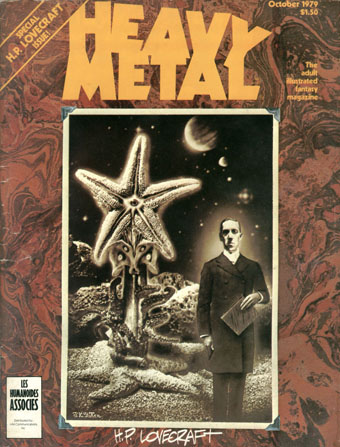
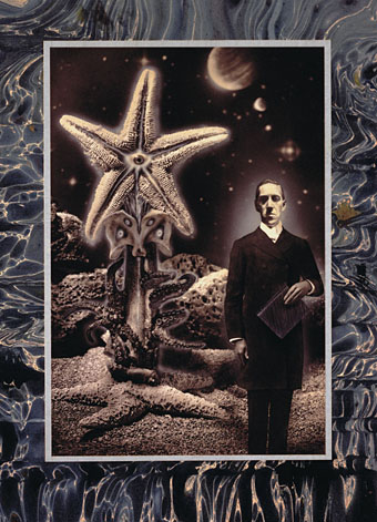
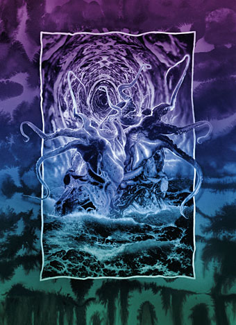
The October 1979 issue of Heavy Metal magazine came as a revelation. I’d only bought a few issues prior to this, and seeing an entire magazine devoted to HP Lovecraft seemed far too good to be true. Lovecraft art is so common now that it needs to be emphasised how scarce this kind of illustration used to be, the most you saw was paperback art of varying quality. There had been a few comic-strip adaptations but they were mostly in American publications or foreign editions I hadn’t seen. As it turned out, Heavy Metal‘s great JK Potter cover promised more than it actually delivered: at least half the magazine was taken up with continuing strips that had nothing to do with Lovecraft, or strips that did little but borrow a few Lovecraftian motifs for a slight horror tale. The one really outstanding piece was Alberto Breccia’s The Dunwich Horror, one of several Lovecraft adaptations the artist produced in 1973. Breccia’s style was sketchy, shadowy and replete with period details. The faces of his characters looked absolutely right for what I still consider to be one of Lovecraft’s darkest stories (people tend to miss the implication that a backwoods magus very nearly destroys humanity). Until I encountered the artists in Heavy Metal I’d given up on comics as an artistic medium, having no time at all for superheroes or the poor science fiction of 2000AD. Artists like Breccia, Moebius and Druillet showed that there was more than one way of drawing imaginative work, that you could use the refined techniques of illustration to tell a story.

yeux.jpg

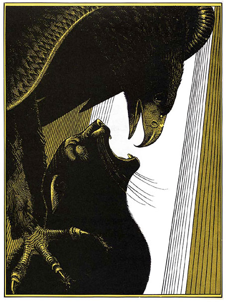
Les Yeux du Chat (The Eyes of the Cat) by Jodorowsky and Moebius (1978)

This story came to my attention when it received its first English translation in the pages of Steve Bissette’s Taboo anthology. It was printed in black on yellow paper, the original French edition having been yellow and black with white highlights. Compared to Jodorowsky’s customary flights of fancy the story is a very simple one, if typically grotesque: a silhouetted figure stands at a tall window overlooking a futuristic (or alien) city, directing with its thoughts the action of an eagle who hunts down a cat in the streets below. The horror comes from the shocking predicament revealed at the end, and the final line of dialogue, although this remains secondary to the formal perfection of the drawing and storytelling. Even by the standards of Moebius’s meticulous draughtsmanship this is a superbly controlled piece of work. Each spread operates as a kind of split-screen, with the left page showing the dialogue and the silhouetted figure, while the full-page illustration opposite shows a simultaneous moment of action somewhere in the city. One thing I immediately liked about this was Moebius’s architecture which even more than usual manages to seem otherworldly yet completely convincing. Everything we see in this brief tale poses questions that remain unanswered. And like many of the best short stories, a few carefully chosen details can imply an entire world.

fromhell.jpg

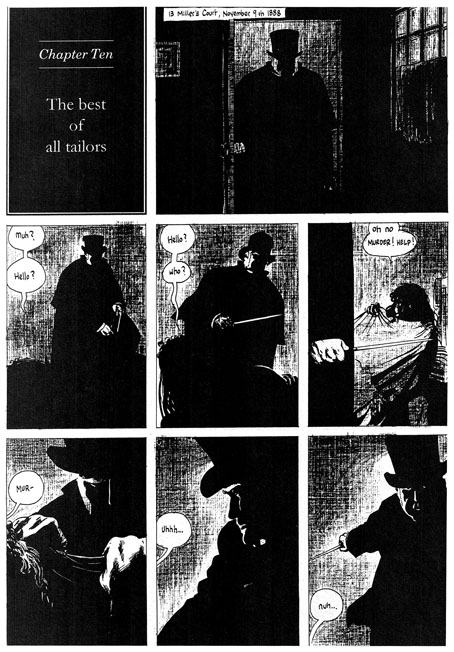
From Hell by Alan Moore and Eddie Campbell (1991–1996)

Horror doesn’t have to be delivered within genre stereotypes, in fact these days it’s often better if it isn’t when so many of those stereotypes—vampires and zombies, for example—have been diminished by over-familiarity. From Hell isn’t a horror story per se—it’s self-described as “a melodrama in sixteen parts”—but it debuted in Steve Bissette’s anthology Taboo where the brief was to offer the reader something dark or challenging that they hadn’t seen before. From Hell certainly fulfilled that brief: Alan Moore’s writing has never shied from the dark—consider the nihilistic Rorschach chapter of Watchmen—but this is as black as he gets. Eddie Campbell has been vocal about his dislike of horror stories but he was the perfect artist here with his long experience drawing ordinary human beings rather than posturing superheroes. Together the pair delivered a story that was novelistic in scope and minute in its attention to detail. Most people would have thought they knew more than enough about Jack the Ripper but no other representation has been this thorough in its exploration of all aspects of the case.

Watchmen had already aimed for a panoramic range of characters—from the president to a newspaper-seller—but From Hell went much further and in greater detail, with a scope that ranges from a group of homeless women to the head of the British Empire and all the classes in between. One of the most impressive aspects of the story was its exposure of the awful gap at the heart of previous dramatisations, namely the reduction of the lives of the murdered women to a cast of frequently nameless unfortunates who we glimpse for a moment sidling up an alley before their blood splashes on a wall. Moore’s script showed us (as much as is possible) the real women behind the roll-call of victims, crushed by poverty yet still distinct individuals. Looking for human detail has always been a feature of Moore’s writing, it’s why his work seemed so fresh in the 1980s compared with lesser writers who were simply recycling clichés as though there was no other way to behave. So too with Campbell’s artwork which has never been subject to the exaggerations of the superhero genre. One of my favourite moments in the entire story was utterly human and utterly trivial: the scene in Chapter 3 when Walter Sickert and Annie Crook meet. Annie says “I need a wee” so she hitches up her shift and squats in the road. It’s the accumulation of numerous human moments such as this—the moments that genre comics invariably avoid—that makes From Hell such a powerful and memorable piece of work. Eddie Campbell’s art shows us the true London dark, a city as black and terrible as it would have been in the days before electric light.

Previously on { feuilleton }
Heavy Metal, October 1979: the Lovecraft special