Alright, these devils are inked rather than painted, but the phrase is a memorable one from Macbeth which was also used by Robert Aickman as a title for one of his story collections.
The devils in question are the work of Thomas Bewick (1753–1858), an English engraver referred to twice in Casting the Runes by MR James. I was reminded of this recently after I’d watched the excellent film adaptation, Night of the Demon, and decided to reacquaint myself with its origin. In James’ story, Karswell, a vengeful occultist with a vague resemblance to Aleister Crowley, torments a man he’s cursed by reminding him of the escalating supernatural threat and its potentially fatal outcome. One of the warnings is as follows:
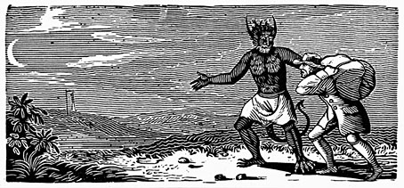
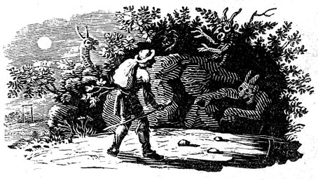
…two things came for him by post during those weeks, both with a London postmark, and addressed in a commercial hand. One was a woodcut of Bewick’s, roughly torn out of the page: one which shows a moonlit road and a man walking along it, followed by an awful demon creature. Under it were written the lines out of the “Ancient Mariner” (which I suppose the cut illustrates) about one who, having once looked round—
walks on,And turns no more his head,
Because he knows a frightful fiend
Doth close behind him tread.
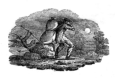
The Coleridge quote makes it into the film but there’s no mention of the woodcut, although we do see some other engravings of medieval devils. (Likewise, the ITV Playhouse adaptation from 1979 includes the quote but omits the woodcut.) Since the quote is a genuine one I was curious to know whether the Bewick picture also existed. Unfortunately, this doesn’t seem to be the case. I’m equivocating, as usual, because I’m not entirely certain, but in an article from 2006 Tom Lubbock had this to say about Bewick and James:
Like Borges, James delights in the fictional but plausible work of literature. In Casting the Runes, he also contrives a fictional work of art. Though a contemporary of Coleridge, the engraver Thomas Bewick never made any woodcuts illustrating The Rime of the Ancient Mariner, nor do any of his works quite correspond to the one described in this passage. Still, it’s a good fake. Many of Bewick’s woodcuts have travellers. Some of them have moonlight and demons, too. You can see what James had in mind.