Athanasius Kircher’s pyramids

kircher.jpg

Athanasius Kircher’s pyramids aren’t as vast as Thomas Cole’s dream construction—for size you need Kircher’s Tower of Babel—but they’re still eccentric inasmuch as they don’t correspond to any group of Egyptian structures. One of the great things about the etchings in Kircher’s books is the way their detail gives a sense of veracity to their depictions. Go slightly further back in time and you’ll find scenes that are just as eccentric but much more crudely rendered; go forward a few years and too much was known about ancient ruins to ever depict them this way again. The illustration is the frontispiece to Kircher’s Sphinx Mystagoga (1676) which can be seen in full at the University of Heidelberg. The details in Kircher’s illustrations benefit from the high-resolution scans.

Steve in the comments to yesterday’s post mentions another painting featuring an impossible view of architecture through the ages (pyramids included), The Professor’s Dream (1848) by Charles Robert Cockerell. BLDGBLOG ran a post about Cockrell’s paintings a couple of years ago.

Elsewhere on { feuilleton }
The etching and engraving art archive

Previously on { feuilleton }
Athanasius Kircher’s Tower of Babel
China Monumentis by Athanasius Kircher

The art of Thomas Cole, 1801–1848

cole1.jpg

The Titan’s Goblet (1833).

Thomas Cole’s Titan’s Goblet isn’t featured at the Google Art Project, unfortunately, but the following paintings are, and all benefit from being able to explore their details. Cole’s colossal vessel predates Surrealism by a century, and is one of many paintings which always has me mentally labelling him as the American John Martin (1789–1854). Having thought of him for years as an American artist–not least because he founded the Hudson River School–it’s a surprise to learn he was born in Bolton, a town not far from Manchester, with his parents emigrating to the US when he was 17. John Martin also grew up in the north of England so there’s another similarity, although the more important comparison concerns their use of painting to convey the spectacularly vast and unreal scenes common to the imaginative side of Romantic art. The Titan’s Goblet is unusual in not having any particular symbolic or moral significance, unlike the pictures below, it’s Magritte-like in its careful depiction of the impossible. The Subsiding of the Waters of the Deluge, on the other hand, could be exhibited beside Francis Danby’s The Deluge (1840) for a “before and after” effect. Like Martin, Cole enjoyed painting architecture of an exaggerated scale. The Architect’s Dream features an Egyptian temple of stupendous size, while the pyramid looming in the background is closer to William Hope Hodgson’s seven-mile-high Last Redoubt than any structure on the Nile plain.

Of equal interest are Cole’s two well-known series: The Course of Empire (1833–36) and The Voyage of Life (1842), both of which I’d love to see at Art Project size.

cole2.jpg

Expulsion from the Garden of Eden (1828).

cole3.jpg

The Subsiding of the Waters of the Deluge (1829).

cole4.jpg

The Architect’s Dream (1840).

Elsewhere on { feuilleton }
The fantastic art archive

Previously on { feuilleton }
John Martin’s musical afterlife
Albert Bierstadt in Yosemite
Danby’s Deluge
John Martin: Heaven & Hell
Darkness visible
Two American paintings
The apocalyptic art of Francis Danby

The poster art of Vic Fair

fair1.jpg

The Man Who Fell to Earth (1976).

This weekend’s viewing was The Man Who Fell to Earth on Blu-ray, highly recommended for anyone who likes the film, Anthony Richmond’s photography looks better than ever. I’ve had this for a while on DVD and what’s notable about the old and new formats is that both UK editions use Vic Fair’s poster design as the cover art. It often seems a hit-or-miss affair whether the original poster gets used for home release. This tends to happen more with older films that have acquired an artistic reputation; the recent UK release of The Conformist by Arrow Films prints four different poster designs on the inlay, with the box enclosure having a clear window that allows one or other of the designs to be facing out. A great idea which makes owning the physical copy a little more worthwhile.

I’d known the poster for Nic Roeg’s film for years but until this weekend I’d never thought to find out who was responsible for the artwork. Vic Fair was a prolific artist for UK film releases during the 1970s and 1980s so this is a small selection of his work. Apparently he was so pleased with the Roeg poster that he signed it. As is often the case with film posters, there’s no record of the designers for these examples so we don’t know who was responsible for the type layouts.

fair5.jpg

Countess Dracula (1972).

The Countess Dracula art looks surprisingly similar to some of the promotional art that Roger Dean produced around this time for UK studios, Hammer included. A few examples appear in his Views book but it’s a side of his work that’s seldom seen or discussed. I recall being impressed by the Vampire Circus poster in the past (although the big cats look a little silly). One of the better Hammers of the 70s, with a cast including cult cutie John Moulder-Brown.

fair2.jpg

Vampire Circus (1972).

fair3.jpg

The Hireling (1973).

As with many posters of the 1970s, The Hireling is a great example of an approach that marketing departments would never allow today.

fair4.jpg

Castaway (1987).

Another Nic Roeg film, and another subtle design, possibly too subtle as I don’t recall seeing it used anywhere. First time I saw this was on the cover of a soundtrack album a few years back when I was putting together Jon Hassell’s website. There’s a piece of his music used in the film so we were trying to trace all the relevant cover art.

There’s more about Vic Fair and his contemporaries in British Film Posters: An Illustrated History by Sim Branaghan & Steve Chibnall, a book I think I ought to buy. If anything it may spare me the temptation to start collecting film posters again.

Previously on { feuilleton }
Petulia film posters
Lucifer Rising posters
Wild Salomés
Druillet’s vampires
Bob Peak revisited
Alice in Acidland
Salomé posters
Polish posters: Freedom on the Fence
Kaleidoscope: the switched-on thriller
The Robing of The Birds
Franciszek Starowieyski, 1930–2009
Dallamano’s Dorian Gray
Czech film posters
The poster art of Richard Amsel
Bollywood posters
Lussuria, Invidia, Superbia
The poster art of Bob Peak
A premonition of Premonition
Metropolis posters
Film noir posters

Weekend links 136

tintenfisches.jpg

Der Triumph des Tintenfisches from Meggendorfer-Blätter (c. 1900). Via Beautiful Century.

Much dismay this week at the news that Coilhouse—the web and print magazine founded in 2008 by Nadya Lev, Meredith Yayanos and Zoetica Ebb—was closing its doors for the foreseeable future. I always loved what they were doing, and was delighted when S. Elizabeth interviewed me for the website two years ago. Looking at the list of their featured articles is like seeing the contents of my head laid bare. Have a browse and see what you may have missed. And fingers crossed they return soon.

• “I think we are just used to seeing naked women because they are used as objects of desire in advertisements and TV. Naked men are not that common—we are not used to seeing a penis. I think that is the main problem for people.” The shock of the (male) nude.

Michael Clarke asks “What Can Publishers Learn from Indie Rock?” Also: Michelle Dean on the value of used books.

Queers find themselves on both sides of the free speech question. Those of us who are writers want the freedom to write and say what we want. I know I do. Yet a preponderance of LGBT people have become part of the larger wave of those who would limit free speech. Because while we want to be able to say whatever we want about “them,” we do not want “them” to say whatever they want about us.

Victoria Brownworth on The Case Against Censorship

• Caspar Henderson re-reads The Book of Imaginary Beings by Jorge Luis Borges.

One hundred classic minimalism, electronic, ambient and drone recordings.

• BLDGBLOG visits the Chand Baori stepwell in Abhaneri, India.

Brion Gysin’s Dreamachine is launched in the UK.

Ken Hollings visits Ludwig II’s Venus Grotto.

• A guide to Meredith Monk‘s music.

• RIP Boris Strugatsky.

Maldorora: a Tumblr.

Stalker: Meditation (1979) by Edward Artemiev | Undulating Terrain (1995) by Robert Rich & B. Lustmord | Stalker (2004) by Shackleton.

Hill figures

whitehorse.jpg

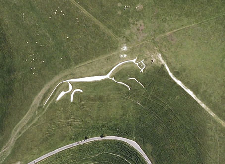
Last year I was searching out various works of American land art via Google Maps. This is a similar post looking for some of Britain’s hillside figures, all of which are far older than any 20th-century artworks even if some of them aren’t as old as people hope. The antiquity of the Uffington White Horse in Oxfordshire has been established, however, the figure being estimated to be at least three thousand years old. The debate in this case is whether it represents a horse, a dragon or some other creature. What’s most fascinating about the figure is that it can’t be seen from any of the surrounding area, it’s only visible at the top of the hill; all other hill figures are intended to be viewed from a distance. There are other white horse figures carved into southern England’s chalky hillsides but the rest look like distinctly modern creatures. The Uffington carving resembles the kind of animals seen in cave paintings.

longman.jpg

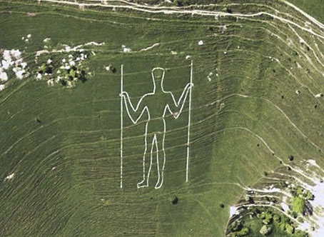
The Long Man of Wilmington in East Sussex provokes endless speculation as to its age and purpose. In the case of this figure and the Cerne Abbas Giant (below) there are no written records of them earlier than the 16th century whereas the Uffington horse is mentioned in medieval texts. This doesn’t rule out their being far older but it implies that their origin may be more recent and more mundane than some would like to believe. The satellite view of the Long Man currently on Google Maps shows that local wags have given the figure a smiley face.

cerneabbas.jpg

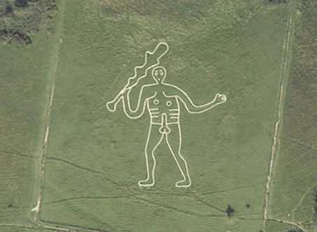
The most famous erect penis in Britain can be found near the village of Cerne Abbas in Dorset. In the 1930s the Bishop of Salisbury petitioned the Home Office to have the giant phallus covered over, to no avail.

cropcircle.jpg

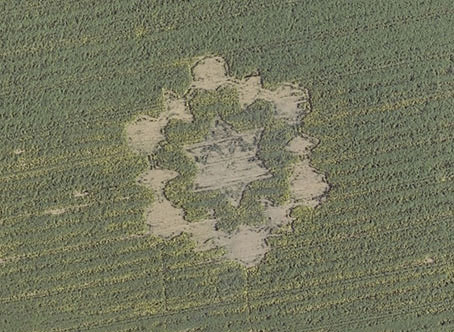
Not a hill figure, this is the remains of a crop circle I noticed when looking at Avebury from the air. There are no doubt more to be found, Wiltshire is apparently a popular area for circle makers.
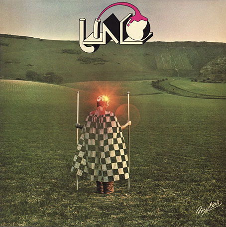
uno.jpg

Uno (1974) by Uno.

Given the usual subjects of concern here I have to mention these two album covers which make use of hill figures. The Uno sleeve is a design by Hipgnosis which is a lot more well-known than the album it decorates. The original XTC vinyl sleeve designed by Ken Ansell was textured card with the horse and lettering embossed into the surface. I’ve not been able to find a cover featuring the Cerne Abbas Giant although that doesn’t mean to say there isn’t one.

xtc.jpg

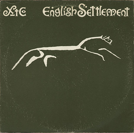
English Settlement (1982) by XTC.

Elsewhere on { feuilleton }
The album covers archive

Previously on { feuilleton }
Land art
How to make crop circles