The Fantastic World of MC Escher

escher1.jpg

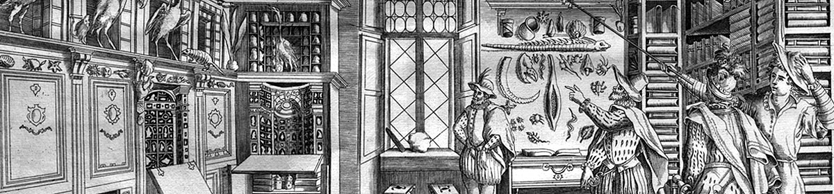
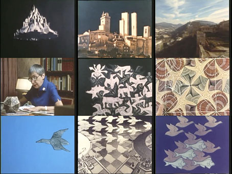
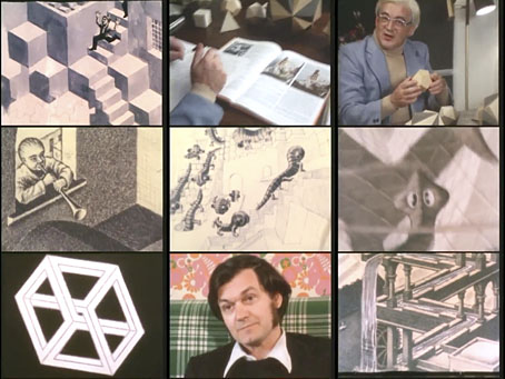
An Italian documentary about the Dutch artist made in 1980 and directed by Michele Emmer. I don’t recall ever seeing a British TV documentary about Escher (although I’d be surprised if there were none) but this resembles the type of thing the BBC used to do so well. Shots of the Italian towns where Escher lived for many years show the influence of the vernacular architecture on Escher’s prints. Elsewhere, animated sequences bring to life his tessellations, while various mathematicians examine some of the structural principles at work in these very familiar images. Of greatest interest for me is mathematician and physicist Roger Penrose discussing his first encounter with Escher’s work, and the development with his father of the Penrose Triangle, an impossible object similar to those that appear in some of Escher’s prints. (I used a Penrose Triangle in my cover art for Zones by Hawkwind.) The Fantastic World of MC Escher runs for 50 minutes, and may be watched here.

escher2.jpg

Previously on { feuilleton }
MC Escher album covers
Escher and Schrofer

Weekend links 246

ngai.jpg

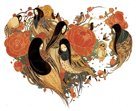
Love Hunter by Victo Ngai.

• “The strangeness of the lyric style, the misuse of words and awkward phraseology that have been criticized even by Poe’s fervent admirers, are here taken as virtues, heightening as they do, a given poem’s conscious and calculated formalism.” Marjorie Perloff reviews The Poet Edgar Allan Poe: Alien Angel by Jerome McGann.

• Mix of the week: Secret Thirteen Mix by Jeremy Kolosine. Starting with Michael Rother is apt when I’ve spent the past week in a Cluster/Harmonia/Kraftwerk/La Düsseldorf/Neu!/Rother loop.

• Court records “suggest that the supposedly prudish Victorians had a far more relaxed attitude to sex between men than their 1960s counterparts”. Historian Jeff Evans has the data.

• “Part of HP Lovecraft’s acknowledged debt to Machen also lies in hearing without seeing.” London Sound Survey on Arthur Machen’s “sounds from beyond the veil”.

• “…pity the designer who has to enact the stage direction that instructs rats to carry away a character’s feet.” Andrew Dickson on the extreme theatre of Sarah Kane.

• Psychedelic collage artist Wilfried Sätty receives a mention in Carey Dunne‘s piece about how LSD helped shape California’s ecstatic design legacy.

• More psychedelia: The Psychedelic Sex Book by Eric Gotland & Paul Krassner, edited by Dian Hanson.

• At Dangerous Minds: Robert Fripp demonstrates Frippertronics on The Midnight Special, 1979.

• Dreams from a Glass House: artist Josiah McElheny on the glass architecture of Paul Scheerbart.

• Director Peter Strickland on six films that fed into The Duke of Burgundy.

Vintage trade card designs

The Zero Of The Signified (1980) by Robert Fripp | Heptaparaparshinokh (1981) by Robert Fripp & The League of Gentlemen | 1984 (1981) by Robert Fripp

Have a heart

belisle.jpg

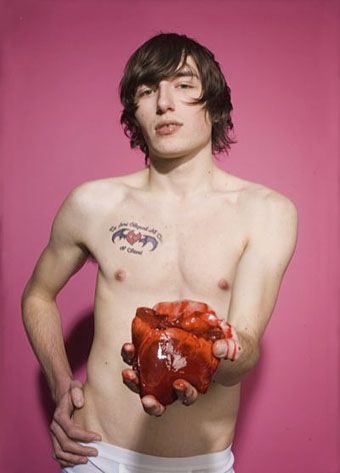
Kristopher photographed by David Belisle.

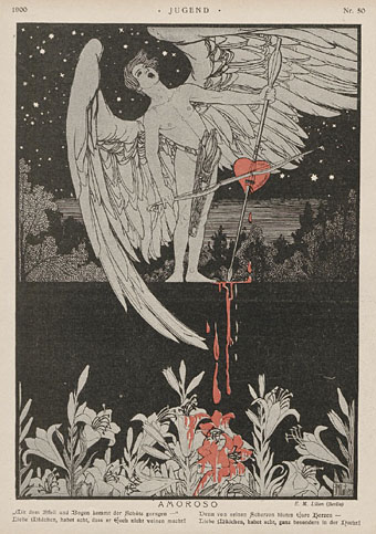
A little something for the 14th; I can always be relied on to post some gore for Valentine’s Day. I was tempted to post this still from Bride of Re-Animator but it’s a bit excessive for something so frivolous. Ephraim Lilien’s drawing shows that the bleeding love heart isn’t such a recent idea.

jugend-1900-11.jpg

Illustration by EM Lilien for Jugend, 1900.

Leitkegel

autobahn12.jpg

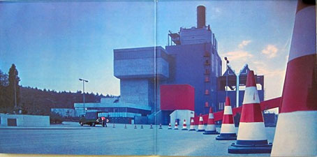
Gatefold interior for Doppelalbum (1974), a double-disc compilation album by Kraftwerk.

More Kraftwerkiana. “Leitkegel” is the German name for traffic cones, and it’s immediately obvious to anyone browsing Kraftwerk’s pre-Autobahn recordings that Ralf and Florian had a fixation with these objects. The closest thing I’ve found for a rationale is in Tim Barr’s history of the group, Kraftwerk: From Dusseldorf to the Future (1998), which features some musings about the influence of Joseph Beuys and the Düsseldorf arts scene of the late 60s. Prior to Kraftwerk, Florian Schneider was a member of a short-lived art collective/music outfit with the very un-Kraftwerkian name of Pissoff. Recordings exist of the group performing with Beuys. A more straightforward explanation might be to look towards Pop Art (something that Barr also suggests), with the traffic cone serving as a symbolic objet trouvé that’s also the first inkling of the future Kraftwerk obsessions with roads, trains and cycling. Whatever the impulse behind its adoption, between 1969 and 1973 the traffic cone was turning up everywhere that Ralf and Florian went.

tonefloat1.jpg

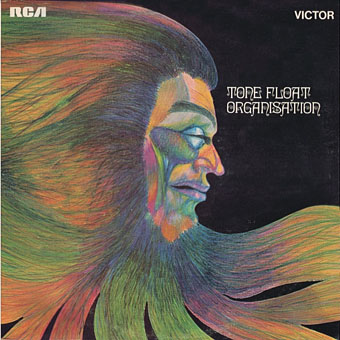
Cover design by “Comus” (Roger Wooton).

tonefloat2.jpg

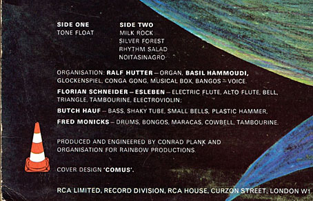
The first instance is on Tone Float (1970), the pre-Kraftwerk album by Organisation, a collection of freeform improvisations that’s very much of its time. The album wasn’t very successful, and matters weren’t helped by the poor cover artwork. That multicoloured head and Ringlet typeface are also very much of their time but if you look on the back of the sleeve you find a traffic cone beside the album credits.

organisation.jpg

Organisation live (1970).

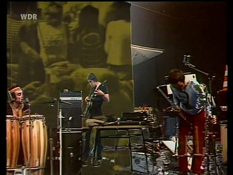
Before the group split they were recorded by German TV, a performance that gives a good idea of the Organisation sound and of how odd they all look together. Ralf Hütter isn’t visible but you do glimpse a traffic cone for a moment when Florian is moving his microphone stand. I suspect the proliferation of cones around Florian (see below) is an indicator that their adoption was his doing.

Continue reading “Leitkegel”

A Q&A with artist Mel Odom

odom1.jpg

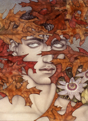
First Eyes (1982).

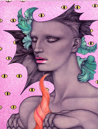
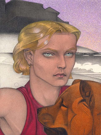
I’ve emphasised the artist label to distinguish this Mel Odom from the very prolific writer of the same name. The artist received a fleeting mention here in the Gay artists archive but for many years he’s been a highly regarded book and magazine illustrator, with a Gold Medal from the American Society of Illustrators among his accolades. (By coincidence, one of his covers was for an Ellen Datlow horror collection, and I happen to be illustrating a new Ellen Datlow collection of horror stories this week.) More recently Odom has gained a very different audience for his doll designs which are mentioned in passing below. I’m grateful again to John Wisniewski for offering me this piece. Thanks to John and to Mel, more of whose gorgeous art can be seen at his website.

*

John Wisniewski: When did you begin drawing and painting?

Mel Odom: I’ve been drawing since I was about 4 years old and painting since my early teens. I have scribbles in an early picture book of mine that I’m sure were my first attempts at drawing.

JW: Whom are some of your favorite artists?

MO: I like so many different artists. The Pre-Raphelites were a huge influence on me as well as artists like Edward Hopper and Georgia O’Keefe. Aubrey Beardsley has been an early and constant favorite of mine. Representational art moves me more than the abstract for the most part. Disney animation also shaped what I still think of as being beautiful.
odom2.jpg

JW: Have you had any exhibitions? If so, what was the reaction to your work?

MO: I’ve really never had a one-man exhibition. When I was illustrating I was too busy to bother and illustration was not considered gallery worthy. Then when I quit illustrating to create Gene [Marshall] there was simply no time to even consider it. I’ve been in tons of group shows where the reaction has been everything from adoring to dismissive. I’ve been working on a series of oil paintings towards a show.

JW: Your work is easily recognizable to those in the art world, Mel. Did you expect this to happen, when you began?

MO: When I started out I knew my drawings didn’t look like anyone else’s, but it wasn’t a conscious ploy for recognition. I devised my style by the process of elimination. I knew what I didn’t want them to look like. I just drew with a vision that made me need to see what the drawing looked like completed. My drawings were always based on a very personal sense of beauty.
odom3.jpg

Hello, I Lied (1997).

Continue reading “A Q&A with artist Mel Odom”