H.P.L.

hpl.jpg

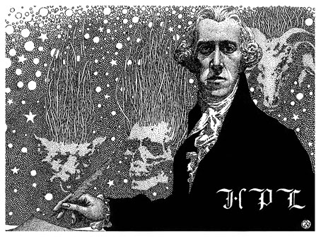
It’s that man again. Presenting the latest reworked page from the ongoing reconstruction/improvement of my Haunter of the Dark book. The picture will illustrate “Abdul Alhazred”, the final section of Alan Moore’s text for The Great Old Ones in which HP Lovecraft is positioned at Malkuth, the “Kingdom” in Alan’s eldritch Kabbalah. This makes Lovecraft himself the receptive vessel of the energies descending from the spheres above, while paradoxically being the source of those energies. Or some of them at least… The Great Old Ones is a Mythos Kabbalah which features Dagon, Hastur, Tsathoggua and Yig as well as Cthulhu and the rest. Alan doesn’t subscribe to Kenneth Grant’s baseless theory that Lovecraft really was a receptacle for transmissions from interdimensional entities, but the incorporation of the writer into his own pantheon isn’t unprecedented. Abdul Alhazred was a childhood persona of Lovecraft’s before he assigned the name to the author of Al Azif, or the Necronomicon; further personas may be found in Through the Gates of the Silver Key (“Ward Phillips”), Robert Bloch’s The Suicide in the Study (“Luveh-Keraph, priest of Bast”), and other fictions.

hpl.jpg

HPL (1937) by Virgil Finlay.

Whether this literary sport warrants the apparently limitless production of Lovecraftian art featuring the man himself, usually sprouting or festooned with tentacles, is a debatable matter. Virgil Finlay began the fantastic portrait trend in 1937 with his memorial depiction of the author writing with a quill pen while dressed in 18th-century garb. The earliest example that I can think of showing Lovecraft paired with the ubiquitous tentacles was the Moebius cover for Lettres d’Arkham in 1975, although there may well be other drawings prior to this. I’ve often wondered what Lovecraft would have made of the deluge of publications and images derived from his work, especially those that place him inside the products of his imagination.

moebius.jpg

Cover art by Moebius, 1975.

And speaking of which… I was at a loss at first with how to approach a new Lovecraft portrait, all I knew was that one was necessary. The original Malkuth picture from 1999 is another poor Photoshop job which has nevertheless been reused elsewhere on a few occasions, even appearing in 2007 on the cover of an issue of FATE magazine. For the new version I started with the portrait itself, using white lines on black to copy the same portrait photograph that formed the centre of the older picture. This was then duplicated and flipped horizontally to create a kind of Janus head which gives the portrait a suitably weird quality without wreathing it in tentacles. The mirrored head harks back to a sequence of treated photos by JK Potter which I first saw in the Heavy Metal Lovecraft special in 1979. Potter had used the same portrait photo to create effects that were somewhat compromised by poor reproduction, leading me to be believe that I’d created something slightly different to the first panel in his sequence. While researching this post I turned up an earlier version of the artwork which appeared on the back of the first issue of a US fanzine, Fantasy Mongers, also in 1979. The clearer reproduction revealed that the first head in Potter’s sequence is almost identical to my own. Ah well…

jkpotter.jpg

Photo art by JK Potter from the back cover of Fantasy Mongers #1, 1979.

The rest of the picture was improvised around this central image. Having drawn the portrait in white-on-black I decided to use a similar technique for the other elements. The Cthulhoid pillars are based on those in my Red-Night Rites painting from 1997, one of which appeared in the 1999 picture. The smaller figure on the right is from one of the photos that Wilfred Talman took while wandering the streets of New York with Lovecraft and Frank Belknap Long. This also appeared in the 1999 picture but for the new version I’ve emphasised what appears to be a book that Lovecraft is carrying in his right hand. Searching around for a complementary figure that might represent Abdul Alhazred turned up a 19th-century photo of a character who not only looked the part but is also standing in a manner similar to the Talman Lovecraft. If you look closely he’s also carrying a book, an addition of my own which turns him into the author of Al Azif. The polyhedra supporting the pair aren’t as arbitrary as they may seem. The spheres serve a dual purpose, preventing the figures from floating in space (or standing in water) while also relating to the Sephiroth of Malkuth which is identified with the Earth in the Kabbalistic scheme of planetary associations.

The next reworked picture will be Tsathoggua which is being polished rather than completely overhauled. I’m hoping I might have this done by the end of the month but I’m still chipping away at The Dunwich Horror while doing all this, as well as working on things which pay the bills. (I’ve just finished designing and illustrating another book.) Further progress will be announced in due course.

Elsewhere on { feuilleton }
The Lovecraft archive

Previously on { feuilleton }
The Return of the Crawling Chaos
Lettering Lovecraft
Weird ekphrasis and the Dunwich Horrors
Kadath and Yog-Sothoth
Another view over Yuggoth

Shin-Bijutsukai

shinbijutsukai01.jpg

If you’ve spent a great deal of time looking at European design publications from before or after 1900 you may experience a shock of surprise when you encounter a Japanese publication from the same period. Shin-Bijutsukai (“New Oceans of Art”) was a Japanese magazine published in monthly issues from 1902 to 1906. At first glance it looks like an equivalent of European design samplers such as Dekorative Vorbilder or Documents d’atelier: Art décoratif moderne, another collection of colour plates with little or no accompanying text. Many of the samples, however, are the kinds of designs you wouldn’t see in Europe for another 20 years, or even 50 years in some cases. The book linked here seems to contain a complete run of the magazine, and is part of the Smithsonian collection at the Internet Archive, a holding I still haven’t explored very thoroughly. A task for the future.

shinbijutsukai02.jpg

shinbijutsukai03.jpg

shinbijutsukai04.jpg

shinbijutsukai05.jpg

Continue reading “Shin-Bijutsukai”

Weekend links 806

wilson.jpg

Cover art by George Wilson for The Twilight Zone #45, September 1972. Via.

• At Public Domain Review: Thea Applebaum Licht on the history of art within art, or cabinets of curiosity and paintings within paintings.

• The final 2025 catalogue of lots for the After Dark: Gay Art and Culture online auction. Homoerotic art, photos, historic porn. etc.

• At Smithsonian Mag: See the “Mona Lisa of Illuminated Manuscripts,” a 600-Year-Old Bible covered in intricate illustrations.

It’s amazing, the number of people out there who love everything about queer life except for queer sex, who would prefer that sex and sexual orientation live in entirely different zip codes, that they exist as non-overlapping magisteria; it’s so much safer that way. Who wants gay sex polluting their enjoyment of the abstraction that is Being Gay?

That is what gay love is, now, in the collective imagination of American commerce: a set of identity relations projected onto bored and indifferent celebrities who will half-heartedly play along with the idea because doing so moves units and, anyway, what does it cost them? The more that sexual orientation slouches to the point of pure abstraction, the less effort it takes. Anyone and anything can be gay, now, because gay is just a set of pompous liberal cultural signifiers that have no earthly material relation to homosexuals.

“I miss when homoeroticism was erotic,” says Freddie deBoer. I’ve made similar complaints myself over the years. For some genuinely erotic homoeroticism, see the latest auction link above.

• At Ultrawolveunderthefullmoon: Illustrations for Edmund Weiss’s Bilderatlas der Sternenwelt.

• DJ Food’s latest harvestings of psychedelic ephemera may be seen here.

• At Dennis Cooper’s: Bruce Connor’s Day.

• The Strange World of…David Lynch.

• RIP Udo Kier and Tom Stoppard.

Atlanta Surrealist Group

Menergy (1981) by Patrick Cowley | Eros Arriving (1982) by Bill Nelson | Erotic City (“Make Love Not War Erotic City Come Alive”) (1984) by Prince & The Revolution

Carnacki’s first manifestation

carnacki1.jpg

Visual manifestation, that is. The first Carnacki story to see print was The Thing Invisible, published in 1909 as a part of The Ghost Pirates, A Chaunty, and Another Story. The book wasn’t illustrated, nor was the Carnacki collection published by Eveleigh Nash in 1913. The five stories that ran in The Idler, however, were all decorated with sketchy illustrations by Florence Briscoe, all of which may be seen in this collection of extracted pages from the issues for 1910. (For the complete magazines, look here.)

carnacki2.jpg

The House Among the Laurels.

Miss Briscoe (and she does appear to have been a Miss at this point) has the distinction of being one of the first illustrators (possibly the first) of any of Hodgson’s fiction. She was also a friend of the author and may well have used him as a model for many of her illustrations. James Bojaciuk suggests as much in this piece of biographical research that I’d managed to miss when it was posted at Greydogtales. I think we can take Hodgson as a definite model for the portrait of Carnacki that illustrates the magazine header, the similarity between the drawing and one of the author’s photos is beyond doubt even if some of the other Carnacki drawings show less of a resemblance. Carnacki also seems to be quite tall, or at least of average male height, something that the diminutive Hodgson was not.

carnacki4.jpg

The Whistling Room.

Portraiture aside, Florence Briscoe’s illustrations tend to be of a type that I refer to as “people standing about in rooms”, a common form in the world of magazine illustration. Sidney Paget’s famous drawings of Sherlock Holmes are almost all of this type, stories of cerebral industry and ratiocination being rewarding for the reader, less so for the jobbing illustrator. (The Hound of the Baskervilles is a notable exception, with its dramatic locations and spectral atmosphere.) The most obvious difference between Carnacki and Holmes is that Carnacki encounters genuine manifestations of eldritch horror which he manages to keep at bay with his incantations and electrical devices. Miss Briscoe shows us none of this, unfortunately. But her figures are well-drawn, and as general illustration her work is of a higher standard than the often amateurish renderings you find in the early pulp magazines of the 1920s. The growing sphere of Hodgsonian illustration begins with these few stories.

carnacki3.jpg

The Horse of the Invisible.

carnacki5.jpg

The Searcher of the End House.

Elsewhere on { feuilleton }
The illustrators archive

Previously on { feuilleton }
The Whistling Room, 1952
The art of Jean-Michel Nicollet
Suspicion: The Voice in the Night
Hodgsonian vibrations
The Horse of the Invisible
Tentacles #2: The Lost Continent
Tentacles #1: The Boats of the ‘Glen Carrig’
Hodgson versus Houdini
Weekend links: Hodgson edition
Druillet meets Hodgson

Weekend links 805

strausfeld.jpg

A poster by Peter Strausfeld for a 1966 screening of Alphaville and La Jetée.

• At Bandcamp Daily: “Caroline True obsesses over compilations so you don’t have to,” says Erick Bradshaw. I recommend CTR’s compilations.

• At The Wire: Read an extract from Music Stones: The Rediscovery Of Ringing Rock by Mike Adcock.

• At Colossal: Pastoral landscapes brim with patterns in luminous paintings by David Brian Smith.

One of the markers that sets Mamoru Oshii apart from his peers is his willingness to allow place to speak for itself. From the seasonality captured in his works, like the first two Patlabor films, to the otherworldly environments of Ghost In The Shell 2: Innocence (all projects in which Ogura was also involved heavily) and even the fantasy scapes of his Angel’s Egg, Oshii’s attention to place, and allowing it to be a player in the story, gives as much voice to world building, as he does to characterisation. This attentiveness and patience for place, allows us to settle deeply inside a worldview that is often simultaneously familiar but unerringly alien.

Lawrence English talks to art director Hiromasa Ogura and composer Kenji Kawai about their work on Oshii’s Ghost in the Shell

• At the BFI: Leigh Singer suggests where to begin with the films of Lucile Hadžihalilović.

• Necromodernist Architectures in Contemporary Writing: an essay by David Vichnar.

• New music: Hydrology by Loula York; Love Letters Via Echelon by Nerthus.

• There’s more Intermittent Eyeball Fodder at Unquiet Things.

• The Strange World of…Early Cabaret Voltaire.

• Winners of the Drone Photo Awards 2025.

Lautréamont’s Apocrypha

Drone Um Futurisma (1992) by Cusp | ABoneCroneDrone 1 (1996) by Sheila Chandra | Suspicious Drone (2009) by Demdike Stare