The art of Pierre Clayette, 1930–2005

clayette1.jpg

The Library of Babel (no date).

Another French artist who specialised in fantastic architecture, Pierre Clayette’s work came to my attention via the picture above which illustrates a Borges story. This leads me to wonder once again what it is about French and Belgian artists which attracts them more than others to this type of imagery.

clayette2.jpg

Whatever the reason, there isn’t a great deal of Clayette’s work online and biographical details are few. This page (the source of the untitled picture above) reveals that he worked as an illustrator for Planète magazine, the journal of “fantastic realism” founded by Jacques Bergier and Louis Pauwels in the early Sixties. Some readers may know that pair as the authors of a { feuilleton } cult volume, The Morning of the Magicians (1960), whose vertiginous blend of speculative and weird fiction, occultism and futurology Planète was intended to continue.

clayette3.jpg

Clayette also worked as a theatre designer and book illustrator. Le Chateau (above) is an illustration from Songes de Pierres, a 1984 portfolio depicting scenes from Pierres by Roger Caillois. That writer has his own significant Borges connection, being responsible for introducing Borges’ work to France via his editorship of the UNESCO journal, Diogenes. (Pauwels and Bergier later published Borges in Planète.)

Finally, there’s a less extravagant Flickr collection of some Clayette covers for Penguin Shakespeare editions. All of which only scratches the surface of what was evidently a prolific career; I’ll look forward to more examples of his work coming to light.

Elsewhere on { feuilleton }
The fantastic art archive
The illustrators archive

Previously on { feuilleton }
The art of Michiko Hoshino
The art of Erik Desmazières
The art of Gérard Trignac
The Absolute Elsewhere

Ronald Searle book covers

searle.jpg

Lilliput issue no. 150, December 1949.

A nice selection of Ronald Searle book covers and illustrations turns up at Caustic Cover Critic. The Lilliput cover above isn’t among them, I just happened to have it lying around as a result of putting together a new edition of Maurice Richardson’s The Exploits of Engelbrecht earlier this year. That volume is still in a holding pattern at Savoy Books but plans are afoot to see it published in the next few months. Searle produced a number of illustrations for the Engelbrecht stories, of course, although not for this particular issue.

Lilliput #150 featured Richardson’s story Engelbrecht and the Mechanical Brain as well as a St Trinian’s Christmas story by Searle and Arthur Marshall, hence the cover. It’s good to see some of the original covers for the Molesworth books on the CCC page. Geoffrey Willans’ Nigel Molesworth was the delinquent male equivalent of the St Trinian’s schoolgirls and I read all the books when they were reprinted in the early Seventies.

Via Coudal.

Elsewhere on { feuilleton }
The book covers archive
The illustrators archive

Previously on { feuilleton }
Engelbrecht again
Mervyn Peake in Lilliput

Berni Wrightson’s Frankenstein

frankenstein1.jpg

A recent conversation with Evan J Peterson touched on the subject of Mary Shelley’s Frankenstein. Evan is currently working on something based on the novel and—in the interests of disclosure—he wrote a very flattering piece about these pages recently. In addition to this, Peter Ackroyd’s latest book works his familiar intertextual games with the same story, placing the monster creator in London where he meets various significant literary types. Andrew Motion reviewed the latter this week and wasn’t impressed.

frankenstein2.jpg

Which preamble brings us to Berni Wrightson’s treatment of the story and a work which was a major inspiration for my HP Lovecraft comics and illustrations. Wrightson’s illustrated edition of Shelley’s complete novel was published in 1983 with an introduction by Stephen King. I’d admired Wrightson’s technique for years but wasn’t always impressed by his subject matter which tended to revolve around the stock selection of favourite American horror characters—vampires, werewolves, zombies and so on—while much of his early art was indebted to the EC horror comics which never interested me at all. Jokey horror has always seemed to me a debased and neutered horror, horror-lite, and yes, that includes plush Cthulhus and the rest of that tat.

frankenstein3.jpg

So the immediate attraction of the Frankenstein book was seeing Wrightson take the story back to its origins and treat it seriously. Frankenstein—creator, monster and myth—has been subject to as much degradation as Dracula over the past century which made Wrightson’s approach very welcome. Crucially, it also gave me the key to interpreting Lovecraft visually. It was very evident that his drawings owed a debt to a favourite illustrator of mine, Gustave Doré; two of the pieces were almost straight copies of Doré drawings from The Rime of the Ancient Mariner. In terms of overt influence, Wrightson’s book is dedicated to the great Roy G Krenkel, one of the finest fantasy illustrators of the early 20th century. I wasn’t aware of it at the time but Wrightson’s style here also owes much to American illustrator Franklin Booth (1874–1948), one of Krenkel’s own influences. If the monster in his drawings had a touch of the lumbering EC zombie about its features that was allowable given the other influences at work, and besides, his compositions are perfect. Once I started work on my Lovecraft drawings I quickly found an approach that suited my own obsessions with fine line and detail. But it was Wrightson’s example which pointed the way.

The only problem discussing this is that the copies available on various sites, including Wrightson’s own gallery pages, don’t do the drawings much justice at all. (There’s a large copy of one picture here.) Where the more detailed pieces are concerned you’ll have to try and find a copy of the book. This year is the 25th anniversary of the book’s publication so Dark Horse Comics will be publishing a hard cover edition in October 2008. In addition, Darkwoods Press have announced an “ultimate edition” which will reprint all the artwork (some drawings weren’t used) with quality reproduction. No further information about that, however, and given that they’ve having to source all of the original drawings it may be a while before it appears.

Elsewhere on { feuilleton }
The illustrators archive

Previously on { feuilleton }
Berni Wrightson in The Mist
The monstrous tome
Franklin Booth’s Flying Islands

Aubrey Beardsley’s musical afterlife

dilettantes.jpg

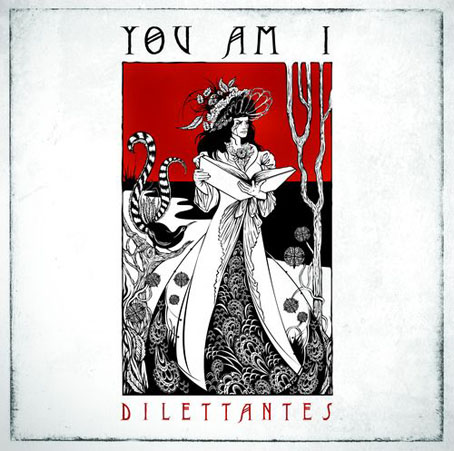
Dilettantes by You Am I (2008). Illustration and design by Ken Taylor.

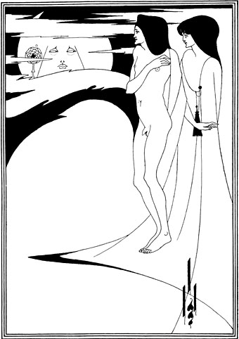
Dilettantes is the eighth studio album from Australian band You Am I which is released this week sporting a very creditable Beardsley pastiche by illustrator Ken Taylor. Sleevage has more details about the creation of the CD package, including preliminary sketches. Those familiar with Beardsley’s work may see in the cover drawing references to The Peacock Skirt and the colour print of Isolde. I like the way Beardsley’s peacock has been exchanged for a more suitably antipodean lyrebird. This isn’t Beardsley’s only influence in the musical world, of course. A few more examples follow.

beardsley1.jpg

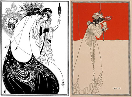
left: The Peacock Skirt from Salomé (1894); right: Isolde (1895).

revolver.jpg

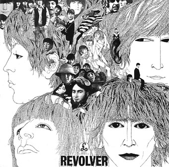
Revolver cover by Klaus Voorman (1966).

The over-familiarity of Klaus Voorman‘s collage/drawing for the cover of Revolver by The Beatles tends to obscure its Beardsley influence but that influence is certainly present in the stylised faces, the figure details and the rendering of the hair. The Beatles themselves were enthused enough with Aubrey to put his face among the pantheon of “people that we like” on the sleeve of Sgt. Pepper a year later. I’d thought for a while that Voorman might have been inspired by the landmark Beardsley exhibition which ran at the V&A in London from May–September 1966. Some correspondence with Raymond Newman, author of Abracadabra, a book about the album, disabused me of that when Raymond confirmed that Voorman in 1966 had already been a Beardsley enthusiast for a number of years.

As well as being possibly the first Beardsleyesque album cover, I wonder whether this was also the first major album release to drop the name of the artist from the front of the sleeve.

see_for_miles.jpg

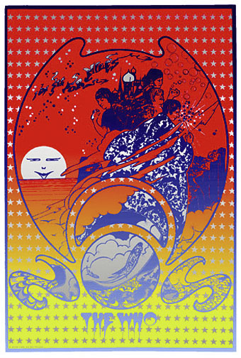
Everyone went psychedelic in 1967, even tough mods like The Who. This Hapshash and the Coloured Coat promo poster for I Can See For Miles (incidentally my favourite Who song) is one of Hapshash’s more overt Beardsley borrowings. The sun (or moon) in the background is a variation on Beardsley’s The Woman in the Moon from Salomé (the face is Oscar Wilde’s) while Pete Townshend’s florid sorcerer’s cloak owes much to Aubrey’s incredible cover design (blocked in gold on the book) for Volpone.

beardsley2.jpg

The Woman in the Moon (1894).
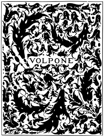
volpone.jpg

Volpone (1897).

revolution.jpg

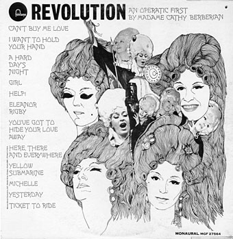
From the sublime to the ridiculous. Cathy Berberian was the mezzo-soprano wife of avant garde composer Luciano Berio, with a long career as a singer of serious classical and contemporary classical works. Her rendition of Berio’s Thema (Omaggio a Joyce)–an electroacoustic setting of the “Sirens” prelude from Ulysses–was one of the tracks on the 1967 electroacoustic compilation Electronic Music III discussed here in April. She also had a separate career as an operatic interpreter of pop music and this collection of Beatles songs dates either from 1968 or 69, depending on which source you choose to believe. Whatever the year, the designer pulled off a decent enough copy of the Revolver sleeve. For a taste of the Berberian style, there’s a sample here. And if you’re desperate for the entire album, this page has a copy.

I’m sure this doesn’t exhaust the Beardsley influence in sleeve design, there must be others between 1968 and 2008. Once again, if you know of any further examples, please leave a comment.

humble_pie.jpg

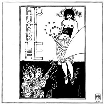
Humble Pie by Humble Pie (1970).

Update: Added Humble Pie’s self-titled third album. The illustration this time is Beardsley’s own, The Stomach Dance from Salomé.

szabo.jpg

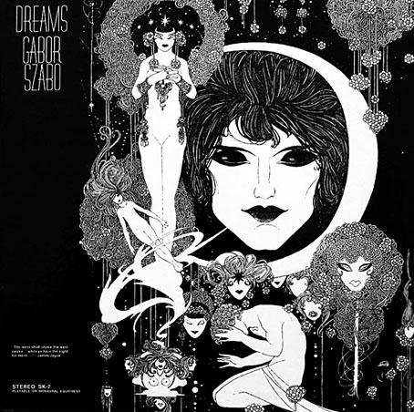
Dreams by Gabor Szabo (1968). Design by David Stahlberg.

Update 2: Therese discovered this great sleeve for an album by the Hungarian jazz guitarist. Closer in style to John Austen’s illustrations for Hamlet 1922) but Austen’s use of black-and-white at the time was very influenced by Beardsley’s work.

witchcraft.jpg

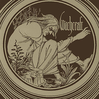
Witchcraft by Witchcraft (2004).

Update 3: Another addition, the debut album from Swedish metal band Witchcraft which uses Beardsley’s Merlin vignette from the Morte Darthur. Thanks to Cyphane for the tip.

coach_fingers.jpg

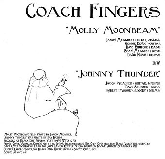
Molly Moonbeam by Coach Fingers (2007).

17th_pygmy.jpg

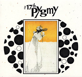
Ballade Of Tristram’s Last Harping by The 17th Pygmy (aka 17 Pygmies) (2007).

Update 4: Added a couple of new discoveries. The 17th Pygmy album apparently includes further Beardsley pieces in its booklet while the Coach Fingers single also has a label featuring designs by Beardsley’s contemporary, Sidney Sime.

isoud.jpg

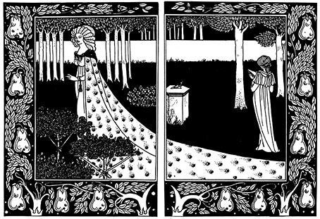
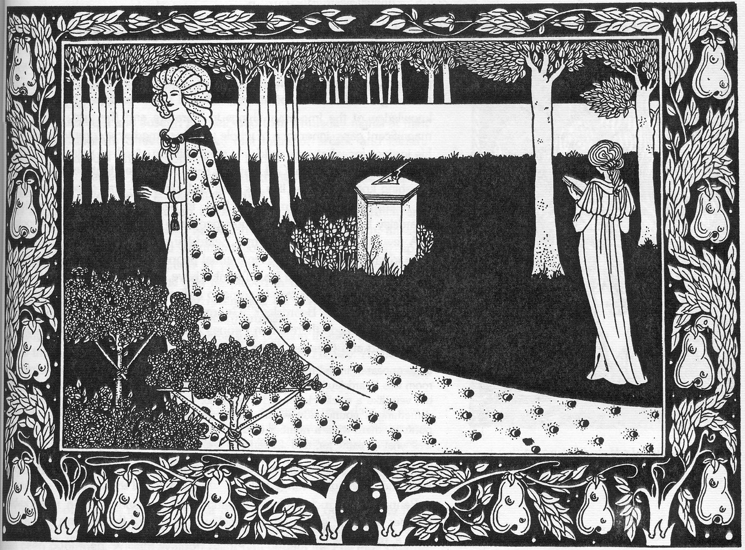
La Beale Isoud at Joyous Gard. (1894).

flowers.jpg

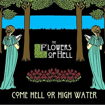
Come Hell Or High Water by The Flowers of Hell (2009).

Update 5: Added the Flowers of Hell cover which is based on La Beale Isoud at Joyous Gard. from Le Morte Darthur. The band also has a video which works variations on the same picture.

procol.jpg

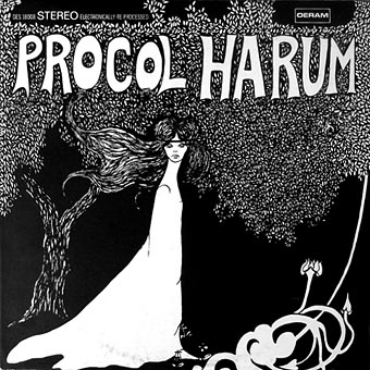
Procol Harum by Procol Harum (1967).

Update 6: Another one I’d missed, Procol Harum’s debut album doesn’t have a credit for the cover art which is perhaps just as well since it doesn’t stand comparison with some of the works above. The same artwork appeared on later reissues when the album was re-titled A Whiter Shade of Pale.

Elsewhere on { feuilleton }
The album covers archive
The Aubrey Beardsley archive
The illustrators archive

The faces of Parsifal

parsifal.jpg

Parsifal by Jean Delville (1890).

Continuing the occasional series of posts examining the evolution of a particular design or image, this one begins with a mystical charcoal drawing by Belgian Symbolist, Jean Delville (1867–1953), our object of concern being that entranced or dreaming face.

lamb.jpgMy first encounter with Delville’s image wasn’t via the original but came with this Seventies’ version produced for a Charles Williams paperback cover by illustrator Jim Lamb. (And this copy is the only one I can find, reused on a recent audiobook of Williams’ novel. If anyone has a link to a larger copy of the paperback cover then please post it in the comments.) Yes, this is tenuous but when I eventually got to see Delville’s picture it made me think immediately of Lamb’s illustration. Many Dimensions is one of my favourite books by Williams and unusually for him it deals with Islamic rather than Christian mysticism; in that case if Lamb was borrowing from Parsifal then it’s a case of the right image for the wrong book.

Jim Lamb is another illustrator from this period who now works mainly as a landscape artist.

Continue reading “The faces of Parsifal”