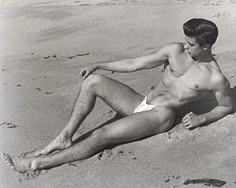
Edgar Hayes (Beach) (1957).
Bruce of Los Angeles is a new exhibition of beefcake photos from the Fifties and Sixties at Wessel + O’Connor, NYC, which opens today and runs until December 20, 2008. Bruce’s name is a very familiar one to aficionados of physique photography and I imagine some of these prints will be pretty familiar too. There’s a couple of guys with swords among the selection but as a break from that particular obsession I picked out cutie Edgar Hayes instead.
Born Bruce Bellas in 1909, he was a chemistry professor from Nebraska who would wind up in Los Angeles as the top “Beefcake” photographer of the 1950’s.
He started out there in the 1940’s, shooting bodybuilding contests and met many of his models while working for Joe Weider’s muscle magazine empire, which chronicled the physical culture movement sweeping across America following WWII. Bellas photographed some of the most important figures of this era; bodybuilders Steve Reeves, Ed Fury, and George Eiferman, as well as models such as Joe Dallesandro, Mark Nixon, and Brian Idol.
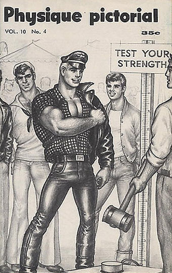
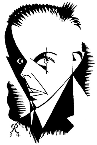
Physique Pictorial cover by Tom of Finland (1961).
Meanwhile, and a bit closer to home for me, the Contemporary Urban Centre in Liverpool has been running an exhibition of drawings by Tom of Finland, another very familiar name in the world of gay art and erotica. Twenty-five works are on display there until November 30th.
• From Finland with lust | Mark Simpson looks at the artist’s legacy
Elsewhere on { feuilleton }
• The gay artists archive
Previously on { feuilleton }
• Philip Core and George Quaintance