Johann Theodor de Bry’s Neiw Kunstliches Alphabet

debry.jpg

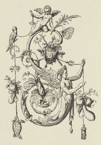
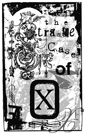
A page from Johann Theodor de Bry’s Neiw Kunstliches Alphabet (1595) which can be found in a free PDF version here, the scans being taken from a Victorian reprint. The late, lamented Giornale Nuovo featured some of these curious letter designs in 2005. Each capital is embellished with various symbolic figures—Moses appears perched on the letter M, for example—whilst also being draped with fruit, lobsters and even insects. I used a smaller redrawing of De Bry’s letter S for one of the page designs in Jeff VanderMeer’s City of Saints and Madmen in 2002. Probably not the use that De Bry intended but then I expect he’d be surprised that his work was still being used at all after four hundred years. Via BibliOdyssey.

strange.jpg

Previously on { feuilleton }
The Book of Ornamental Alphabets
Paul Franck’s calligraphy
Gramato-graphices
John Bickham’s Fables and other short poems
Letters and Lettering
Studies in Pen Art
Flourishes

Weekend links: Ghosts, Spooks and Spectres edition

spectres.jpg

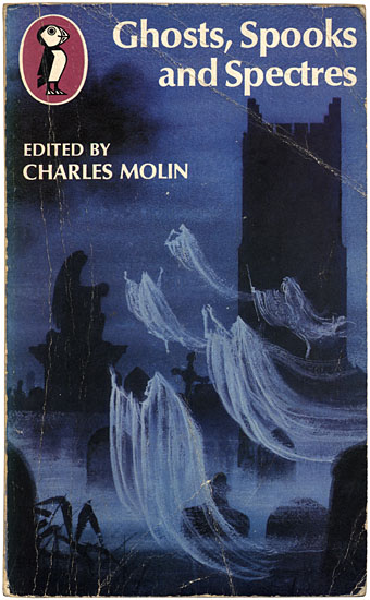
Cover design by Philip Gough.

Ghosts, Spooks and Spectres (1972 reprint). Editor Charles Molin collected nineteen ghost stories by writers including Oscar Wilde (The Canterville Ghost), Charles Dickens (The Signal-Man), J. Sheridan Le Fanu (Madame Crowl’s Ghost) and HG Wells (The Inexperienced Ghost). This was one of my favourite books when I was ten-years old. There’s nuffin like a Puffin. Puffin Books’ parent company, Penguin, is 75 this year.

• The good people at the Outer Alliance have posted an interview with me here in which I talk about the subversive sexualities of sf in the 1970s and also admit to writing fiction.

• There’s just time to mention It Came From Pebble Mill, an event which includes another screening of David Rudkin’s Penda’s Fen.

• “In our society, there has tended to be a very strong compartmentalization of different experiences, different cultural forms, different genres. We can talk in a very broad sense and say art is separate from science, for example, or body is separate from mind, or we can talk in a specific sense and say one certain form of dance music is separate from one form of, say, heavy metal. I don’t really buy those compartmentalizations. I understand why they exist, how they’ve come into being and why they’re convenient, but it’s not the way I think, it’s not the way I experience the world, it’s not the way I believe things should be.” From an interview by Colin Marshall with David Toop at 3QD. Toop’s latest book is Sinister Resonance: The Mediumship of the Listener.

The Kingdom of the Pearl by Léonard Rosenthal, illustrated by Edmund Dulac.

Ghost Stations by Dollboy, a CD package. And then there’s the Ghostly Bento.

7 Inch Cinema are Birmingham-based cultural historians.

• Mark Pilkington’s Mirage Men now has its own site.

Borges on Pleasure Island: JLB and his love of RLS.

• RIP Arne Nordheim, Norwegian composer.

• Charlie Visnic’s Modular Ghost Synth.

On the trail of Tutankhamen’s penis.

Photos by Thom Ayres.

Ghosts by Japan | Spooky Rhodes by Laika | Purple Dusk by Spectre.

Crush Depth by Chrome Hoof

chrome_hoof1.jpg

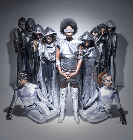
Chrome Hoof photographed by Steve Bliss.

How to describe London’s Chrome Hoof? A difficult proposition but that hasn’t stopped people trying. The BBC labels them a “10+ piece glam clad death disco outfit” which isn’t a bad start. Their record label offers more detail:

Cathedral bassist Leo Smee started a bass and drums duo under the moniker Chrome Hoof with his brother Milo at the turn of the millennium to celebrate their shared love of mid-seventies funk and disco. Like sequined pied pipers, they recruited everywhere they played, building an army of multi-instrumentalists, including a full horn and string section, generating a devoted cult following with their legendary live shows. A veritable orchestra of musicians perform, decked out in futuristic monks’ robes, kicking it like some unholy hybrid of Sun Ra, ESG, Goblin, Parliament-Funkadelic and Black Sabbath, complete with choreographed dancers, actors taking vaudeville interludes, and a twelve-foot tall metallic ram dominating the dancefloor.

chrome_hoof2.jpg

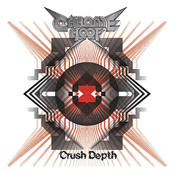
Crush Depth (2010). Design by Fergadelic.

Crush Depth is their latest album and the cover graphic here doesn’t convey the mirrored grooviness of the metallic gatefold package. Inside you get thirteen tracks with titles such as Witch’s Instruments and Furnaces and Anorexic Cyclops. Musically it’s like a collision between Magma, Igor Wakhévitch, Acid Mothers Temple and, I dunno…X-Ray Spex? The Androids of Mu? With disco rhythms…and riffs…and Mellotrons…and squalling synths…and harps…and violins…and Cluster! (Yes, Moebius & Roedelius Cluster). The Cluster-embellished track, Deadly Pressure, even manages to make a reference to “Old Ones” waking from their sleep in the depths of the sea, so I suppose we can throw Cthulhu’s squamous bulk into the mix as well. Chrome Hoof are so far beyond the legions of characterless indie clones they’re not even on the same planet. It makes a real change finding a band with this level of musical imagination and the technical authority to deliver the goods. One of the albums of the year, without a doubt.

Elsewhere on { feuilleton }
The album covers archive

Previously on { feuilleton }
A cluster of Cluster
Chrome: Perfumed Metal
Metabolist: Goatmanauts, Drömm-heads and the Zuehl Axis
The music of Igor Wakhévitch

Surrealism, graphic design and Barney Bubbles

starowieyski.jpg

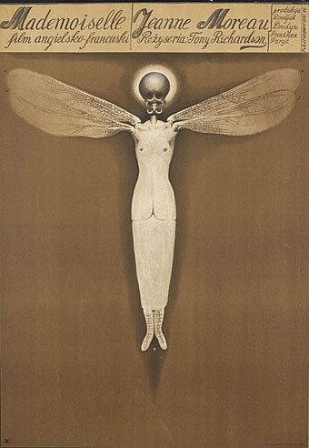
Poster for Mademoiselle (1970) by Franciszek Starowieyski.

Work has cranked into overdrive this week so posting will no doubt be minimal until some semblance of normality is restored. I can however mention two essential exhibitions which will be running through the forthcoming months.

Uncanny: Surrealism and Graphic Design at the Moravian Gallery in Brno, Czech Republic, is curated by design writer Rick Poynor and runs to 24 October, 2010. On display is an intriguing mix of work from familiar names such as Jan Švankmajer and Eva Švankmajerová, poster artist Franciszek Starowieyski, graphic designers Vaughan Oliver and Stefan Sagmeister, and many others.

Uncanny: Surrealism and Graphic Design uncovers the presence of an alternative tradition in graphic design. The Surrealist movement of the 1920s and 1930s focused on literature, painting, photography and the object, and the Surrealists’ publishing activities provided only hints of what a fully conceived Surrealist graphic design or typography might look like. Many of the most suggestive early examples came from Czechoslovakia, where Surrealism would become a lasting influence. Subsequently, Surrealist ideas and images had a profound impact on image-makers in every sphere of art and design, and by the 1960s the effects of Surrealism were widely felt in international graphic communication. Uncanny traces this intermittent line of development up to the present.

There’s further information at the gallery site including a page of related works.

process.jpg

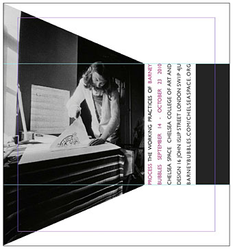
And launching later in the year is Process: The Working Practices of Barney Bubbles, a very timely exhibition of the designer’s work at Chelsea Space, London. Bubbles biographer Paul Gorman is the curator and the event will also see the launch of a second edition of his study of Barney’s life and work, Reasons To Be Cheerful.

The show will contain many never-before-seen items drawn from private collections, including student notebooks, working sketches, original artwork, paintings, books and photography. These were the raw material for videos, record sleeves, t-shirts and posters created by Bubbles for such performers as Ian Dury, Hawkwind, Elvis Costello, The Damned and Billy Bragg (who is contributing a one-off rug with a rendition of the designer’s Masereel-quoting cover for his album Brewing Up With).

Process opens on September 14 and will run to October 23, 2010.

Previously on { feuilleton }
Franciszek Starowieyski, 1930–2009
Jan Svankmajer: The Complete Short Films
Barney Bubbles: artist and designer