Serious houses: The Lud Heat Tapes, 1979

ludheat.jpg
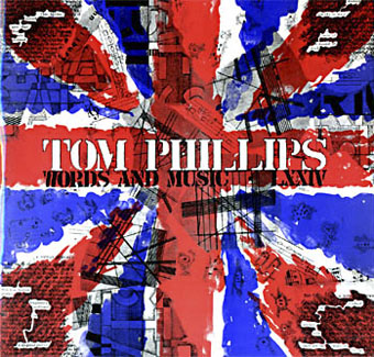
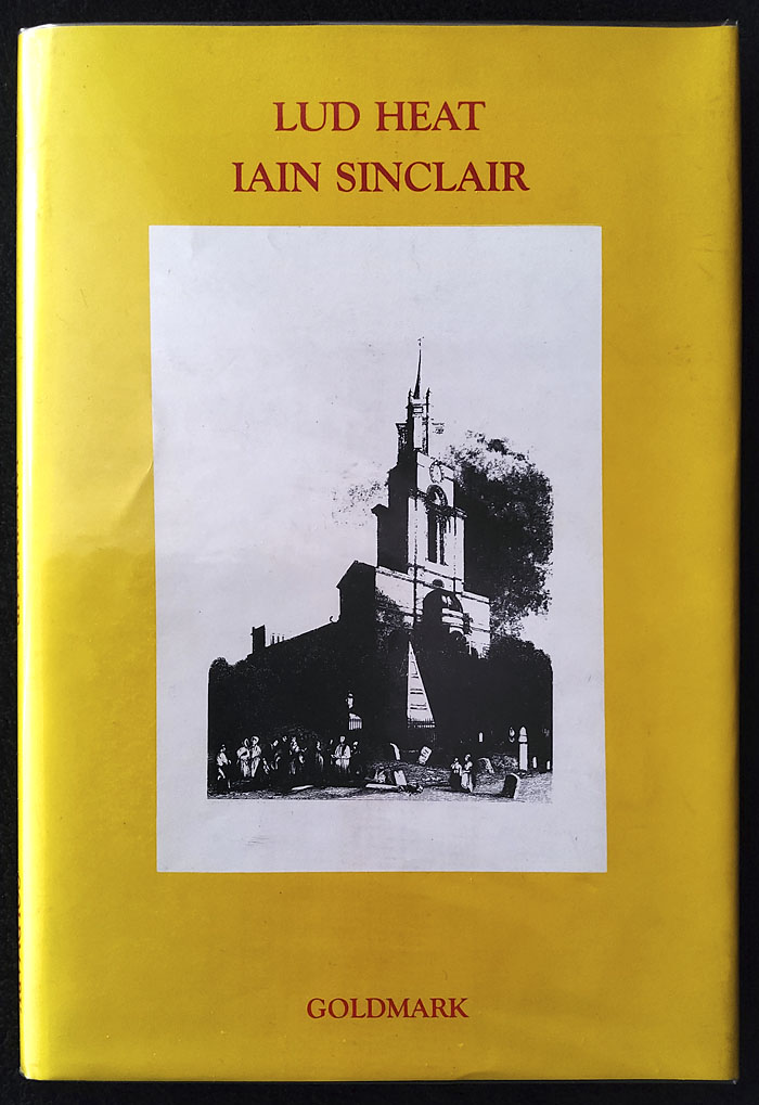
Goldmark hardcover, 1987.

The old maps present a sky-line dominated by church towers; those horizons were differently punctured, so that the subservience of the grounded eye, & the division of the city by nome-wound, was not disguised. Moving now on an eastern arc the churches of Nicholas Hawksmoor soon invade the consciousness, the charting instinct. Eight churches give us the enclosure, the shape of the fear; – built for early century optimism, erected over a fen of undisclosed horrors, white stones laid upon the mud & dust. In this air certain hungers were activated that have yet to be pacified; no turning back, as Yeats claims: “the stones once set up traffic with the enemy.”
—Iain Sinclair, Lud Heat

A serious house on serious earth it is
—Philip Larkin, Church Going

“Serious” is a word with many meanings. The Oxford English Dictionary gives one of these as “attended with danger; giving cause for anxiety”, a definition that wouldn’t suit Philip Larkin’s poem describing a visit to a moribund country church, but which is easily applied to a longer cycle of poems by Iain Sinclair. Lud Heat: A Book of the Dead Hamlets is the collection of writings that lifted Sinclair’s authorial profile out of the poetry ghetto in which he’d been situated throughout the 1970s. He published the first edition through his own Albion Village Press in 1975 but it wasn’t until the arrival of Peter Ackroyd’s Hawksmoor a decade later that wider public attention began to turn in Sinclair’s direction. Lud Heat set out for the first time a series of observations concerning the peculiar and sinister qualities of the churches built by Nicholas Hawksmoor in 18th-century London: Christ Church, Spitalfields; St George’s, Bloomsbury; St Mary Woolnoth; St George in the East; St Anne’s, Limehouse; St Alfege Church, Greenwich; plus those built in collaboration with John James: St Luke Old Street, and St John Horsleydown. The book separates the poetry with prose pieces—diary extracts, accounts of a film viewing and an art exhibition—that anticipate the author’s subsequent explorations of London’s margins and esoterica. Like many of Sinclair’s later writings, the texts in the early editions are accompanied by a variety of illustrations: engravings, contemporary photographs, and a map of London drawn by Brian Catling that posits a network of “lines of influence…invisible rods of force” connecting the churches with each other and with significant locations such as William Blake’s house, Cleopatra’s Needle and so on. Paperback reprints omitted the illustrations* but retained the map which was redrawn by Dave McKean. The new version gave greater emphasis to the Egyptian symbols that Sinclair and Catling had scattered across the city: jackal-headed Anubis as as the presiding deity of the Isle of Dogs.

christchurch.jpg

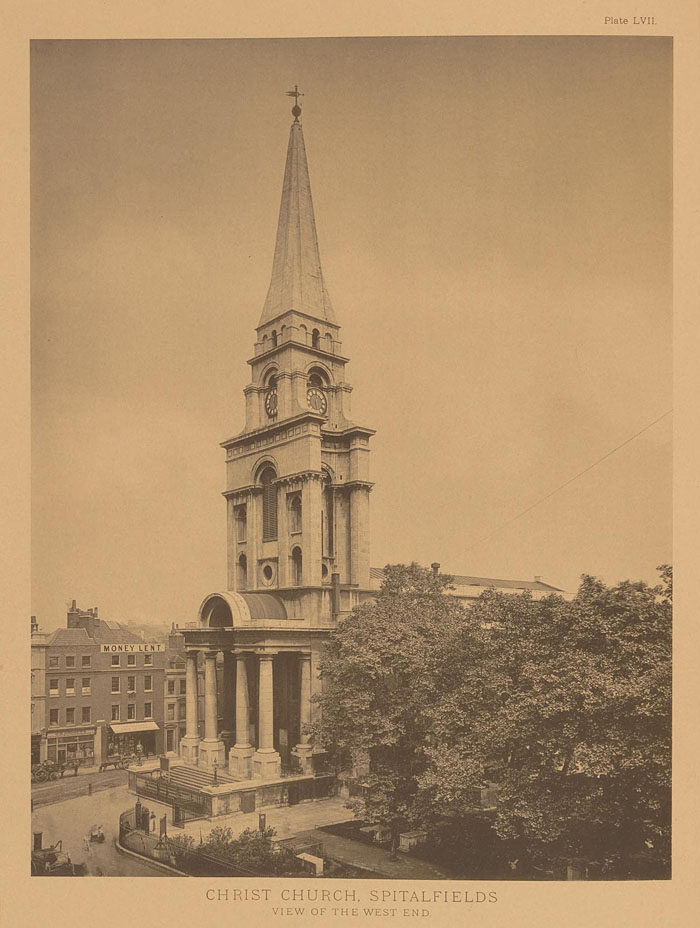
Photo by Charles Latham from London Churches of the XVIIth and XVIIIth Centuries (1896) by George H. Birch.

Lud Heat is a beguiling and potent book; it’s also a book that’s of its time in its suggestion of malefic “rods of force” scored across the capital. Sinclair’s map may be the earliest artistic development of a process begun in 1969 when John Michell published The View Over Atlantis, an elaboration of ideas set forth in his earlier volume, The Flying Saucer Vision. Michell’s free-wheeling speculations gave new life to the innocuous studies of Alfred Watkins, inflating amateur archaeological ruminations into full-blown Aquarian metaphysics. Where Watkins considered that “ley lines” (a term of his own invention) might have been ancient trading routes, Michell’s enthusiasm for the full range of Fortean phenomena transmuted the alleged paths into channels of unspecified “Earth energy”, flying-saucer guides, and the axes of a sacred geometry. Other crank scholars were eager to follow Michell’s lead, leaving an opening for Sinclair to adopt the conceit for its poetic resonances; the New Age trappings were inverted to reveal a darker pattern more suited to London’s history of plague, murder and mass destruction. (The Hawksmoor churches had been built to compensate for the devastations of the Great Fire of 1666; two of them were hit by bombs during the Blitz, with one being damaged beyond repair.)

This isn’t to suggest that Sinclair was borrowing directly from Watkins and Michell; in an interview he mentions an earlier precursor of both his map and Watkins’ ley lines in Prehistoric London: Its Mounds and Circles (1914) by Elizabeth O. Gordon. But something was in the air in the 1970s. Lud Heat appeared shortly before the release of a pair of albums that borrowed heavily from Michell’s books—Green (1978) by Steve Hillage, and Blake’s New Jerusalem (1978) by Tim Blake—while two TV serials exploited the idea of ley lines as channels of Earth energy, Children of the Stones (1977) and Nigel Kneale’s Quatermass (1979). Lud Heat stands apart from these works by concentrating on urban structures rather than isolated monoliths and ancient pathways. The suggestion that the city of London could be home to mysterious “rods of force” is an especially intriguing one, hence the appropriation of the idea by Peter Ackroyd in Hawksmoor and Alan Moore in From Hell. Any church of a sufficient size or age is a kind of time machine, maintaining in its appearance and its grounds a pocket of history separated from the changes that take place around it. The churches in Lud Heat are also batteries of stone, impregnated with the unspent energies of the dead who lie in their crypts. These latent forces overflow their containers, spilling into the streets beyond the church walls. Sinclair has always been adamant that his Lud Heat map is a fabrication; the degree to which he believes in the rest of his thesis is for the reader to decide. It is a fact that St George in the East is close to the location of the Ratcliffe Highway Murders of 1811 (Sinclair includes a illustration of the murderer’s corpse in Lud Heat), while Christ Church, Spitalfields, sits at the centre of maps of the Jack the Ripper murders; the fifth and most brutal of these occurred a short distance from that colossal porch on the opposite side of Commercial Street. “Dead Hamlets” also has many meanings.

Continue reading “Serious houses: The Lud Heat Tapes, 1979”

Harold Budd, 1936–2020

thepearl.jpg

Art and design for The Pearl by Russell Mills.

I must have listened to this album hundreds of times, maybe thousands, there having been days when I’ve allowed it to loop for hours on end. I’ll never tire of it.

There’s a lot I could write about Harold Budd: about his early electronic compositions like The Oak Of The Golden Dreams; about the way that The Pavilion Of Dreams is the slowest jazz album you’ll ever hear; about the Eno/Lanois production on The Pearl which creates music that’s simultaneously earthed and extraterrestrial, the latter quality making it a (dark-eyed) sister to Apollo—Soundtracks & Atmospheres; about the time that Budd became the fourth member of the Cocteau Twins; about the William Burroughs influence in the poems that Budd reads on By The Dawn’s Early Light; about the beautiful soundtrack he composed with Robin Guthrie for Gregg Araki’s Mysterious Skin, a film whose subject matter isn’t beautiful at all… But it’s easier to simply say listen to this.

Previously on { feuilleton }
Made To Measure
Night Music in two parts

Weekend links 358

higuchi.jpg

Painted beetle (2016) by Akihiro Higuchi.

David Horbury: The Tate’s Queer British Art exhibition ignores the pioneering scholarship of Emmanuel Cooper, author of The Sexual Perspective: Homosexuality and Art in the last 100 years in the West (1986).

L’Androgyne Alchemique is an exhibition at the Azzedine Alaïa Gallery, Paris, by pascALEjandro, a collaboration between Pascale Montandon-Jodorowsky and Alejandro Jodorowsky.

• At Strange Flowers: an interview with DJ Sheppard, biographer of poet Theodore Wratislaw (1871–1933), one of the models for Max Beerbohm’s hapless Enoch Soames.

Eloise or, the Realities is a new 122-page comic book by Ibrahim R. Ineke “inspired in part by Children of the Stones and The Owl Service“.

• Cormac McCarthy hasn’t published a novel for over ten years now but this new piece of writing addresses the mysterious origin of language.

• “…she invented a kind of symbolic code that channelled the occult and the Renaissance masters”. Yo Zushi on Leonora Carrington.

John O’Reilly on the Samuel Beckett cover designs created by Russell Mills and Gary Day-Ellison for Picador.

Porter Ricks (Thomas Köner & Andy Mellwig) have announced their first album in 18 years.

• At The Daily Grail: Alan Moore on science, imagination, language and spirits of place.

• All 66 issues of Performance Magazine (1979–1992) are now available online.

• The Throbbing Gristle catalogue is being reissued (again).

Lost Soul In Disillusion (1967) by The Power Of Beckett | Liquid Insects (1993) by Amorphous Androgynous | Biokinetics 2 (1996) by Porter Ricks

El Lissitzky record covers

genx.jpg

Your Generation (1977) by Generation X. Design by Barney Bubbles.

Continuing an occasional series about the work of particular artists or designers being used on record sleeves. El Lissitzky (1890–1941) is an interesting candidate in this area since his pioneering abstractions have greatly influenced subsequent generations of graphic designers. As a result of this you’re just as likely to find his Suprematist style being pastiched on an album cover as find one of his paintings decorating the sleeve. Pastiches are difficult to locate unless you already know they exist—or unless the album credits acknowledge the style they’re imitating—so this list will no doubt be incomplete.

Barney Bubbles’ design for the debut single by Generation X is the earliest example I’m aware of that makes use of the El Lissitzky style. It was also one of Bubbles’ first sleeves for a punk band, and a significant break with his often florid hippy designs.

kraftwerk1.jpg

Die Mensch Maschine (1978) by Kraftwerk. Design by Karl Klefisch, “inspired by El Lissitzky”.

Kraftwerk’s seventh album uses Lissitzkian typography and graphics on its front and back covers. A very popular album with the post-punk crowd that would have been the first introduction for many people to El Lissitzky’s name. Kraftwerk still use that vibrant arrangement of black, red and white in their stage shows.

kraftwerk2.jpg

sakamoto1.jpg

B-2 Unit (1980) by Riuichi Sakamoto. Design by Tsuguya Inoue.

More pastiche, this time borrowing from El Lissitzky’s Suprematist book for children: About Two Squares: In 6 Constructions: A Suprematist Tale (1922). The book’s two characters of a red square and a black square appear on the vinyl labels. This is a great album, incidentally, still my favourite by Sakamoto.

sakamoto2.jpg

Continue reading “El Lissitzky record covers”

Tom Phillips album covers

phillips00.jpg

Words and Music (1975) by Tom Phillips.

Two related posts is coincidence, three is a series. Earlier posts from the past couple of weeks looked at album covers created by designers better known for their work in other areas. Tom Phillips is a British artist, writer and composer who I continue to insist is one of our greatest living artists, a figure of singular intelligence, invention and versatility whose lack of grandstanding has never raised his profile to, say, the Hockney level. Phillips’ involvement with the music world, both as composer/librettist, and his oft-cited position as Brian Eno’s art teacher in the 1960s, have led to the creation of a handful of record and CD covers from the mid-70s on. Before we get onto those I’ll note that Phillips has a piece in the latest edition of Eye magazine where he reviews a book of postcards from the Wiener Werkstätte. I happen to have a review in the same issue looking at a republished Kenneth Anger study.

Words and Music above has a January 1975 release date although the cover clearly states “LXXIV” in Phillips’ customary stencil lettering. The pressing was limited to 500 copies and doesn’t seem to have been reissued since which means that copies for sale command excessive prices. Side A comprises recordings of Phillips’ compositions while on the flip the artist/author reads extracts from A Humument, the treated book/experimental novel which is not only his most celebrated work but a project whose influence permeates all of the Phillips oeuvre, including the sleeve art.

phillips01.jpg

Starless and Bible Black (1974) by King Crimson.

phillips02.jpg

A year before Words and Music, Phillips created the cover art for this King Crimson album, and he’s also credited with the design. The fractured stencil lettering on the gatefold interior resembles similar effects in some of Phillips’ paintings while on the back cover there’s a tiny extract from A Humument bearing the enigmatic phrase “this night wounds time”. I’ve wondered for years how this cover came about: Robert Fripp often selects the art for King Crimson’s covers so was Phillips his choice as artist/designer? Or was it a result of the Fripp and Eno connection? If anyone knows the answer, please leave a comment.

Continue reading “Tom Phillips album covers”