Mister Rock’n’roll, 1969.
David Britton, author, artist and publisher, died on 29th December. I wrote this for the Savoy Books news announcement:
My closest artistic collaborator from 1989 to 1999, and a close friend for longer than this: capricious, determined, fearless, funny, generous and inspirational. No David Britton, no Lord Horror; no Lord Horror, no Reverbstorm. He changed my life.
He’d been increasingly ill for several years so this came as less of a surprise to those of us close to him than to others. Dave and I used to talk at least once a week, and on the last occasion he’d sounded worse than usual. Those talks were episodes in a conversation about art that ran for over 30 years, beginning in the mid-1980s at the counter of the Savoy bookshop in Peter Street, Manchester, continuing in the Savoy offices with co-publisher and collaborator Michael Butterworth, and resuming on the phone; art in all its forms and in any medium, with no attention paid to categories of “high” and “low”.
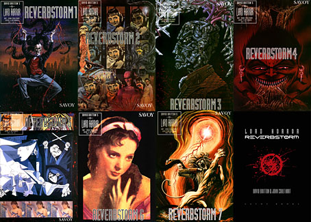
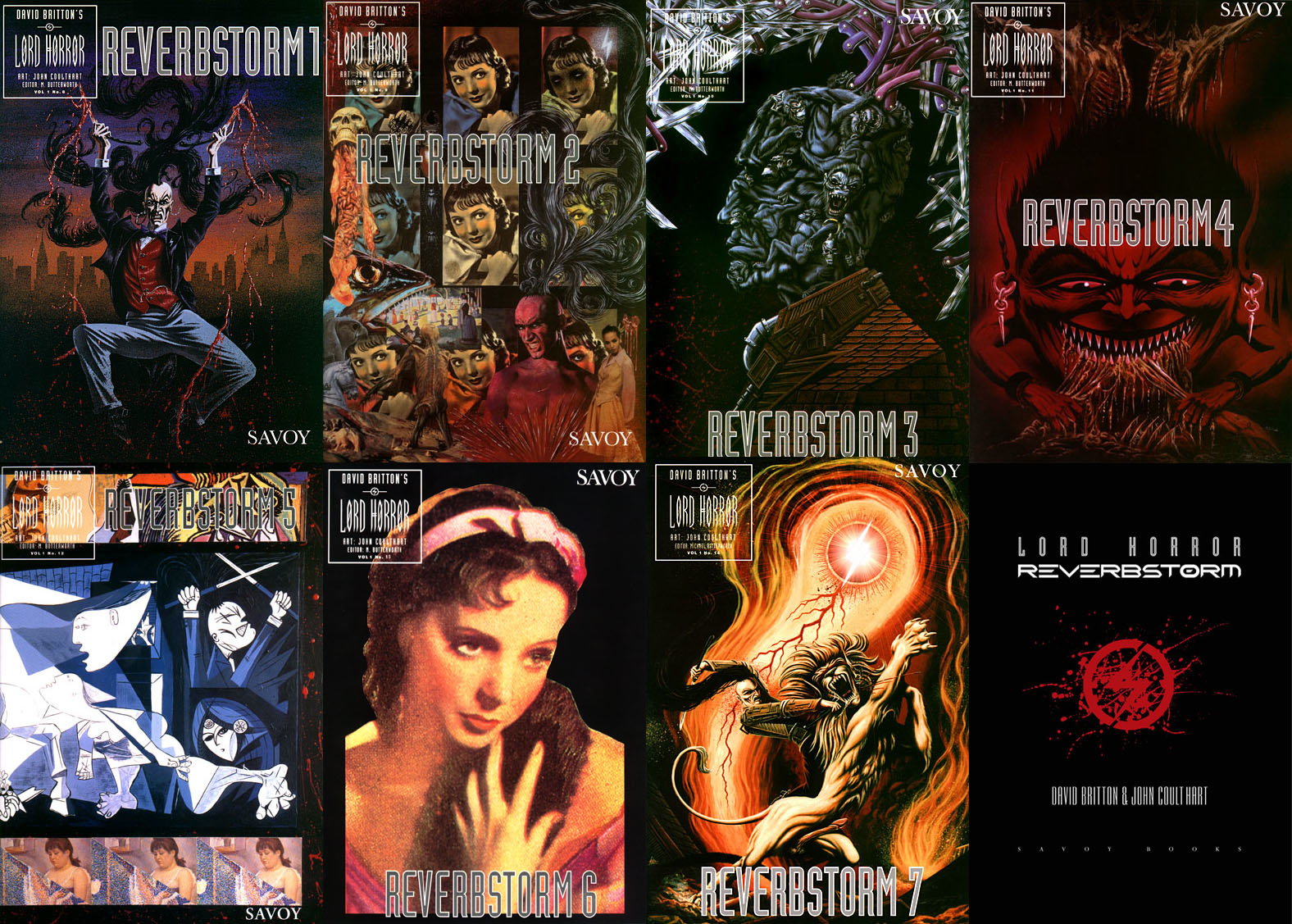
Reverbstorm, the Lord Horror comic series that we created throughout the 1990s, was the product of those conversations, and was also produced mostly through conversation, working by instinct without a script. The series, which was compiled into definitive book form in 2012, is testament to a pooled breadth of interest, encompassing/quoting/appropriating/reworking Pointillist, Cubist and Expressionist painting, Modernist poetry, pop songs, Sondheim musicals, Finnegans Wake, Tom Phillips’ Humument, Burne Hogarth’s Tarzan comics, Joel-Peter Witkin’s photographs, voodoo chants, Piranesi, King Kong, Bauhaus graphic design, Hugh Ferriss architecture, and illustration of all kinds, from fairy tales to cosmic horror via Aubrey Beardsley and Harry Clarke; there’s even ballet in the mix if you look closely. Dave always liked the idea of Lord Horror leaping and pirouetting like a dancer. More than anything, Reverbstorm is rock’n’roll, and this is partly what the title refers to: a thundering rhythm.
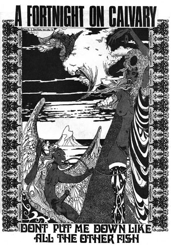
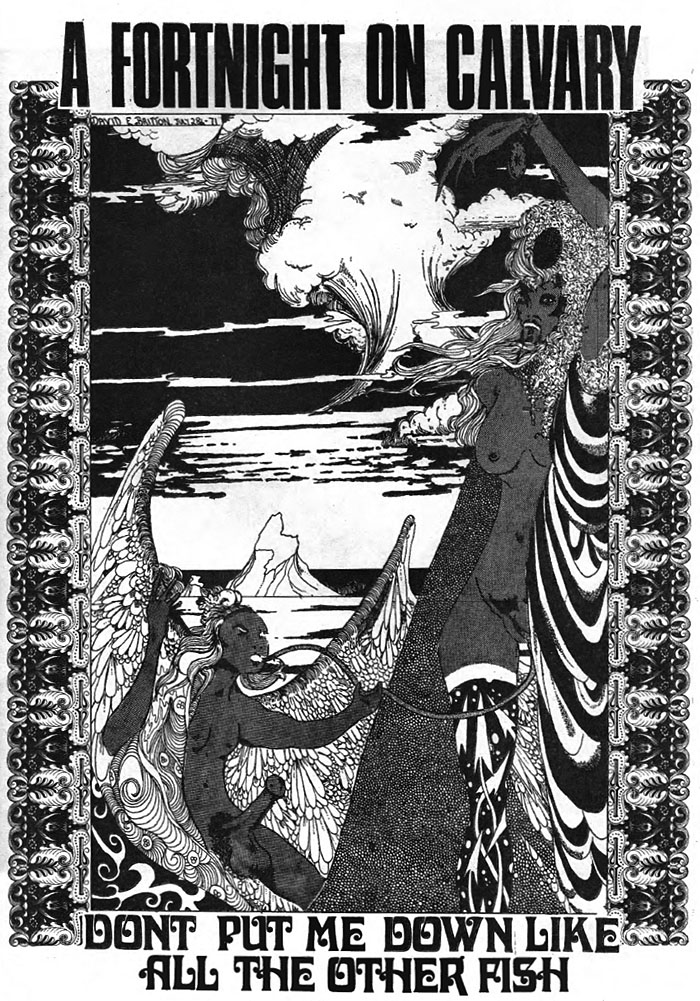
Britton art from Weird Fantasy #2, 1971. This is the drawing that caught the attention of William Burroughs when Britton and Butterworth visited Burroughs in New York City in 1979.
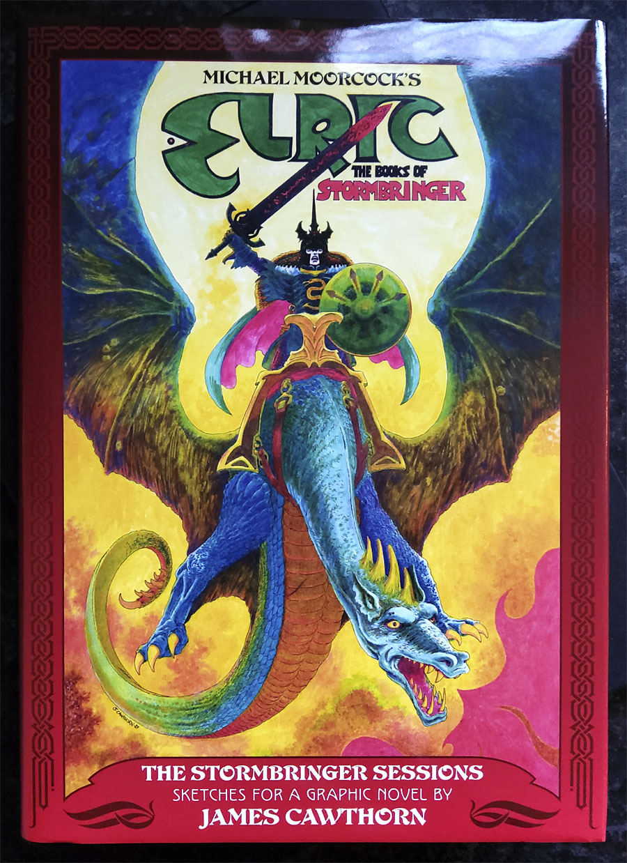
The term “rock’n’roll” always requires qualification when considering the Britton oeuvre, he used it with regularity while remaining bitterly aware that the original charge of the words had been degraded by over-use, reduced to a caricature by too many mediocre music acts and lazy journalists. I chided him a couple of times that his use of the term was functionally meaningless, a synonym for “my favourite things”. But the application was always a serious one, a label for any work that he found sufficiently thrilling, wild, original, excessive, anarchic, flamboyant, boundary-breaking or confrontational. Little Richard, Larry Williams, Howlin’ Wolf and Bo Diddley were Dave’s kind of rock’n’roll, as were Captain Beefheart and His Magic Band, PJ Proby, Iggy Pop, the Sex Pistols, The Cramps, The White Stripes and the Wu-Tang Clan. No surprise there, but Burne Hogarth was also rock’n’roll, although Hogarth would no doubt have disputed this. Another favourite artist, James Cawthorn, was given the label because Dave had discovered Cawthorn’s work when his teenage rock’n’roll obsession was at its height; two forms of art were permanently bound together, with sword & sorcery recast as the literary equivalent of a delinquent musical idiom. Dave’s other artist collaborator, Kris Guidio, was rock’n’roll for having served time as a peerless portraitist of The Cramps. LaVern Baker was rock’n’roll, as was CL Moore. Aubrey Beardsley was rock’n’roll and Harry Clarke was rock’n’roll; William Burroughs and William Hope Hodgson were rock’n’roll, so were Michael Moorcock and Harlan Ellison. Francis Bacon and Paula Rego were rock’n’roll; Alan Clarke was rock’n’roll and so was David Lynch. The quest for more of this rare commodity was relentless and unceasing. Many of our conversations were little more than enthusiastic discussions of shared favourites, or recommendations to watch/read/listen to something new.
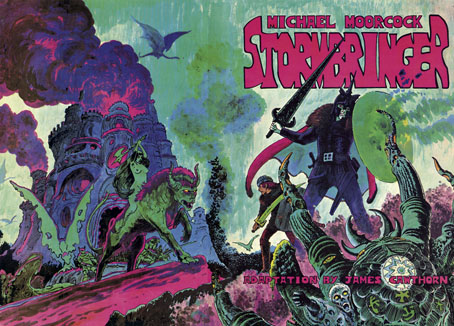
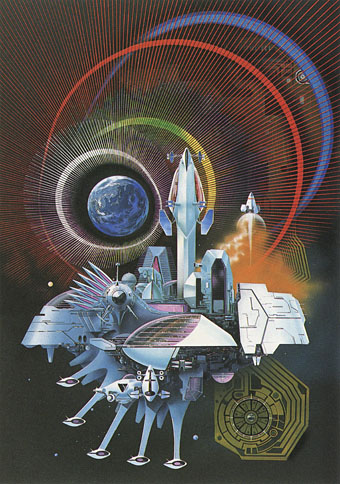
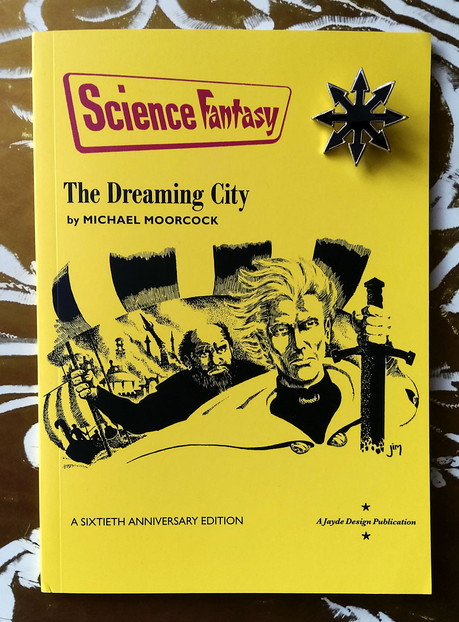
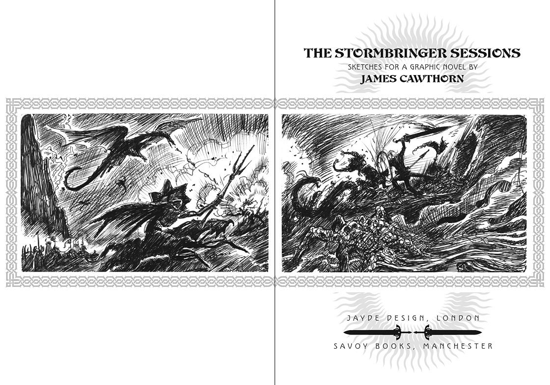
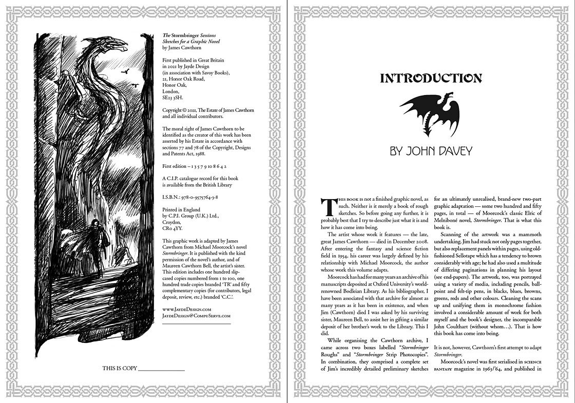
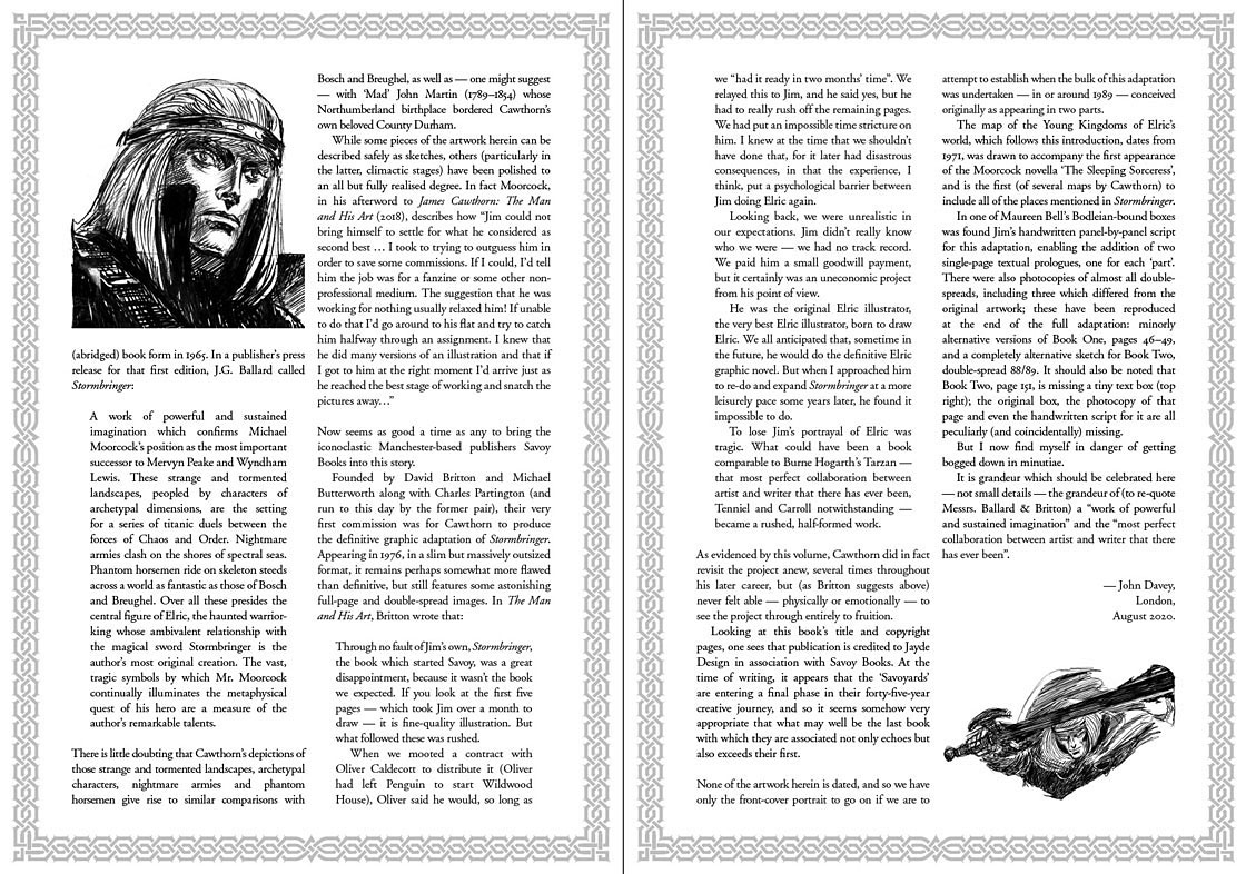
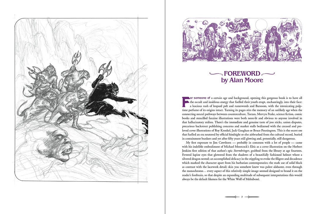
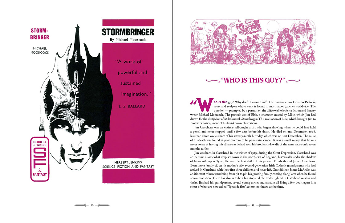
The first Savoy publication from 1976—Cawthorn adapting Moorcock’s apocalyptic Elric novel—was a declaration of intent: maximum rock’n’roll.
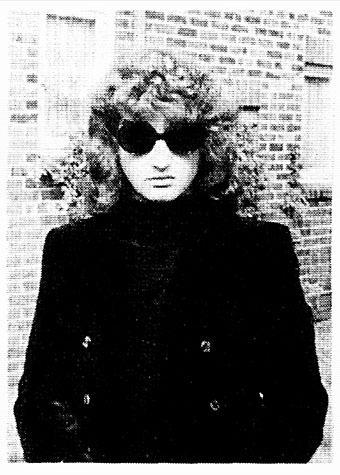
The photo at the head of this post is one that Dave had reused in recent years, one of the few portraits he seemed to like. It first appeared inside his debut publication, Weird Fantasy #1, a genre fanzine that was also enough of an underground publication to receive a passing mention in Oz magazine. The picture is emblematic of the Britton character, dressed in a manner at odds with the north Manchester surroundings he grew up in, and where he was still stuck at the time, a world of back-to-back housing and squalid ginnels. Rock’n’roll in all its forms was the great escape from a world of severely limited horizons and circumscribed lives, where all you could look forward to after a few years of poor education was a job in the local mill or factory. People who dismiss the gaudier forms of entertainment as “escapist” are usually middle class and blessed with comforts and opportunities that reinforce their condescensions; people who never had to consider a life so lacking in promise that a song heard on the radio, a vinyl record, a comic book, a paperback found on a market stall, might be the key to a wider world, an affirmation that there was more than the brick walls of your immediate environment, and there could be even more than this. “Escapist” suggests a hiding away but it also means breaking free. In later years Dave maintained a sporadic correspondence with Alan Moore; they never met but were mutually supportive, thanks in part to a shared background as bright boys from working-class backwaters with no encouragement to try and transform their lives through their escapist enthusiasms. Alan maintained an affection for his background, but Dave seldom spoke of his without a shudder, as though he’d evaded a fate worse than death. One thing he retained from north Manchester was an ebulliently vulgar sense of humour. He agreed with Picasso that good taste is the enemy of creativity.
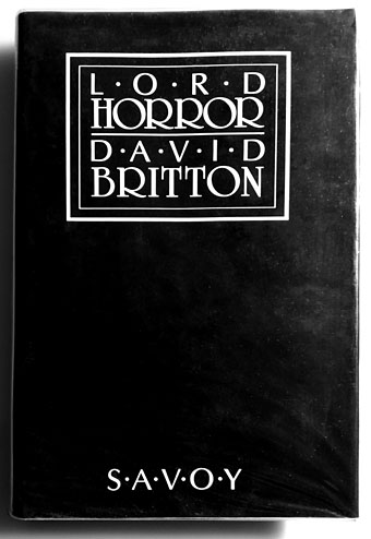
David Britton’s first novel wasn’t one he considered his best but it remains the most notorious thanks to the conscientious literary assessments of the Greater Manchester police.
I’ll miss Dave’s infectious humour, just as I’ll miss the conversations that so often provoked it, the quest for better art, some new kind of kick, more rock’n’roll. I’ll miss being able to show him something I know he’ll enjoy. He always liked quotations so I’ll end this with a lengthy one from Walter Pater, the aesthetic theorist whose ideas energised the Decadents and the founders of The Savoy, the magazine from which Savoy Books took its name. It summarises Dave’s attitude to life even if he’d never discuss things in such a grandiloquent manner:
…we are all condamnes, as Victor Hugo says: we are all under sentence of death but with a sort of indefinite reprieve—les hommes sont tous condamnes a mort avec des sursis indefinis: we have an interval, and then our place knows us no more. Some spend this interval in listlessness, some in high passions, the wisest, at least among “the children of this world,” in art and song. For our one chance lies in expanding that interval, in getting as many pulsations as possible into the given time. Great passions may give us this quickened sense of life, ecstasy and sorrow of love, the various forms of enthusiastic activity, disinterested or otherwise, which come naturally to many of us. Only be sure it is passion—that it does yield you this fruit of a quickened, multiplied consciousness. Of this wisdom, the poetic passion, the desire of beauty, the love of art for art’s sake, has most; for art comes to you professing frankly to give nothing but the highest quality to your moments as they pass, and simply for those moments’ sake.
Previously on { feuilleton }
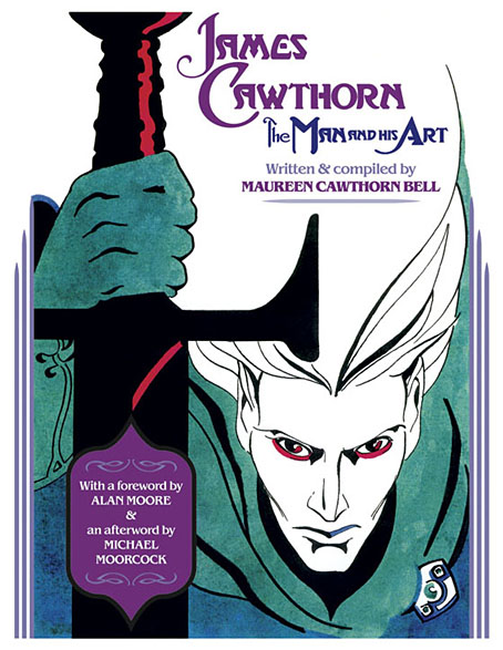
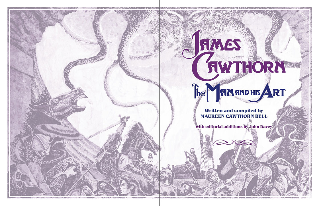
• James Cawthorn: The Man and His Art
• A Reverbstorm jukebox
• Reverbstorm: an introduction and preview