Mapping the Boroughs

boroughs.jpg

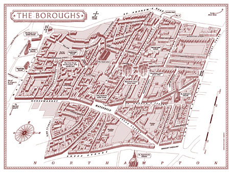
Alan Moore’s magnum opus, Jerusalem, is published today so I can talk at last about my small involvement with this huge novel. The request came through just before Christmas last year: Alan and his publishers, Knockabout Comics, wished to know whether I could create a map for the endpapers of the book. Not a flat street plan, but a bird’s eye view (in isometric or axonometric projection) of the now-demolished area of Northampton known as the Boroughs. The area still exists today under this name but Jerusalem concentrates on the region as it was when Alan was living there as a child: a dense labyrinth of houses, shops and a few small factories dating back to the 19th century, with many older buildings among them. This was the oldest area of the town, having originally grown up around Northampton Castle, a structure that was demolished gradually over the past few hundred years. Some of the street names in the Boroughs recall this history: Castle Street, Fort Street, Moat Street, Castle Terrace, etc.
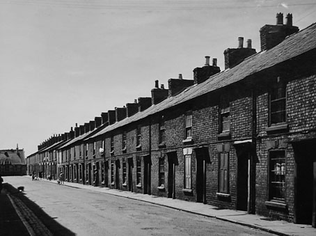
compton.jpg

Compton Street a few years before demolition.

I immediately agreed to the request, of course, while swallowing heavily at what I was sure would be a demanding task. Looking at the crude street plan that Tony from Knockabout sent through, and examining the available maps on local history websites, it was evident that this was going to be a difficult technical challenge. Difficult, but not impossible if I could get hold of accurate maps of the area, which is what I did shortly after the Christmas break.

boroughs1899.jpg

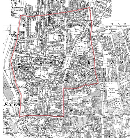
The Boroughs mapped by Ordnance Survey, 1899.

There’s a wonderful publishing company, Alan Godfrey Maps, that specialises in reprinting old Ordnance Survey charts of Britain for use by genealogists and local historians. I’ve had some of their maps of Manchester city centre for years, so I knew they’d be ideal if they covered the relevant area of the town. Fortunately for my purposes, they publish two 1899 25-inch-to-the-mile maps of Northampton town centre which cover the whole of the Boroughs. When the maps arrived I scanned them at high-resolution then stitched them together; the top of the Boroughs extends onto the lower part of the map of northern Northampton. After scanning, it was a case of tracing all the streets and the outline of every single building in the area in order to create a plan that was much more accurate than any of the vague plans available online.

boroughs1899-2.jpg

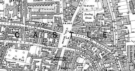
When I began work I had the idea of widening all of the streets in order to have legible street names running along the roads, a common practice among mapmakers who draw city plans. (The map of New York City that Alan and Dave Gibbons used when creating Watchmen is a good example.) However, widening the roads (or diminishing the scale of the buildings) would have risked important landmarks appearing too small, and there were other potential problems looming, so I decided to play safe and keep to the map scale.
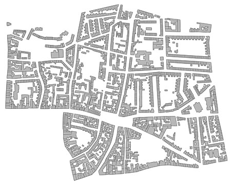
plan.jpg

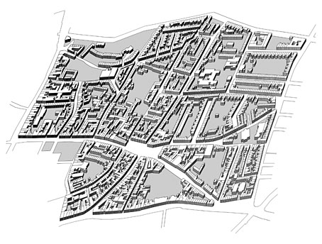
The biggest headache after solving the accuracy of the roads and buildings was what to do about the roofs. It wasn’t too difficult to elevate the ground plan once I had it tilted at a suitable angle: the elevation was achieved by making about 12 copies of the ground plan which are stacked one on top of the other. The first layer was run through the bas relief filter in Photoshop in order to give it some depth and shadow. This had the result of shadowing the building walls so they resembled solid three-dimensional blocks when enough layers were stacked together.

plan2.jpg

So all the streets and buildings are accurate up to a point. One inaccuracy is that all the buildings except for the churches are the same height, something that was unavoidable without invention. And there’s no representation of the slight hills which raise the streets in places. As for the roofs, these are mostly speculation. I’d thought at first that I might be able to save time by copying and pasting a generic roof shape but the streets are too meandering, and the building plans are too varied. The only solution was to put a copy of the roofless map into Illustrator then draw every single part of every single roof by hand: over 4500 vector pieces in all. By examining Google’s satellite pictures of the undemolished fringes of the old Boroughs I was able to guess how the some of the roofs might have worked together. At the beginning of the novel there’s repeated mention of the word “angles” (and its confusion with “angels”) so it now seems fitting that I spent the best part of a week drawing so many angles on the map. It would have been nice to also put chimneys on each house, and doors and windows (and add fences and pavements…), but if I’d started doing that I’d probably be finishing the work about now. Louis Bretez spent two years drawing the Turgot Map of Paris; I had deadlines pressing so had to get mine finished in five weeks.
boroughsdetail.jpg

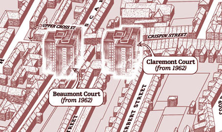
The map is based on the area as it was in 1899 but some of the landmarks are anachronisms. Alan’s story covers the past and present of the area so The Destructor, for example, wasn’t built until the 1920s. This is the building with the smoking chimney, one of several “municipal destructors” (incinerators) built around Britain at the time. The high-rise blocks of Beaumont Court and Claremont Court are even more out-of-time, having been built in 1962. It’s not so obvious from the printed map but these have a slightly ghostly presence since they don’t fit into the streets of the older Boroughs at all. Beaumont Court was built across Scarletwell Street so if you visit the area today you’ll find a block of flats at the end of a street that used to run from the houses where Alan grew up (on St Andrew’s Road) down to the Mayorhold.

A tough assignment, then, but it worked out in the end. It’s been an immense honour being asked to contribute to such a major novel.

Previously on { feuilleton }
Maps of Midtown Manhattan
The Turgot Map of Paris
Art is magic. Magic is art.
Alan Moore: Storyteller
Alan Moore: Tisser l’invisible
Dodgem Logic #4

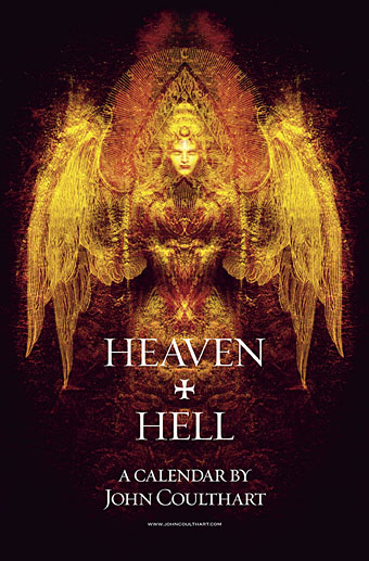
Heaven and Hell calendar

heavenhell00.jpg

Painting from the poster art for The Highbury Working (2000) by Alan Moore & Tim Perkins.

Unlike last year, this year’s CafePress calendar arrives on time, its creation being eased by the fact that it’s a reworking on an earlier version. The idea with the previous Heaven & Hell calendar had been to alternate various pieces of infernal Cradle of Filth artwork with contrasting imagery; as things turned out I had more offerings for Hell than for Heaven—no surprise there—so the reality wasn’t very satisfying.

This year I’ve managed to fill out the Heaven sequence with more recent works, all of which have been slightly adjusted to fit the square page ratio required by CafePress. So even though these are old pieces many of them are unique to this printing. Larger copies of the pages may be seen here while the CafePress purchase page is here. As always, my thanks to everyone who buys these things.

And as before, the calendars for previous years are now available all year round; see the full range here. Note that this means you need to select January as the starting month if you want the months to run for a single year only.

heavenhell01.jpg

JANUARY: Variation of the poster art for Angel Passage (2001) by Alan Moore & Tim Perkins.

Angel Passage was Alan and Tim’s album about the life and work of William Blake. I designed the CD, a poster, and also produced a video for the multi-media performance of the piece at the Purcell Room, London, in February 2001.

heavenhell02.jpg

FEBRUARY: Cover for Bitter Suites To Succubi by Cradle of Filth (2001).

My first piece of Cradle of Filth art. I was a little surprised when working on this that they really did want the wings and horns; Dani loved that kind of imagery. I was even more surprised when this cover was subsequently showcased in an entire window in Tower Records’ main London shop in Piccadilly.

Continue reading “Heaven and Hell calendar”

Weekend links 87

scott.jpg

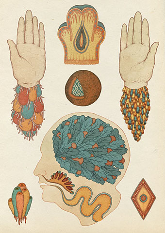
Untitled art by Katie Scott.

“…the very fact that people cannot get published by the big-name publishers in the way that they used to has meant that you’ve got some really interesting and often really beautiful little small publishing houses that are springing up and coming into existence. And the stuff that they’re providing is actually a lot better. I’m thinking of people like Tartarus Press, Strange Attractor and various other commendable small publishers that do a beautiful job and that are producing books that are good to have on your bookshelf.”

Alan Moore discussing books old and new in a lengthy interview at Honest Publishing. In part two he takes to task hardboiled moron Frank Miller and offers his thoughts on the Occupy movement. Elsewhere the Guardian finally paid some attention to the importance of design in the book world. Some of us who do this for a living have been saying for years that if publishers want to see physical books thriving they need to maintain (or improve) the quality of their design and materials. Related: The Truth About Amazon Publishing, Laura Hazard Owen at paidContent examines some the figures behind Amazon’s PR.

• “Tenniel argued for several changes to the characters as conceived by Carroll. The croquet mallets are ostriches in the original drawings, and the hoops are footmen bent over with the tails of their coats hanging down over their bottoms like an animal’s. Tenniel left them out. He told the author that a girl might manage a flamingo, but not an ostrich.” Marina Warner again on John Tenniel, Lewis Carroll and the Alice books.

schoeler.jpg

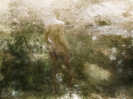
Untitled painting by Christian Schoeler who was interviewed for a second time at East Village Boys.

Shamanism and the City: Psychedelic Spiritual Tourism Comes Home and Scientists finding new uses for hallucinogens and street drugs. Related: LSD – A Documentary Report (1966), “a totally new kind of record album”.

• More books: Interview with a Book Collector. Mark Valentine, author, biographer and editor was also the co-publisher in 1988 of my adaptation of HP Lovecraft’s The Haunter of the Dark.

• The Priapus Chandelier “features six hand-sculpted phalluses cast in translucent resin, which radiate an atmospheric light.”

Stewart Lee on Top Gear, in which the comedian and Dodgem Logic contributor eviscerates the BBC’s pet trolls.

• The Beinecke Rare Book and Manuscript Library put the Voynich Manuscript online.

• The 432-page SteamPunk Magazine collection with my cover art is now on sale.

Hubble, Bubble, Toil & Trouble: The Haxan Cloak Interviewed

• The Sunn O))) chapter of The Electric Drone by Gilles Paté.

Colonel Blimp: The masterpiece Churchill hated

Submergence (2006) by Greg Haines | Reyja (2011) by Ben Frost & Daníel Bjarnason | The Fall (2011) by The Haxan Cloak.

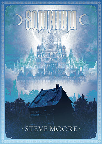
Somnium by Steve Moore

somnium.jpg

Another new piece of illustration and design. Somnium is an occult novel by Steve Moore being published this month by Strange Attractor. Some readers here may know Steve’s work as a comics writer, ex-editor of Fortean Times and also the subject of Alan Moore’s recent Unearthing text and recording. I’ve not seen the book yet but it comes laden with praise from Michael Moorcock and Iain Sinclair, and features an afterword by Alan Moore:

Written in the early years of the 21st century, when the author was engaged in dream-explorations and mystical practices centred on the Greek moon-goddess Selene, Somnium is an intensely personal and highly-embroidered fictional tapestry that weaves together numerous historical and stylistic variations on the enduring myth of Selene and Endymion. Ranging through the 16th to 21st centuries, it combines mediæval, Elizabethan, Gothic and Decadent elements in a fantastic romance of rare imagination.

With its delirious and heartbroken text spiralling out from the classical myth of Endymion and the Greek lunar goddess Selene, Somnium is an extraordinary odyssey through love and loss and lunacy, illuminated by the silvery moonlight of its exquisite language.

The printed version should incorporate metallic silver ink on the title and border, something you can never quite replicate on a web image, hence the gradient on the title lettering. Somnium is available in a range of signed or unsigned editions and can be purchased direct from the Strange Attractor Shoppe.

Previously on { feuilleton }
Dodgem Logic again
Of Moons and Serpents

Seminal art and design

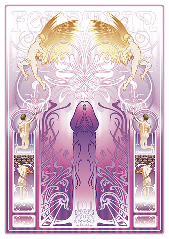
fountain.jpg

Fountain (2011) by John Coulthart.

seminal, a. and n.

A. adj. Of or pertaining to seed; of the nature of seed.

1. a. Of or pertaining to the seed or semen of men and animals (applied Phys. and Anat. to structures adapted to contain or convey semen); of the nature of semen.

Oxford English Dictionary

The Dirty Comics exhibition curated by Jon Macy opens today in San Francisco so here at last is my non-comics contribution to Jon’s erotic art show. This is something I’d had in mind for a while so it was good to have the opportunity to actually tackle the thing, and also have an outlet for it outside this website. Below I explore some of the intent and inspiration which led to the piece.

Creating some sort of gay erotica was an idea I’d had in mind for a while but it suffered from the usual syndrome whereby work with no immediate outlet gets shunted aside by the pressure of paid commissions and ongoing personal projects. It’s also the case that pieces of work I create for myself I tend to want to sell or see reproduced via a service such as CafePress. The trouble is that most of those services are based in the US which means they’re subject to that tiresome puritan attitude towards sexual content: anything other than “artistic” nudity is forbidden at CafePress, and the same applies to many other self-publishing services. There are outlets for gay erotica but I’ve not had chance to explore the best options. If anyone has any tips then please leave a comment.

closeup.jpg

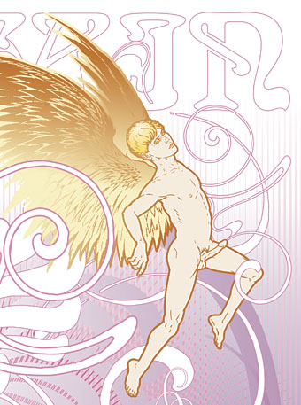
This angel figure was something I’d drawn back to 2008 when I’d made a start on a similar work which fell by the wayside. One of the great things about computer graphics is being able to work on part of something which can then be picked up later and dropped into a new composition.

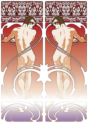
figures.jpg

So the intention was to produce a follow-up to the Dodgem Logic cover I created last year which presented a same-sex take on various Art Nouveau stylisations. The figures above are from one of the early drafts which takes a border design from Alphonse Mucha’s Documents Decoratifs (below), a series of sample borders and frames Mucha produced for the use of artists and designers.

Continue reading “Seminal art and design”