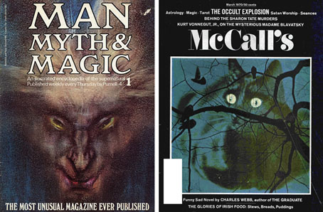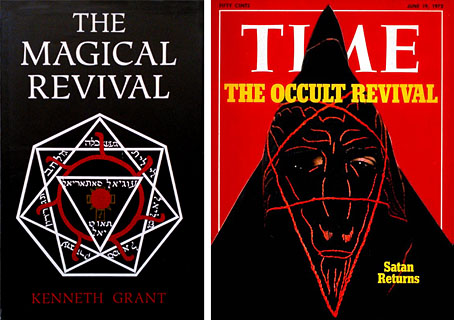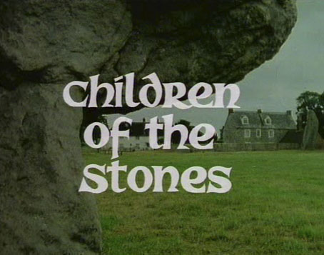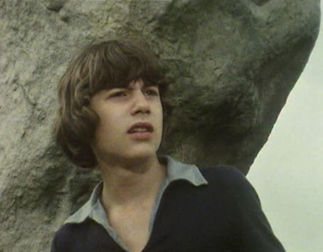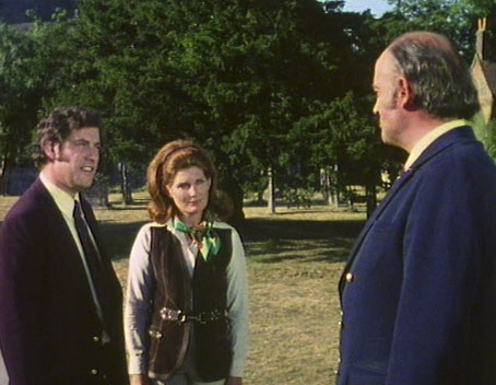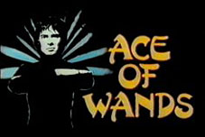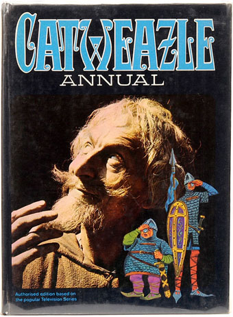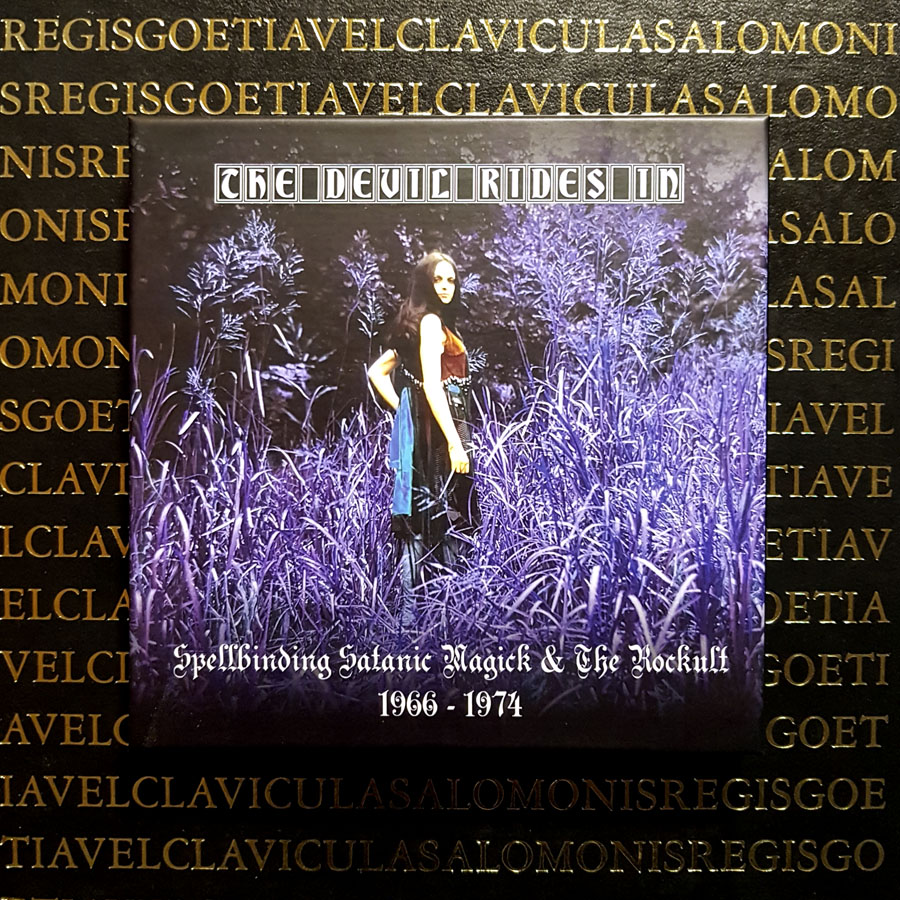
The Devil rode in at the weekend on three shiny compact discs crammed with Satanic psychedelia and the pentagram-branded rock music of the early 1970s: 55 tracks in all. I’d been hoping for some time that an enterprising anthologist might put together an officially-sanctioned collection like the series of mixes compiled by The Ghost of the Weed Garden. Cherry Red Records are ideal candidates for the task, having distinguished themselves in recent years with a series of multi-disc compilations that mine specific periods of British music: psychedelia, heavy rock, folk, punk, reggae, post-punk, experimental electronics, electro-pop, and so on. The Devil Rides In bears a subtitle that ties the collection to the prime years of the Occult Revival, “Spellbinding Satanic Magick & The Rockult 1966–1974”, a period when the Aquarian transcendence of the hippy world was jostling with darker trends in the media landscape. 1967 was the year the Beatles put Aleister Crowley on the cover of the Sgt Pepper album; it was also the year that Hammer were filming their first Dennis Wheatley adaptation, The Devil Rides Out. The song of the same name by Icarus appears on the second disc of this compilation, a single intended to capitalise on the publicity generated by the film. For all the serious occult interest that flourished during by this period many of the cultural associations were frivolous or superficial ones, either cash-ins like the Icarus single or exploitations by those who followed in Dennis Wheatley’s wake. Serious occultists no doubt abhorred the exploitation but it helped create a market for Man, Myth and Magic magazine, and for all the reprints of grimoires and other magical texts that were appearing in paperback for the first time. I’ve always enjoyed the frivolous side of the Occult Revival, probably because I grew up surrounded by it. Without Ace of Wands and Catweazle on the TV I might not have been so interested in my mother’s small collection of occult paperbacks, or gravitated eventually to the Religion and Spirituality shelves of the local library.
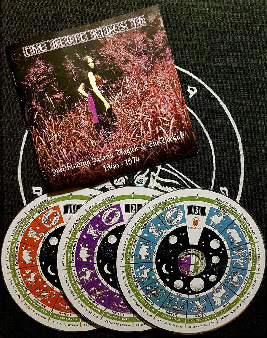
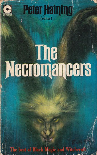
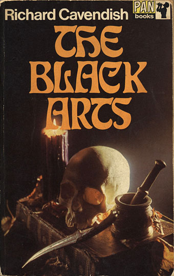
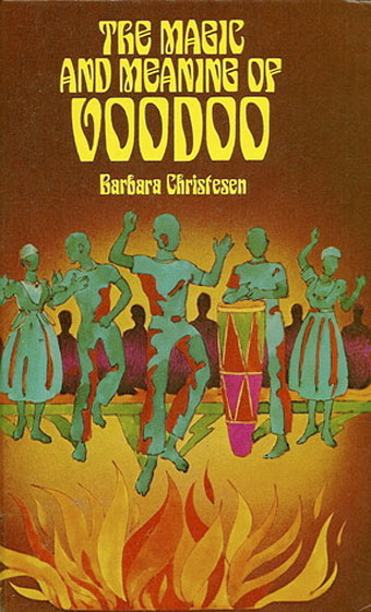
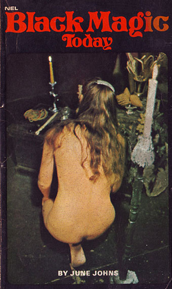
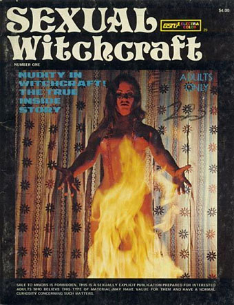
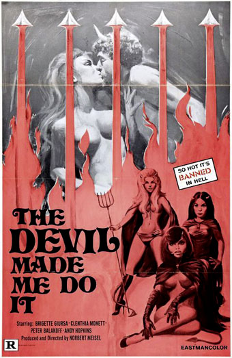
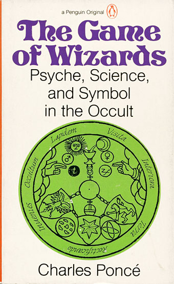
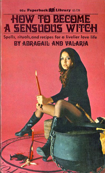
The Devil Rides In was conceived, designed and annotated by Martin Callomon, working here under the “Cally” pseudonym he uses for many of his activities. The accompanying booklet is evidence of a labour of love, the detailed notes being illustrated throughout with Occult Revival ephemera: film posters and magazines (the inevitable Man, Myth & Magic), also plenty of paperback covers which tend towards the lurid and exploitational end of the magical spectrum (the inevitable Dennis Wheatley). Cherry Red always take care with their sleeve notes but Cally’s booklet design has gone to considerable lengths to track down many obscure book covers, some of which I’d not seen before. The same diligence applies to the music, with the proviso that compilations are often restrained by the hazards of licensing law. There’s a track list on the Cherry Red page but this doesn’t tell you that the collection is divided into eight themed sections:
1) Buried Underground
2) Phantom Sabbaths
3) Popular Satanism
4) She Devils
5) Folk Devils
6) Evil Jazz
7) Beelzefunk
8) Let’s All Chant
Many of the selections on the first disc are the kinds of songs I’d usually avoid outside this collection, the lumbering heavy rock that filled the Vertigo catalogue for the first half of the 1970s. But groups that you wouldn’t want to hear at album length become palatable when placed in a context such as this.
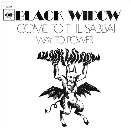
Among the immediate highlights I’d pick Race With The Devil by The Gun, already a favourite of mine by the group that launched Roger Dean’s career as a cover artist; Black Mass by Jason Crest, a psychedelic B-side whose subject matter and high-pitched wailing is a precursor of the heavy-metal future; and the perennially popular Come To The Sabbat by Black Widow. A few of the selections have been chosen more for their name than anything else, something I’m okay with so long as the choices are good ones. Cozy Powell’s Dance With The Devil, for example, is a drum-led instrumental with a musical theme swiped from Jimi Hendrix; it has nothing at all to do with the Devil but it’s still a great piece of music which was also a surprise UK chart hit in 1973. More of a reach is Magic Potion by The Open Mind, a song about psychedelic drugs not witches’ brews. I included this one on one of my psychedelic mixes so I can tolerate its presence here. Less tolerable is Long Black Magic Night by Jacula, an Italian prog band whose contribution features Vittoria Lo Turco as “Fiamma Dallo Spirito” stuck in one channel of the stereo mix where she intones monotonously in very poor English; the cumulative effect is diabolical in the wrong way. And I would have prefered Julie Driscoll’s long, slow version of Season Of The Witch instead of Sandie Shaw squeaking her way through Sympathy For The Devil. But you can’t always get what you want, as Mick Jagger reminds us elsewhere, something which is especially true of compilation albums.