Subterranean Modern: The Residents, Chrome, MX-80 Sound and Tuxedomoon

submod0.jpg

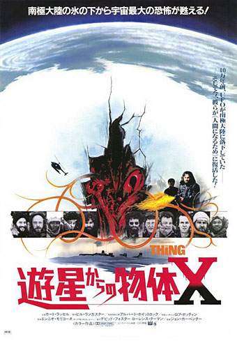
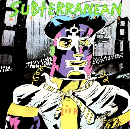
Subterranean Modern (1979). Sleeve art by Gary Panter.

As often happens, one post leads to another and the next thing you know there’s a themed week happening, so here’s something more about Tuxedomoon. Subterranean Modern was a compilation album released by The Residents on their Ralph Records label in 1979. The idea was to showcase The Residents along with three other groups from contemporary San Francisco, all of whom were underground acts, hence the “subterranean” title. (Just to confuse matters, Subterranean was also a San Francisco record label.) Three of those groups—Chrome, Tuxedomoon, The Residents themselves—have since developed cult followings; hard-rock outfit MX-80 Sound seem a little ordinary and out-of-place in this unique company but such is the nature of the compilation album. The Residents wanted each group to provide an interpretation of I Left My Heart In San Francisco but none of the others were very interested; Chrome’s offering, which lasts all of 27 seconds, is hilariously contemptuous of the idea, a squall of riff and vocals that fades in then quickly fades away. Cartoonist Gary Panter illustrated the cover which is also given the Rozz Tox seal of approval. For more about Rozz Tox, whose enigmatic presence can be found on other Ralph Records releases, see this.

I’d already heard Chrome and The Residents when I bought Subterranean Modern but this was first place I encountered Tuxedomoon’s music. Chrome, who appear on the back cover wearing their Clockwork Orange droog outfits, contribute two tracks that are as good as anything on their early records, Anti-Fade and the chugging Meet You In The Subway, for which they made a video filmed on the city’s BART platforms. I listened to those tracks, and the Tuxedomoon ones, much more than the rest of the album. With the exception of the pieces by MX-80 Sound, everything on the album has since been reissued on other compilations (Tuxedomoon’s tracks are on the Pinheads On The Move collection).

The following is a two-page feature from the NME for 17th November, 1979, profiling the album and the people who made the music. I don’t know whether this was Tuxedomoon’s first UK interview but it says it’s the first interview given by Chrome which gives it some vague contemporary relevance. Helios Creed recently re-formed Chrome, and played a show in London earlier this month. There’s also a new Chrome album, although for me Chrome proper requires Damon Edge, and he died in 1995. (Thanks to Gav for saving the pages!)

* * *

submod5.jpg

submod6.jpg

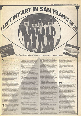
I LEFT MY ART IN SAN FRANCISCO

Checking out the West Coast’s Avant Garde by Michael Goldberg

ralph.jpg
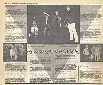
SAN FRANCISCO—The true avant-garde is never accepted, barely tolerated. The public has no use for ideas which challenge society’s preconceptions.

Certainly the outright hatred which was heaped on The New York Dolls and, later, The Ramones and Sex Pistols—all groups who spat on the status quo of their times—attests to the difficulty of pushing a radical concept on the public. And those groups were merely returning to the basic, raw values which great rock and roll has always maintained.

So imagine the difficulty of developing and maintaining a style of music which has little, if any, solid tradition to fall back on. In San Francisco, a city where the Grateful Dead, Jefferson Starship and Steve Miller can sell out the largest of stadiums, an avant-garde underground has been hanging on, etching out the meagrest of niches so that it can continue a dogged pursuit of rock experimentation.

Carrying the torch for “outre” music is San Francisco’s Residents and their parent companies, Ralph Records and the nebulous Cryptic Corporation. For nine long years, the Residents have relentlessly persisted, bowing to no one as they explore a sonic universe of their own devising.

In the wake of The Residents’ relative success—though the group is still practically unknown in their hometown, they have been received by a rather large cult spread out across the U.S. and Europe—other equally unique and esoteric groups have been attracted to San Francisco.

Realising that there is strength in numbers, Ralph Records gathered together three of the most uncompromising bands in San Francisco (and possibly on the West Coast): Chrome (with roots in L.A.), MX-80 Sound (who migrated from Bloomington, Indiana, last year), and Tuxedomoon (whose core members came from Denver, Colorado and Chicago, Illinois), and convinced them to join The Residents (originally from Shreveport, Louisiana) in a joint project. The project is a compilation album, Subterranean Modern (Ralph).

Continue reading “Subterranean Modern: The Residents, Chrome, MX-80 Sound and Tuxedomoon”

Weekend links 174

ikuma.jpg

Dress (2012) by Nao Ikuma.

• Two of my Cthulhu artworks can currently be seen in the Ars Necronomica exhibition at the Cohen Gallery, Brown University, Providence, RI. The exhibition is part of NecronomiCon, and runs to September 13th. In related news, my steampunk illustration has been nominated in the Visual category of this year’s Airship Awards. Winners will be announced at Steamcon V in October.

• “…the story of how a small cabal of British jazz obsessives conducting a besotted affair with the style arcana of Europe and America somehow became an army of scooter-borne rock fans…” Ian Penman looks back at the culture of Mod for the LRB.

• “What is it about the writer in the First World that wants the Third World writer to be nakedly political, a blunt instrument bludgeoning his world’s ills?” Gina Apostol on Borges, Politics, and the Postcolonial.

If someone had designed a work regime perfectly suited to maintaining the power of finance capital, it’s hard to see how they could have done a better job. Real, productive workers are relentlessly squeezed and exploited. The remainder are divided between a terrorised stratum of the, universally reviled, unemployed and a larger stratum who are basically paid to do nothing, in positions designed to make them identify with the perspectives and sensibilities of the ruling class (managers, administrators, etc) – and particularly its financial avatars – but, at the same time, foster a simmering resentment against anyone whose work has clear and undeniable social value. Clearly, the system was never consciously designed. It emerged from almost a century of trial and error. But it is the only explanation for why, despite our technological capacities, we are not all working 3–4 hour days.

On the Phenomenon of Bullshit Jobs by David Graeber

Ron Rosenbaum talks to Al Pacino about all the usual stuff, and reveals some detail about the actor’s obsessive interest in Oscar Wilde’s Salomé.

• More queer history: The Brixton Fairies and the South London Gay Community Centre, Brixton 1974–6.

• At Dangerous Minds: Anthony Burgess and the Top Secret Code in A Clockwork Orange

• Every day for 100 days, Jessica Svendsen redesigned a Josef Müller-Brockmann poster.

LondonTypographica: Mapping the typographic landscape of London.

• Mix of the week: Secret Thirteen Mix 083 by Demdike Stare.

• At Strange Flowers: Alfred Kubin the writer.

Derek Jarman’s sketchbooks.

Rick Poynor on Collage Now.

• Thomas Leer: Private Plane (1978) | Tight As A Drum (1981) | Heartbeat (1985)

The Stone Tape

stonetape1.jpg

The Stone Tape has accrued a considerable cult reputation since it was first broadcast as a BBC ghost story during Christmas, 1972. I was too young to see the original transmission—I used to hear awed reports from those who remembered it—and didn’t get to see it until the BFI brought out on DVD a few years ago. That disc is now deleted, and the play is another unfortunate omission from the BFI’s Ghost Stories box set, so this seems a good opportunity to point the curious to the full-length copy that’s currently on YouTube.

stonetape3.jpg

In the past I’ve compared Nigel Kneale, the writer of The Stone Tape, to HP Lovecraft. This isn’t a comparison the often curmudgeonly Kneale might have agreed with but you can find similarities in the way both Kneale and Lovecraft (in his later fiction) created scenarios featuring scientists or technical people which grade from science fiction to outright horror. The horror can be something ancient and earthbound or, as in the case of Kneale’s Quatermass cycle, it can be extraterrestrial. Kneale’s narratives may return continually to scientific investigation but he was smart enough to avoid explaining away his mysteries. The Stone Tape is an uncanny masterpiece that often seems so bare-bones you can hardly believe the effect it’s creating compared to lavishly-budgeted yet inferior feature films. Something about Kneale’s drama works it way insidiously under the skin then lodges there. It leaves with its mysteries intact.

stonetape2.jpg

One reason Kneale’s Christmas play may have been left out of the BFI box is that it doesn’t fit the MR James model of accumulation-of-clues leading to revelation-of-spook. In Kneale’s story an industrial research and development team move into an old mansion building which turns out to be haunted. The manifestation of the ghost—usually the end point of most supernatural stories—quickly becomes an almost commonplace occurrence when the team decide to start probing its presence with their machines. Like most TV plays of the period this is done in the electronic studio but any absence of film atmosphere is compensated for by excellent writing and performances. Jane Asher plays a computer programmer and the only female professional in a group of loud and blustering men. She’s not only the person most sensitive to the spectral happenings but also proves to be the only one with the brains and tenacity to fathom the true nature of the haunting.

The conviction in the performances, Asher’s especially, and the quality and detail of Kneale’s characterisation, is what makes this production work so well. Among the other actors Michael Bryant is the stubborn team leader while Iain Cuthbertson plays the mediating foreman. Cuthbertson later had a major role in the cult TV serial Children of the Stones, and in 1979 was a memorable Karswell in an adaptation of MR James’ Casting the Runes. Also among the cast is Michael Bates who most people will know as the bellowing prison guard in A Clockwork Orange. The sound effects are by the Radiophonic Workshop’s Desmond Briscoe who also created electronic effects for The Haunting, Phase IV and The Man Who Fell to Earth. Director Peter Sasdy worked on a couple of the lesser Dracula films for Hammer but this is his finest hour-and-a-half. And if that isn’t enough priming for you I don’t know what else would suffice. I urge anyone who hasn’t seen this drama to turn off the lights and start the tape. It’s perfect Halloween viewing that grips to the very end.

Previously on { feuilleton }
Haunted: The Ferryman
Schalcken the Painter

Weekend links 131

thingposter.jpg

Japanese poster (1982).

At The Quietus Steve Earles looks back at John Carpenter’s visceral and uncompromising The Thing which exploded messily onto cinema screens thirty years ago. It’s always worth being reminded that this film (and Blade Runner in the same year) was considered a flop at the time following bad reviews and a poor showing at the summer box office. One reason was The Thing‘s being overshadowed by the year’s other film of human/alien encounters, something called E.T. the Extra-Terrestrial. To The Thing‘s status as the anti-E.T. you can add its reversal of the can-do heroics of Howard Hawks’ The Thing from Another World (1951), an attitude out-of-step with Reaganite America. Carpenter’s film is not only truer to the original story but from the perspective of 2012 looks like one of the last films of the long 1970s, with Hawks’ anti-Communist subtext replaced by bickering, mistrust, paranoia and an unresolved and completely pessimistic ending that most directors would have a problem getting past a studio today.

I was fortunate to see The Thing in October of 1982 knowing little about it beyond its being a John Carpenter film (whose work I’d greatly enjoyed up to that point) and a remake of the Hawks film (which I also enjoyed a great deal). One benefit of the film’s poor box office was a lack of the kind of preview overkill which made E.T. impossible to avoid, and which a couple of years earlier did much to dilute the surprise of Ridley Scott’s Alien. I went into The Thing mildly interested and came out overwhelmed and aghast. For years afterwards I was insisting that this was the closest you’d get on-screen to Lovecraft’s At the Mountains of Madness. The correspondence is more than merely Antarctica + monsters when you consider this:

Lovecraft’s story was rejected by his regular publisher Weird Tales but was accepted by Astounding Stories in 1936 >> The editor of Astounding, John W. Campbell, published his own Antarctica + monsters story (under the pen-name Don A. Stuart), “Who Goes There?”, in the same magazine two years later >> Charles Lederer wrote a loose screen adaptation of Campbell’s story which Howard Hawks and Christian Nyby filmed as The Thing from Another World.

This isn’t to say that Campbell copied Lovecraft—both stories are very different—but I’d be surprised if Lovecraft’s using Antarctica as the setting for a piece of horror-themed science fiction didn’t give Campbell the idea.

More things elsewhere: Anne Billson, author of the BFI Modern Classics study of The Thing, on the framing of Carpenter’s shots, and her piece from 2009 about the film | Mike Ploog’s storyboards | Ennio Morricone’s soundtrack music, of which only a small percentage was used in the film.

• The week in music: 22 minutes of unreleased soundtrack by Coil for Sara Dale’s Sensual Massage | Analog Ultra-Violence: Wendy Carlos and the soundtrack for A Clockwork Orange | A Halloween mixtape by The Outer Church | Herbie Hancock & The Headhunters, live in Bremen, 1974: a 66-minute set, great sound, video and performances | Giorgio Moroder’s new SoundCloud page which features rare mixes and alternate versions | A video for Collapse by Emptyset.

One of the main themes of the book, and what I found in The Arabian Nights, was this emphasis on the power of commodities. Many of the enchanted things in the book are lamps, carpets, sofas, gems, brass rings. It is a rather different landscape than the fairy tale landscape of the West. Though we have interiors and palaces, we don’t have bustling cities, and there isn’t the emphasis on the artisan making things. The ambiance from which they were written was an entirely different one. The Arabian Nights comes out of a huge world of markets and trade. Cairo, Basra, Damascus: trades and skills.

Nina Moog talks to Marina Warner

John Palatinus, “one of the last living male physique photographers of the 1950s”, is interviewed. Related: the website of Ronald Wright, British illustrator for the physique magazines.

• “A classic is a work which persists as a background noise even when a present that is totally incompatible with it holds sway.” Italo Calvino’s 14 Definitions of What Makes a Classic.

Huge Franz Kafka archive to be made public. Related: Judith Butler asks “Who owns Kafka?”

• Geoff Manaugh’s Allen Ginsberg Photos & Ephemera, 1994–Dec 1996.

Magic mushrooms and cancer: My magical mystery cure?

Clark Ashton Smith Portfolio (1976) by Curt Pardee.

Jan Toorop’s 1924 calendar.

artQueer: a Tumblr.

• All The Things You Are (1957) by Duke Ellington | Things That Go Boom In The Night (1981) by Bush Tetras | Things Happen (1991) by Coil | Dead People’s Things (2004) by Deathprod.

Design as virus 15: David Pelham’s Clockwork Orange

clockworkbook.jpg

Design by David Pelham (1972).

Continuing an occasional series. Pity the poor designer who has to create a new cover for Anthony Burgess’s novel when David Pelham’s Penguin cover—created in haste forty years ago—is more visible than ever. Pelham’s design is a familiar sight on these pages but it’s also an increasingly familiar sight elsewhere, having become the primary visual signifier not only of the novel itself but also the novel’s entanglement with Stanley Kubrick’s film. Burgess came to resent the cult power of the film and the way it inflated the status of one of his early novels whilst overshadowing the rest of his work. The book still overshadows his other novels but what’s interesting now, fifty years after it was published, and forty years on from Pelham’s cover design, is seeing the novel clawing back some of the territory ceded to the film, in part because of that memorable cog-eyed face. What follows is a look at some of the subsequent reworkings of Pelham’s design.

clockworkposter1.jpg

Artwork by Philip Castle, design by Bill Gold (1971).

It’s necessary to mention the original poster art first since the fat title typography gets reused more than any other part of the film’s publicity. The poster was also indirectly responsible for Pelham’s cover design when Kubrick denied Penguin any use of his promotional material:

Barry Trengove had designed a delightful cover for the Penguin edition of A Clockwork Orange and then the movie came along. While the Penguin marketing department was desperate to tie in with the film graphics, the director of the movie Stanley Kubrick wasn’t at all interested in tying in with the book. Consequently I was given the task of commissioning an illustration that gave the impression of being a movie poster. Sadly I was subsequently let down very badly by an accomplished airbrush artist and designer (whose name I will keep to myself), who kept calling for yet more time and who eventually turned in a very poor job very late. I had to reject it which was a hateful thing to have to do because we were now right out of time.

[…]

Well there I am, late in the day and having to create a cover for A Clockwork Orange under pressure. Already seriously out of time I worked up an idea on tracing paper overnight, ordering front cover repro from the typesetter around 4.00 am. I remember that my type mark-up was collected by a motorcycle messenger around about 5.00 am. Later that morning, in the office, I drew the black line work you see here on a matt plastic acetate sheet, specifying colours to the separator on an overlay while the back cover repro was being pasted up by my loyal assistants who had the scalpel skills of brain surgeons. I had wonderful assistants, absolutely wonderful.

Then more motorcycle messengers roaring around London in large crash helmets; and some days later I would see a proof. In those days, that was quick! Since those times I have often been amused to notice that my hurried nocturnal effort of so long ago appears to have achieved something of iconic status, for I’ve seen this cog-eyed image on fly-posters in Colombia, on t-shirts in Turkey, and put to a variety of uses in Canada, Los Angeles and New York. Because I did it, I spot it. Its like walking into a room where a party’s going on and, although the room is buzzing with conversation, if somebody simply mentions your name in conversation you immediately pick it up because it’s so familiar.

Penguin by Designers: David Pelham

clockworkposter2.jpg

A scarce item, allegedly from 1972 (although it may be from a year later), which surprisingly uses the book design with the film poster titles. According to a film memorabilia site “This rare alternate style R-Rated poster was designed for wild posting exclusively in New York and Los Angeles”. In the US the film was given an X rating on its first release meaning that many theatres wouldn’t have shown it. Following a few edits it was reissued with an R rating. On the back of the 1972 Penguin paperback there’s notice of a copyright restriction against selling that edition in the US so Pelham’s design wouldn’t have been familiar there until much later.

Continue reading “Design as virus 15: David Pelham’s Clockwork Orange”