Will Bradley’s Fringilla

bradley1.jpg

Title spread.

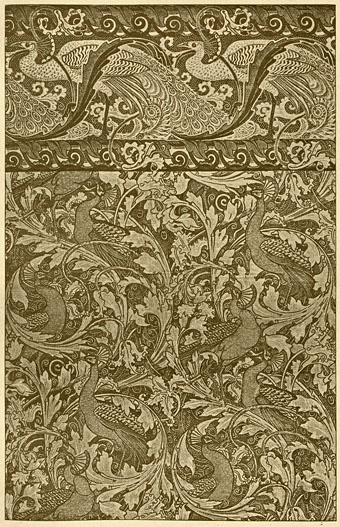
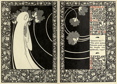
Like Marcus Behmer, another Beardsley follower from the Internet Archive, Will Bradley‘s work has been featured here before and should be familiar to anyone interested in illustrators of the 1890s. As well as being one of the great American illustrators, Bradley was also a very accomplished and successful practitioner of what we now call graphic design, and you see some of his design sensibility at work in these pages which illustrate RD Blackmore’s “tales in verse”, Fringilla (1895). The page borders are in the William Morris style which Beardsley imitated for Le Morte Darthur; Aubrey dropped this kind of heavy decoration when he moved to other books but Bradley made the borders his own for a while, using them in unlikely places such as adverts for that new-fangled transport device, the bicycle.

bradley2.jpg

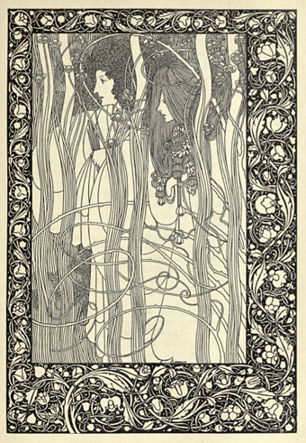
Pausias and Glycera.

The Internet Archive also has A Booklet of Designs by Bradley, a collection of motifs and very cartoony advertising illustrations from 1914. As art it’s a lot less worthwhile than Frangilla but for anyone interested in early design methods it’s worth a look for the insight it offers into how things were done in the days of scissors and paste.
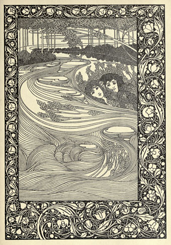
bradley3.jpg

Kadisha.

Elsewhere on { feuilleton }
The illustrators archive

Previously on { feuilleton }
Bradley does Beardsley

Esquisses Décoratives by René Binet

exposition1.jpg

The work of French architect and designer René Binet (1866–1911) has been featured here before with one of his most famous creations, the monumental gate he designed for the Paris Exposition Universelle of 1900. Philippe Jullian in his 1974 book about the exposition, The Triumph of Art Nouveau, calls the gate the “Porte Binet” and also notes that it was referred to as “the Salamander” for its resemblance to the salamander stoves of the period.

binet1.jpg

The reference to nature is apt, albeit for a different reason, since it was Ernst Haeckel’s Kunst-Formen der Natur which Binet used as inspiration for his designs, the encrustation on the gate being based on Haeckel’s studies of shell forms. This influence was developed four years later in Binet’s Esquisses Décoratives, a series of speculative designs which applied Haeckel’s work to architecture and interior design as a whole; the Porte Binet can be seen on the title plate above and the print there seems to have been either signed by or dedicated to Haeckel.

Art Nouveau design is usually thought of in terms of the curvaceous style derived from Alphonse Mucha and others, but there were several designers of the period looking to nature for inspiration in a way which went beyond William Morris’s application of plant forms to flat surfaces. Binet’s lamp designs below show how Haeckel’s sea-life could be transmuted into enclosures for electric lights. These designs hint at a direction which went unexplored in the 20th century; the Art Nouveau style was steadily vulgarised after the Exposition Universelle until it was replaced altogether by the development of Art Deco following the First World War. Binet went on to design the extension of the Paris department store, Printemps, but his huge Art Nouveau atrium was later destroyed by fire.

binet2.jpg

There aren’t many examples of Binet’s designs on web pages, the ones here are from this Flickr set and a vintage print seller. There is a recent study of Binet’s work available, however, René Binet: from Nature to Form by Olaf Breidbach. For an idea of how an entire city based on Haeckel might look, we have Schuiten and Peeters’ imaginary metropolis of Blossfeldtstad whose “Vegetalistic” architecture was featured in an earlier post.

Previously on { feuilleton }
Le Palais de l’Optique, 1900
Exposition Universelle films
Exposition jewellery
Exposition Universelle catalogue
Exposition Universelle publications
Exposition cornucopia
Return to the Exposition Universelle
The Palais Lumineux
Louis Bonnier’s exposition dreams
Exposition Universelle, 1900

Mayuri lute

lute.jpg

Mayuri means “peacock” and although this splendid instrument doesn’t look like a European lute, a lute it is, albeit styled for Indian court performances. Via Wunderkammer.

Popular at nineteenth-century Indian courts, this bowed lute borrows features of other Indian stringed instruments, such as the body shape of the sarangi and the frets and neck of the sitar. There are four melody strings and fifteen sympathetic strings, which sound when the instrument is played to accompany popular religious song. The peacock is the vehicle of Sarasvati, the goddess of music, and it appears in Indian poetry as a metaphor for courtship. (More.)

peacock-crane.jpg

As a complement, here’s something I’m still hoping to find in a good colour reproduction, all one usually sees are details. The Peacock Garden (1889) was one of a number of wallpaper designs created for William Morris by Walter Crane. This copy showing the full pattern is from an 1897 issue of the German arts periodical Pan, part of a section highlighting arts and crafts in England. Walter liked his peacocks, here’s Juno and her birds from The Baby’s Own Aesop (1887).

Previously on { feuilleton }
Jaipur peacocks
Maruyama Okyo’s peacocks
Louis Rhead’s peacocks
The White Peacock
Peacocks
Whistler’s Peacock Room
Beardsley’s Salomé

Charles Ricketts’ Hero and Leander

ricketts1.jpg

Enthusiasts of Charles Ricketts’ illustrations can find book collections of his drawings and paintings but the artist (with partner Charles Shannon) was also a printer, typographer and book designer who would no doubt have preferred his illustrations to be seen in their intended setting. The Internet Archive has a few choice examples of Rickett’s books, of which the most profusely illustrated is Hero and Leander (1894), Christopher Marlowe’s poem (completed by George Chapman).

ricketts2.jpg

Also of interest is Danaë (1903) by Thomas Sturge Moore with its black and red type, A Bibliography of the Books Issued by Hacon & Ricketts (1904), and A Defence of the Revival of Printing (1899). The latter is of interest to book designers and typographers for its presentation of Ricketts’ aesthetic philosophy. Ricketts’ and Shannon’s books made continual use of a small leaf motif as a pilcrow to mark a fresh paragraph. In A Defence of the Revival of Printing Ricketts discusses his replacement for the ampersand (&), which he disliked, preferring instead a new character combining the letters E and T, ampersands being a contraction of the Latin word “et”. There’s also some discussion of his unique type designs which he charmingly refers to as “founts”, preferring, like contemporary William Morris, the antique terminology.

ricketts3.jpg

Colophon from Hero and Leander. A rose forms the monogram of Ricketts’ and Shannon’s Vale Press.

Elsewhere on { feuilleton }
The illustrators archive

Previously on { feuilleton }
Art Nouveau illustration
Dorian Gray revisited

Designing Booklife

bl1.jpg

I created a cover design recently for Jeff VanderMeer‘s new novel, Finch, and shortly after completing that Jeff asked if I could put together some cover ideas for his forthcoming writer’s guide, Booklife, which Tachyon will be publishing later this year. Jeff is known as a fantasy writer but this book was intended to have a general appeal for any would-be or working writer. It also needed to look suitably contemporary and (possibly) reflect the discussion within which concerns the modern writer’s use of computers, the internet and social networks. Lastly, several lines of text needed to be placed on the cover without it looking confused or messy.

I agreed to this whilst busy with several other projects so the initial drafts were rather haphazard. (That’s my excuse, anyway.) The first version (above) came out of an idea to apply a kind of trompe l’oeil effect to the cover with a torn dustjacket and handwritten amendments. The red call-out/roundel highlights an important sub-section of the book. This was knocked up very quickly and, as well as not looking very contemporary, the title doesn’t look enough like gold blocking to be convincing. Jeff requested something more up-to-date.

Continue reading “Designing Booklife”