Design as virus 16: Prisms

dsotm1.jpg

The Dark Side Of The Moon (1973) by Pink Floyd. Design by Hipgnosis.

Dark Side of the Moon is one of seven or eight suggestions we submitted to Pink Floyd. It relates to the Floyd’s concerts and their use of light shows. Specifically it was sparked off by Rick Wright who wanted something very simple, clinical and precise. It’s not a particularly original design but I do feel it is very appropriate and highly effective.

Storm Thorgerson in An ABC of the Work of Hipgnosis: Walk Away René (1978)

Continuing an occasional series. Album cover designer Storm Thorgerson died in April, a month after the 40th anniversary of the release of The Dark Side of the Moon by Pink Floyd. Thorgerson may have downplayed the originality of the cover design but it remains the most well-known of the many covers produced by Hipgnosis, a combination of the enormous commercial success of the album and the success of the design itself.

The variations below are post-Hipgnosis productions by Thorgerson and his various assistants for reissues of the album. I did have the idea of collecting a few of the better unofficial variants and pastiches but a quick image search turns up a daunting quantity of homages, parodies, imitations and other derivations. This is partly down to the way the internet stimulates an accelerated recycling of cultural signifiers, but it still shows how this simple design continues to affect people beyond its original application.

The 2011 Immersion Box Set featured further variations, some of which have been used to promote the 40th album anniversary. There’s a poster available with even more variations. If you’re still not sated after that lot then deviantART is the place to go for endless collisions between the Floydian prism and all the hottest emblems of pop culture. Just keep scrolling…

dsotm2.jpg

30th Anniversary reissue. Design by Storm Thorgerson & Peter Curzon.

dsotm3.jpg

The Dark Side Of The Moon: The Making of Pink Floyd’s Masterpiece (2005) by John Harris. Designed pseudonymously by Storm Thorgerson.

dsotm4.jpg

Immersion Box Set (2011). Design by Storm Thorgerson & StormStudios.

Previously on { feuilleton }
Design as virus 15: David Pelham’s Clockwork Orange
Design as virus 14: Curse of the Dead
Design as virus 13: Tsunehisa Kimura
Design as virus 12: Barney’s faces
Design as virus 11: Burne Hogarth
Design as virus 10: Victor Moscoso
Design as virus 9: Mondrian fashions
Design as virus 8: Keep Calm and Carry On
Design as virus 7: eyes and triangles
Design as virus 6: Cassandre
Design as virus 5: Gideon Glaser
Design as virus 4: Metamorphoses
Design as virus 3: the sincerest form of flattery
Design as virus 2: album covers
Design as virus 1: Victorian borders

My White Bicycle

tomorrow1.jpg

My White Bicycle (1967), poster by Hapshash and the Coloured Coat. Too risqué for EMI.

In what passes here for spare time I’ve been working on a private project that concerns events in London during a single week in 1967. I won’t elaborate for now but the research has been fun, and has led down byways where it’s easy to get lost in a profusion of historic detail. The International Times archive is a great time-sink if you want to see London’s psychedelic culture evolving from one week to the next. Oz magazine covered much of the same ground but in broader strokes; IT being a weekly paper was the closest thing the underground of the time had to a journal of record which means you’ll find things there which weren’t reported anywhere else.

tomorrow3.jpg

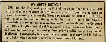
International Times, Volume 1, issue 13, 19/05/1967.

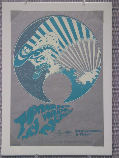
A brief item about a poster for the debut single by Tomorrow caught my eye, the artwork being an early piece by Hapshash and the Coloured Coat (Michael English and Nigel Waymouth) who we here discover were briefly known by another name:

MY WHITE BICYCLE

EMI join the long and growing list of those self-censors who still believe that the younger generation are going to continue to support them. The above poster for the Tomorrow record, MY WHITE BICYCLE, was rejected by EMI on the grounds that the titties might provoke “complaints from certain organizations…” So Jacob and the Coloured Coat (Mick English and Nigel Weymouth [sic]) put on their crocheted boots and manufactured a poster design from every phallic image they could. Subliminal pornography triumphed where open indecency had failed and the prick within sustains where the exposed breast falters.

Tomorrow were one of the first British psychedelic bands. My White Bicycle is their most memorable song but the rest of their self-titled debut album still holds up today. Ace guitarist Steve Howe became a lot more famous in Yes a few years later, while drummer Twink was in a host of bands in the late 60s and early 70s, Hawkwind included. My White Bicycle sounds superficially like a typical piece of psych whimsy à la Pink Floyd’s Bike (both songs were recorded at Abbey Road) but according to Twink there’s an anarchist subtext:

“My White Bicycle” was written out of what was actually going on in Amsterdam. One of the owners of Granny Takes a Trip, Nigel Weymouth [sic], had gone there and come back with a Provos badge which he gave to me. They were kind of like a student anarchist group that believed everything should be free. In fact, they had white bicycles in Amsterdam and they used to leave them around the town. And if you were going somewhere and you needed to use a bike, you’d just take the bike and you’d go somewhere and just leave it. Whoever needed the bikes would take them and leave them when they were done.

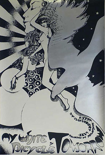
What would have been dismissed as pure utopianism now looks like prescience when bike-sharing schemes have become a reality. As to the redrawn poster, there’s a copy here which is described as very rare, hence its absence from other Hapshash galleries. Not really as phallic as the IT report implies; Aubrey Beardsley got away with a lot more priapic subterfuge in the 1890s when the strictures were also more severe.

tomorrow2.jpg

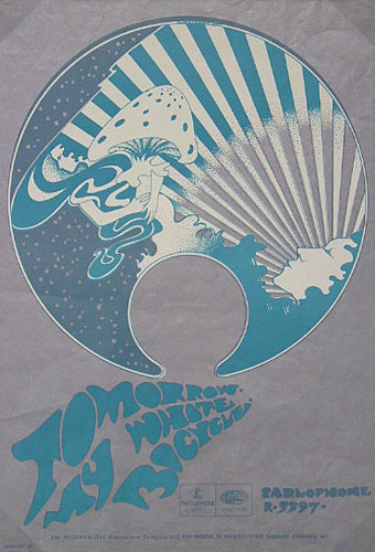
My White Bicycle (1967), the replacement poster by Hapshash and the Coloured Coat.

On the same page of IT there’s a brief announcement that The Beatles will have a new album out in June, something entitled Sgt. Pepper’s Lonely Hearts Club Band. That album also gave EMI a headache with both Lucy In The Sky With Diamonds and A Day In The Life being accused by “certain organisations” of promoting drugs. If the record company could have seen the greater headache that was coming less than ten years later from Malcolm McLaren and his King’s Road scallywags they might not have been so uptight.

Previously on { feuilleton }
Hapshash Takes a Trip
Michael English, 1941–2009
The Look presents Nigel Waymouth
The New Love Poetry

Weekend links 157

focusgroup.jpg

Elektrik Karousel, a new release on the Ghost Box label by The Focus Group. “For a clue to its moods, think Czech animation, Italian Giallo, early Radiophonics, HP Lovecraft stories, 1960s underground cinema, Lewis Carroll and baroque psych.” Julian House’s package design is “heavily inspired by 1960s underground press and conceived as a kind of mind altering DIY board game”.

Joseph Stannard of The Outer Church compiles a mix for Kit Records, and talks about rural psychedelia and malevolent lighthouses, among other things.

• At Sci-Fi-O-Rama: a sampling of Dan Nadel & Norman Hathaway’s Electrical Banana – Masters of Psychedelic Art (2012).

Stranger than Paradise: Tilda Swinton photographed by Tim Walker in the Surrealist Wonderland of Las Pozas, Mexico.

Whistler in Limehouse & Wapping: stunning etchings by the 25-year-old artist when he was newly arrived in London.

• The complete catalogue of Sunn O))) recordings is now on Bandcamp for preview and purchase.

La Danza de la Realidad: Alejandro Jodorowsky returns to his childhood in Tocopilla, Chile.

• Enjoy The Silence: Jude Rogers talks to Michael Rother about joy of quiet.

Dressing the Air, “the Bureau of Sensory Intelligence”, had a relaunch.

Fast forward – and press play again: Cassettes are back

The Lovecraft Expert: An Interview with S.T. Joshi

Book Graphics: an illustration blog.

Paint Box (1967) by Pink Floyd | Beat Box (1984) by Art of Noise | Glory Box (1994) by Portishead

Labels

label01.jpg

A post for Record Store Day, and a slight return to the work of Hipgnosis and the late Storm Thorgerson. One of the many things which impressed about Hipgnosis album designs was the way they gradually came to approach each album as a distinct package for which every component deserved special attention. The very early Hipgnosis designs were little more than photos or photo-collage with some typography applied; a few years down the line and in addition to creating elaborate pictorial sleeves they were also designing logos or special typography for each release, with the design frequently extending to the labels of the vinyl records themselves.

label03.jpg

This last feature has since become so commonplace that it’s surprising now to find albums with a simple generic label. The Beatles Sgt. Pepper album is famous for its own elaborate package which included a special inner sleeve, but the label on the disc was the regular Parlophone design which had been used on all the earlier Beatles releases. Hipgnosis were in the vanguard of designing special labels, and I’m tempted to say they began the practice although it’s likely there were prior examples. The earliest Hipgnosis example seems to be the prism design for The Dark Side of the Moon (1973); prior to this Pink Floyd were using the same label as other artists on Harvest Records. A few more Hipgnosis examples follow below. I especially like the ones for Wings Over America (1976), a triple-live set which extended the passenger plane sleeve design by using artwork based on different aircraft instrument dials.

label04.jpg

label05.jpg

Continue reading “Labels”

Storm Thorgerson, 1944–2013

hipgnosis1.jpg

Wish You Were Here (outer and inner sleeve, 1975) by Pink Floyd.

Whenever people ask questions about your work, at some point the subject of influences always turns up. Influences for me are usually few, they’re those things which skew your perception to such a degree—or which enlarge the range of possibilities—that they make you follow a path you might otherwise have never pursued. I’ve said on many occasions that the window of our local record shop in the 1970s was an art gallery whose contents changed every week, with gatefold sleeves offering an endless variety of fantastic visions and smart designs. I was often indifferent to the music the sleeves were intended to advertise, if a favourite band happened to have a great record sleeve then so much the better. It wasn’t that I wanted to be a record sleeve designer as such, more that the views (as Roger Dean called his first book) were incredibly stimulating, and they excited me enough that I wanted to have the creation of images like that in my future.

hipgnosis2.jpg

Wish You Were Here shrinkwrap and George Hardie’s sticker design.

I’ve written at some length about Roger Dean and Barney Bubbles but it was Hipgnosis that dominated those window displays during the golden age of record sleeve design. Obituaries of Storm Thorgerson have rightly been acknowledging the contributions of his Hipgnosis design partners Aubrey Powell and Peter Christopherson, but Thorgerson always came across as the driving force, a position reinforced by his text for the group’s first book collection, An ABC of the Work of Hipgnosis: Walk Away René (1978), and by his post-Hipgnosis career which continued to generate even more startling images. Walk Away René is like the designs of Hipgnosis themselves: witty, clever, and beautifully produced, while Thorgerson’s commentary is refreshingly honest both about the details of album production, and in its lack of the affectation which afflicts many design books. Working in the music business probably helped maintain a no-bullshit attitude; it’s difficult to imagine many other designers cheerfully announcing in their first public showcase that their studio is so primitive that everyone has to piss in the sink. Or, as I noted in December, drawing attention to your least favourite covers in an even more lavish showcase.

hipgnosis3.jpg

The Dark Side Of The Moon (1973) by Pink Floyd.

The cover examples here have been chosen via the essays in For the Love of Vinyl: The Album Art of Hipgnosis (2008) where several people were asked to choose their favourite sleeves. I’d find it impossible to choose a favourite, although at a push I’d probably go for Wish You Were Here. With its absence/four elements concept, in its original package—the postcard insert, the unlabelled sleeve shrink-wrapped in black cellophane then stickered with a George Hardie drawing which I once laboriously copied—it comes close to perfection when you’re discussing album designs as works of art.

hipgnosis4.jpg

Presence (1976) by Led Zeppelin.

The Hipgnosis Covers site is the place to see more work by Storm Thorgerson and company.

Storm Thorgerson, Pink Floyd and the final secret of the world’s greatest record sleeve designer
The Guardian: “The best album designer in the world”
Storm Thorgerson remembered by Aubrey Powell
Adrian Shaughnessy at Creative Review
Mark Blake at MOJO
Telegraph obituary

hipgnosis5.jpg

Go 2 (1978) by XTC.

Elsewhere on { feuilleton }
The record covers archive

Previously on { feuilleton }
Hipgnosis turkeys
Peter Christopherson, 1955–2010
Storm Thorgerson: Right But Wrong
Battersea Power Station