Atalanta Fugiens

teb.jpg

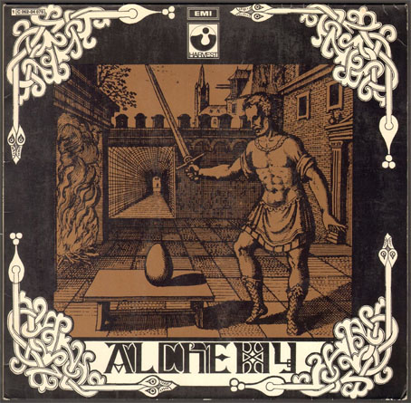
Alchemy (1969) by the Third Ear Band. Design by Dave Loxley.

For an idea of how these posts often come into being, this one is the result of the following chain of association: an article by Leo Robson about the films of Roman Polanski > A re-viewing of Polanski’s Macbeth > A re-listening to albums by the soundtrack artists for Macbeth, British folk group the Third Ear Band > A tracking down of the famous cover image from the first Third Ear Band album.

mm01.jpg

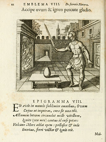
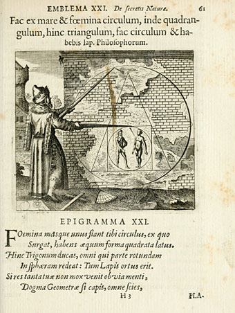
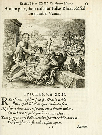
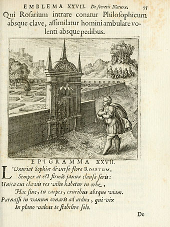
Alchemy is the dominant theme of the first two Third Ear Band albums. The engraving used on the cover of their debut album is one of the most frequently reproduced of all images associated with this branch of occultism, one of fifty emblems from Atalanta Fugiens (1618) by the German alchemist Michael Maier (1568–1622).

The plates are by Matthäus Merian, an artist whose career produced a number of notable alchemical illustrations. A detail from one of his other oft-reproduced pieces, Macrocosm and Microcosm from the Basilica Philosophica (1618), appeared on the cover of Pink Floyd’s Saucer Full of Secrets album a year before the Third Ear Band debut. Merian would no doubt be astonished that his work was so visible to future generations even though his name is seldom mentioned at all. The popularity can be accounted for by the way the best of these images seem almost archetypal whilst being resistant to any easy interpretation. Some of Merian’s plates remind me of Magritte’s paintings; they share a tension between carefully rendered yet impossible images that imply a hidden meaning. As Borges considered metaphysics to be a branch of fantastic literature it’s possible to consider this kind of alchemical illustration as a branch of fantastic art.

A 1687 edition of Maier’s Atalanta Fugiens (retitled Scrutinium Chymicum) may be browsed here or downloaded here.

mm02.jpg

mm03.jpg

mm04.jpg

Continue reading “Atalanta Fugiens”

Hipgnosis turkeys

turkeys.jpg

Here in Britain there’s no Thanksgiving so turkey as a seasonal meal is a Christmas dish. Turkey also has another meaning which the OED can supply:

6.6 U.S. slang. a.6.a An inferior or unsuccessful cinematographic or theatrical production, a flop; hence, anything disappointing or of little value.

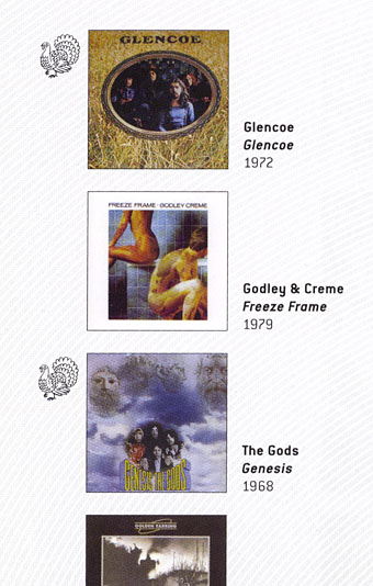
This post concerns the latter—turkeys for the turkey season—being a series of bad or merely lacklustre album covers produced by the Hipgnosis design partnership throughout the 1970s. If the label seems unfair it should be emphasised that “turkey” is the designation applied by Storm Thorgerson himself in the appendix to the third Hipgnosis book, For the Love of Vinyl: The Album Art of Hipgnosis (2008). The following are all covers that he says Hipgnosis disliked, although not necessarily because they were bad designs:

There are some designs we would rather like to forget altogether and have been awarded turkeys to denote — no disrespect is intended for the blame lies mostly with us, save for the twin spectres of release schedules and rock egoism — “That’s a jolly interesting idea chaps but… hmm… actually we’d rather have a picture of our good selves.”

A consistent feature of the Hipgnosis books is a refusal to adopt the Olympian attitude that radiates from many design monographs. Thorgerson has always been happy to describe the history of Hipgnosis, and the practice of album cover design, in warts-and-all anecdotal detail, so it’s no surprise if he also admits to failings. You’d be hard-pressed to find other designers who would draw attention to poor work in this manner, especially in a book dedicated to the highlights of a lauded career. Most designers are self-conscious types who can be relied upon to bury their mistakes as thoroughly as possible.

I wrote a brief post years ago about bad cover design but I usually try to avoid such things, there’s already enough junk in the world without compiling lists of it. But this post is instructive for showing that not everyone gets things right however good they might be, and also that everyone has to start somewhere. Most of my early album covers are various degrees of terrible so I try to spare others the accusatory finger. That said, you have to wonder what on earth Thorgerson and partner Aubrey Powell were thinking of with some of these designs.
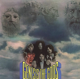
01gods.jpg

Genesis (1968) by The Gods.

Thorgerson’s introduction to For the Love of Vinyl explains the haphazard beginnings of Hipgnosis, pretty much two guys and a couple of cameras. They had no design training but a lot of luck (not least having Pink Floyd as friends), and were learning on the fly, something you can see happening with these early covers. It’s unfair to compare a design like the Gods sleeve to work they were producing a few years later when they had access to a range of professional illustrators, retouchers and models, and also budgets from record companies that paid for flights to exotic locations.
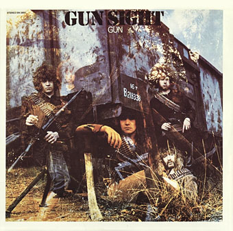
02gun.jpg

Gun Sight (1969) by Gun.

This was Gun’s second album. The cover for the first happened to feature the first album cover art by Roger Dean whose career in the music business would run parallel with that of Hipgnosis. Most of the early Hipgnosis covers are simple photos that are occasionally processed in some way. This one didn’t really work out, however, the Roger Dean cover is better.
03prettythings.jpg

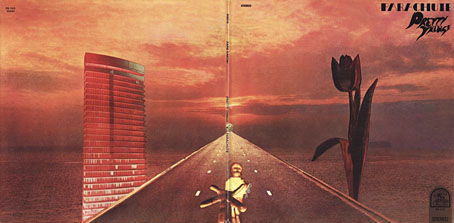
Parachute (1970) by The Pretty Things.

But at least the Gun cover doesn’t look like this bizarre attempt at Surrealist collage. Hipgnosis often tried to illustrate the album title but I can’t see how you get “parachute” from this one. The collage approach worked a lot better on the Quatermass album produced the same year.
04pepejaramillo.jpg

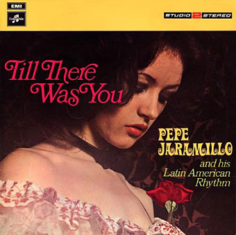
Till There Was You (1970) by Pepe Jaramillo.

This was the only cover singled out in the first Hipgnosis book, Walk Away René (1978), as something they didn’t like:

…straight down the line and utterly tasteless as a result — it doesn’t even work as a genteel piece of middle class tweeness.

Continue reading “Hipgnosis turkeys”
Twentieth Century Meets the Fifteenth

dirigible.jpg

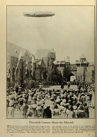
Something spotted whilst browsing issues of Photoplay magazine at the Internet Archive, a photo showing the US dirigible ZR1 drifting over the Cosmopolitan Studios in 1923 during the filming of Yolanda. I don’t doubt that the ZR1 really did fly over Hollywood although it looks here to be at an odd perspective (it’s also being completely ignored by the crowd of extras). This makes me think the magazine may have comped two separate photos for convenience, as famously occurred with the cover photo of Pink Floyd’s Animals album.

kibardin.jpg

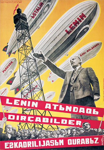
Searching around for details about the ZR1 turned up this 1931 poster by Georgii Kibardin exhorting Soviet citizens to build a fleet of airships in Lenin’s name. The Hindenberg disaster six years later put an end to this kind of enthusiasm.

Previously on { feuilleton }
Zeppelinology
Vickers Airship Catalogue
The Air Ship
Dirigibles
The Airship Destroyer
Zeppelin vs. Pterodactyls

Gerald Scarfe’s Long Drawn-Out Trip

scarfe.jpg

Yet more animation. Long Drawn-Out Trip was Gerald Scarfe‘s first foray into the medium, produced in 1972 at the request of the BBC who sent the artist to Los Angeles to try out the new De Joux animation system. The process needed only six or eight drawings per second of film thus reducing the usual amount of labour. Scarfe says in the first book collection of his work, Gerald Scarfe (1982), that the 16-minute film was still very labour intensive.

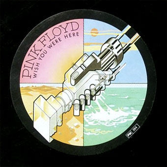
The subject of Long Drawn-Out Trip is Los Angeles and America itself, the concerns being the same ones that Ralph Steadman was depicting the same year in his illustrations for Hunter S. Thompson’s Fear and Loathing on the Campaign Trail ’72: venality, violence, vulgarity and the omnipresent spectre of Richard Nixon, a president who had the good fortune to be drawn many times by two of Britain’s greatest living satirists although he wouldn’t have thanked them for it. In Scarfe’s film we also find Mickey Mouse being reduced to his constituent lines and colours after smoking a joint. In the 1980s Scarfe regularly drew Ronald Reagan wearing the famous mouse ears, something that nearly got him fired from his post at the Sunday Times after Rupert Murdoch saw one of the cartoons. Long Drawn-Out Trip had a more favourable effect when it was seen by Roger Waters who asked Scarfe to create some animations for Pink Floyd’s Wish You Were Here tour. The animated sequences for The Wall have their origin in this short film. Watch it here.

Carel Struycken’s panoramas

struycken1.jpg

The Bradbury Building by Carel Struycken.

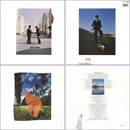
An idle search for a panorama view of the interior of the Bradbury Building in Downtown Los Angeles fetched me up at my favourite panorama site 360Cities and this photo by Carel Struycken. Mr Struycken is better known as an actor whose great height has seen him cast as The Giant in the Twin Peaks TV series, and Lurch in the Addams Family films. 360Cities has a page of his panorama views most of which are taken in and around Los Angeles. The strangely ossified landscape around California’s Monolake is more familiar from this photo by Hipgnosis for Pink Floyd’s Wish You Were Here album.

struycken2.jpg

Urban Light by Carel Struycken.

struycken3.jpg

Monolake in Winter by Carel Struycken.

Elsewhere on { feuilleton }
The panoramas archive

Previously on { feuilleton }
Through the darkness of future pasts
The Bradbury Building: Looking Backward from the Future