Weekend links 9

arthur7.jpg

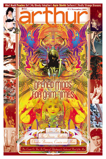
Own a copy of Arthur #7 (October 2003) with my swirling cover pic featuring cosmic jazz maestro Sun Ra. Lots of good stuff inside, details here.

Spinetingler Magazine announced their nominees the 2010 Spinetingler Award this week. Jeff VanderMeer’s Finch is one of the titles in the Best Novel category while my cover for Jeff’s book is in the Best Cover category.

• A Journey Round My Skull posted the results of the Raymond Roussel illustration contest. Entrants were asked to read Roussel’s story Bertha, The Child-Flower then create a picture based on that.

Has Dottie got legs? The New Criterion on the poetry of Dorothy Parker.

• The gays: Fuck Yeah Hot Weird Guys, more from the Tumblr hall of mirrors; Simon Callow reviews Gay Icons Through the Ages by Tom Ambrose; Wessel + O’Connor Fine Art is open again with a new exhibition at a new location in Lambertville, NJ; some things never change: “Secret tape reveals Tory backing for ban on gays.”

• “Make the inaccessible exciting.” Colin Marshall interviews Chris Bohn, editor of music magazine The Wire.

• More music: Jon Savage’s brief history of Krautrock. The new Soul Jazz compilation, Deutsche Elektronische Musik, is released next week.

Sage of the Apocalypse; Samuel R Delany’s Dhalgren comes to the stage in New York.

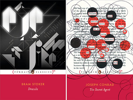
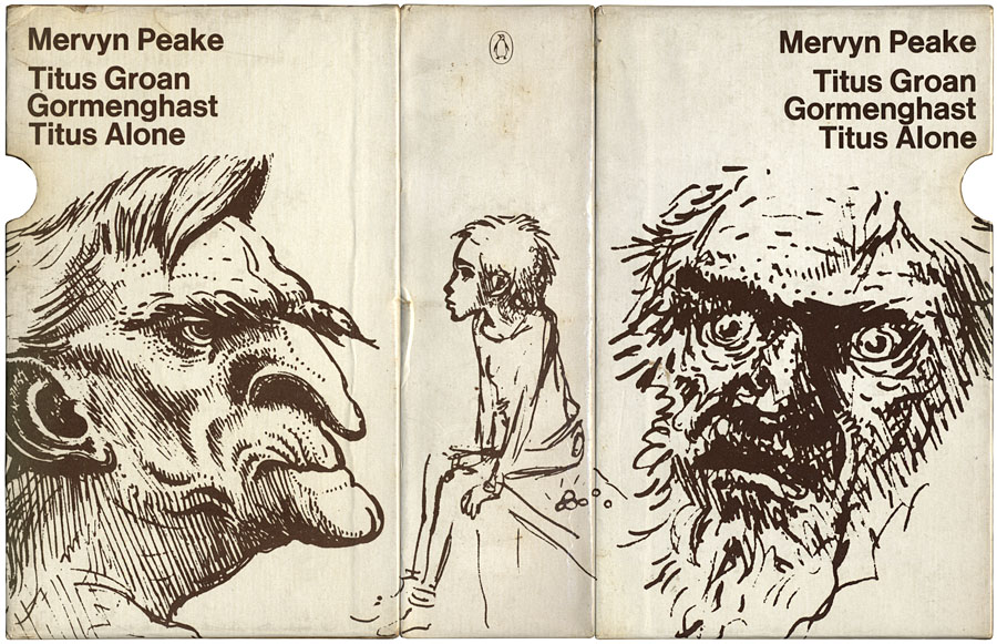
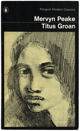
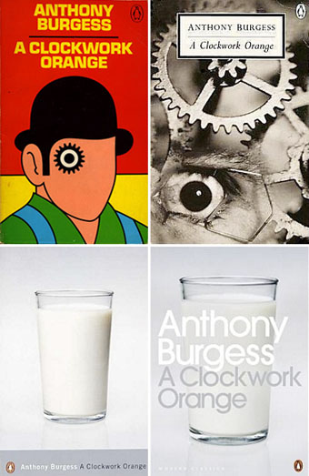
• Further Penguin fetishism: “Penguin Decades bring you the novels that helped shape modern Britain.”

• Yes, they’re out there, the Clients From Hell. For a palliative there’s Herbert W Kapitzki’s elegant poster designs from the 1960s.

• Song of the week: House of Glass (1967) by The Glass Family.

Weekend links 1

penguin_red

• Two covers from a new range of Penguin reprints for the AIDS awareness fund (RED), all of which are based around quotes from the books in question. Non-Format‘s stylised extract concerns the blazing red of the Count’s eyes while Coralie Bickford-Smith plays some Tom Phillips games with the text of The Secret Agent. The random circles no doubt relate to those which the doomed Stevie Verloc occupies his time in drawing. More at Caustic Cover Critic.

Artspeak? It’s complicated. Jon Canter at The Guardian makes a blazingly obvious point which few in the art world would ever admit: that the specious pronouncements of many galleries and contemporary artists are the worst kind of bullshit.

• I helped judge the Ballardian/Savoy Microfiction competition whose winners were announced last week.

• Designer Jonathan Barnbrook enjoys Neu! and Wendy Carlos.

Nuit Blanche, a short film by Spy Films.

Elsewhere on { feuilleton }
The book covers archive

A profusion of Peake

gormenghast_box.jpg

Bellgrove, young Titus and Barquentine by Mervyn Peake. Case designed by Robert Hollingsworth.

I’d thought about posting the covers of my boxed set of Gormenghast paperbacks a couple of years back when there was a flurry of blogospheric attention being given to Penguin cover designs…thought about it then never got round to it. The reason for doing so now is twofold: firstly I’ve been re-reading the books, and secondly some Gormenghast-related news emerged this week which gives this post an additional relevance.

gormenghast1.jpg

Fuchsia by Mervyn Peake.

The set of Peake paperbacks which Penguin published in 1968 (and their subsequent reprints) were the first editions of Peake’s trilogy which I encountered so I can’t help but regard them as the ones, the only copies I could countenance reading. That may change, however (see below). I’ve no idea how scarce the boxed edition is but the books are reprintings from 1970 so I presume Penguin put out a boxed gift set to make the most of Peake’s posthumous success. I always liked the presentation which is the standard Penguin Modern Classics format of the period, it leaves to you how much you want to regard the books as works of fantasy or simply novels of a rather grotesque and highly imaginative reality. Titus Groan‘s sketch of a glowering and thoroughly unglamorous Fuchsia was a daring choice for a cover intended to lure a newer, younger audience to Peake’s work. The drawing says a great deal about the author’s unsentimental attitude towards his creations; compared to the florid and often delicate covers of the fantasy books being published by Ballantine in the late Sixties (a series which included the Gormenghast trilogy), it seems shockingly unpleasant.

Continue reading “A profusion of Peake”

March of the Penguins

aco_penguin.jpg

top left: David Pelham’s classic design (1972); top right: photography
by Lionel F Williams (Eye) and SOA / Photonica (Cogs) (1996).
bottom left and right: photography by Véronique Rolland (2000 & 2008).

In April this year I wrote about James Pardey’s excellent site devoted to book covers from the Penguin science fiction range. I’m often pointing to various book cover galleries on Flickr and elsewhere but James’s site goes far beyond these, with credits and annotations for every cover on display. He emailed this week to let me know that his site has been considerably expanded, from 160 covers to 250 (!), bringing the timeline closer to the present. In addition the site has improved page layouts which enable you to study the evolution of each title. All design sites should be this good.

And coincidentally, Anne S mentioned in the comments yesterday that she’s been adding some Penguin Classics covers to her Eye Candy for Bibliophiles site. Lots of other worthwhile viewing there, including some of the old Puffin covers for Alan Garner.

Elsewhere on { feuilleton }
The book covers archive

Previously on { feuilleton }
Penguin science fiction
A Clockwork Orange: The Complete Original Score
Penguin Labyrinths and the Thief’s Journal
Penguin Surrealism
Juice from A Clockwork Orange
Penguin book covers
Clockwork Orange bubblegum cards
Alex in the Chelsea Drug Store

Penguin science fiction

drought.jpg

The Drought, 1968; design by Richard Hollis, photography by Dr. J Comroe.

James Pardey contacted me earlier this week announcing his site devoted to Penguin Books’ science fiction covers. I posted some of my own dishevelled copies a while back and this news gives me an excuse to throw up another Ballard cover. Pardey’s site is just the kind of thing I enjoy seeing, with a comprehensive collection and detailed notes for each design. The front page is especially good since you can see immediately how the look of the titles evolved, from spare layouts and pictorial covers through to bold graphic design which culminates in David Pelham’s great run as designer during the 1970s. Creative Review posted a talk Pelham gave a couple of years ago which explores his work at Penguin and touches on the covers he did for Ballard. A shame they didn’t do a complete set of Ballard’s titles at the time, I’d have loved to see how he treated the other books.

Elsewhere on { feuilleton }
The book covers archive

Previously on { feuilleton }
Penguin Labyrinths and the Thief’s Journal
Penguin Surrealism
Penguin book covers