Donald Cammell and Kenneth Anger, 1972

cinema.jpg

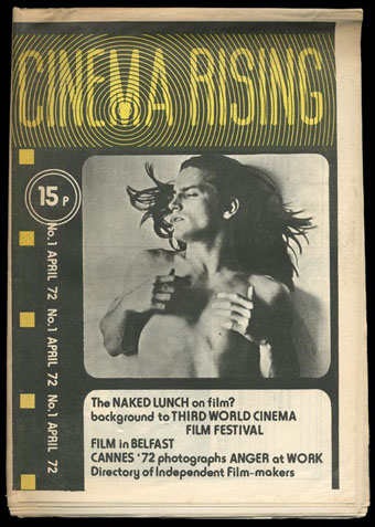
Another resurrected article. Cinema Rising was a short-lived newsprint film magazine that ran for three issues in the UK in 1972. I have a few pages from the rare first issue that was part of a batch of old underground newspapers I was given a few years ago. (The Frendz Hawkwind strip is from the same haul.) Cinema Rising was edited by Simon Hartog and Tony Rayns, the latter being a long-time Kenneth Anger aficionado which would explain both the magazine title and the presence of a photo feature about Anger’s Lucifer Rising. The bulk of this post is a short interview with Donald Cammell that’s of interest for his comments about the gender roles in Performance, and his opinion of Jorge Luis Borges whose recurrence as both signifying text and presiding magus in Performance is never really explained.

Cammell’s next film after Performance would have been Ishtar (no relation to the Elaine May film), the themes of which Cammell discusses at the end of the piece. The Cammell biography describes the script of Ishtar as a story about a film star and Hollywood producer who want to make a film in Morocco. While there they get involved with a woman who embodies various mystical/mythological feminine attributes; there’s also a sub-plot about the pair kidnapping an American judge. Mick Jagger was down for the role of the film star while William Burroughs was slated to play the judge. Given how wayward Cammell’s later films became it’s difficult to say whether this would have been good or not. Performance could easily have been terrible without Nicolas Roeg’s experienced hand.

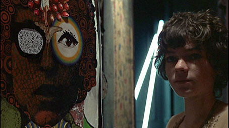
After the Cammell piece there are photos from Cinema Rising‘s Kenneth Anger feature which show the director at work on the new version of Lucifer Rising. I’ve not seen any of these stills or the two black actors before—what happened to their parts? Note that the photos should be credited to Diarmid Cammell, Donald’s brother.
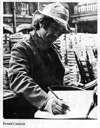

dc1.jpg

DONALD CAMMELL: PERFORMANCE TO ISHTAR, Cinema Rising, no. 1, April 1972

Donald Cammell’s first movie was Performance, made in collaboration with Nicolas Roeg; the most unexpected British movie of recent years, and one of the very few products of the British industry capable of holding its own in an international context. Cammell’s new script is Ishtar, originally written with Mick Jagger in mind for the lead again, but possibly to be made without him; Cammell is currently in America to raise the backing for the film.

In the following extracts from a conversation with John du Cane (recorded last year), Cammell speaks of his background and interests…matters that inform his new script at least as much Performance.

Collaboration

“In the recent past, reverence for the director of a film as sole creator has been vastly exaggerated, through critical efforts. I’m thinking particularly of the Cahiers du Cinema ‘author’ concept—I’ve been living in Paris, and have been quite aware of it for a long time. The kind of theory of creativity that’s arisen there (and in related worlds in New York) is, succinctly, crap. It’s a way of trying to demonstrate the view that cinema is an artform, and that therefore there must be a single creative mind controlling the artefact, through to its ultimate form. It’s a way of justifying movie-making, socially and culturally.

“But leaving aside the reasons for the concept, I think it’s contradicted by the facts. I think that many of the greatest artefacts things that have moved people most throughout history—have been collectively produced. You don’t even have to look for examples: the whole of Egyptian culture, arcane cultures generally. Today in tribal cultures, the vast majority of the products are collectively produced. The hangup is the concept of one ego necessarily controlling the production in order for that ego to be expressed; the notion that the expression of an ego is the final goal of any artwork, that this is what it’s for. I think that an artwork expresses itself, that the creators involved will all see in it their own egos, each one individually satisfied when looking at the final work. My analogy is with contemporary music, where people go into it collectively, and their egos are satisfied collectively and individually. Look at Mick and Keith and their confreres: they see in their work as The Rolling Stones what they each wanted to say. Working in the film medium is ideally suited to interaction of different heads; it’s the ideal medium for all the good functions of collective work.”
Continue reading “Donald Cammell and Kenneth Anger, 1972”

Martin Sharp, 1942–2013

sharp1.jpg

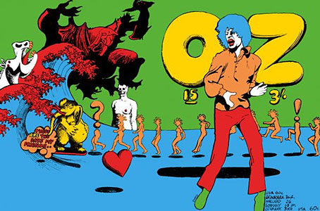
Oz magazine no. 15, October 1968.

The psychedelic art of Australian artist Martin Sharp has featured here on several occasions. Unlike his British and American contemporaries who maintained a single graphic style, Sharp was a versatile artist whose work could range from loose, often cartoony drawing and painting to very detailed collage designs; he was also as happy as any other artist of the period to plunder art history, as the cover for issue 15 of Oz demonstrates. The Mick Jagger figure from that cover was later reworked as a poster for “Turner’s Purple Orchestra”, one of a number of pieces of Sharp art which can be glimpsed throughout Donald Cammell & Nicolas Roeg’s Performance (1970).

sharp7.jpg

Performance (1970): Michele Breton and a Martin Sharp collage.

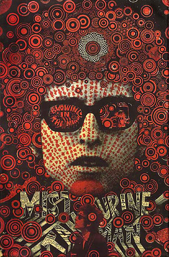
Sharp’s involvement with Oz magazine, and the creation of a handful of endlessly reproduced designs—the Bob Dylan Mr Tambourine Man poster, Jimi Hendrix in a Jackson Pollock explosion, the sleeve art for Cream’s Disraeli Gears—makes his art some of the most visible of the period. People may not necessarily know the name but they’ll recognise the work.

In 2009 Sharp’s Oz colleague Germaine Greer wrote a warm appraisal of the artist and his work. A few more examples follow. There’s a great selection of posters and other art and design here.

The GuardianMartin Sharp, Australian artist who came to symbolise the ’60s | Martin Sharp in pictures

sharp2.jpg

Mister Tambourine Man (1966).

Continue reading “Martin Sharp, 1942–2013”

Brush of Baphomet by Kenneth Anger

anger2.jpg

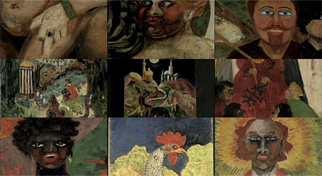
Another recent piece of Angeriana, and another short video sketch, Brush of Baphomet (2009) is a kind of addendum to Anger’s The Man We Want to Hang (2002), being a further look at Aleister Crowley’s paintings. The title refers to one of Crowley’s many occult names. As a painter Crowley’s technical ability was almost nil but that never dissuaded him from trying, and I’m sure I’m not alone in finding his work to have a naive malevolence. Anger has had a lifelong interest in Crowley’s paintings, famously journeying in 1955 to the abandoned villa in Cefalù, Sicily, where he cleaned whitewash from the walls to reveal the remains of the murals Crowley had painted there.

anger3.jpg

The music in Brush of Baphomet is a surprising choice, an extract from the second part of Morton Subotnick’s Silver Apples of the Moon (1967). Anger’s musical selections have never been random ones so you have to wonder why this particular score. Was it because the electronics are reminiscent of the Moog drones Mick Jagger supplied for Invocation of My Demon Brother (1969)? Subotnick’s title is borrowed from The Song of Wandering Aengus by WB Yeats, a poet for whom Crowley (also a poet) had little affection. In Crowley’s occult novel Moonchild, Yeats appears as “Gates”, a mediocre painter (yes, well…), who ends up being killed in an act of magical revenge. Crowley must have been mortified a few years later when Yeats was awarded a Nobel Prize.

Previously on { feuilleton }
Anger Sees Red
Kenneth Anger’s Hollywood Babylon
Lucifer Rising posters
Externsteine panoramas
Missoni by Kenneth Anger
Anger in London
Arabesque for Kenneth Anger by Marie Menken
Edmund Teske
Kenneth Anger on DVD again
Mouse Heaven by Kenneth Anger
The Man We Want to Hang by Kenneth Anger
Relighting the Magick Lantern
Kenneth Anger on DVD…finally

MC Escher album covers

scaffold.jpg

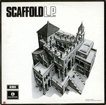
L The P (1969) by Scaffold. Art: Ascending and Descending (1960).

A follow-up to yesterday’s post. MC Escher lived long enough to see his work move from curiosities appealing to a small circle of print collectors, through enthusiasm among scientists and mathematicians, to mass acceptance in the late 1960s thanks, in part, to the general vogue for any art that looked weird or far out. New Worlds magazine used Relativity on a cover in 1967, while Thomas Albright writing for Rolling Stone in 1970 introduced a generation of American heads to Escher’s work. A year earlier, another Rolling Stone, Mick Jagger, had tried to persuade Escher to create something for the cover of Let It Bleed; the artist declined but that didn’t stop others using his prints for cover art.

mott.jpg

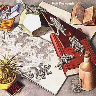
Mott The Hoople (1969) by Mott The Hoople. Art: Reptiles (1943).

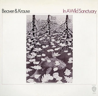
Escher’s work is so well-suited to a vinyl sleeve that I’m surprised his lithographs and woodcuts haven’t seen more use. Liverpool group Scaffold beat Mott the Hoople to the first usage by a few months in 1969 (unless there’s an earlier example I don’t know about); L The P is a play on the Scaffold’s big hit, Lily The Pink. As is often the case with these music design histories, things start off well with sympathetic treatments of the artwork then degrade when hamfisted amateur designers take over. I can’t imagine Escher being flattered by some of the later examples. If you know of any others, good or bad, then please leave a comment.

beaverkrause.jpg

In A Wild Sanctuary (1970) by Beaver and Krause. Art: Three Worlds (1955).

mandrake.jpg

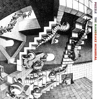
Puzzle (1970) by The Mandrake Memorial. A gatefold sleeve which opened out to reveal the whole of Escher’s House of Stairs I (1951). Inside the gatefold was Curl-up (1951). Design by Milton Glaser who also designed the group’s second album, Medium.

Continue reading “MC Escher album covers”

Soft machines

smseven.jpg

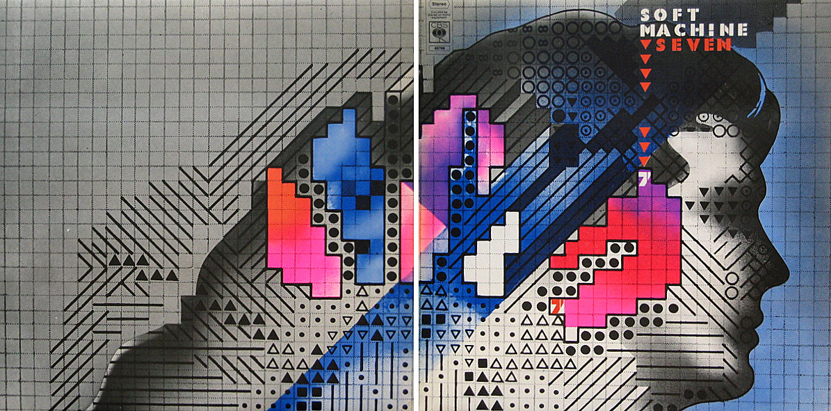
Seven (1973) by Soft Machine. Design by Roslav Szaybo.

You’re the great, grey man whose daughter licks policemen’s buttons clean,
You’re the man who squats behind the man who works the soft machine.

Mick Jagger, Memo From Turner (1968)

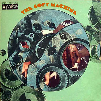
By coincidence this month I’d been re-reading some William Burroughs when I picked up a nice box set of five Soft Machine albums, part of a series of reissues that Sony have been doing recently. They’re very cheap and sound excellent, and also have the additional benefit of being a card slipcase holding the discs in card sleeves so there’s no nasty plastic packaging. The set comprises the Third (1970), Fourth (1971), Fifth (1972), Six (1973), and Seven (1973) albums. I have the band’s first two studio albums already so this has been an opportunity to get fully acquainted with the rest of their output up to the point where the machine started to run out of steam.

smone.jpg

The Soft Machine (1968) with die-cut sleeve. Design by Byron Goto, Eli Allman, Henry Epstein.

Third and Fourth are freaked-out jazz fusion recorded when Robert Wyatt was still on drums; Fifth, which I had for years on vinyl, is post-Wyatt fusion of a more polite variety, great compositions but it sounds lightweight compared to Miles Davis’s On The Corner which was released the same year. Six, which I’d hardly heard at all, is a set of live recordings and four superb studio tracks. Seven is the weakest of the lot but it prompts this post on account of the cover which I always liked the look of when flicking past it in record shops. Seen today it still looks surprisingly advanced for 1973, and the intention behind the design is still mysterious. I used to regard it as vaguely “futuristic” despite knowing that the music was nothing of the sort. The accumulation of abstract symbols contained by a human head implies either a score for some aleatory composition (which again is belied by the short jazzy pieces within), or can perhaps be read as a “soft machine”, especially if one considers that the popular idea of electronics at this time involved patch-boards and banks of flashing lights. Ten years later with synthesizers in common use this kind of semi-cybernetic imagery was a lot more topical.

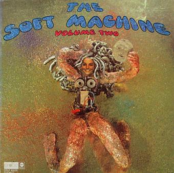
smtwo.jpg

The Soft Machine Volume Two (1969). Design by Byron Goto, Henry Epstein.

The first two Soft Machine albums both showed literal renderings of Burroughs’ “soft machine” idea albeit couched in the naked-woman-as-decoration style of the late 60s. Six has a horrible cover with an airbrushed attempt at a soft machine, one of those pictures common to the 1970s that you’re amazed was approved by band and record company.

v2.jpg

V2 by The Vibrators (1978). Design by Roslav Szaybo.

The design for Seven is credited to Roslav Szaybo, an in-house designer at CBS. Looking through Mr Szaybo’s other credits there’s little that resembles his Soft Machine cover until you arrive at the sleeve for V2, the second album by British punk band The Vibrators. This was another cover I always liked for similar graphical reasons to the Soft Machine sleeve; they also share a similar stencil typeface. Musically they’re worlds apart, of course, although William Burroughs’ influence on music carried on into the punk era (another Brit punk band named themselves Dead Fingers Talk) and beyond. It’s an influence reaching from the mid-60s with Soft Machine and his appearance on the cover of Sgt Pepper, into the 1990s with the many recordings he collaborated on or inspired from Bill Laswell, Hal Willner and others. His influence generally may have fallen off since his death in 1997 but it’s still a remarkable achievement for someone who never seemed to care much for music beyond the popular tunes he heard as a boy.

Elsewhere on { feuilleton }
The album covers archive
The William Burroughs archive