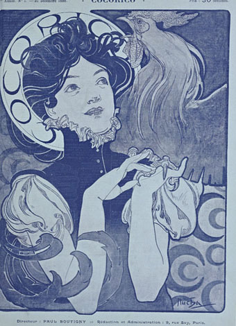
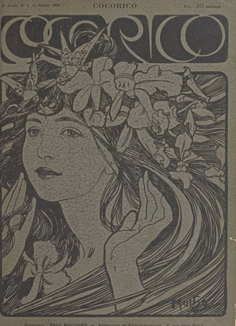
Cocorico covers

cocorico01.jpg

Alphonse Mucha.

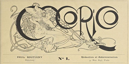
For a while now I’ve been waiting for several French journals of the fin de siècle to turn up online but humour magazine Cocorico has never been among them. I knew that Alphonse Mucha had contributed a handful of covers and some other graphics to Cocorico, notably the frontispiece (below) which ran in every issue. What I didn’t realise was that this title was effectively the French counterpart to Jugend magazine which had been running for two years when the first issue of Cocorico appeared in December 1898. Both magazines share the same mix of humorous articles, cartoons, serious art pieces and poetry, all connected by some very fine Art Nouveau graphics.

cocorico19.jpg

Alphonse Mucha.

Jugend has the edge when it comes to the graphics, some of which are very strange, but Cocorico looks much more like a humour magazine to contemporary eyes, with many cartoons that resemble those drawn today. Cocorico is also mostly free of the Jugend brand of satire which is often little more than nationalist rabble-rousing. Cocorico ran for 63 issues to 1902 by which time its format had changed and the florid graphics had been abandoned for a more sober layout. What follows is a selection of cover designs, many of which are Mucha’s work, and all of which follow the Jugend template of varying the art style and title design. There’s also one by František Kupka (or François as he was credited here) who also contributed interior illustrations in the later issues. There’ll be more about him tomorrow.

cocorico02.jpg

Alphonse Mucha.

Continue reading “Cocorico covers”

The Dracula Annual

wolff1.jpg

A comment by Modzilla in last month’s post about psychedelic comic book Saga de Xam is responsible for this recent book purchase. Dracula was a full-colour large-format comic book from notorious pulp imprint New English Library (later to be distributors for my colleagues at Savoy Books) that repackaged Spanish horror strips for a British audience. The comic ran for 12 issues in the early 1970s; the pages shown here are from the hardback annual that gathered all the issues into a single volume. I remember this being around in secondhand shops for years but I never paid it any attention at all so the artwork has been a revelation.

NEL’s Dracula isn’t much of a horror comic, despite its title; Dracula himself only appears in one story, and that’s a jokey throwaway piece. The two main episodic strips are Wolff, a Conan clone searching for his lost wife in a world ravaged by witches, werewolves and other supernatural threats; and Agar-Agar, a deliriously psychedelic picaresque concerning a hyper-sexual “sprite” (or a hippyish young woman with blue hair and magic powers) from the planet Xanadu. Everything in the book is redolent of the early 1970s when strains of psychedelia were still percolating through pop culture. Watered-down psychedelia used to bore me because I wanted the authentic stuff but forty years on this kind of work is much more attractive.

wolff2.jpg

Wolff is the work of Esteban Maroto whose splash pages and inventive layouts give Barry Windsor-Smith’s Conan the Barbarian (which was running at this time) some serious competition. Wolff is very much in the Conan mould—he even shouts “Crom!” at crucial moments—a pawn of supernatural forces he often fails to comprehend. The artwork in Smith’s Conan was often praised for its details and decor but the Art Nouveau influence in Maroto’s work is much more overt. Maroto’s flame-haired witches are like Alphonse Mucha sirens—one panel even borrows from Mucha’s Salammbô—and he’s no slouch with the Frazetta-like demons either. The scripting is perfunctory but I don’t mind that when it turns up pages like these. There’s also a brief nod to Lovecraft when “R’Lyeh” is mentioned.

wolff3.jpg

wolff4.jpg

Continue reading “The Dracula Annual”

Alphonse Mucha record covers

mucha01.jpg

Henryk Wieniawski / Alexander Glazunov: Violin Concerto No. 2 In D Minor / Violin Concerto In A Minor (1965); Ida Haendel, Prague Symphony Orchestra, Václav Smetácek. Artwork: Morning Star (1902).

Continuing an occasional series about artists or designers whose work has been used on record sleeves. Note that this is a selection of works by Alphonse Mucha only. Pastiches of the Mucha style are plentiful, and some—like Barney Bubbles’ cover for Space Ritual by Hawkwind—are very familiar, but I’ll leave it to someone else to go looking for those.

mucha04.jpg

Gypsy (1970) by Gypsy. Artwork: La Plume: Zodiac (1896).

mucha02.jpg

Dvorák: Slavonic Dances (1993); Czech Philharmonic Orchestra, Václav Talich.

Mucha is one of the most celebrated of all Czech artists so it’s no surprise his work appears on releases from Czech label Supraphon. This is one of a series of orchestral recordings that use a Mucha postage stamp for the cover art.

Continue reading “Alphonse Mucha record covers”

Intertextuality

cthulhu17.jpg

The Call of Cthulhu (1988): in the upper half there’s the big sun from Bob Peak’s poster for Apocalypse Now, in the lower half a radical reworking of Arnold Böcklin’s The Isle of the Dead.

In 1990, shortly after the first season of Twin Peaks had finished showing in the US, Video Watchdog magazine ran a feature by Tim Lucas which attempted to trace all the various cultural allusions in the character names and dialogue, references to old TV shows, song lyrics and the like. This was done in a spirit of celebration, with Lucas and other contributors welcoming the opportunity to dig deeper into something they’d already enjoyed. This week we’ve had a similar unravelling of textual borrowings in a TV series, only now we have the internet which, with its boundless appetite for accusing and shaming, can often seem like something from the grand old days of the Cultural Revolution.

cthulhu01.jpg

The Call of Cthulhu (1988): a more subtle allusion to Apocalypse Now.

The latest culprit ushered to the front of the assembly for the Great Internet Struggle Session is Nic Pizzolatto whose script for True Detective has indeed been celebrated for its nods to Robert Chambers and The King in Yellow. It’s also in the process of being condemned for having borrowed phrases or aphorisms from Thomas Ligotti’s The Conspiracy Against the Human Race (2011). See this post for chapter and verse.

cthulhu02.jpg

The Call of Cthulhu (1988): It’s not very clear but that’s a boat from The Creature from the Black Lagoon.

If I find it difficult to get worked up over all this pearl-clutching it’s because a) it shows a misunderstanding of art and the way many artists work; b) True Detective was an outstanding series, and I’d love to see more from Pizzolatto and co; and c) I’ve done more than enough borrowing of my own in a variety of media, as these samples from my adaptation of The Call of Cthulhu demonstrate, a 33-page comic strip where there’s a reference to a painting, artist or film on almost all the pages, sometimes several on the same page.

cthulhu03.jpg

The Call of Cthulhu (1988): Ophelia by Millais.

Cthulhu is a good choice here since Pizzolatto’s story edged towards Lovecraft via the repeated “Carcosa” references. You’d think a Lovecraft zine of all things would know better than to haul someone over the coals for borrowing from another writer when Lovecraft himself borrowed from Robert Chambers (and Arthur Machen and others), while “Carcosa” isn’t even original to Chambers’ The King in Yellow but a borrowing from an Ambrose Bierce story, An Inhabitant of Carcosa (1886). Furthermore, Lovecraft famously complained about his own tendencies to pastiche other writers in a 1929 letter to Elizabeth Toldridge: “There are my ‘Poe’ pieces and my ‘Dunsany pieces’—but alas—where are any Lovecraft pieces?”

Continue reading “Intertextuality”

Summer

mucha.jpg

Summer (1896) by Alphonse Mucha.

With the temperature rising inexorably throughout the week—today it hit 30C—it’s been easy to identify with Alphonse Mucha’s languid spirit of summer, and the urge to drape yourself on a branch beside some water. Mucha produced many picture series on different themes, with several attempts at depicting the seasons. This is from the first series in 1896, and is the one I prefer over all the others. The 1903 version deploys all the traditional harvest iconography but also looks much too sedate and overdressed for warm weather; Summer 1896 is suitably enervated and dishevelled. She even looks as though she may be a little horny although it’s unlikely she’d want to do much about that. Her sister spirits may be seen here.