More Swans and Robots

robotartists01.jpg

Real Italian fantascienza is an authentic expression of Italian culture, which is brainy, nerdy, gutsy and pulp, it’s far-out but down-home, and raw but civilized. I would not proclaim that it’s the best fantasy writing ever created in the world, but it encourages and motivates me.

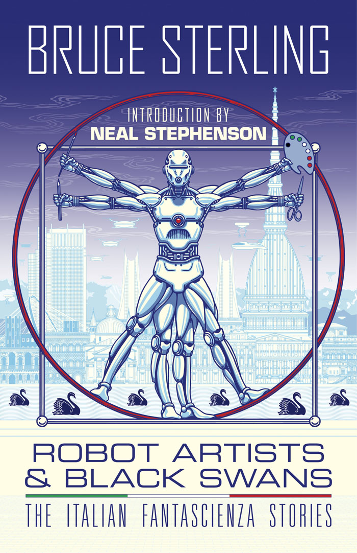
Bruce Sterling talking to Paul Semel about his collection of fantascienza stories, Robot Artists and Black Swans. My cover design was posted here last September; the book itself is published this week by Tachyon so I can at finally reveal the interior illustrations. Sterling’s collection presents seven stories written by his Italian alter-ego, Bruno Argento, with several of them appearing in English for the first time. The Italian theme informs the design as well as the content, although the associations aren’t always as obvious as they are in my illustrations for Sterling’s earlier fantascienza book for Tachyon, Pirate Utopia, the art and design for which adapted graphics by the Italian Futurists.

robotartists08.jpg

As I mentioned in the earlier post, while searching for more recent Italian graphics I came across the work of Franco Grignani (1908–1999), a designer whose most famous work was the Woolmark logo, one of those international symbols that most people will have seen even if few know who was responsible for its creation. The Woolmark’s black-and-white stripes are typical of Grignani’s designs, many of which work variations on the eye-jangling Op Art style pioneered by Bridget Riley. Grignani’s work seemed at first as though it might offer a suitable model for the cover design but it quickly became apparent that his style wasn’t suitable for this title so I went in another direction. Grignani’s influence is present inside the book, however, in the more abstracted illustrations, and in the parallel lines that provide a connecting thread between the stories and their illustrations. The Eurostile fonts used throughout the book also have an Italian flavour. They’re a little clichéd for science fiction but I liked the way they combined SF associations with more Italian design, being the work of Alessandro Butti and Aldo Novarese.

robotartists15.jpg

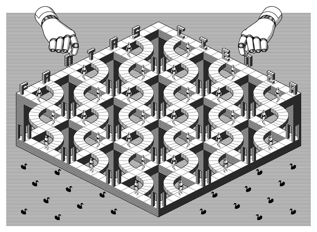
The other design influence, and a more identifiable source, is MC Escher, a choice prompted by the black swans in the title. Escher’s tessellated patterns feature a variety of animals, swans included, so I adapted two of the artist’s swan patterns to prevent the illustration from being robot-heavy. Escher also has an Italian side, as it happens; he enjoyed holidaying in Italy, and the vernacular architecture of the country’s small coastal towns may be found in many of his lithographs. The Escher swans led in turn to a self-indulgent illustration that fills two pages at the front of the book, something that came about after I was playing with Penrose triangles in Illustrator. I’d made a group of these impossible shapes into a construction which a little tweaking turned into a piece of equally impossible architecture, rather like those in the Escher-influenced mobile game, Monument Valley. All that was required to flesh things out was to cover the walls in a brick pattern then add a few swans and robots.

Continue reading “More Swans and Robots”

Solid Space: Jon Anderson’s cosmic voyage

olias1.jpg

Jon Anderson’s solo debut, Olias Of Sunhillow, is reissued this week in a double-disc set comprising a remastered CD plus an audio DVD. I’d been hoping for some time that this album might be given a proper reissue, it’s one I like a great deal but my old CD has never sounded as good as it ought to. The album may command cult status round here but you don’t see it mentioned anywhere outside Yes forums or partisan enclaves like the Prog Archives. This post may be taken as a small corrective to the neglect.

olias2.jpg

Olias Of Sunhillow was released in 1976, and was the most unusual of all the solo albums recorded by the individual members of Yes in the mid-70s, being a spin-off from some of the group’s early albums, or at least their cover art. Roger Dean’s first cover work for the group was on Fragile in 1971, for which he painted a miniature world rather like one of MC Escher’s planetoids. This was Dean’s idea, the band had suggested a broken piece of porcelain as the cover image. The back cover of the album showed the same planet in a state of fragmentation with a fish-like spaceship floating above it (see below). Another drawing of the fish-ship was added to the front cover before the album’s release, and it’s this ship, and the narrative it suggests, that leads eventually to Anderson’s solo album. Two years after Fragile, the planetary disintegration had turned into an exodus on the group’s triple-live album, Yessongs, the back cover of which shows pieces of planet being towed through space by a similar fish-ship. The other panels of the cover depict the arrival of these fragments on a newer, larger world. Anderson’s album takes this sequence of events then filters them through Vera Stanley Alder’s mysticism to craft a musical odyssey which Discogs describes as:

…the story of an alien race and their journey to a new world due to catastrophe. Olias, the title character, is the chosen architect of the glider Moorglade, which will be used to fly his people to their new home. Ranyart is the navigator for the glider, and Qoquaq is the leader who unites the four tribes of Sunhillow to partake in the exodus.

olias3.jpg

For many years in British music circles it would have been a grave error to even acknowledge this album’s existence, never mind admit to actually liking it. This was partly the old animus against progressive rock, an unexamined prejudice that lasted well into the 1990s, but Anderson’s album had so many strikes against it that it might have stood as the winner of a disapproval lottery for the more ideologically rigid writers and readers of the NME. It’s Jon Anderson (strike 1), the lead singer of progressive rock (2) group Yes (3), whose album is a science fiction (4)/ fantasy (5) concept (6), littered with Tolkien-like invented names and words (7), and with a multi-page sleeve embellished with detailed fantasy illustrations (8) by David Fairbrother-Roe. The design was art directed by Hipgnosis, who subsequently designed the next two Yes albums. Anderson originally wanted Roger Dean to create the packaging, which would have provided a further strike of disapproval against the album, but Dean’s career had gone into overdrive following the publication of Views so he either didn’t have the time or didn’t want to be involved. In Views Dean mentions “another project” based on the fish-ship’s journey which may be a reference to Anderson’s forthcoming album, the credits of which thank Dean for “planting the seed”.

views1.jpg

Roger Dean’s original artwork for Fragile (1971). Another fish-ship was added to the final cover art.

Continue reading “Solid Space: Jon Anderson’s cosmic voyage”

Weekend links 561

ghostbox.jpg

The next release on the Ghost Box label, Painting Box is a collaborative seven-inch single by Beautify Junkyards and Belbury Poly, the A-side of which is a cover of a song by The Incredible String Band. Available on 30th April. Design, as always, is by Julian House.

• “What is good for you as a person is often bad for you as a writer. People will tell you that this not true, and some of the people who will tell you that are also writers, but they are bad writers, at least when they try to convince you, and themselves, that the most important thing for a fiction writer to have is compassion.” Brock Clarke on the case for meanness in fiction.

• The week in non-human intelligence: “Life beyond human has to play by the rules of natural selection,” says David P. Barash, and Thomas Moynihan on dolphin intelligence and humanity’s cosmic future.

Ilia Rogatchevski speaks with historian Juliane Fürst about her new history of Soviet hippies and the counterculture of the former USSR.

• Mushroom with a view: Karen Schechner at Bookforum talks with Bett Williams about her mycological journey.

• Retro instinct versus future fetish: Fergal Kinney on Stereolab’s Emperor Tomato Ketchup 25 years on.

• At Dennis Cooper’s: Spotlight on…JG Ballard: The Atrocity Exhibition (1970).

This is Hexagon Sun: A feature-length video on Boards of Canada.

• Mix of the week: The Ides by The Ephemeral Man.

• New music: Gyropedie by Anne Guthrie.

Paintbox (1967) by Pink Floyd | Orgone Box (1989) by Haruomi Hosono | God Box (1996) by Paul Schütze & Andrew Hulme

Weekend links 559

fukuda.jpg

Cover art by Toshiyuki Fukuda for the Japanese edition of the new novel by Kazuo Ishiguro.

• “The story here is how between 1978 and 1982, this impulse shed its novelty genesis and its spoils were divvied up between gay producers making high-energy soundtracks for carnal abandon, and quiet Hawkwind fans smoking spliffs in Midlands bedrooms.…this excellent compilation offers fresh understandings of a period in sonic history where the future was up for grabs.” Fergal Kinney reviews Do You Have the Force? Jon Savage’s Alternate History of Electronic Music, 1978–82.

DJ Food continues his history of mini CDs with Oranges And Lemons, the 1989 album by XTC which was released in the usual formats together with a limited edition of three small discs in a flip-top box. The cover art by Dave Dragon is a good example of the resurrected groovy look.

• “If Austin Osman Spare, William Burroughs, Mary Butts and Kathy Acker got together for a séance, the transcript could well look like this.”

• How Leonora Carrington used Tarot to reach self-enlightenment: Gabriel Weisz Carrington on his mother’s quest for mythic revelations.

• Mixes of the week: Sounds Unsaid at Dublab with Tarotplane, and To Die & Live In San Veneficio by SeraphicManta.

• At Dennis Cooper’s: 5strings presents…Solve et Coagula: An introduction to Israel Regardie.

• The Joy of Silhouettes: Vyki Hendy chooses favourite shadow-throwing cover designs.

Emily Mortimer on how Lolita escaped obscenity laws and cancel culture.

Freddie deBoer has moved his writing to Substack.

• New music: Wirkung by Arovane.

• Children Of The Sun (1969) by The Misunderstood | Children Of The Sun (1971) by Hawkwind | Children Of The Sun (2010) by The Time And Space Machine

The groovy look

groovy14.jpg

Peter Max, 1968.

Artists complain justifiably about the constraining effect of labels but sometimes you really do need a label in order to identify a particular idiom. The artwork here is what most people would regard as psychedelic even though the subject matter isn’t always psychedelic at all. I doubt that Citroën intended their new Dyane car to be associated with LSD when they asked Michel Quarez to create a comic book to promote the vehicle, while Quarez’s Mod Love comic is just as hallucinogenically chaste. I tend to think of this style as “groovy”, an unsatisfying term with other associations but “post-psychedelic”, while accurate, feels too cumbersome for such playful graphics. The groovy look is where the purely psychedelic style enters the mundane world, and where the intended audience may be youthful but isn’t always a crowd of experienced lysergic voyagers; a watering down of psych delirium mixed with a dash of Pop Art, all bold shapes, heavy outlines and very bright colours, comic art (or actual comics) with the edges and detail smoothed away and the gain pushed to the maximum. I keep wishing someone would put together a collection of this stuff. There’s a lot more to be found.

Update 1: I knew I’d forgotten somebody. I replaced the book cover by Gray Morrow—an artist who was never really groovy in the manner of these other works—with a contraception poster by Nicole Claveloux, who was very much in the Groove Zone in the 1970s.

Update 2: Added designs by Miguel Calatayud, Mike Hinge, György Kemény, and Tito Topin. Thanks to Vadim for the tips!

• Further browsing: The Peculiar Manicule.

groovy01.jpg

Guy Peellaert, 1967.

groovy02.jpg

Guy Peellaert, 1968.

groovy03.jpg

Guy Peellaert, 1968.

groovy04.jpg

The Adventures of Jodelle by Pierre Barbier and Guy Peellaert, 1966.

Continue reading “The groovy look”