HR Giger’s Passagen

giger1.jpg

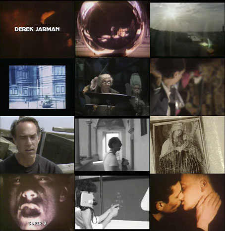
HR Giger’s art books were always very thorough in detailing all the media manifestations of the artist’s work, including film and television appearances. For years this presented tantalising questions, especially regarding the lengthy pre-Alien documentaries that were listed there: what were these films, and when would we get to see them? Giger’s Necronomicon (1976) did finally appear on YouTube a few years ago, and now here’s the second of the pair thanks to an upload of what appears to be a Japanese laserdisc.

giger2.jpg

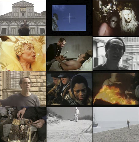
Passagen was made in 1972 by Giger’s friend Fredi M. Murer, their third film collaboration after Heimkiller and High (1967) and Swiss Made 2069 (1968). The latter (which Giger co-directed) is still frustratingly absent from the web, and similarly tantalising for being a 45-minute piece of underground science fiction which features Giger’s first production designs for cinema. Passagen was less ambitious, a 50-minute documentary about Giger’s work made for the German TV station, WDR. As a documentary it functions as a companion to Giger’s Necronomicon, while both films complement the subsequent art books, especially Giger’s Necronomicon (the book) which features many of the paintings seen in the films, together with anecdotes about their origins and inspiration. One of these anecdotes, about the nightmares induced in the young Hans Rudi by a stairway in the hotel next door to the Giger family home, is recounted in Passagen alongside the vertiginous drawings the nightmares inspired. It’s impossible to consider this piece of child psychology, and to watch the artist walking up and down stairs and stepladders, without recalling that Giger died after falling down a flight of stairs in 2014.

giger3.jpg

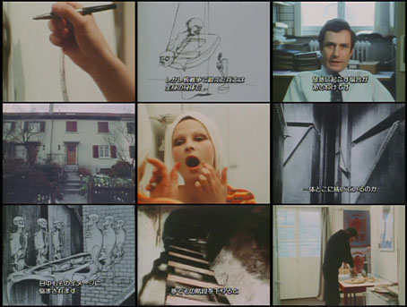
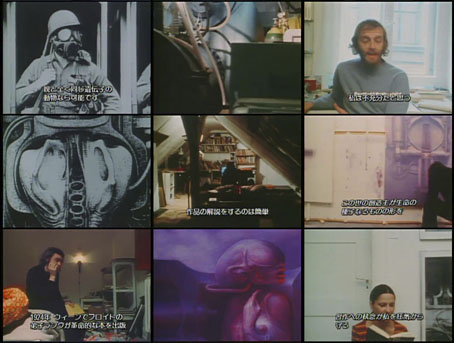
Giger’s Necronomicon is the more interesting of the two documentaries, especially now that the life and work is so well known; the art is taken more for granted, and we also get to see Giger at work on one of his big airbrush paintings. Passagen spends much of its time attempting to contextualise Giger’s drawings and paintings for an unwitting television audience, so a great deal of the running time is given over to newsreel footage of wars, riots, terrorism, atomic explosions and so on. A geneticist discusses the effects of atomic mutation while Giger’s earliest series of pictures, Atomkinder, is shown; psychoanalysts examine his paintings from a psychosexual angle.

Of more interest for Giger aficionados is the presence of his partner at the time, Li Tobler, the subject of several memorable portraits from this period. Among the working shots, the best shows Giger improvising a drawing with the same speed as Philippe Druillet in the Ô Sidarta film. Giger only started using an airbrush in 1972 so most of the works seen here are either early drawings or the paintings in the Passagen and Alptraum series, the style and colouring of which is much closer to the art world of 1972 than anything which would follow. For me the greatest revelation comes early on when Giger picks out a record to play while he’s working. The disc he chooses is just identifiable as Universal Consciousness by Alice Coltrane, an album which had been released the year before. (This isn’t the music heard on the soundtrack, however.) Alice Coltrane’s brand of ecstatic, pan-religious jazz would seem remote from Giger’s own universe but the choice isn’t so surprising if you know that he’d been a jazz enthusiast since the 1950s; in The Book of Alien (1979) his list of influences includes HP Lovecraft, John Coltrane and Miles Davis.

As is evident from the screen grabs, the film is hard-coded throughout with Japanese subtitles. Unlike Giger’s Necronomicon there’s no English overdub either, the soundtrack is in German throughout. I can’t complain when I’ve been waiting so long to be able to see this at all. For those who watched the later film divided into four YouTube clips there’s now a complete version (also Japanese but with English overdub) here.

Previously on { feuilleton }
Heimkiller and High
The Man Who Paints Monsters In The Night
Hans by Sibylle
HR Giger album covers
Giger’s Necronomicon
Dan O’Bannon, 1946–2009
Alejandro Jodorowsky’s Dune
The monstrous tome

Weekend links 402

hodgson.jpg

Cover art for the 1921 edition by W. Otway Cannell.

• “An exiled recluse, an ancient abode in the remote west of Ireland, nightly attacks by malevolent swine-things from a nearby pit, and cosmic vistas beyond time and space. The House on the Borderland has been praised by China Miéville, Terry Pratchett, and Clark Ashton Smith, while HP Lovecraft wrote, ‘Few can equal [Hodgson] in adumbrating the nearness of nameless forces and monstrous besieging entities through casual hints and significant details, or in conveying feelings of the spectral and abnormal.’

“‘Almost from the moment that you hear the title,’ observes Alan Moore, ‘you are infected by the novel’s weird charisma. Knock and enter at your own liability.’ The House on the Borderland remains one of Hodgson’s most celebrated works. This new edition features an introduction by Alan Moore, an afterword by Iain Sinclair, and illustrations by John Coulthart.” The long-gestating illustrated edition of William Hope Hodgson’s The House on the Borderland is now available for pre-order from Swan River Press. This is limited to 350 copies so I’d advise anyone interested to order as soon as they can; there’s been a lot of interest in the edition, and with the print run being a small one it’s liable to sell out quickly.

• “Art et Liberté was a movement that came into being in 1938 in Cairo. It was affiliated to Surrealism through contact with André Breton in Paris, and shared Surrealism’s spirit of rebellion and provocation, its desire for dream knowledge and penchant for manifestos.” Marina Warner on the neglected history of Egyptian Surrealism.

• Titan Comics follow their recent collection of Philippe Druillet’s first six Lone Sloane stories with Gail, a book which I don’t think has received an English translation until now.

• Mixes of the week: FACT mix 641 by Alva Noto, a mix by Chris Carter for Bleep/NTS, and Through A Landscape Of Mirrors Vol. I: Sweden by David Colohan.

• 200 years after the first publication of Frankenstein, the city of Bath is to unveil a plaque commemorating Mary Shelley‘s time spent there while writing the book.

• Southern Lord co-founder Gregg Anderson talks to Red Bull Radio about running a record label devoted to avant-garde metal.

• Twelve illustrated dust jackets from Martin Salisbury’s The Illustrated Dust Jacket: 1920–1970.

• At MetaFilter: Links to Hokusai’s drawing guides and similar books.

Canada Modern

Grief (1999) by Tactile | In The Cellar (2005) by Nostalgia | The House On The Borderland (2008) by Electric Wizard

Illustrating Frankenstein

holst.jpg

Frontispiece by Theodore Von Holst of the 1831 edition of Frankenstein. The monster in this illustration, which Mary Shelley would no doubt have seen, is closer to the description in the text than the myriad shambling figures that came later.

It’s a recurrent feature of commissioned work that you sometimes find yourself illustrating novels or stories you might otherwise have never attempted. Spanish publisher Editorial Alma have just added a new edition of Mary Shelley’s Frankenstein to their series of illustrated classics, convenient timing with this year being the bicentenary of the book’s first publication. Last year I produced 33 illustrations for Alma’s collection of Poe stories, as well as 3 new illustrations for a small Lovecraft collection. For their edition of Frankenstein I’ve created 24 full-page pictures, one for each chapter. (I produced 25 in total, 24 for the chapters and one for the letters at the front, but the Spanish translation is arranged slightly differently so one of the drawings has been omitted.) In the past I’ve given little consideration to illustrating classic books, preferring to look for subjects which were less familiar. Frankenstein is a book that isn’t illustrated as much as some but Lynd Ward in 1934, and Berni Wrightson in 1977/78 both produced sufficiently exceptional sets of drawings for me to regard the novel as almost unassailable. Until last year, that is.

ward1.jpg

Frankenstein by Lynd Ward (1934).

Despite such formidable predecessors, I felt that with this book at least I might be able to offer something new using the blend of collage and drawing that I’ve been evolving recently. There was additional promise in that the story as it’s written is less familiar than the Poe stories, and much less familiar than its fellow horror classic, Dracula. People think they know Frankenstein but what they often know is the manglings the novel has received in various film and TV adaptations. The Ward and Wrightson illustrations stay close to the text, the latter being replete with period detail, and rendered in a style reminiscent of 19th-century wood engravings. Wrightson even copied two of Gustave Dore’s pictures from The Rime of the Ancient Mariner for the opening scenes on the ship, one of which went unused. But Wrightson’s drawings are closer still to Franklin Booth‘s pen-and-ink style which was also derived from wood engraving yet which achieves its effects in a different manner to the engraving process.

frankenstein2.jpg

Frankenstein by Berni Wrightson (1977/78).

Even when artists follow the text of Frankenstein more closely than the screenplay adapters, personal tastes can’t help manifest themselves. So Ward’s drawings reflect the angular and stylised compositions of his “novels in woodcuts”, while Wrightson’s work still shows evidence of his earlier career as a comic artist. With my illustrations I wanted to reflect the artistic spirit that gave birth to the novel, namely Romanticism. Frankenstein is very much a Romantic tragedy with violent passions set against the overwhelming landscapes of the Swiss Alps, the Rhine valley and the Arctic seas. Three of the illustrations below allude to Caspar David Friedrich’s paintings, while many of the others have had their mundane cloudscapes exchanged for gloom and tumult.

I’ve said before that one of the things I enjoy about the collage technique is being able to use engravings and other graphics from the same period (give or take a few decades) as the story itself. The disadvantage of relying on pre-existing sources is that you’re always limited by the available material, so recently I’ve been pushing the technique further to achieve a hybrid style, something midway between the Ernst/Sätty engraving-collage technique and the very laborious, heavily-shaded pen-and-ink style I used when I was drawing comics. The approach isn’t so different to the one I used in my Lovecraft comics many of whose backgrounds and other details were copied from photographs. The difference is that where I used to spend several days working on a single panel (and two weeks working on a page) I can now create an entire picture in half the time. In these new illustrations I feel the hybrid style is working as I intended, allowing me greater freedom to create the picture I have in mind rather than a picture dictated by the source material. Without incorporating original figures and other drawn elements into the compositions it would have been difficult to illustrate a story with the same characters in so many scenes, a problem I encountered when I was illustrating Lewis Carroll’s Alice books and ran out of pictures of Victorian girls.

The full run of pictures follows below, including the one which was omitted from the print edition. All may be seen at a larger size here. Since the scenes aren’t always self-explanatory I’ve included fragments of text from each chapter.

frankenstein00.jpg

“In the morning, however, as soon as it was light, I went upon deck and found all the sailors busy on one side of the vessel, apparently talking to someone in the sea. It was, in fact, a sledge, like that we had seen before, which had drifted towards us in the night on a large fragment of ice.”

frankenstein01.jpg

“During one of their walks a poor cot in the foldings of a vale attracted their notice as being singularly disconsolate, while the number of half-clothed children gathered about it spoke of penury in its worst shape.”

This one was omitted from the Alma edition. No loss, really, since the scene doesn’t add much to the story.

frankenstein02.jpg

“When I returned home my first care was to procure the whole works of this author, and afterwards of Paracelsus and Albertus Magnus. I read and studied the wild fancies of these writers with delight; they appeared to me treasures known to few besides myself.”

The diagrams here are taken from some of the books the young Victor Frankenstein is reading. There’s an allusion to this in the magic square on the wall in the back of Theodore Von Holst’s frontispiece, the square being the kind of thing seen in books like this one by Cornelius Agrippa, one of the occult philosophers mentioned in the novel.

Continue reading “Illustrating Frankenstein”

Weekend links 401

time.jpg

TIME, June 21st 1968. Cover by Roy Lichtenstein.

• “Forget the democratic processes, the judicial system and the talent for organization that have long been the distinctive marks of the US. Forget, too, the affluence (vast, if still not general enough) and the fundamental respect for law by most Americans. Remember, instead, the Gun. That is how much of the world beyond its borders feels about the US today. All too widely, the country is regarded as a blood-drenched, continent-wide shooting range where toddlers blast off with real rifles, housewives pack pearl-handled revolvers, and political assassins stalk their victims at will.” The TIME magazine feature with the famous Roy Lichtenstein cover (prompted by the assassination of Robert Kennedy) will be fifty years old in June.

• “Where do we feel at home? What do our cities look like? How do we see? In 1908, architect and theorist August Endell set out to answer these deceptively simple questions.” Endell’s The Beauty of the Metropolis is coming from Rixdorf Editions in May.

Beardsley 120: The Death of Pierrot is a series of events in Aubrey Beardsley’s birthplace, Brighton, taking place throughout the month of March.

Like the Bloomsbury Group and the Beats, the Surrealists could be incestuous, choosing lovers from inside the circle and often remaining close to their exes. When [Max] Ernst and [Leonora] Carrington reached Paris, he introduced her to Leonor Fini, his friend and former lover. Tall, dazzling, and bejeweled, Fini cultivated a baroque theatricality; every day with her was a masked ball. Recognizing Carrington as “a revolutionary,” she claimed her as an astrological twin—a feat possible only because Fini lied about her age. “This chronological charade, combined with later cosmetic surgeries, sustained the image of youth and beauty that remained vital to Leonor’s self-image, the sexuality and her sense of her place in the world,” writes Chadwick:

Imperious and mercurial, she was also generous, loving and happy to share her rich intellectual life with the younger woman she considered her double. Like Leonora, she believed that cats possessed highly developed psychic powers, that horses had mythological powers that identified them with the feminine, and that painting was an alchemical process.

Regina Marler reviewing three new books about Leonora Carrington and the women artists of the Surrealist movement

As Serious As Your Life: Black Music and the Free Jazz Revolution, 1957–1977 by Val Wilmer receives a welcome republication next month.

• At Dangerous Minds: Occultism, cinema and architecture: How a ouija board built the Bradbury Building.

• When Books Read You, a Defence of Bibliomancy by Ed Simon.

• Ä Brïëf Hïstöry Öf Mëtäl Umläüts by Mike Rampton.

Joey Zone Illustration – Art from The joey Zone.

• At Dennis Cooper’s: Brad Dourif Day.

Alva Noto‘s favourite albums.

Eddie Campbell, Dammit!

• Metropolis (1978) by Edgar Froese | Metropolis (1979) by Motörhead | Under The Gun (Metropolis Mix) (1993) by The Sisters Of Mercy

Derek Jarman: Know What I Mean…

dj1.jpg

The recent news from the BFI about their forthcoming collections of Derek Jarman films sent me to YouTube once more in search of a documentary I’d been hoping to see again. Derek Jarman: Know What I Mean… is the film in question, and was posted a few months ago by director Laurens Postma on his own YouTube channel. Postma produced a number of arts features for Channel 4 (UK) in the 1980s, one of which, Six Into One: The Prisoner File, a documentary about the making of Patrick McGoohan’s The Prisoner, has been mentioned here already. The Jarman film was made in 1988, and I think was the first lengthy television examination of Jarman’s career. It’s still one of the best since the later documentaries tended to be either shortish interview sessions or posthumous works such as Derek (2008) by Isaac Julien and Bernard Rose.

dj2.jpg

Postma’s film captured Jarman shortly after he’d moved to his cottage at Dungeness, a relocation that was a kind of semi-retirement even though his films were becoming more visible as a result of funding and screening from Channel 4. This was also the period when he was becoming more vocally political thanks to what seemed at the time to be the unending reign of the iniquitous Margaret Thatcher. The Tories of the day had recently announced the now-infamous Section 28 of the 1988 Local Government Act (discussed in the film as both Clause 28 and—confusingly—Clause 29, the labels by which the amendment was first known), a ruling that forbid councils from promoting homosexuality, especially in schools. The late 80s saw the peaking of anti-gay bigotry in Britain, a reaction against the growing freedoms of the 1970s and, inevitably, the menace of AIDS which was still being regarded as “the gay plague”. Jarman had recently been diagnosed as HIV+, something he discusses here with typical good cheer although the conversation is generally more about art than his health, and about the way his own works were always related to gay sexuality. Jarman was one of many gay artists who welcomed their sexual identity as fixing them in the position of outsiders, and it’s notable how many of his films are concerned with outsider figures. When discussing The Tempest (1979) he compares Prospero’s island to gay sexuality, an uncharted enclave and a home to outcasts where different rules apply. This was still a common view among gay men and lesbians in the 1980s—Jarman’s friends in Coil used to say similar things in their interviews—and very different from today’s drive towards conformity and social assimilation. Postma’s film ends with Jarman on the beach at Dungeness, the perfect zone for a lifelong outsider, midway between the land and the sea.

(Note: the Winston Churchill referred to in the film is the grandson of the famous Prime Minister. Winston Churchill Jr. was an MP in the Thatcher government who tried to bring in a bill banning the public exhibition of “explicit homosexual acts” following Channel 4’s TV broadcast of Jarman’s Sebastiane.)

Previously on { feuilleton }
David Tibet meets Derek Jarman
Shooting the Hunter: a tribute to Derek Jarman
Derek Jarman’s landscapes
Derek Jarman album covers
Ostia, a film by Julian Cole
Derek Jarman In The Key Of Blue
The Dream Machine
Jarman (all this maddening beauty)
Sebastiane by Derek Jarman
A Journey to Avebury by Derek Jarman
Derek Jarman’s music videos
Derek Jarman’s Neutron
Mister Jarman, Mister Moore and Doctor Dee
The Tempest illustrated
In the Shadow of the Sun by Derek Jarman
Derek Jarman at the Serpentine
The Angelic Conversation
The life and work of Derek Jarman