Art by Drew Struzan.
One of my current commissions is a piece of art for a book based on John Carpenter’s The Thing, due to be published next year. This was a request I agreed to immediately, having been astonished by the film when it appeared in 1982 (I saw it three times), and having rated it ever since as Carpenter’s best, as well as one of my all-time favourite horror films. I haven’t started on the planned piece just yet but the commission encouraged me to upgrade my DVD copy of the film to the Blu-ray version, and to also read for the first time John W. Campbell’s “Who Goes There?”, the short story that was the origin of both Carpenter’s film and The Thing From Another World (1951) directed by Christian Nyby. Reading the story set me hunting around for other interpretations of Campbell’s alien.
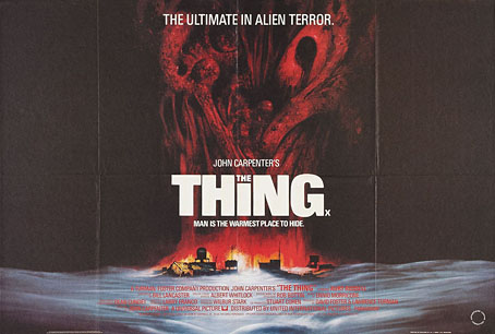
UK poster. Art by Les Edwards.
The story was instructive in several ways, the first being how closely Bill Lancaster’s script for the Carpenter film follows the story’s outline. The paperback collection I was reading has an introduction by James Blish which complains about the Howard Hawks/Christian Nyby production turning the polymorphous alien into another clone of Frankenstein’s monster. That’s true but the Nyby film still scared me to death when I first saw it aged 11 or so, and it has its merits. Lancaster not only stayed closer to the original shape-shifting premise but also kept many of the character names, plus details such as the blood test and the Thing’s attempt at the end to build a machine to escape from the encampment. The unforgettable opening, however, with the lone helicopter pursuing the dog, is all Lancaster’s.
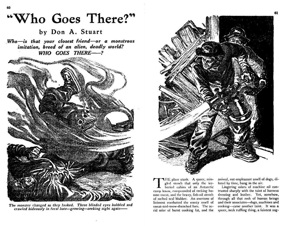
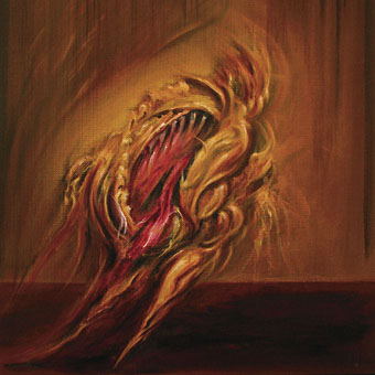
Astounding Science-Fiction, August 1938; artist unknown. “Don A. Stuart” was a pseudonym for John W. Campbell, at that time the newly appointed editor of Astounding. Campbell’s editorship changed the name of the magazine from Astounding Stories to Astounding Science-Fiction.
It was face up there on the plain, greasy planks of the table. The broken haft of the bronze ice-axe was still buried in the queer skull. Three mad, hate-filled eyes blazed up with a living fire, bright as fresh-spilled blood, from a face ringed with a writhing, loathsome nest of worms, blue, mobile worms that crawled where hair should grow—
Campbell’s description of the ice-bound alien is better than some of his writing elsewhere. I’m used to tempering my judgement when visiting stories written for the pulps but Campbell’s writing is really awful, and a reminder of why I never got very far with the early SF writers. Weird Tales magazine had its share of ham-fisted journeymen (and women), but Campbell’s contemporaries such as Clark Ashton Smith and HP Lovecraft read like the most finessed and mandarin prose stylists in comparison. Well, The Thing isn’t the first great film to be based on a poor-quality story so we can at least thank Campbell for his scenario, although how much of it was his own has never been clear. The idea of ancient aliens in Antarctica (some of which are amorphous shape-shifters) had already been explored by HP Lovecraft in At the Mountains of Madness; Lovecraft’s story was published in 1936 by Astounding Stories, the same magazine that published “Who Goes There?” two years later. This lineage, and the possible influence, makes The Thing one of the foremost Lovecraftian films even without all of its tentacled abominations.
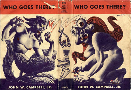
Art by Hannes Bok.
The story provided the title of Campbell’s debut collection of short fiction in 1948. I’ve known the Hannes Bok cover art for many years but hadn’t realised until recently that the three-eyed monster on the front was a Bokian rendering of Campbell’s alien. The figure on the back is presumably a human/husky hybrid, while I’d guess the robot relates to one of the author’s other stories.