I was intending to post a new book cover this week but I’m up against another deadline—the last pressing one of this half of the year—so good intentions have been felled by the urgent need to keep drawing. In place of the cover design, here’s a taster of some of the work of the past few months which will be seen shortly in another volume from Editorial Alma. All being well, the postponed cover should appear next week. I also have planned a post I’m looking forward to putting together about a series of horror covers from the 1970s. As always, watch this space.
Category: {work}
Work
Illustrating Dracula

Cover art by Edgar Alfred Holloway for the Rider edition of Bram Stoker’s novel, an edition reprinted many times during the early 20th century. Holloway’s Count is shown as Stoker describes him in the early chapters of the book, white-haired and bearded.
Last year I illustrated a number of stories by Edgar Allan Poe, and the entirety of Mary Shelley’s Frankenstein for Spanish publisher Editorial Alma. Earlier this year I was illustrating Dracula for the same publisher; now the book is in print I can show the results here. This was another difficult task since I had a few weeks to illustrate all 27 chapters of the novel while trying to do something new (or at least slightly different) with a very familiar story.
As with Frankenstein, I opted for fidelity to the text and period details. Despite its epistolary form, Dracula is much more readable (in a contemporary sense) than Frankenstein, so more people will have read Stoker than Shelley; but the sheer scale of cultural mauling that Dracula has been subject to means that—as with Frankenstein—even the allegedly faithful adaptations often deviate from the novel. The lounge-lizard vampire that everyone knows was a creation of Hamilton Deane’s 1924 stage adaptation, the success of which led to Tod Browning’s film and Bela Lugosi’s performance (which I’ve never liked); film and theatre may have made Dracula universally popular but the Lugosi stereotype has overshadowed the more powerful and violent character that Stoker gives us, with his bearded face, hairy palms and glowing eyes. So that’s who you see here, although the restrictions of time and brief (one picture per chapter) meant that some of the moments I’d have liked to illustrate had to be forfeit. Poor old Renfield gets short shrift, and some of the minor male characters are out of the picture altogether.

On the plus side (I hope), many of the background details are well-researched even if they’re not at all obvious. The castle in the first picture (above) is Bran Castle, known today as “Dracula’s Castle” even though the building in the novel is Stoker’s invention; it certainly looks the part. As before, the full run of pictures follows below. All may be seen at a larger size here.


Daughters of Forgotten Light by Sean Grigsby
I’ve spent most of the year so far working on more black-and-white illustrations for Editorial Alma—47 full-page pieces to date—so this cover design made a welcome break, especially since all the black-and-white art has a late-Victorian setting. More about that later. Sean Grigsby’s second novel for Angry Robot Books is previewed at the Barnes & Noble SF blog as follows:
A floating prison is home to Earth’s unwanted people, where they are forgotten…but not yet dead, in this wild science fiction adventure.
Deep space penal colony Oubliette, population: scum. Lena “Horror” Horowitz leads the Daughters of Forgotten Light, one of three vicious gangs fighting for survival on Oubliette. Their fragile truce is shaken when a new shipment arrives from Earth carrying a fresh batch of prisoners and supplies to squabble over. But the delivery includes two new surprises: a drone, and a baby. Earth Senator Linda Dolfuse wants evidence of the bloodthirsty gangs to justify the government finally eradicating the wasters dumped on Oubliette. There’s only one problem: the baby in the drone’s video may be hers.
The gangs are biker gangs, riding machines with wheels of light, so the brief was for a design as much reminiscent of a rock poster as a science-fiction cover. I don’t stray very often into the SF world so this again made a refreshing break from the 19th century and its heavy furnishings. There’s a touch of Syd Mead in the background, a reference suggested by the Tron-style bikes, but he’s long been a favourite visual futurist of mine even before Blade Runner (as I noted recently). The side panels and parts of the halo are adapted from Art Deco designs, the panels being based on embellishments for a New York skyscraper. It doesn’t take much to push the aerodynamic qualities of Deco style into the Space Age (the Soviet Monument to the Conquerors of Space could have been designed in 1930), a suggestion that William Gibson explored from a different angle in The Gernsback Continuum.
The Barnes & Noble post linked above also has an extract from the beginning of the novel. The book itself will be out on 4th September, 2018.
Weekend links 410

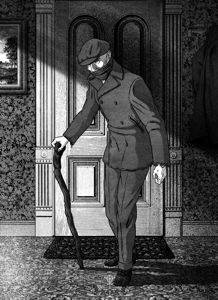
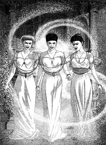
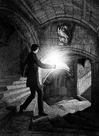
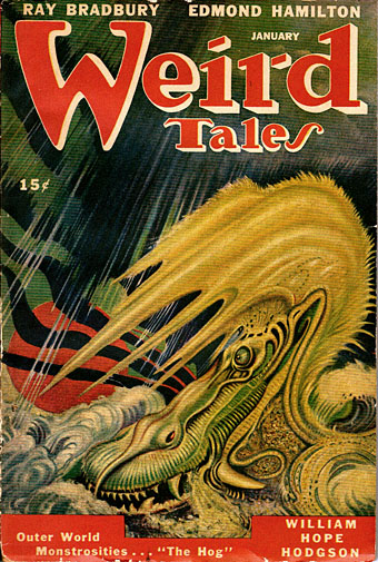
William Hope Hodgson’s final Carnacki mystery, The Hog, received its first magazine publication in January 1947. The cover art by AR Tilburne may not have been originally created for Hodgson’s tale but it complements the story’s atmosphere of febrile dread.
• It’s still April so that means it’s still the month that saw the 100th anniversary of the death of William Hope Hodgson, bodybuilder, manacler of Harry Houdini, and the author of several novels of weird fiction that continue to entrance new generations of readers. The edition of Hodgson’s The House on the Borderland that I illustrated for Swan River Press would have been on sale this month but print problems have caused delays with the run as a whole; anyone interested is advised to contact the publisher for news. • Meanwhile, Jon Mueller (composer of the book’s accompanying soundtrack CD) and myself talked to Swan River Press about the attractions of Hodgson’s novel. • More Hodgsoniana: Greydogtales acknowledged the Hodgson centenary via a discussion with Hodgson scholar Sam Gafford, while Michael Dirda reviewed the new edition of The House on the Borderland and another SRP title, The Scarlet Soul (whose cover I also designed), for The Washington Post.
• “From the ashes of countless decayed Modernities comes Neo-Decadence, a profaned cathedral whose broken stained glass windows still glitter irregularly in the harsh light of a Symbolist sun. Behind this marvellously vandalised edifice, a motley band of revellers picnic in the graveyard of the Real, leaving behind all manner of rotting delicacies and toxic baubles in their wake.” Drowning in Beauty: The Neo-Decadent Anthology edited by Daniel Corrick & Justin Isis is published this month by Snuggly Books, an imprint whose catalogue of new books and first-time translations will be of interest to anyone who comes here for Decadence, Symbolism or anything related. Related to the above: A Neo-Decadence Day at Dennis Cooper’s.
• “Witches are change-makers. They’re transgressive beings who dwell on the fringes of society, and so they’re the perfect icon for rebels, outsiders, and rabble-rousers, especially those of the female persuasion.” Pam Grossman talks to Grimoire about witchcraft and related arts.
• Mixes of the week: Resident Advisor Podcast 621 by Grouper, and Bacchus Beltane 5: The Owl Service by The Ephemeral Man.
• Back in black: Publisher/translator James Conway and designer Cara Schwartz on the cover designs of Rixdorf Editions.
• I was talking again this week at The Writer’s Corner where JKA Short asked me about working as an illustrator.
• All Gates Open: The Story of Can by Rob Young is published next week. The Wire has an extract.
• Delusional Albion: Brad Stevens on how foreign directors saw Britain in the Swinging Sixties.
• “There’s no book I love more than Derek Jarman’s Modern Nature,” says Olivia Laing.
• Eden Tizard on Soliloquy For Lilith, the drone album by Nurse With Wound.
• Owls (1969) by Ruth White | Decadent & Symmetrical (1995) by ELpH vs Coil | The Owls (2013) by Félicia Atkinson
The man who wasn’t Tesla

Searching through old emails last week reminded me that a couple of years ago I’d supplied some art for use in a steampunk-themed bar in Gran Canaria. I would have mentioned this before now but, as is often the way with freelance commissions, once the negotiations were over I dispatched the art then heard nothing more about the project.

A search for the bar this week revealed a number of things: the place in question is the Tesla Steampunk Bar in Las Palmas de Gran Canaria; the artwork did indeed get used to prominent effect, with the main elements of my picture being positioned behind the bar itself; and it wasn’t immediately obvious whether the place was still open. Subsequent searching (and some Google translating of the bar’s Facebook page) further revealed that the bar has been closed but is in the process of relaunching itself.

As to the artwork, this was adapted from the second version of a design I produced for Jeff VanderMeer in 2008 to illustrate a semi-serious steampunk slogan of Jeff’s devising. Ten years ago steampunk was still a very minor subgenre, and one with few visual signifiers. I quickly hacked together a piece using imagery taken from the Dover Pictorial Archive series, a collection of books which are useful but whose engraved illustrations have since been plundered endlessly for this type of work.
When I’m collaging things today I try and avoid using too much from the Dover books so I’ve been pained that this particular design, especially the goggle-wearing head, has proved so popular. Even when people haven’t asked to use the head itself I’ve been asked to do something similar, as was the case with the Aether Cola can I designed in 2012. The Tesla people used a stripped-down version of the colour design which I scaled to very large size. They also have a picture of the flying man on their wall but I’ve not found any good photos of him.
The original head, meanwhile, was used again last year in a new design for yet another business. Dr Pieper is a steampunk-themed chip shop (yes, really) in Amsterdam, a place with very nice antique decor by the looks of their Instagram page. My variant designs may be seen in the window and in their advertising graphics.
The head itself was found in Men, one of several collections of engraved illustrations edited for Dover Publications by Jim Harter. Some of Harter’s other books identify the pictures but not this one, so the identity of the portrait was unknown until, in my attempts to avoid the Dover books, I found a picture of Joseph Edgar Boehm in Hill’s Album of Biography and Art (1882). Boehm was a sculptor of a rather staid and respectable kind, being commissioned for royal portraiture among other things. I can’t imagine he’d be thrilled to find his posthumous image looking down on a drinking house and a chip shop, but sculptors often seem to be more easily forgotten than painters so he’s doing better than many of his contemporaries.

And while on the subject of steampunk, I ought to note that there’s a steampunk convention taking place in Morecambe at the beginning of June. I won’t be in attendance (they did ask) but I said I’d mention the event here.
Previously on { feuilleton }
• The George Dower Trilogy by KW Jeter
• Steampunk in the Tank
• More vapour trails
• Steampunk catalogued
• Steampunk: The Art of Victorian Futurism
• Steampunk Calendar
• Words and pictures
• Nathanial Krill at the Time Node
• Fiendish Schemes
• Ghosts in Gaslight, Monsters in Steam
• Steampunk Revolution
• The Bookman Histories
• Aether Cola
• Crafting steampunk illustrations
• SteamPunk Magazine
• Morlocks, airships and curious cabinets
• The Steampunk Bible
• Steampunk Reloaded
• Steampunk overloaded!
• More Steampunk and the Crawling Chaos
• Steampunk Redux
• Steampunk framed
• Steampunk Horror Shortcuts


