Posterized

cramps.jpg

Band portraits by Kris Guidio from his original fanzine illustrations. Cramps DVD shown for scale.

I was asked recently if it was possible to have a poster made of one of the insert pages from the Cramps DVD I designed for Savoy a few years ago. This is the result, a 50.8 cm x 76.2 cm (20 x 30 inches) C-type Fuji print on heavy paper with a gloss finish. I’ve done this in part as a tentative move towards making signed prints available of my other artwork, something I mentioned when writing earlier about the website redesign. I’ve found print-on-demand services like CafePress to be increasingly unsatisfactory, and they were never very useful for poster art since their sizes are limited and they lack the options that a dedicated printer can offer.

This poster is exactly the kind of quality I was hoping for, so the next step will be to add a page to my site so that prints may be ordered via the site itself rather than emailing me with a query. In the meantime, if anyone does want a quality print made from one of my pictures or designs, get in touch.

Previously on { feuilleton }
• The Cramps at the Haçienda

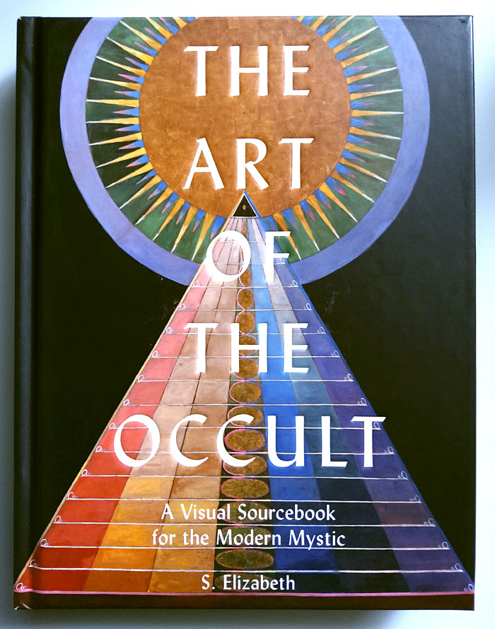
The Art of the Occult

occult1.jpg

Cover art: Group X, No. 1, Altarpiece (1915) by Hilma af Klint. Design by Paileen Currie.

A surprise arrival in today’s post, the occult art compendium by S. Elizabeth which I would have wanted to read even if it didn’t contain one of my pictures:

From theosophy and kabbalah, to the zodiac and alchemy; spiritualism and ceremonial magic, to the elements and sacred geometry – The Art of the Occult introduces major occult themes and showcases the artists who have been influenced and led by them. Discover the symbolic and mythical images of the Pre-Raphaelites; the automatic drawing of Hilma af Klint and Madge Gill; Leonora Carrington’s surrealist interpretation of myth, alchemy and kabbalah; and much more.

Most of the books I’ve seen on this subject have either been very general and in need of an update (Thames and Hudson’s venerable Magic: The Western Tradition) or exhibition catalogues which are never comprehensive and become increasingly hard to find since they don’t get reprinted. The Art of the Occult is an ideal introduction to the subject for the curious reader, as well as being a useful overview for the aficionado (or initiate) which spans several hundred years of art and illustration, from the earliest occult manuscripts to contemporary works. Occult art is a house with many mansions, a form which can encompass photo-realism, Symbolism, Surrealism or total abstraction without the definition breaking down. The Art of the Occult contains a satisfyingly wide range of examples, 200 in all, and includes many artists whose work I hadn’t seen before. It also reinforces the origin of abstract art in occult concerns, a lineage that went unmentioned for many years by critics who couldn’t accept that their beloved “pure” idiom was tainted by mysticism.

occult2.jpg

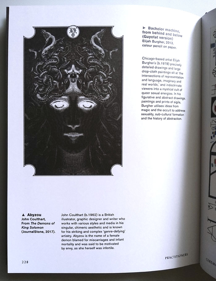
My piece is a portrait of the serpent-haired Abyzou, one of the Solomonic demons I depicted for The Demons of King Solomon in 2017. The picture was one of the better representations in a series I would have preferred to have more time to work on. I was pleased to see my contribution facing one of Elijah Burgher’s sigil drawings; I like Burgher’s art so he makes a good companion. This is the first and maybe the only book where my name is listed in an index between Pamela Colman Smith and Aleister Crowley.

The Art of the Occult will be published by White Lion Publishing on 13th of October, just in time for the annual spook-fest.

Update: Haute Macabre has a new post by S. Elizabeth showing more pages from the book’s interior plus the opportunity to win a copy.

Previously on { feuilleton }
• Calendrier Magique
• The Demons of King Solomon
• Typefaces of the occult revival
• The art of Frieda Harris, 1877–1962
• The art of Fay Pomerance, 1912–2001
• Songs for the Witch Woman
• Wilfried Sätty: Artist of the occult
• The art of Scott Treleaven

Litany of Dreams

litany.jpg

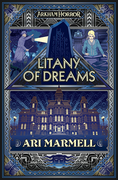
One of the covers I was working on during the summer months was revealed this week so here it is. Litany of Dreams by Ari Marmell is another title from games-related imprint Aconyte, and a further addition to their Lovecraft-related Arkham Horror series of games and novels:

The mysterious disappearance of a gifted student at Miskatonic University spurs his troubled roommate, Elliott Raslo, into an investigation of his own. But Elliott already struggles against the maddening allure of a ceaseless chant that only he can hear… When Elliott’s search converges with that of a Greenland Inuk’s hunt for a stolen relic, they are left with yet more questions. Could there be a connection between Elliott’s litany and the broken stone stele covered in antediluvian writings that had obsessed his friend? Learning the answers will draw them into the heart of a devilish plot to rebirth an ancient horror.

The new cover follows the form of The Last Ritual with an Art Deco style and a similar arrangement of triangular panels with an architectural focus. The building is Lovecraft’s Miskatonic University, and this is the first time I’ve attempted a proper depiction of the place. A couple of the panels in my unfinished adaptation of The Dunwich Horror showed Wilbur Whateley entering the university but the buildings there owed more to Manchester University’s Gothic facades with a pair of gateposts borrowed from Brown University in Providence. The building here is a better match, a typical Ivy League structure with added spikes. The latter are an unusual feature given the generally conservative appearance of these places but still a long way from the eccentricities of Gavin Stamp’s depictions in the George Hay Necronomicon. The faces in the corners of the cover design are based on tupilak figures carved from antlers or whale teeth by the Inuit of Greenland, figures which feature in the story.

Litany of Dreams will be published on April 6, 2021.

Elsewhere on { feuilleton }
• The Lovecraft archive

Previously on { feuilleton }
• The Last Ritual

The hundred-year Voyage

arcturus1.jpg

Today’s post at Wormwoodiana reminds me that David Lindsay’s unique novel of philosophical fantasy, A Voyage to Arcturus, was published a hundred years ago today. I designed a lavish reprint for Savoy Books in 2002, an edition which unfortunately used the re-edited text from earlier reprints instead of going to the original publication. This wasn’t done for lack of a first edition, it was more out of ignorance—nobody bothered to look into the history of the text—as well as convenience; Savoy’s earlier reprinting of Anthony Skene’s Monsieur Zenith the Albino had involved many weeks of text preparation, scanning pages from a photocopy of Skene’s very scarce novel, then running the copy through rudimentary OCR software and proofing the result. In Savoy’s slight defence, the reprint of Arcturus did correct a couple of typos that everyone else had missed.

arcturus2.jpg

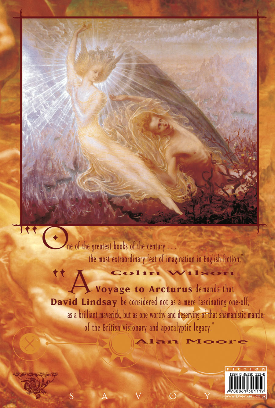
I still think the best feature of my design was the selection of Jean Delville’s remarkable Symbolist painting, The Treasures of Satan (1895), a picture used with the permission of the Brussels Museum of Fine Art. (They supplied us with a print of the painting together with a photo of Delville’s Angel of Splendour (1894) for the back cover.) With the exception of Bob Pepper’s artwork for the 1968 Ballantine paperback, previous reprints of the novel seldom reflected the contents on their covers. I’m no longer happy with the type layout on the rest of the dust-jacket, however, although the front cover looks okay. The Savoy edition included an introduction by Alan Moore, an afterword by Colin Wilson, a collection of philosophical aphorisms by David Lindsay, plus a couple of photos of the author which I don’t think had been published before. Despite its flaws, the book was well-received. The paper was heavier stock than is generally used for hardback fiction which made for a heavy and expensive volume but the edition still sold out.

Penguin are reprinting the novel next year in an edition which continues the tradition of unsuitable cover art. According to Lindsay site The Violet Apple the figure on the cover is from an illustration for a Dostoevsky novella, so what is it doing on Lindsay’s book? Cover art aside, the novel is in a class of its own, and very highly recommended.

Previously on { feuilleton}
• The art of Bob Pepper
• Masonic fonts and the designer’s dark materials

Robot Artists and Black Swans

robotartists.jpg

Four years ago I designed and illustrated a book for Tachyon written by Bruce Sterling, Pirate Utopia. Robot Artists and Black Swans is a kind of sequel, being the work of the same author for the same publisher, and with a similar geographical focus on southern Europe. The new book differs from the earlier one by being a collection of stories rather than a single piece, many of which are set in or near the city of Turin where Sterling and his wife, Jasmina Tesanovic, spend much of their time. Sterling has been living in Europe for many years, long enough to have cultivated an alter-ego, Bruno Argento, an Italian science-fiction writer who is offered as the real author of the stories in Robot Artists and Black Swans.

Pirate Utopia was an easy book to design because of the Futurist theme which I illustrated by adapting graphics by artist and designer Fortunato Depero. For the cover of the new volume I considered trying something similar with another Italian artist/designer, Franco Grignani (1980–1999). In addition to having studied in Turin, Grignani was commissioned by David Pelham to create cover art for a handful of Penguin science fiction titles in the late 1960s. Much of Grignani’s artwork is heavily indebted to the Op Art style popularised by Bridget Riley and Victor Vasarely, especially the early Riley formula of dazzling arrangements of parallel lines, a formula he made his own after Riley’s work evolved in other directions. Despite these favourable qualities, Grignani’s art proved too abstract for my purposes, and for Tachyon’s who wanted something more illustrative, so I ended up co-opting a very different Italian artist/designer, Leonardo da Vinci. The figure of Da Vinci’s Vitruvian Man has been parodied and pastiched many times so this isn’t remotely original (I’ve also used the original drawing on a pastiche book cover I designed for the Lambshead Disease Guide), but making the figure a robot was a convenient way of combining the title with Italian history. One of the stories in the collection, Pilgrims of the Round World, concerns the inhabitants of Turin during the Renaissance years, and mentions Leonardo (or “the Vinci boy”) several times, so the figure does have some actual relevance beyond being recognisably Italian. The background is, of course, the city of Turin given a slightly futuristic tweak, although it’s more Turinesque than a match for the place itself.

As usual, I’ll save discussion of the book’s interior until after publication which will be in March, 2021. Watch this spacetime.

Previously on { feuilleton }
• Pirate Utopia by Bruce Sterling
• Futurismo!