Jodorowsky times three, or The box that never was

jodorowsky1.jpg

The first three feature films by Alejandro Jodorowsky—Fando y Lis, El Topo and The Holy Mountain—are released this week on Region B blu-ray by Arrow Video, but the box they’re packaged in won’t look like any of the designs shown here. It was almost three years ago that Arrow asked me to create something for this box set, but backstage wrangles meant the project moved out of my hands in the early stages. This was a great disappointment since Jodorowsky’s interests and aesthetics align with my own much more than many other directors whose work has been released by Arrow. And having written the notes for the Arrow release of Henri-Georges Clouzot’s The Mystery of Picasso, I was looking forward to working with the company again.

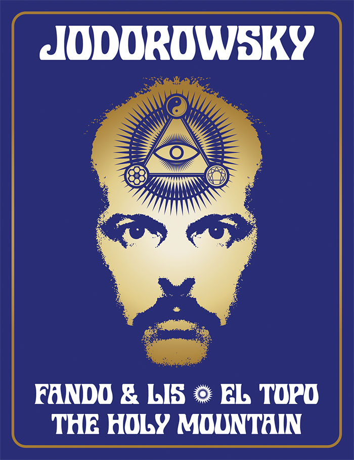
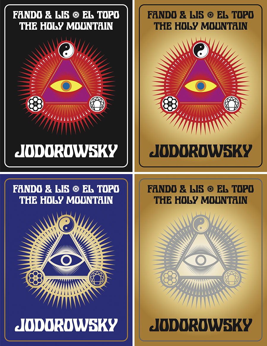
In preparation for the work I rewatched almost all of Jodorowsky’s films (I still haven’t seen Tusk or The Rainbow Thief), then drew up a detailed proposal with sketches, something I seldom do for commissions. Arrow releases all have double-sided inserts in the boxes that hold the discs, one side of which shows a poster design from the film’s original release, the other a new design. My idea for the new art was to connect the three films using Tarot-like iconography (the director is a Tarot scholar, among other things), with each film also being assigned a symbol of some kind. The Surrealist fable of Fando y Lis lacks any suitable graphics so for this I chose a yin and yang symbol to represent the film’s opposed-yet-connected brother and sister characters; El Topo was to be represented by a cross-section through a revolver chamber, while the seven characters from The Holy Mountain are represented by the enneagram that Jodorowsky himself wears in the film. All three symbols are connected by the eye-in-a-triangle from El Topo, a symbol that worked while a three-film box was being planned but which wouldn’t have worked for the final release which adds Jodorowsky’s most recent film, Psychomagic, A Healing Art. For the box design I suggested metallic inks (or foils) either as highlights or in other combinations. The font was a further suggestion, Roberta being one of the typefaces of the occult revival of the 1970s. The art for each film didn’t go further than the sketch stage although I was asked to work up the El Topo design into a final piece; I wasn’t very satisfied with the end result so it isn’t posted here. One problem with the extended negotiations was they were taking place at a time when I was extremely busy with other projects, including contracted illustration work for Editorial Alma. There was no contract for the Arrow commission so it had to take second place even though it was the work I most wanted to be concentrating on at the time. Collisions such as these are an occupational hazard when you’re working freelance.
jodorowsky2.jpg

As things turned out the stumbling block wasn’t my art and design suggestions (which Arrow liked) but the parties described in communications as “the rights-holders”. These individuals apparently disliked the Arrow Video aesthetic and wanted something more directly connected with the films, preferably photographic material which is what you now see on the discs and the box art. It should be emphasised that the rights-holders are not the director, whose wishes for the presentation of his work were never part of the discussion. Given the previous activities of the rights-holders we should probably be grateful that the first three films have been reissued at all. For details of Jodorowsky’s difficulties with one rights-holder in particular, see this interview by Jay Babcock.

On the upside (there is one!), the box set is a typically high-quality Arrow release, with new transfers of the films approved by the director. The bonuses include Jodorowsky’s short films (including his explanation of Tarot symbolism), Louis Mouchet’s feature-length documentary, La Constellation Jodorowsky (1994), soundtrack CDs of El Topo and The Holy Mountain, a small poster and set of postcards, and a substantial booklet. In the end the most important thing is that the films are available for home viewing once again, not their exterior decoration.

Previously on { feuilleton }
• Fabulas Panicas by Jodorowsky
• Alejandro Jodorowsky’s Dune
• Jodorowsky on DVD
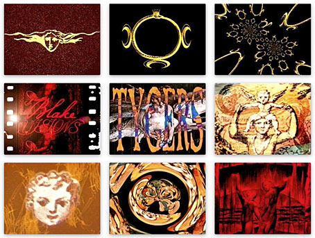
The Blake Video

blake.jpg

More from the website update. One of the pages buried in the site is an appendix to my design for Angel Passage, a William Blake-themed CD by Alan Moore and Tim Perkins that was released on Steven Severin’s Re: label in 2001. In addition to designing the CD I also created a video accompaniment for the sole performance of the piece at the Purcell Room in London in February of that year. The old web page showed screen shots of the video, and very small ones at that, so as well as updating the page itself I’ve replaced the thumbnails with the original shots.

The video was created in a rush five days before the performance, and only finished the night before I departed for London, so was rather lazily done in places. I’d just taken delivery of a new G4 Power Mac without which I wouldn’t have been able to do any video editing at all. Raw material was artwork scanned from books plus a stack of VHS tapes, including a TV documentary about Blake that provided a few relevant shots of contemporary London. Another essential component was a borrowed video player that could play both VHS and MiniDV cassettes, as well as connect to the computer. The assembled footage was recorded to a MiniDV master cassette which I still have somewhere although I’ve no idea whether it’s still viewable, and have no way to watch it in any case. Those MiniDV players had a tendency to mysteriously render their tapes unplayable which I think may have happened to my tape when I came to try and archive it after the performance. This is fitting in a way, Alan was always adamant that the music-based readings he was doing at this time were one-off events, and the video was only intended to augment the reading, not be watched away from the performance. Copies of the CD still circulate so the work hasn’t vanished altogether. Alan and Tim collaborated on three readings in this series, together with two earlier outings, The Birth Caul and (with David J) The Moon And Serpent Grand Egyptian Theatre Of Marvels. We’re overdue a reissue of the entire Moon and Serpent discography.

Previously on { feuilleton }
• William Blake in Manchester

Motorway cities

motorway.jpg

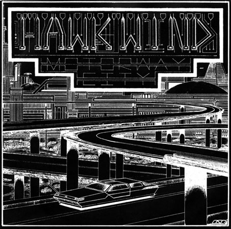
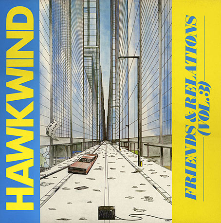
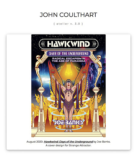
The process of updating the main website meant I had to check (and double-check, etc) every single page, so I’ve been looking at more of my old artwork than usual. This 7-inch single sleeve from 1983 made me belatedly realise that the wheel-less levitating car I put on the back of Joe Banks’ Hawkwind book has an ancestor here and on the cover of the third Friends and Relations compilation that Flicknife released in 1985. The continuity was accidental but Motorway City (the song) dates from the end of the period discussed in Joe’s book so it’s good to think that a vague reference to the Levitation era can be found on the cover art.

This odd drawing dates from 1980, a year when my life was in such turmoil I’m amazed I had time to do any drawing at all. I was 18 and had already burned my way through three dead-end jobs after leaving school the year before, by which point I was agreeing with Dave Brock’s Brainstorm ad lib on the Live Seventy Nine album, “I don’t want to be employed!” This attitude led to increasing rows with my mother which in turn led me to spend more time than usual in Blackpool library. Part of the inking on the drawing was done during one of these stress-free afternoons in the library reading room. I’d guess this was shortly after I’d met the group for the first time at their Preston concert on 20th October since most of the drawings I took with me were generic space art rather than pieces derived from Hawkwind songs. They’d played Motorway City that evening (the second song according to Setlist.fm) so I’m sure I would have made a point of showing it off. I say this is an odd drawing because I’ve no idea why I made it look so obviously like a single sleeve, but it’s possible that a single release of the song from the new Levitation album had been rumoured. Whatever the explanation, this was one of the first drawings I made using my new Rotring Variant pen which I used throughout the ensuing decade; one advantage of the dead-end jobs was they at least gave you enough money to afford expensive German technology. A year later, looking through a friend’s copy of Centigrade 232 by Robert Calvert, I was amused to discover a poetic complaint about the tendency of fine-nibbed Rapidograph pens to become blocked with ink. You have to treat them with care and respect, Bob.

void.jpg

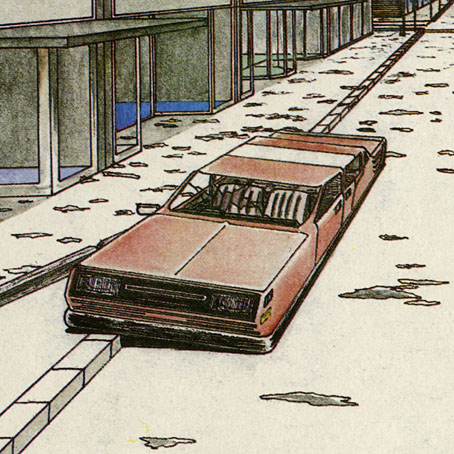
The car on the Friends & Relations cover wasn’t intended to be a reference to the earlier vehicle but removing the wheels was the easiest way of indicating a futuristic scene without any other overt signifiers. A shame, then, that the TV in the foreground is a cathode-ray tube in a wooden case. (And while I’m being critical, the careless use of perspective makes the car much too long.) Both these vehicles look rather graceless, as did cars in general in the late 1970s/early 1980s when there was a trend for boxy design. I’m usually indifferent to the automotive world but I could at least have borrowed some of the carapace sleekness you see in paintings by Syd Mead or Peter Jones.

void2.jpg

The Friends & Relations album was reissued on CD in 2014 in one of the Atomhenge CD box sets: The Flicknife Years, 1981–1988. The set includes two other albums with covers of mine: Zones and Out And Intake. Zones was a compilation of recent live recordings and a few studio outtakes that includes the version of Motorway City released as a single, together with a Michael Moorcock song that’s unique to this album (and sung by the man himself), Running Through The Back Brain.

Previously on { feuilleton }
• Reality you can rely on
• Hardy art
• Silver machines
• Notes from the Underground
• Hawkwind: Days of the Underground
• The artists of Future Life
• Science Fiction Monthly
• The Chronicle of the Cursed Sleeve
• Rock shirts
• The Cosmic Grill
• Void City
• Hawk things
• The Sonic Assassins
• New things for July
• Barney Bubbles: artist and designer

New website!

website.jpg

“Launch commit!” as NASA technicians used to say, and maybe still do. After many late-night HTML sessions I’m pleased and relieved to announce that my recoded website is now up and running. I mentioned earlier that the site has remained unchanged for the past 15 years, so the update was a major task that involved recoding over 450 separate pages. Much of the work was made easier by using mass find-and-replace but this only takes you so far. Too many of the pages had slight differences in their coding (and all had unique content, of course) so they still had to be checked—and usually rewritten—individually.

15 years is a long time on the internet. In 2005 smartphones didn’t exist, and while the existing phones could access websites their screens were so small and data transfer so slow that making an art site suitable for a phone was a ridiculous idea. Having recently revitalised the blog so it changed its layout to suit different devices I realised that I really ought to do the same for the rest of the site. The new website layout dispenses with the background decoration, the onscreen menu, and even the navigation bar at the top of the screen, in favour of a very minimal presentation: white pages everywhere, with a menu bar icon on the top left and a search icon on the top right. I was a little unsure about the latter but with such a sprawling site you can’t expect everyone to hunt through pages at their leisure. Those menu bars are now a common sight on apps as well as websites, so they don’t require explanation; and the Google search that I’d been using is now much better than the old version, with simpler code and better presentation of the results. (The old search used to take you offsite to a page of Google results.) Switching from decorative backgrounds to ultra-minimalism feels like having jumped from the Art Nouveau decade straight to the Bauhaus era. All that decoration looked nice on a desktop machine but it didn’t work at all on a smaller scale. I’m not keen on absolute minimalism, however, especially when so much of my work is the very opposite, so I’ve adulterated the main pages with engraved vignettes.

In doing all this I really have to thank the people who run W3schools for their free CSS code which is now the foundation of the site. W3’s clear demonstrations of how to create web pages that resize themselves and their content was a huge help in rewriting the site. The home page is a W3 template that I hacked a little (it does some smart resizing when you reshape the browser window or flip the screen from portrait to landscape) while the rest of the site is mostly the same as before. I don’t see many people dumping all of their work onto the internet in this way but I’ve worked in so many different areas—book illustration and design, album illustration and design, comic book art, occasional (paid!) writing commissions—that people who only know my work in one area are unlikely to be aware of the rest. The general upgrade has also forced me to properly update the music section, a task that I’d been putting off for too long. Most of my recent work in this area has been simple layout designs for the Subtext label but I’m very happy to be associated with these releases. The Subtext albums range through abstract electronics, environmental recordings, contemporary composition, even two releases devoted to Cevdet Erek’s Turkish drums. One of their artists in the composition world, Yair Elazar Glotman, was working on film soundtracks with Jóhann Jóhannsson shortly before the latter’s death, and contributes to Jóhannsson’s posthumous feature, Last and First Men.

Continue reading “New website!”

Hardy art

hardy1.jpg

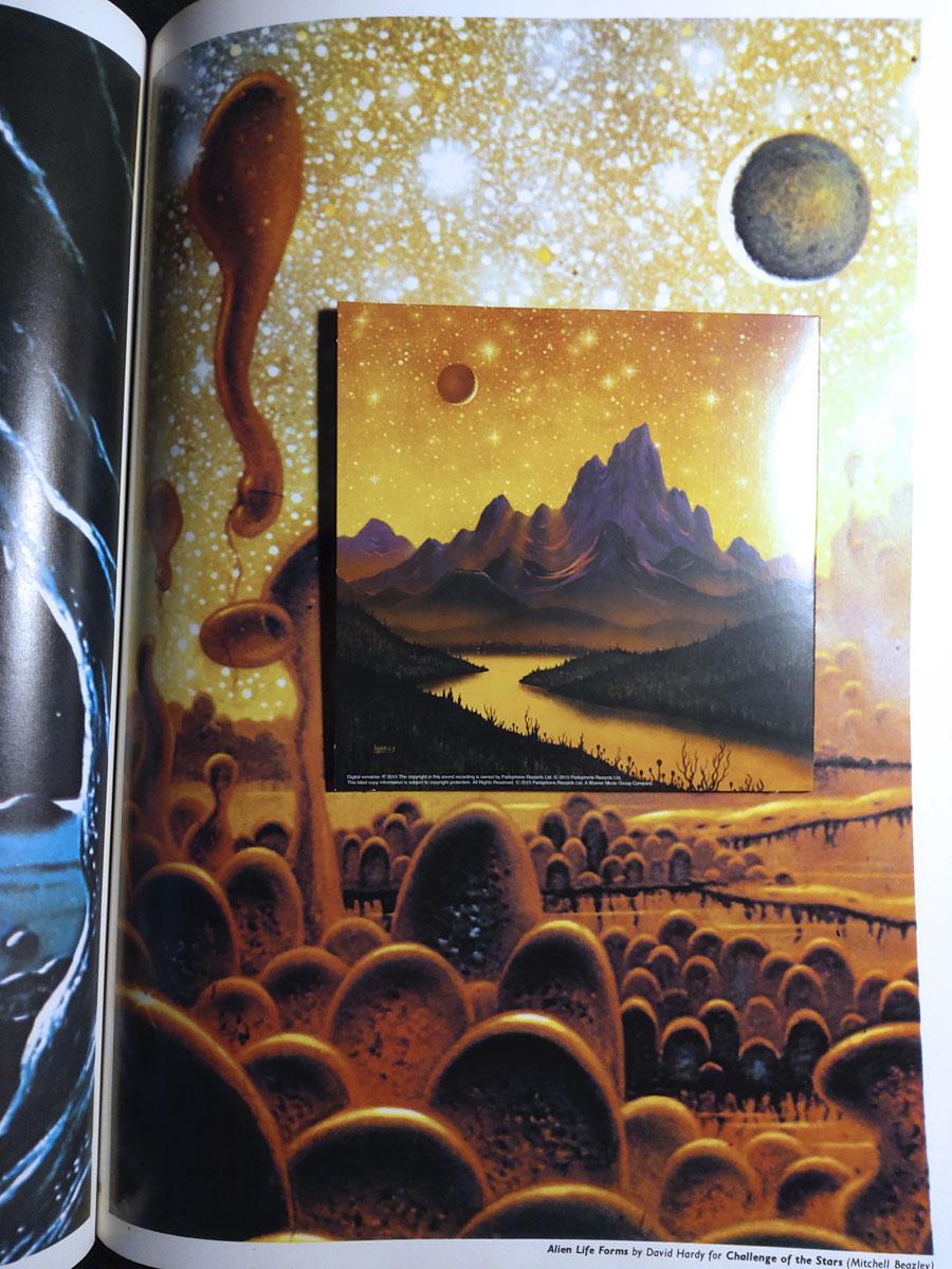
Hawkwind continue to be the overwhelming topic of the moment while I’m reading Joe Banks’ marvellously detailed account of the group’s first decade. One of the many attractions of Hawkwind for this listener was their intersection with other areas of interest: Moorcock and New Worlds, obviously (two of Robert Calvert’s poems appeared in New Worlds Quarterly), but also SF and fantasy in general. The alien planet on the back cover of the Hall of the Mountain Grill album was immediately recognisable as the work of British space artist David A. Hardy thanks to a feature in Visions of the Future (1976) a collection of artwork reprints from the art and fiction magazine Science Fiction Monthly. Hardy had a long association with astronomer Patrick Moore, illustrating the covers of Moore’s novels and later collaborating on a speculative science book, Challenge of the Stars (1972). A few of the latter paintings were reprinted in Visions of the Future, including one with the title Alien Life Forms that depicted amoeboid creatures on a remote planet. The painting would have become the back cover of the Hawkwind album if Hardy hadn’t insisted on creating a new work in a more suitable ratio.

Hardy’s association with Hawkwind extended to their stage shows, with a series of circular paintings used by “Liquid Len” (Jonathan Smeeton) on a rotating projector that covered the band in moving panoramas of ancient monuments, dinosaurs, alien landscapes and exploding worlds. Two of the paintings appear as the endpapers in Joe’s book; the dinosaurs and the monuments may be seen here.

hardy2.jpg

Cover design by Bryan Cholfin.

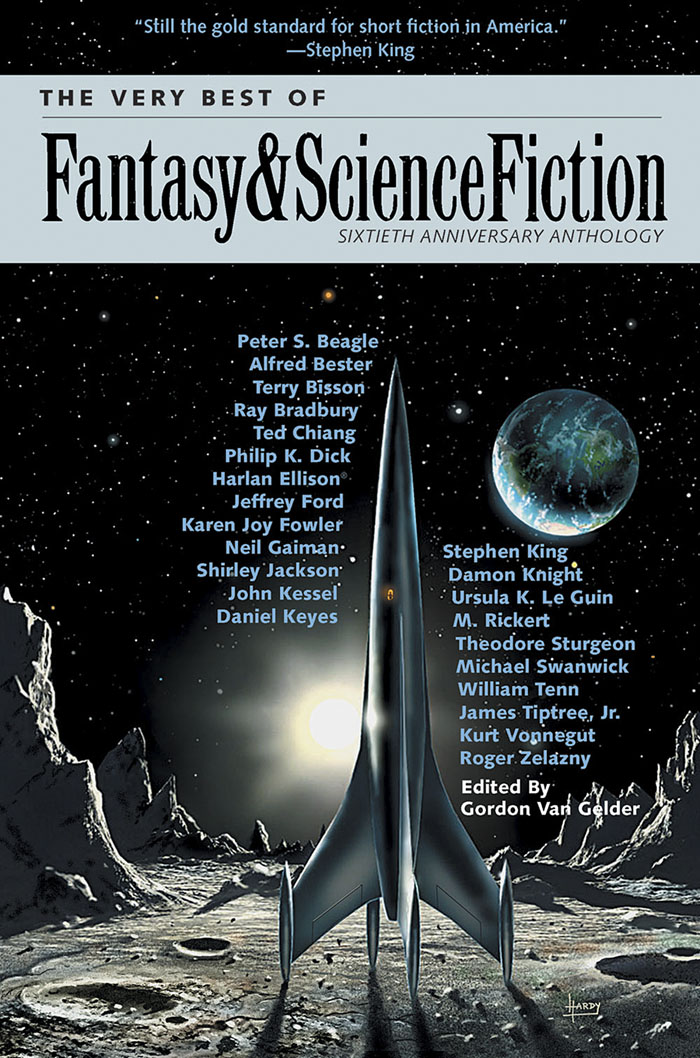
My own Hawkwind covers make very poor comparisons to Hardy’s meticulous renderings but we do have a further connection via The Very Best of Fantasy and Science Fiction, a collection of stories from the long-running magazine edited by Gordon Van Gelder. I designed the book’s interiors and Hardy contributed the cover art. Hardy painted many covers for F&SF throughout the 1970s and 80s, this shining rocket being a reworking of a cover he produced for the magazine’s 60th anniversary issue. The archetypal spacecraft of classic science fiction, and almost a definitive example. You might even call it a silver machine…

Previously on { feuilleton }
• Silver machines
• Notes from the Underground
• Hawkwind: Days of the Underground
• The artists of Future Life
• Science Fiction Monthly
• The Chronicle of the Cursed Sleeve
• Rock shirts
• The Cosmic Grill
• Void City
• Hawk things
• The Sonic Assassins
• New things for July
• Barney Bubbles: artist and designer