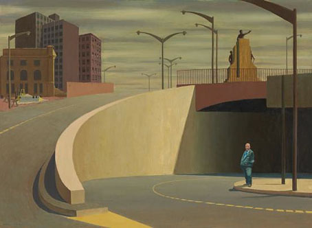
Cahill Expressway (1962) by Jeffrey Smart whose death was announced this week.
• “Russell Beale is awed by the beauty of the Roman silver Warren Cup showing men and youths making love, so startlingly erotic that the first time the British Museum was offered it in the 1950s, it turned it down flat. In 1999, when it came on the market again, the museum had to raise £1.8m to acquire it. ‘It’s just heaven, isn’t it?’ Russell Beale sighs.” Maev Kennedy on Same-Sex Desire and Gender Identity, a new exhibition at the British Museum.
• “The route to Tyburn Tree snaked through Holborn and St Giles, then went along Tyburn Road, today’s Oxford Street. It was dense with spectators.” Matthew Beaumont on the tiny memorial (Google view) for the estimated 50,000 people executed in the centre of London.
• Mixes of the Week: Bottoms Up by Staffan Lindberg for BUTT Magazine, and Electronic Ladyland, a collection of women with synths (and other instruments) from Bitch Media.
But the very thing that is valuable about diversity – the cultural and ideological clashes that it brings about – is precisely what many people fear. And that fear takes two forms. On the one hand you have the little Englander sentiment: immigration is undermining the national fabric, eroding our sense of British or Englishness, turning our cities into little Lahores or mini-Kingstons. And on the other you have the multicultural argument: that diversity is good, but it has to be policed to minimise the clashes and conflicts and frictions that diversity brings in its wake. And so we have to restrain speech, and police the giving of offence.
Kenan Malik on The Pleasures of Pluralism, The Pain of Offence.
• L’Empire des Lumières is a great title for Anne Billson’s blog about Belgium. Tram-wire covered streets are one of my favourite things.
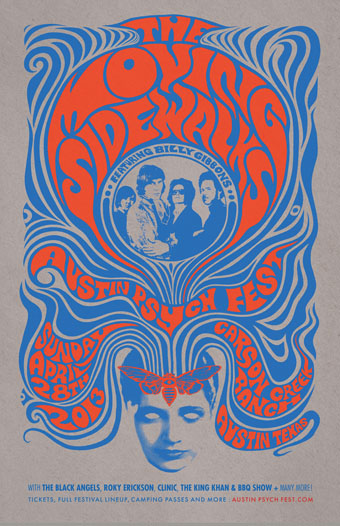
• The Outer Church, 28 musical artists with an uncanny temperament collected by Joseph Stannard for Front & Follow.
• His Heavy Heart, a film by Alan Moore & Mitch Jenkins, is looking for Kickstarter funding.
• In 1997 Quentin Crisp wrote about “Ten Wonderful Gangster Movies” for Neon magazine.
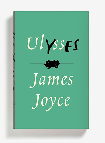
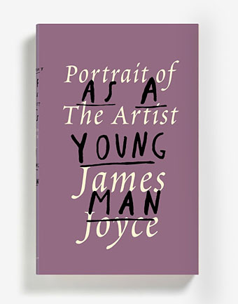
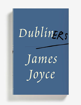
• Raymond Chandler’s The Big Sleep redesigned for the Penguin Design Award, 2013.
• Out on DVD/Blu-Ray this month: The Curtis Harrington Short Film Collection.
• A billion-pixel panoramic view of the planet Mars from the Curiosity Rover.
• In the TLS: Robert Craft on Stravinsky and The Rite of Spring.
• Typophonic: Album cover typography.
• The Owl Theremin is a thing.
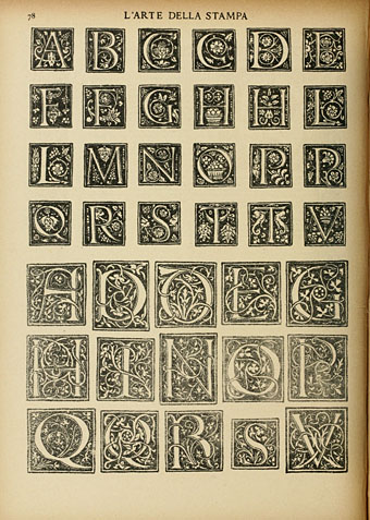
• LSD ABC
• Spring Rounds From The Rite Of Spring (1975) by Alice Coltrane | Revenge Of The Black Regent (1999) by Add N To (X) | Sore Ga Afrirampo (2010) by Afrirampo