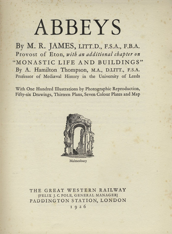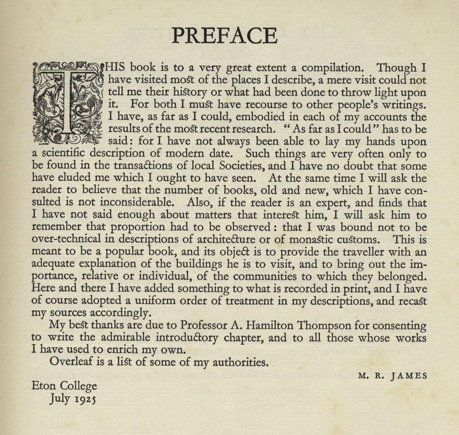
MR James is remembered today for his ghost stories but the four collections published during his lifetime represent a small percentage of his written work. His scholarly studies inform his stories, of course, but they also contribute to a pair of popular non-fiction books which have peripheral associations with the ghost collections: Suffolk and Norfolk: A Perambulation of the Two Counties with Notices of Their History and Their Ancient Buildings (1930) is a guide to the low-lying eastern counties where a number of the stories are set; Abbeys (1925) is a guide to the monastic ruins of the south-western counties and central England, locations which the author and his characters would enjoy visiting. This is a favourite book of mine, and one I often recommend to James enthusiasts.
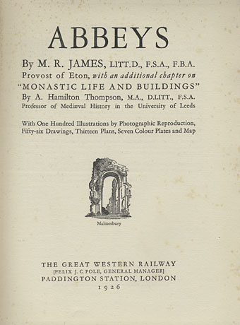
Abbeys is one of a three-volume set of illustrated guides published by the Great Western Railway company in 1925, (my copy is a second edition from 1926) the other titles being Cathedrals (1924), with no author credited, and Castles (1926) by Charles Oman. The books detail the ancient attractions a traveller in Britain might wish to explore using the services of Great Western Railway. Many of the more celebrated buildings in England and Wales are covered but the lines only travel as far north as Manchester and as far east as London. In addition to photo plates and illustrations, each book contains a removable map of the rail network folded into a pocket inside the back of the book. The coloured boards (red for Abbeys, blue for Cathedrals and brown for Castles) are sturdy enough to withstand the rigours of travel.
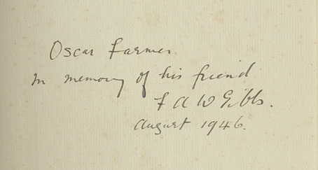
Another of those poignant inscriptions.
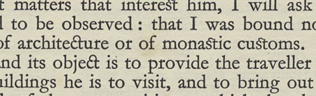
Although Abbeys lacks any credits for its photos and illustrations, Cathedrals states that the photos are the work of the railway’s staff photographers while the pen-and-ink illustrations are by William M. Hendy. There’s also a credit for the typographer, William Gordon Tucker, who not only provides many fine illuminated capitals but also uses ligatures for “ct” and “st”. Abbeys has an additional feature in the form of several fold-out plans of the larger buildings.
Continue reading “Abbeys by MR James”