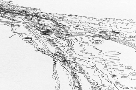
Victorian typography

type1.jpg

“Victorian” isn’t really the correct term for the products of 19th century America but then “19th century” covers rather a lot of ground. Mr BibliOdyssey’s most recent post is a stunning collection of title pages from fire insurance maps of the late 19th and early 20th century. Rather than repost any you ought to go and see them for yourself, they’re excellent examples of the best and worst of “Victorian” graphic design, insanely and pointlessly ornate yet often very inventive in their elaborations and stylised letterforms. Being a typophile I’d often feel frustrated when looking at 19th century documents and seeing type designs in use for which there were no contemporary equivalents. There was such a profound reaction against ornamented design in the 20th century that it’s only relatively recently that typography of this period has been reappraised and, in some cases, resurrected. The book from which these examples are taken dates from 1897, and it fascinates for putting names to some of those neglected designs. This is a big catalogue of 740 pages so I’ve been sparing in my selection. Anyone wishing to see more can download the whole thing here.

type2.jpg

Despite my affection for curvilinear Art Nouveau, when it comes to typography I’m often drawn to the spikier styles. Atlanta was digitised by P22 in a style they call Victorian Gothic. Their accompanying ornament set replicated that curious shape from Victoria below.

type3.jpg

type4.jpg

This typeface, or ones which resemble it, is a common one in 19th century newspaper and advertising design but I’d never seen it given a name until now. The catalogue pages have a number of variations which is no doubt an indicator of its popularity. A bold weight of the design was digitised by Scriptorium as a font they call Mephisto.

type5.jpg

Rubens is my favourite of all the designs in this catalogue, probably because I always liked the way it looked when it enjoyed a surprising flush of popularity in the 1960s and 1970s. The narrow style made it very useful for book covers (as with the examples here) while those spiky serifs made it popular with art directors looking for a typeface that said “horror”. Wooden Type Fonts recently digitised a version of Rubens but their version lacks the elegance of the original. Anyone else want to have a go?

type6.jpg

Lastly the catalogue has many pages of clip art figures and decorations including the pointing hands which people always associate with 19th century design. I’d wondered a few times whether these jagged decorations were meant to be electrical or not. Electricity was a new thing in 1897 so these would have seemed distinctly modern.

Previously on { feuilleton }
Steampunk overloaded!
Penguin Labyrinths and the Thief’s Journal
Masonic fonts and the designer’s dark materials

Deutsche Kunst und Dekoration #7

dkd07-01.jpg

Continuing the delve into back numbers of Deutsche Kunst und Dekoration, the German periodical of art and decoration. Volume 7 covers the period from October 1900 to March 1901 and features a set of ornamental capitals throughout this edition designed by Karl Lürtzing, part of a presentation of typefaces in the Art Nouveau style. The figures in Lürtzing’s alphabet all seem to be Biblical or mythological (as with David and Eve above) although some are easier to decipher than others. Volume 6 paid a visit to the Exposition Universelle in Paris and there’s a few more examples from that event here, along with further examinations of the best in German art and design. As usual, anyone wishing to see these samples in greater detail is advised to download the entire volume (which comprises over 300 pages) at the Internet Archive. There’ll be more DK&D next week.

dkd07-02.jpg

Remarkable interiors by Richard Riemerschmid.

dkd07-03.jpg

Continue reading “Deutsche Kunst und Dekoration #7”

Designs on Kafka

kafka.jpg

Book covers of the week are a series of new Kafka designs by Peter Mendelsund for Schocken, a set comprising eight paperbacks which will be out this summer in the US. What’s notable about these designs aside from their minimal style is the way they dispense with the visual clichés which have accumulated around Kafka’s work. So no sombre author photos, ominous shadows or views of Prague, just bold colours and simple shapes to create a beautiful collection. The script typeface is Mister K by Julia Sysmäläinen, a design based on Kafka’s handwriting. Peter Mendelsund has the rest of the covers and some words about their design on his blog. Via Coudal.

Elsewhere on { feuilleton }
The book covers archive

Previously on { feuilleton }
Kafka’s porn unveiled
A postcard from Doctor Kafka
Alexandre Alexeieff and Claire Parker
Hugo Steiner-Prag’s Golem
Steven Soderbergh’s Kafka
Kafka and Kupka

The psychedelic art of Howard Bernstein

bernstein1.jpg

Lord of Light by Roger Zelazny (1967).

I made a post a while back about the work of Bob Pepper, an artist whose illustrations from the 1960s can also be described as psychedelic and who was equally visible in the music and book publishing worlds. Howard Bernstein (not to be confused with musician Howie B) wasn’t as prolific as Pepper but this post was prompted by the appearance at Sci-Fi-O-Rama of the swirling abstractions of his Roger Zelazny cover. Like Pepper, Bernstein produced album cover art as well as book covers although it’s possible the Zelazny piece may have been a one-off. This was the jacket of the first edition and a rather flagrant attempt by Doubleday to co-opt the trendiness of the psychedelic style for a science fiction readership. They tried something similar with the cover for Harlan Ellison’s landmark anthology Dangerous Visions in the same year, the art in that case being the work of Leo & Diane Dillon. The Zelazny cover caught my attention for another reason, the typography is a variation on the 19th century Kismet typeface by John F Cumming which I used for my two Alice in Wonderland calendars and which turns up regularly in psychedelic design. And while we’re considering conjunctions of music and science fiction, I ought to note that the Hawkwind song Lord of Light lifts its title from Zelazny’s novel.

bernstein4.jpg

The Heliocentric Worlds Of Sun Ra, Vol. I (1965).

As for Bernstein’s music work, most of this appears to have been for Bernard Stollman’s eccentric ESP Disk label where the roster of artists included many free-jazz greats along with The Fugs, William Burroughs, Timothy Leary and fringe psychedelic groups such as Pearls Before Swine, Cromagnon, The Godz and others. Bernstein’s Cromagnon cover (below) exists in both monochrome and coloured versions but the monochrome one seems to be the original. In fact much of his art looks like it was drawn in black-and-white with the colours being created by separations at the print stage. His poster for The Godz is especially striking, so much so I’m surprised to find there isn’t more of his work around. Wolfgang’s Vault has a blacklight poster and there are some other blacklight works here. If anyone knows of other posters, please leave a comment although I suspect if there was much more then Wolfgang’s Vault would have the goods.

Continue reading “The psychedelic art of Howard Bernstein”

Compass Road by Iain Sinclair

sinclair.jpg

I was hoping to get my delayed 2011 calendar launched today but other work needed completing so here’s an interim post.

Think of your journey through mortality as a sequence of valid movies and the pain is ameliorated. Forget the tedious 60-minute division of the lecture hall or dead television (quartered by adverts): arrange just enough markers for the 90-minute slots of Golden Age cinema. And then it’s only a question of nominating the eight guides, culture-figures who will dominate your thoughts (and reveries) for as long as you stay upright. The road is endless, you aren’t. Iain Sinclair

There may be a recession on but people still keep putting out the luxury goods; maybe the bankers are buying all this stuff with their unwarranted bonuses. Compass Road is a limited edition wristwatch from Mr Jones Watches, London, and sports a design commissioned from writer Iain Sinclair, a somewhat surprising choice given that these things are more usually farmed out to those individuals we have to call celebrities. Sinclair is too intelligent and interesting to be a mere celebrity and consequently designs a watch I’d probably buy if I had an excessive income. The watch middle and the hands are based on the British road signs designed by Margaret Calvert and Jock Kinneir while the typeface used for the compass points is Calvert and Kinneir’s Transport (below) which is also used across Britain’s road signs. For the destinations Sinclair has chosen eight writers with London associations: John Clare, Gerald Kersh, Bram Stoker, Joseph Conrad, William Blake, HG Wells, JG Ballard and Louis-Ferdinand Céline. The last seems an odd choice but he did work in London for a while.

transport.jpg

Sinclair’s design is a flexible enough to be applied to other literary cities which raises the question of which names you’d choose for Paris, say, or New York. And which signage systems? Subways or the local roads? Compass Road meanwhile can be yours for £145.