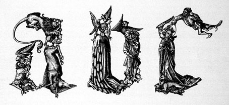
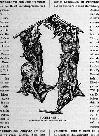
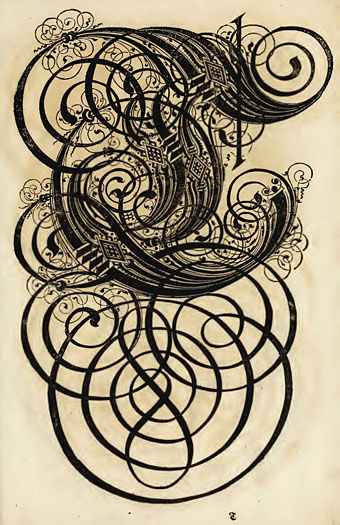
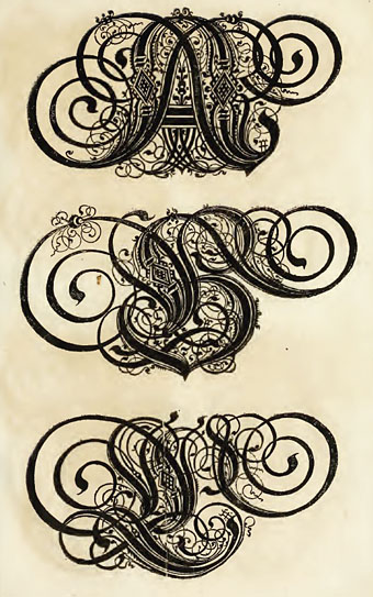
The Museum of Bad Album Covers

bad_album1.jpg

The world is over-stuffed with bad design, from food packaging to tv graphics and awful websites, but it’s fun to be reminded now and then just how bad things can get when all aesthetic considerations are thrown to the winds. The Museum of Bad Album Covers features some of the choicest examples from the music world, such as the sleeve above for Marty Feldman-eyed Heino, a classic of Easy Listening kitsch (Cooper Black is a favourite typeface for this kind of thing). Heino’s records don’t look that terrible compared to other German albums of the 70s which often managed to combine outrageous bad taste with abysmal graphics and illustration. God only knows what sounds Foster Edwards and his band of bewigged elephants produced. Next time someone tells you that you can get any album on CD, ask them about Foster and his jumbos.

bad_album2.jpg

The Museum site threatens to bring us a complementary Museum of Bad Single Covers soon. If you’re still not sated in the meantime, Dana Countryman’s Virtual Museum of Unusual Cover Art has further examples of graphic strangeness from the vanished vinyl wastelands.

Elsewhere on { feuilleton }
The album covers archive

The Apple logo

apple01.jpg

The original company logo from 1976 depicts Isaac Newton sitting under a tree with the fateful apple glowing above his head and looks about as far removed from a computer company logo as it’s possible to get. The picture frame contained Wordsworth’s description of Newton, “A mind forever voyaging through strange seas of thought, alone.”

apple02.jpg

Rob Janoff designed the more familiar Apple at about the same time. The typeface used was Motter Tektura.

According to the logo designer…the typeface was selected for its playful qualities and techno look, in line with Apple’s mission statement of making high-technology accessible to anyone.

As with many old typefaces, there doesn’t seem to be a font of Motter Textura available today apart from this Cyrillic clone.

apple03.jpg

The original apple was streamlined and given coloured bars at
Steve Jobs’ behest in order to “humanise the company”.

apple04.jpg

Ironically, it was Jobs who also decided to remove the colour bars in 1998. The current logo is now a typical piece of flexible contemporary branding, easily reproduced in any colour, at any size or shape.

Great British design

underground_map.jpg

The BBC’s Great British Design Quest has reached a shortlist of ten:

1) Catseyes. Hmm, more of an invention to me but the brief here seems to be pretty broad.

2) Concorde. Can’t imagine this winning seeing as it’s generally regarded as a costly failure. In design terms though, it was a great-looking plane.

3) Grand Theft Auto. Er…a computer game? And one that merely imitates Hollywood at that.

4) The K2 phone kiosk. Some of these choices seem to be determined by nostalgia more than anything else. The cast-iron urinal phone booths are distinctive but I’m not sure they could be called “great”.

5) The Mini. This is a design classic, and, like the VW Beetle, still in use today.

6) The Routemaster bus. More nostalgia.

7) The Supermarine Spitfire. And again… I wonder what people would think if Germany voted in a similar competition for the Stukka divebomber?

8) Tomb Raider. Another computer game… Yes, it was surprising at the time but it was another game aping Hollywood. In game terms, something like the Rubik’s Cube was far more “classic” and original. But then that’s not British, is it?

9) The London Underground map. This is the one I’d vote for. Harry Beck’s solution to mapping the first underground rail network was brilliant and elegant. Not only that but it’s stood the test of time and been imitated (and parodied) in similar transport maps all over the world. While we’re at it, let’s also remember Edward Johnston and Richard Kegler’s 1916 type design for the Underground system, the world’s first widely-used sans serif lettering.

underground_type.jpg

10) The World Wide Web. Respect to Tim Berners-Lee and all, but, again, is this a design or an invention? And how British is the web? Do they mean the web or HTML?

Arnold Böcklin and The Isle of the Dead

iod_basle.jpg

Another favourite painting for many years and Böcklin’s most well-known work.

Arnold Böcklin (1827–1901) produced several different versions of the painting. All versions depict an oarsman and a standing white-clad figure in a small boat crossing an expanse of dark water towards a rocky island. In the boat is an object usually taken to be a coffin. The white-clad figure is often taken to be Charon, and the water analogous to the Acheron. Böcklin himself provided neither public explanation as to the meaning of the painting nor the title, which was conferred upon it by the art dealer Fritz Gurlitt in 1883. The first version of the painting, which is currently at the Metropolitan Museum in New York City, was created in 1880 on a request by Marie Berna, whose husband had recently died.

Continue reading “Arnold Böcklin and The Isle of the Dead”