MacKellar, Smiths & Jordan’s mortised card cuts

cut01.jpg

This one is partly intended as an aide-memoire for my future self should I need to recall where these particular illustrations are located. The Internet Archive has a good collection of specimen books created by type foundries, most of them American volumes although there are a few from Britain, France and Germany. The bulk of these books comprise typeface samples which I usually ignore, my interest being in the sections near the end which contain all manner of decorative detail: borders, ornaments and the small illustrations (“cuts”) that today would be classed as clip art. A few of these books have proved very useful when I’ve been working on a design that requires imitation of the decoration found in 19th-century print design (my cover for The Atropine Tree is a recent example) but I don’t always remember which book contains the elements I might want, hence this post.

cut02.jpg

Another of those cannibalistic advertising animals.

If you’re looking for antique print decoration then the catalogues published by the Johnson Type Foundry of Philadelphia (later MacKellar, Smiths & Jordan) are the ones to go for. I’ve copied or adapated ornaments and decorative details from this book on many occasions over the past ten years. The Internet Archive had a more substantial MSJ catalogue in their collection but it was a bad scan, one that was poor enough to receive some rare complaining comments from other Archive users. Happily another copy of the same book, The Eleventh Book of Specimens of Printing Types (1878), arrived there recently. The Johnson/MSJ catalogues are a much better source of decorative material than those created by their competitors, with a wider variety of combination ornaments (tiny details which could be pieced together to create unique borders or other peripheral decorations) and, in the eleventh volume, a larger stock of illustrations for advertising purposes. Before discovering these scanned catalogues I’d been relying on books from Dover and Pepin Press as source material for antique design. Pepin published a book/CD-ROM collection in 1999, Graphic Frames, which reproduces a number of the advertising cuts from the eleventh MSJ catalogue, including a couple of the ones shown here. The scans are seldom ideal in their raw state, I usually end up tracing the required design as a new version which I then convert to a vector shape. But they’re valuable in being the actual print decoration from the period, not modern reconstructions (or interpretations) of “Victorian” design.

cut12.jpg

The “Mortised Card Cuts” and “Mortised Comic Cuts” in the MSJ catalogue were comic illustrations intended for advertising purposes, although any “comic” quality is more likely to appear grotesque to our eyes. Shouting figures with very large, yawning mouths are popular in these kinds of drawings, as are dogs with singularly ugly faces. You can even see a forerunner of the “Kilroy” graffiti in the figure with a nose poking over the advert. I used a few of these faces for my Alice in Wonderland picture series in 2009: the top half of the smoking figure appears in “Advice from a Caterpillar” while other faces may be seen in the background of “Who Stole the Tarts?”.

cut07.jpg

Sondheim enthusiasts may recognise this particular figure as the origin of the razor-wielding character on the poster for the original Broadway run of Sweeney Todd – The Demon Barber of Fleet Street. Designer Frank Verlizzo (aka “Fraver”) shows how easily an old illustration can be made to slip from the comic to the sinister.

cut14.jpg

And from the comic to the plain bizarre… The past is often revealed to be a weirder place than you’d imagine once you start rummaging in its ephemera. The illustrations in most print catalogues are seldom this peculiar but until you go looking you don’t know what else might be out there.

cut13.jpg

Continue reading “MacKellar, Smiths & Jordan’s mortised card cuts”

Weekend links 729

demorgan.jpg

Phosphorus and Hesperus (1881) by Evelyn De Morgan.

• Mix of the week, or possibly the entire year: The Deep Ark, 167 tracks (over 8 hours of music), most of which are from the electronic deluge of the early 1990s. The download link may not work for all browsers—it didn’t for one of mine—but it is active. Via Simon Reynolds who has more about the Deep Ark project.

• At Nautilus: Betsy Mason on the use of stage magic to investigate animal behaviour. “By performing tricks for birds, monkeys, and other creatures, researchers hope to learn how they perceive and think about their world.”

• At The Daily Heller: Mad and the Usual Gang of Idiots. Meanwhile, Mr Heller’s font of the month may prove useful for this election season, a Jonathan Barnbrook design named Moron.

Looking back, you can see a pattern in those eras in which interest in telepathy boomed. Coined by Myers and his fellow psychical researchers in the 1880s, telepathy gained traction because it was formulated inside a moment of scientific and technological revolution, where uncanny transmissions proliferated across the visible and invisible spectrum, seeming to collapse the natural and the supernatural together. In the 1970s, telepathy returned, if under different names, as part of another moment of crisis. The Cold War arms race was an essential part of this, feeding a strange supplemental world of fantasy technologies, from mind control to brainwashing, and playing on an all-too-widespread psychological paranoia around being seen, infiltrated and manipulated by invisible agents.

Roger Luckhurst looks back at a century of psychic research

• New music: Portable Reality Generator by Field Lines Cartographer, and Sublime Eternal Love by Chrystabell and David Lynch.

• Coffee and Chocolates for Two Guitars: Robert Fripp interviewing John McLaughlin in July, 1982.

• Paintings by Ithell Colquhoun currently showing at the Ben Hunter gallery, London.

• At Public Domain Review: Eye Miniatures (ca. 1790–1810).

• ESP (1965) by Miles Davis | ESP (1990) by Deee-lite | ESP (2002) by Comets On Fire

Fifteen ghosts and a demon

ghost01.jpg

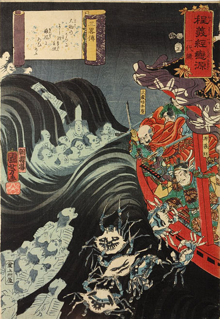
The Secrets of Strategy (1853) by Utagawa Kuniyoshi. “Yoshitsune with Benkei and his other retainers in their ship, beset by the ghosts of the Taira, some in the form of crabs, during a storm.”

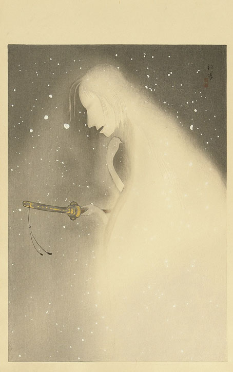
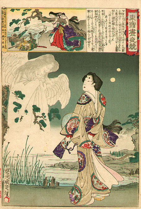
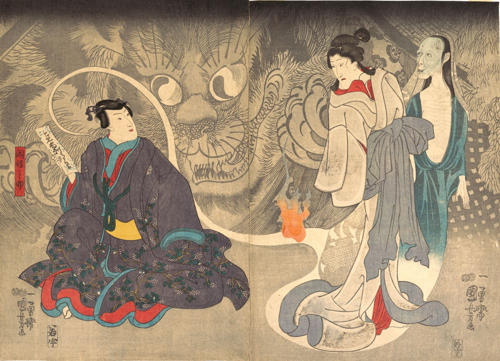
Actually more than fifteen ghosts, and at least two demons, but you get the idea… There are many ghosts in Japanese prints, from the spectral variety which manifest in all shapes and sizes, to their theatrical equivalents in Noh and Kabuki plays. Some of the best examples are those by Hokusai and Tsukioka Yoshitoshi but since these have appeared here before I’ve gone looking for prints by other artists.

ghost02.jpg

Ghost (1922–26) by Shoen Uemura.

ghost03.jpg

Lady and Ghost – Edo Embroidery Pictures (1886) by Toyohara Chikanobu.

ghost04.jpg

Scene from a Ghost Story: The Okazaki Cat Demon (c.1850) by Utagawa Kuniyoshi.

ghost05.jpg

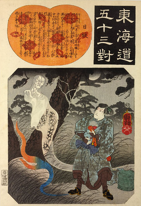
Nissaka Station from Fifty-three pairings along the Tokaido Road (c.1845) by Utagawa Kuniyoshi. “Moonlit scene of a travelling warrior receiving a child from a ghost.”

Continue reading “Fifteen ghosts and a demon”

Les Maîtres de l’Affiche

affiche09.jpg

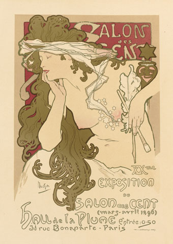
Alphonse Mucha.

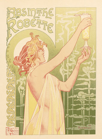
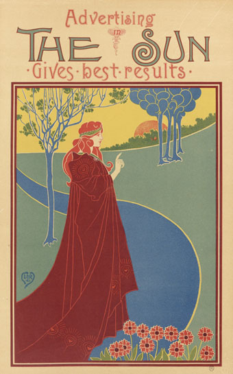
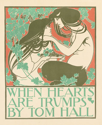
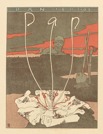
Les Maîtres de l’Affiche was a multi-volume guide to the state of poster art in the 1890s, published in five volumes from 1896 to 1900. Being a French publication, the contents are mostly by French artists but other nations are represented—Britain, Germany, Italy, the United States—although fewer contributions than you might expect given the quantity of pages to be filled. The chief attraction of these books is the attention they give to each design, all of which are printed in colour on a full page, and the time of publication which coincides with the birth of Art Nouveau. In addition to the great Alphonse Mucha there are designs by Eugène Grasset, Henri Privat-Livemont, Georges de Feure, Will Bradley, Louis Rhead and others. There’s also a lot of cabaret stuff from Montmartre which has never been to my taste (although I like the Steinlen posters) but those designs were the typical ones of the period.

affiche12.jpg

Henri Privat-Livemont.

The first four volumes in this set may be found at Gallica (Volume 1, Volume 2, Volume 3, Volume 4) but not the fifth volume—isn’t a national library supposed to be more thorough than this?—which may be seen at NYPL. For those who prefer paper reproductions, there’s a reprint in Dover Publications’ Pictorial Archive series, The Complete “Masters of the Poster: All 256 Colour Plates from “Les Maîtres de l’Affiche”.

affiche01.jpg

Louis Rhead.

affiche02.jpg

Will Bradley.

affiche04.jpg

Joseph Sattler.

Continue reading “Les Maîtres de l’Affiche”

Directions to Servants by Tenjo Sajiki

ts1.jpg

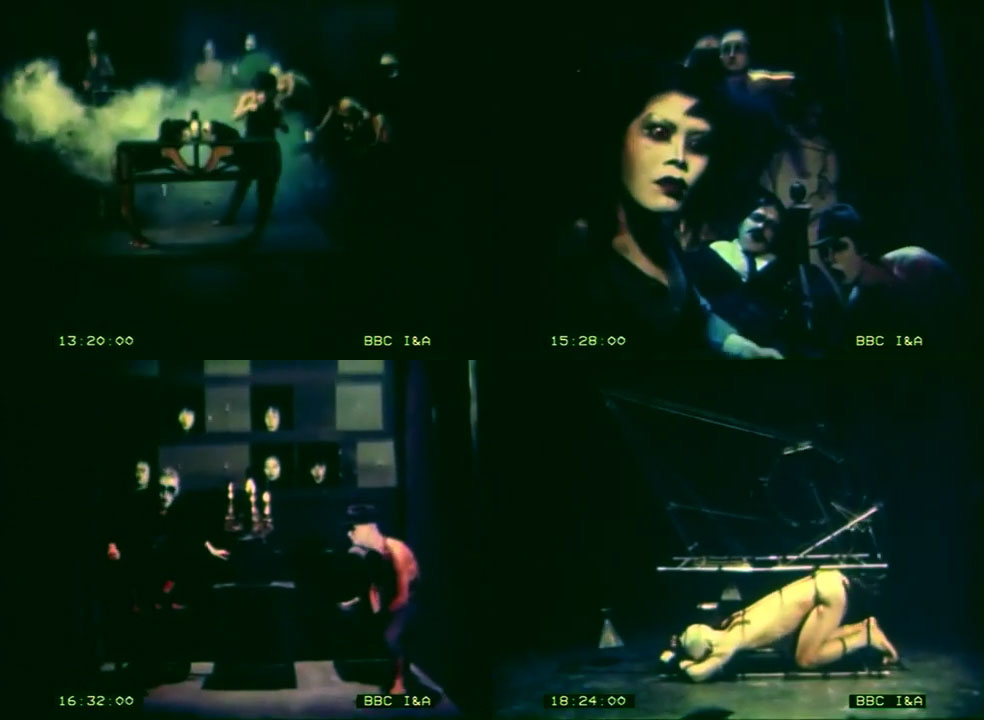
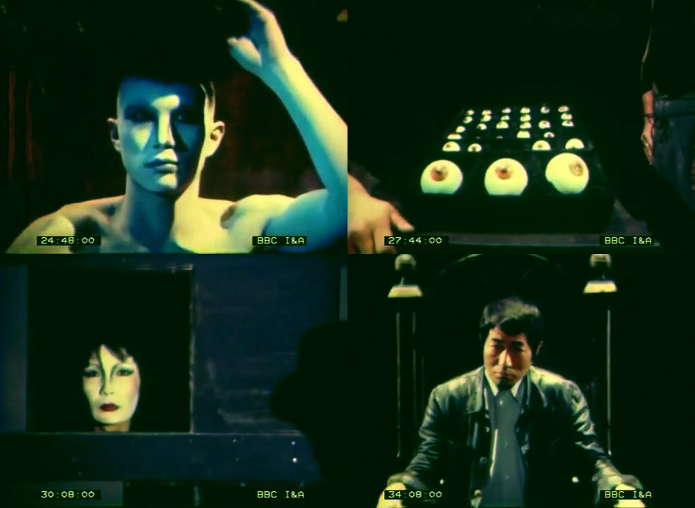
Tenjo Sajiki was an avant-garde theatre troupe led by Shuji Terayama from 1967 to 1983. The name of the troupe is taken from the Japanese title of Marcel Carné’s Les Enfants du Paradis, a film I happened to be watching again this weekend. Terayama is known more in the West for his cinematic work than his many plays, consequently I never expected to see any of his theatrical productions until stumbling across this short TV documentary about a performance of Jonathan Swift’s Directions to Servants that Tenjo Sajiki were staging in Europe in 1978. (There’s actually a lot of Tenjo Sajiki footage out there once you start looking for it, including whole videos of original stagings.) The film has the additional attraction of being a rare early episode from the BBC’s Arena arts series, made during the period when the programmes were only 30 minutes long, with director Nigel Finch often acting as unseen commentator and interviewer. Regular readers will be aware that Arena has cult status on these pages but I didn’t get to see many of the earliest programmes, and usually don’t expect to find those from the late 1970s at all, video-recording only really becoming widespread a few years later.

ts2.jpg

Whoever unearthed this film must have liberated it from the BBC archives since it has a time code running through it. The film is a curio more than anything else which makes me wonder why anyone went to this amount of trouble to find something that isn’t very revealing about its subject. The play was a difficult one for audiences, being performed in Japanese while the audience was forced to watch select views on TV monitors or sit inside black boxes being pushed around the performers by stage-hands. Terayama had treated the audience like this for other plays, the disruption being his way of reflecting our own disrupted view of real events. It’s a shame that Arena caught Tenjo Sajiki while they were touring this particular play. Shortly before this the troupe had staged an adaptation of Bartók’s The Miraculous Mandarin which was followed a few years later by Duke Bluebeard’s Castle, either of which would have been more interesting to see.

Previously on { feuilleton }
• Les Chants de Maldoror by Shuji Terayama