Deutsche Kunst und Dekoration #7

dkd07-01.jpg

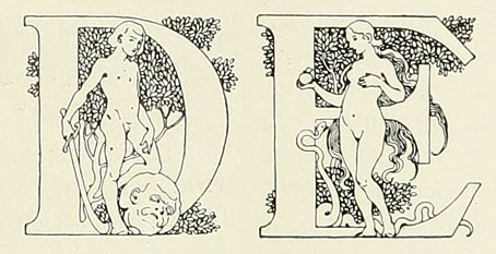
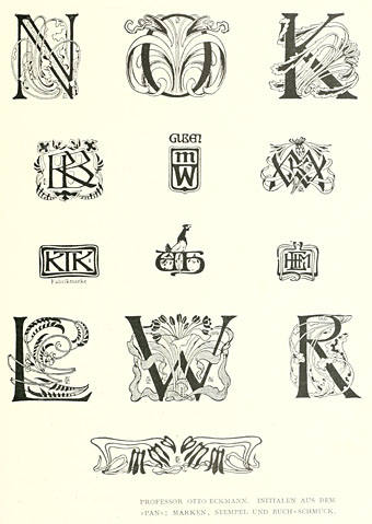
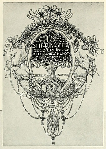
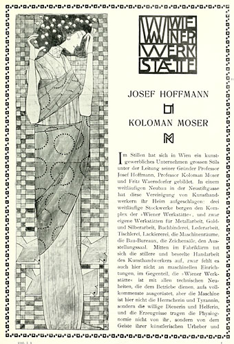
Continuing the delve into back numbers of Deutsche Kunst und Dekoration, the German periodical of art and decoration. Volume 7 covers the period from October 1900 to March 1901 and features a set of ornamental capitals throughout this edition designed by Karl Lürtzing, part of a presentation of typefaces in the Art Nouveau style. The figures in Lürtzing’s alphabet all seem to be Biblical or mythological (as with David and Eve above) although some are easier to decipher than others. Volume 6 paid a visit to the Exposition Universelle in Paris and there’s a few more examples from that event here, along with further examinations of the best in German art and design. As usual, anyone wishing to see these samples in greater detail is advised to download the entire volume (which comprises over 300 pages) at the Internet Archive. There’ll be more DK&D next week.

dkd07-02.jpg

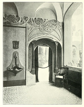
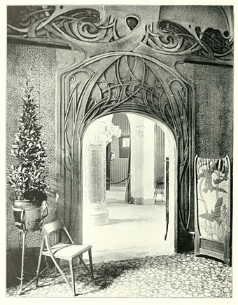
Remarkable interiors by Richard Riemerschmid.

dkd07-03.jpg

Continue reading “Deutsche Kunst und Dekoration #7”

Symbolist cinema

dracula1.jpg

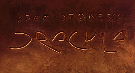
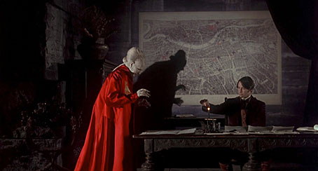
Symbolist? Arguably. Decadent? Certainly. Watching Francis Ford Coppola’s Dracula (1992) again this weekend I thought it worth making note of some of these resonances. The real age of Symbolist cinema was the Silent Era from around 1910 onwards, something I discussed in more detail here. That being so, several films made since can be taken as Symbolist (more usually Decadent) productions even if this was never their original intention. Kenneth Anger‘s Magic Lantern Cycle comes immediately to mind, so too Sergei Parajanov’s The Colour of Pomegranates.

dracula3.jpg

Bram Stoker’s novel was published in 1897 at the ebbing of the fin de siècle but vampires and vampirism were already recurrent Symbolist themes. Aesthetic magus Walter Pater wrote of the Mona Lisa in 1893, “She is older than the rocks among which she sits; like the vampire, she has been dead many times, and learned the secrets of the grave…” Dracula almost demands a Symbolist interpretation, and for now Coppola’s production is the closest we get. I’ve found this makes the film more satisfying in a way: you can ignore the shoddy performances by secondary characters and concentrate on the decor and details (and the tremendous score by Wojciech Kilar). Some of the following screen grabs argue my point.

dracula2.jpg

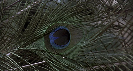
Oh look, peacock feathers. I loved the artificiality of this film, the excessive palette, the obvious models and miniatures, the layering of images. The dissolve from a peacock feather to Jonathan Harker’s infernal train journey is a great moment.

Continue reading “Symbolist cinema”

Deutsche Kunst und Dekoration #6

dkd06-01.jpg

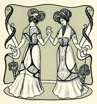
Continuing the delve into back numbers of Deutsche Kunst und Dekoration, the German periodical of art and decoration. Volume 6 covers the period from April to September 1900, and the content is still Art Nouveau all the way, with a dash of Symbolism. Among the contributors in this edition there’s Otto Eckmann and more work from Hans Christiansen, both frequent contributors to Jugend magazine There are further examples of stylish Art Nouveau interiors, and of considerable interest to this Exposition Universelle obsessive, a look at the Paris exposition of 1900 from the German side of things. As before, anyone wishing to see these samples in greater detail is advised to download the entire volume at the Internet Archive. There’ll be more DK&D next week.
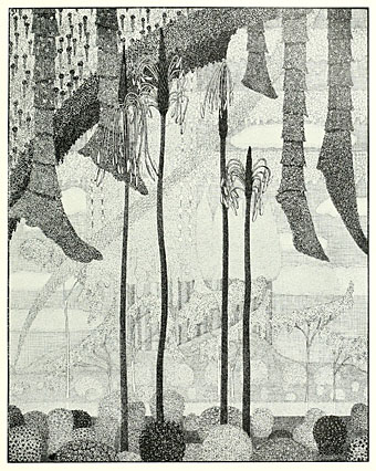
dkd06-02.jpg

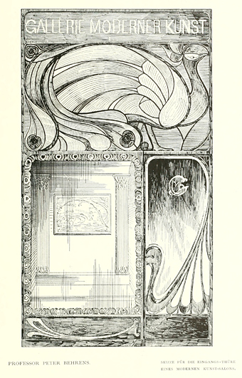
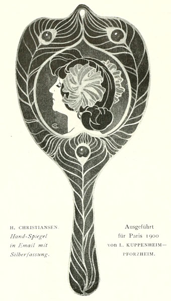
The ubiquitous peacocks were never far away in 1900.

dkd06-03.jpg

Continue reading “Deutsche Kunst und Dekoration #6”

Deutsche Kunst und Dekoration #5

dkd05-01.jpg

Continuing the delve into back numbers of Deutsche Kunst und Dekoration, the German periodical of art and decoration. Volume 5 covers the period from October 1899 to March 1900, and the Art Nouveau style is in full flower at this point, as it was across most of Europe. This is also the place at which the journal becomes so laden with impressive design work that it’s impossible to easily do justice to over 300 pages of contents. Anyone wanting to see more is encouraged to download the whole thing as either page scans or a PDF. As before I’ve tended to concentrate on the graphic material but this issue also features more lavish interior designs, a range of jewellery, and ponderous monumental architecture including proposals for some of Germany’s many Bismarck Towers. Examples follow below. There’ll be more DK&D next week when we take a trip to the Exposition Universelle in Paris.

dkd05-02.jpg

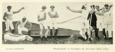
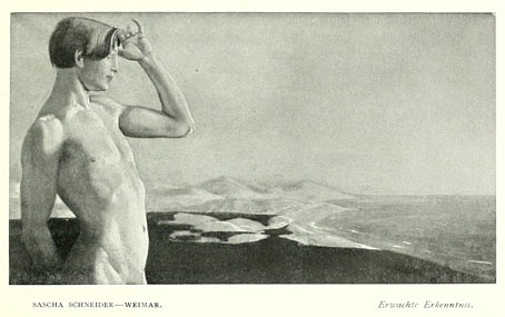
Sascha Schneider was Karl May’s favourite illustrator and one of the few openly gay artists in Germany at the time. He’s represented here with a small feature on his paintings among which there’s this depiction of a team of strapping oarsmen.

dkd05-03.jpg

Continue reading “Deutsche Kunst und Dekoration #5”

Mossa’s Salomés

mossa5.jpg

Salomé (1901).

Monsieur Wiley prompted this post by drawing my attention to the picture above. I’d already seen another Salomé by Gustav Adolf Mossa on this page a few days ago but resisted the temptation to mention it. A bit more searching revealed yet another Mossa rendering of the theme which perhaps isn’t so surprising given the artist’s obsession with lethal women. The first exceeds all previous depictions of the Biblical temptress by having her actually licking blood from the executioner’s sword. In the third picture she’s content merely to use a severed hand as a page-turner while John the Baptist’s mutilated body is carted away by servants.

The search for pictures turned up a blog I hadn’t seen before, Women in the Bible (“This is no religious blog!”), which has several Salomé postings. And there’s also Les voiles de Salomé: Labyrinthique errance, virevoltes et volutes.

mossa6.jpg

Encor Salomé (1905).

mossa7.jpg

Salomé (1908).

Elsewhere on { feuilleton }
The Salomé archive