Going beyond the zero

gr1.jpg

“But it is a curve each of them feels, unmistakably. It is the parabola. They must have guessed, once or twice—guessed and refused to believe—that everything, always, collectively, had been moving toward that purified shape latent in the sky, that shape of no surprise, no second chances, no return. Yet they do move forever under it, reserved for its own black-and-white bad news certainly as if it were the Rainbow, and they its children….”

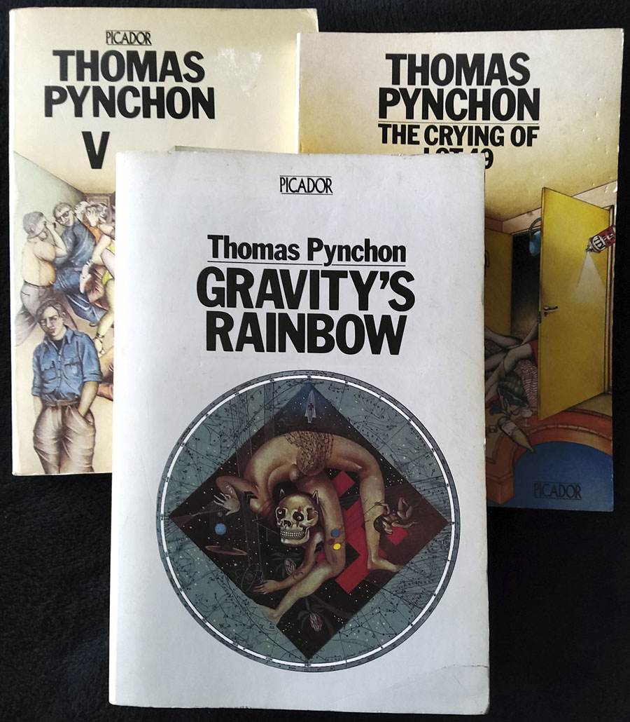
Reader, I read it. It isn’t an admission of great achievement to announce that you’ve reached the last page of a novel after a handful of stalled attempts, but when it’s taken me 36 years to reach this point it feels worthy of note; and besides which, Gravity’s Rainbow isn’t an ordinary novel. Umberto Eco is partly responsible for my return to Pynchon. I’d just finished The Name of the Rose, a book I’d avoided for years even while reading (and enjoying) a couple of Eco’s other novels, and was wondering what to read next. Maybe it was time to try the Rocket book again? The thick white spine of the Picador edition—760 pages in 10pt type—would accuse me every time I spotted it on the shelf: “Still haven’t made it to page 100, have you?” For many people this happens with novels because a book is “difficult” (which I didn’t think it was), or boring (which it isn’t at all), or simply too long (page count doesn’t put me off). Back in 1985 I was looking for more heavyweight fare after reading Ulysses, something I’ve now done several times, so I wasn’t going to be intimidated by a novel which is misleadingly compared to Ulysses on its back cover. If anything the comparison was an enticing one. Pynchon at the time exerted a gravitational pull (so to speak) for being very mysterious, although this was a decade when most living authors, especially foreign ones, were mysterious to a greater degree than they are today, when so many have their own websites and social media profiles. Pynchon’s works were also referred to in interesting places, unlike his less mysterious contemporaries. I may be misremembering but I seem to recall a mention of the W.A.S.T.E. enigma from The Crying of Lot 49 in Robert Shea & Robert Anton Wilson’s Illuminatus!; if it is there then it’s no surprise that a writer so preoccupied with conspiracy and paranoia would find favour with the authors of the ultimate conspiracy novel. (And that’s not all. I’m surprised now by the amount of coincidental correspondence between Illuminatus! and Gravity’s Rainbow. Both novels were being written at the same time, the late 1960s, yet both refer to the Illuminati, the eye in the pyramid on the dollar bill, Nazi occultism, and the death of John Dillinger. Both novels also acknowledge the precedent of Ishmael Reed’s Mumbo Jumbo, another remarkable conflation of conspiracy, secret history, and wild invention.)
gr2.jpg

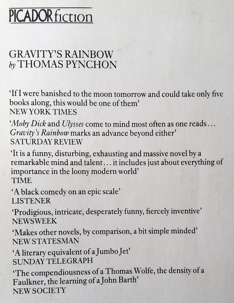
Pynchon had other connections to the kind of fiction I was already interested in. One of his early short stories, Entropy, had been published in New Worlds magazine in 1969, although editor Michael Moorcock later claimed to have avoided reading any of the novels until much later. And, Pynchon, like Shea & Wilson (and Moorcock…), made pop-culture waves. I think it was Laurie Anderson who put Gravity’s Rainbow in the centre of my radar when she released Mister Heartbreak, an album whose third song, Gravity’s Angel, refers to the novel and is dedicated to its author. As for the novel itself, in the mid-1980s this was still Pynchon’s major work, the one that fully established his reputation. Nothing new had appeared since its publication in 1973; Vineland, and the subsequent acceleration of the authorial production line, was six years away. The final lure was the refusal of the Picador edition to communicate very much of its contents: what was this thick volume actually about? The back cover is filled with praise but doesn’t tell you anything about the novel at all, while the cover illustration by Anita Kunz suggests a scenario connected with the Second World War but little else. (“This was one of the most complicated books I ever read,” says the artist, “and really hard to get the germ of the idea. Pynchon kept going off in tangents. I mixed up the art the same way the writer did and made an image that can be read in all directions.”) It’s only when you start reading the book that you find the connection between the novel’s dominant concerns—the development of the V-2 rockets used by the Nazis to bomb London, and the erotic compulsions of Tyrone Slothrop, an American lieutenant at large in war-ravaged Europe—subtly reflected in the illustration, much more subtly than the cover art on the edition that preceded this one.
Continue reading “Going beyond the zero”

Peter Haars book covers

haars20.jpg

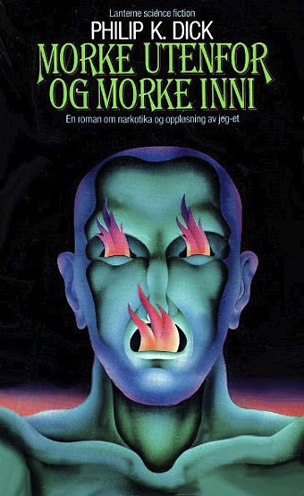
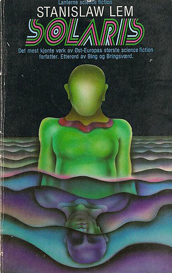
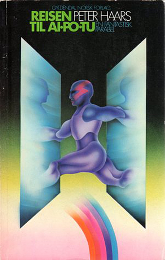
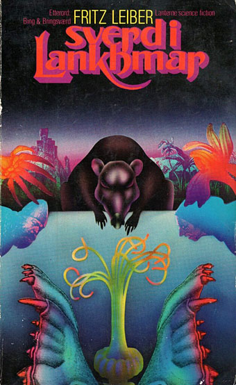
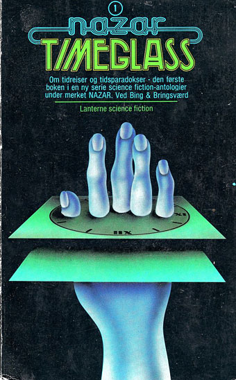
Peter Haars (1940–2005) was born in Germany but moved to Norway in the 1960s where he worked as a graphic designer, art director and illustrator. He also wrote fiction and created Prokon (1971), a one-off publication that looks like a designer’s take on underground comics. Most of the covers that turn up when you search for his work are science fiction, and all painted in that bold airbrush style that was common in the 1970s. Documentation is scarce, unfortunately, ISFDB only lists two titles, so I’ve no idea about the dates, but the Lanterne SF imprint was active throughout the decade.

haars01.jpg

haars21.jpg

haars15.jpg

haars08.jpg

Continue reading “Peter Haars book covers”

The art of Mike Hinge, 1931–2003

hinge06.jpg

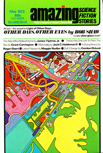
Amazing Science Fiction, May 1972.

Back in March I ended my post on the psychedelia-derived art style that I think of as “the groovy look” with the words “there’s a lot more to be found.” There is indeed, and I’d neglected to include anything in the post by Mike Hinge, a New Zealand-born illustrator whose covers for American SF magazines in the 1970s brought a splash of vivid colour to the groove-deprived world of science fiction. This was a rather belated development for staid titles like Amazing and Analog whose covers in the previous decade wouldn’t have looked out of place in the Gernsback era. Opening the door to someone like Mike Hinge, a graphic designer as well as a general illustrator, was probably a result of both magazines having undergone recent changes of editorship. Hinge approached SF art in the same way that Jim Steranko approached comic-book art in the late 1960s, importing trends that had been flourishing outside the medium. (And Steranko liked Hinge’s art enough to publish a portfolio of black-and-white drawings, The Mike Hinge Experience, in 1973.) This kind of graphic style was increasingly outmoded by the mid-70s but some of Hinge’s compositions are audacious in context: the Algol cover with one of his robots seen in a water reflection (and those ripples that defy perspective), the Analog cover that works both vertically and horizontally.

For this post I’ve favoured Hinge’s groovy look over other covers, especially those from the late 70s when his cover art shifted to a painted style which is less distinctive, and less interesting as a result. It’s the distinctive style that people still prefer today. There’s more to be seen at Tenth Letter of the Alphabet and Onyx Cube.

hinge21.jpg

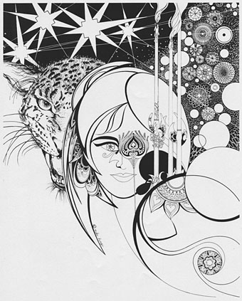
Undated drawing (probably mid-60s).

Something else you can always find more of is Aubrey Beardsley borrowings. Via Tenth Letter of the Alphabet which has a couple more pieces in this style.

hinge19.jpg

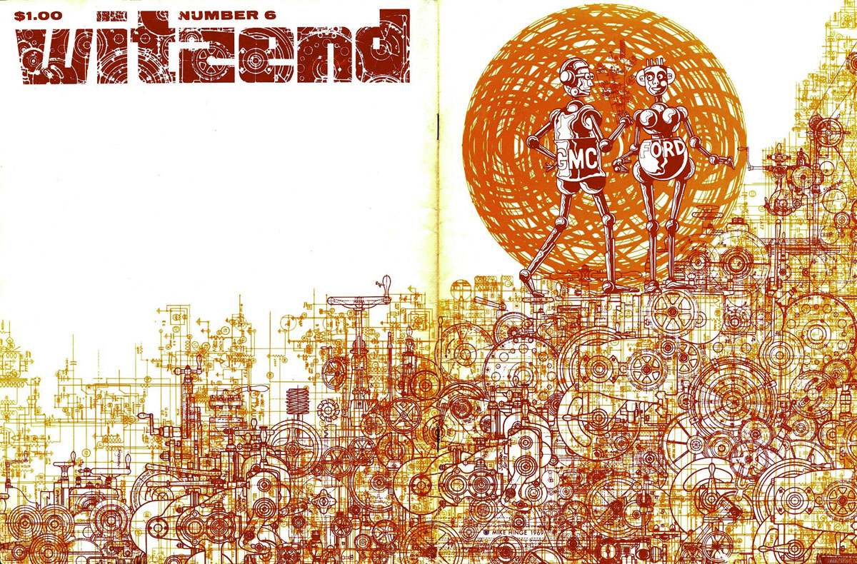
Wraparound cover for Witzend #6, Spring 1969.

Witzend was a magazine of comics, fantasy stories and related art published by Wallace Wood, a complete run of which may be found here.

hinge01.jpg

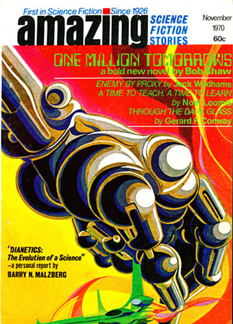
Amazing Science Fiction, November 1970.

hinge02.jpg

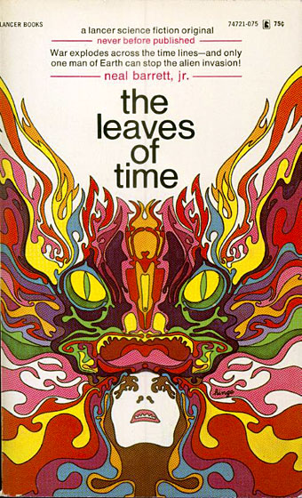
The Leaves of Time (1971).

Continue reading “The art of Mike Hinge, 1931–2003”

Ian Miller at Interzone

im05.jpg

Issue 4, 1983.

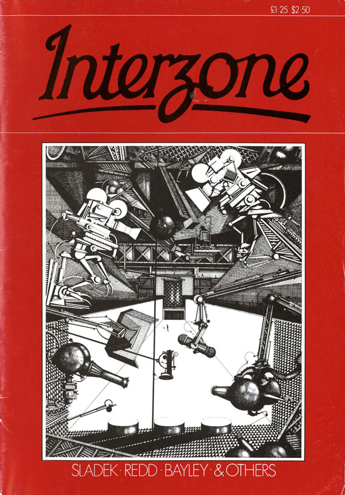
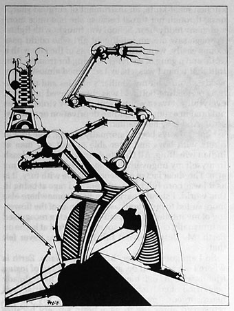
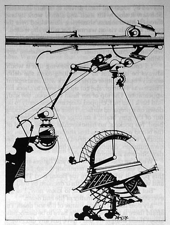
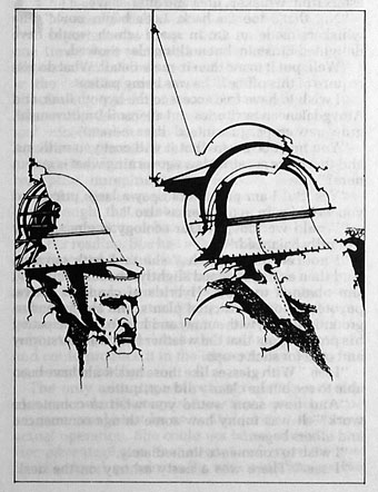
Ian Miller was the art editor for the early issues of Interzone magazine, during which time several of his own drawings and paintings appeared as illustrations. Many of these haven’t been reprinted since, including three that are credited to an “Edwin Dorff”, a name I think we can take as a pseudonym. The run of Interzone at the Internet Archive is an incomplete one, unfortunately, some of the missing issues feature more Miller. Issue 34 contains Miller drawings throughout.

im01.jpg

Issue 3, 1982.

im02.jpg

Issue 3, 1982.

im03.jpg

Issue 3, 1982.

im04.jpg

Issue 3, 1982.

im06.jpg

Issue 4, 1983.

Continue reading “Ian Miller at Interzone”

Weekend links 569

lehr.jpg

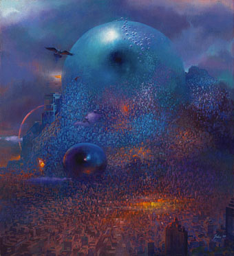
City with Eyes in Blue (1989) by Paul Lehr.

• “Lehr chose science fiction illustration because he saw it as a path to making a living and an opportunity to ‘depict the epic’. ‘War, destruction, celebration, congestion, marching armies, waving flags and banners—the strange and mysterious atmosphere of it all, rather than the literal illustration.'” Jane Frank on the art of Paul Lehr (1930–1998).

• “Time isn’t the only thing Harrison treats as firmly malleable. The same is true of his willingness to play with genre conventions…” Tobias Carroll on M. John Harrison, and an article where you have to ignore the clickbait clichés in the headline.

• The narrators for the forthcoming audiobook of Voice of the Fire by Alan Moore have been revealed.

• At Public Domain Review: A remembrance of aerial forms: Odilon Redon’s À Edgar Poe.

• The weight of the ritual: Frank Rynne on The Master Musicians of Joujouka.

• “Cerne Giant in Dorset dates from Anglo-Saxon times, analysis suggests.

Aaron Moth, the artist creating exquisite collages from vintage [gay] porn.

Clive Hicks-Jenkins on revision in illustration.

• At Wikimedia Commons: Lesbian pulp fiction.

• Mix of the week: A Wire mix by BLK JKS.

• At Dennis Cooper’s: Psychedelics.

Colleen‘s favourite albums.

Ritual Fire Dance (1969) by Tuesday’s Children | Ritual (1973) by Vangelis | Rituals (1981) by Bush Tetras