Pavonine pattern play

pattern1.jpg

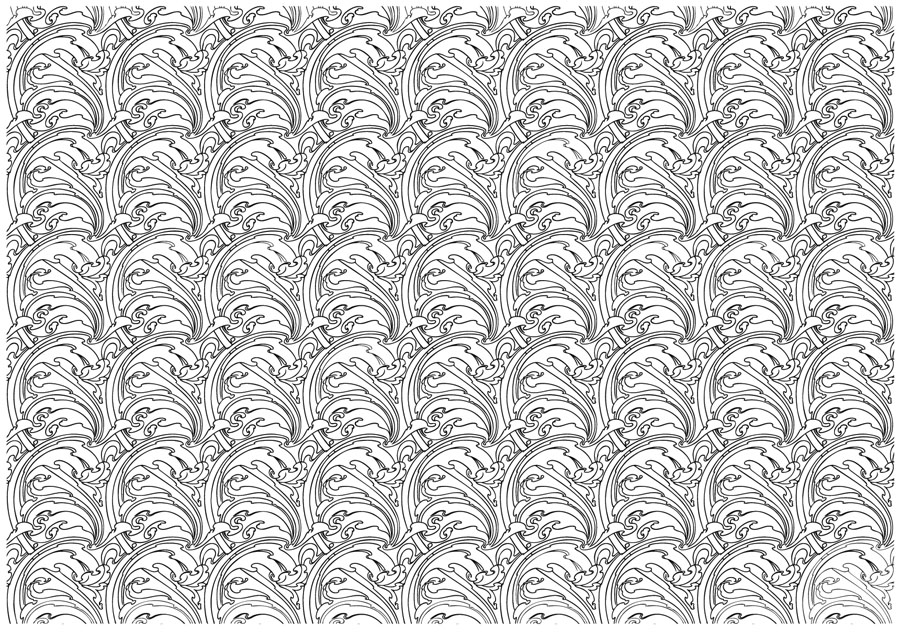
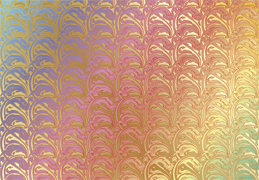
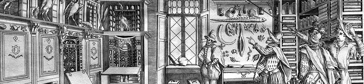
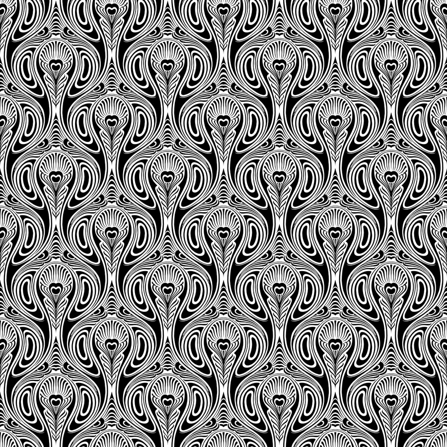
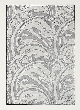
One of the projects I’ve been working on recently contains a large quantity of Art Nouveau design. I can’t discuss this any further for the usual embargo reasons, but I can show off this pattern which has been generated as a by-product of the main work. This is one of those fin-de-siècle designs that looks like it might have originated in the 1960s, a decade which saw a revival of interest in Art Nouveau graphics. Those sinuous lines would work well on a psychedelic poster, and there’s even a touch of Op art in the melting ovals that separate the peacock feathers.
pattern7.jpg

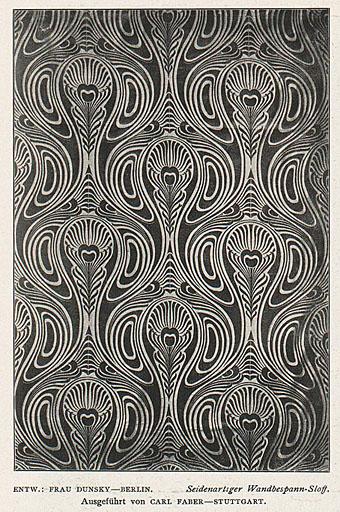
But this isn’t a design from 1970, it actually dates from 1900, the source being a small wallpaper sample that I spotted some years ago in issue 7 of Deutsche Kunst und Dekoration. “Frau Dunsky, Berlin” is named as the designer although there’s no further information about her design in the text. After seeing this I thought I’d have a go at copying the pattern in order to create a digital version but I soon gave up when it became apparent that too much work was required to convert the indistinct image into a sharp outline. I didn’t have a graphics tablet at the time, and my printer had broken down, so the only way to draw an outline was the hard way, using a mouse pointer.
pattern2.jpg

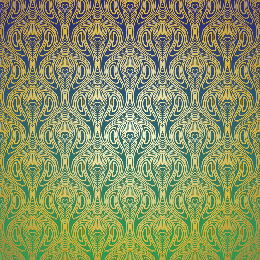
Vectorised and coloured.

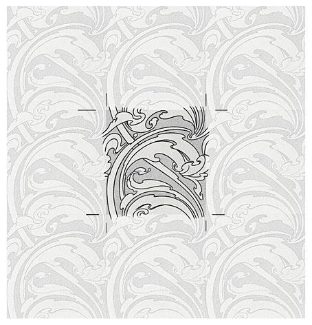
A few days ago I pulled out the copy I’d been working on and, since I now have a graphics tablet, decided to try again. Even though creating the outline was easier this time I still wasn’t sure whether a repeatable pattern would be possible. The magazine sample is slightly warped, and the repeated elements don’t match exactly when overlaid, but I was able to compensate for the flaws with some stretching and redrawing in Photoshop. It’s very satisfying getting something like this to work, even more so when it’s a 120-year-old design that you’ve managed to resurrect. I also feel a little familial continuity with this kind of pattern making. My mother worked as a textile designer for a few years in the 1950s, although she never worked on anything like this, the designs produced by her studio were generally chintz-like floral patterns.
pattern3.jpg

Prior to redrawing the peacock design I’d resurrected another wallpaper design from the same period. This is one of several examples by a French designer, André Morisset, that appeared in issue 15 of L’Art Decoratif. Monsieur Morisset’s design was easier to work into a digital version, being a better reproduction, while the design itself is a square that tiles vertically and horizontally so it’s easier to build into a pattern.
pattern4.jpg

Drawing the outline.

pattern5.jpg

A tessellated tiff.

pattern6.jpg

A coloured vector version.

I’ll be doing a few more things like this when I get the chance. I’m not sure yet whether they’ll find a place in the things I’m working on, but once you have a satisfactory vector outline you can file the art away until you need it later.

Previously on { feuilleton }
Louis Rhead’s peacocks
Peacocks
Rene Beauclair
Whistler’s Peacock Room
Beardsley’s Salomé

Splendid Suns

suns.jpg

I answered a few interview questions recently for Shunga Gallery, a site concerned with the erotic side of Japanese prints, and with contemporary practitioners who work in a similar areas. (All NSFW, needless to say.) I’m not really an erotic artist but Marijn has selected a few examples of my artwork that contain prominent erections, going back to the badly-proportioned drawing of the Great God Pan that I did in 1986 for my late friend, Ed, when he was part of a Dutch music & performance group, Abrahadabra. The drawing appeared in the zine of the same name, and later provoked mild disapproval from the organisers of a video festival in Den Haag where Ed and friends were using it as a flyer to promote their activities. Also at Shunga Gallery are a few pages from the rebarbative Reverbstorm, a book that’s the darkest and nastiest thing I’ll ever do. Some of that artwork provoked a rather more serious form of disapproval, as I explain in the interview.

Continue reading “Splendid Suns”

Through The Gates Of Yesterday

broadcast1.jpg

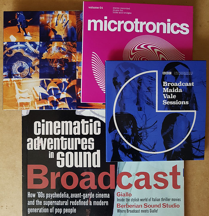
Here at last, the two Broadcast reissues and the album of officially released radio sessions. I already had much of the music so these purchases are mostly for reasons of cult completism and the Julian House cover designs. Mr House had already designed the rest of the Broadcast discography, as well as collaborating with them in his Focus Group guise, so this continuity was essential.

broadcast2.jpg

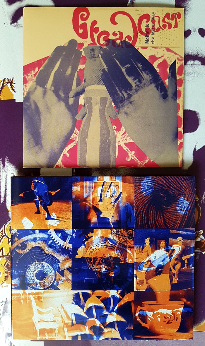
Also essential, music-wise, is the Mother Is The Milky Way EP even though it’s only 20 minutes long. This was originally limited to 750 copies sold during the 2009 tour so it’s always been hard to find. Musically, it’s of a piece with the Witch Cults Of The Radio Age album, and just as beguiling, a dreamy mélange of song fragments and sound samples—Kurt Schwitters’ Ursonate colliding with Jonathan Miller’s Alice in Wonderland—that’s more genuinely “psychedelic” than many attempts to conjure these qualities by mimicing old musical styles. The overlaid images on the cover may be alluding to the layered sounds…and are those magic mushrooms in one of the squares? Answers on a lysergic sugarcube.

broadcast3.jpg

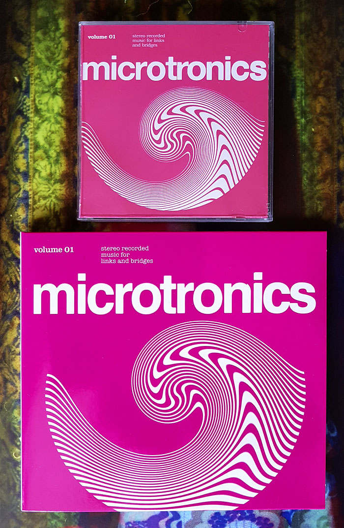
The two Microtronics EPs were intended to be functional works rather than entertainments, “Music for links and bridges”, although I don’t know if they’ve ever been used as such outside Broadcast mixes. These were also sold on separate tours as mini CDs but they now come packaged together, including a first-time release on vinyl which will keep the fetishists happy despite the format seeming like overkill for a collection of 21 very short squawks and drum loops.

broadcast4.jpg

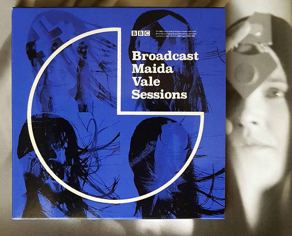
Maida Vale Sessions will also be essential for some listeners, comprising the group’s three sessions for John Peel’s show (1996, 2000, 2003) plus one from 1997 for Steve Lamacq’s Evening Session, 54 minutes in total. Being a collector of Broadcast bootlegs I already had most of these but they sound so much better coming from the original recordings. The final session, which I hadn’t heard before, is a fantastic set, and includes one of their few covers, a version of Sixty Forty by Nico. John Peel was an enthusiast, unsurprisingly, who may be heard on a bootleg of a Birmingham concert introducing the group as “one of the nation’s great bands”.

And if any of the above has stimulated your interest, Warp Records wisely commissioned The Gaslamp Killer to create an hour-long mix from the new records which may be heard here.

Previously on { feuilleton }
Esoterica 49
Peter Strickland’s Stone Tape
Valerie and Her Week of Wonders
The Ghost Box Study Series

Weekend links 607

cadmus.jpg

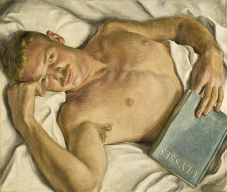
Jerry (1931) by Paul Cadmus.

• “I wanted to photograph naked young men as opulently and as attentively as those professional ladies appearing in Playboy-type magazines.” RIP James Bidgood, photographer and director of no-budget gay-porn classic Pink Narcissus. Also in the obituary notices this week: Monica Vitti and John Appleton, composer of electronic music and inventor of the Synclavier sampling keyboard.

• “…the Sola Busca deck is limited in its use for divinatory purposes today, and yet, since its enigmatic imagery irresistibly invites decoding, the deck nonetheless beckons twenty-first century cartomancers into a game of high imagination.” Kevin Dann on the mysteries of the world’s oldest complete Tarot deck.

• “This Missouri company still makes cassette tapes, and they are flying off the factory floor.” Jennifer Billock reports.

He attended to his own talent, not in the interest of bombast or self-aggrandisement, but rather like a faithful watchman. He had the fixity of the great and therefore no need of vanity. He estimated that three shillings would be a reasonable price for Ulysses. A tiresome book, he admitted. At the same time he was dogged by fear that the printing house would be burnt down or that some untoward catastrophe would happen. He assisted Miss Beach in wrapping the copies, he autographed the deluxe editions, he wrote to influential people, he hawked packages to the post office. He knew that the illustrati would change their minds many a time before settling down to a final opinion and that many another would know as much about it as the parliamentary side of his arse.

Edna O’Brien on James Joyce

• At Wormwoodiana: Mark Valentine on The Secret Glory by Arthur Machen, another novel now in its centenary year.

• At Aquarium Drunkard: It Is Not My Music, (1978) an hour-long Swedish TV documentary about Don Cherry.

• At Bandcamp: The transportive psychedelia of Moon Glyph records.

• Mix of the week: Fact Mix 844 by A Psychic Yes.

• Steven Heller’s font of the month is Show.

• At Dennis Cooper’s: Guitar.

Mumblin’ Guitar (1960) by Bo Diddley | Electric Guitar (1979) by Talking Heads | Impossible Guitar (1982) by Phil Manzanera

Weekend links 606

smith.jpg

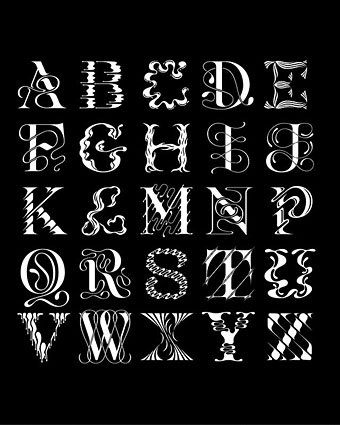
An alphabet by Tina Smith.

• Coming in March from Warp records: reissues of three Broadcast releases that were previously only available in limited quantities, Microtronics, Volumes 1 & 2, and Mother Is The Milky Way. The latter is an EP which makes a perfect companion to Witch Cults Of The Radio Age, and while its reissue means I’ll no longer be able to brag about owning one of the rare originals it really ought to have been more widely available. In addition, Warp will be releasing the group’s first live album, BBC Maida Vale Sessions, a collection of performances for radio. All these releases are packaged in new cover designs by Julian House.

• “Nature Boy was the conduit through which vegetarian ideals, nonconformism and notions of living in harmony with nature began to filter into US culture.” Jon Savage on the exotic world of Eden Ahbez.

• At Dennis Cooper’s: Two booklets of Austin Osman Spare: Earth: Inferno (1905), The Book of Pleasure (Self-Love) (1913).

Joyce refused to fix the meaning of the words on the page and left the reader to fend for themselves. So the content may not be actually shocking, but the book feels exciting—as though it might turn shocking any second. Anything might stir in the body or consciousness of a character, in the body or consciousness of the reader. My mother was right to consider it a dangerous text. The thing the censors worried about were the uncensored workings of their own minds.

More than any other book, Ulysses is about what happens in the reader’s head. The style obliges us to choose a meaning, it is designed to make us feel uncertain. This makes it a profoundly democratic work. Ulysses is a living, shifting, deeply humane text that is also very funny. It makes the world bigger.

Anne Enright on Ulysses at 100

• At Aquarium Drunkard: occult scholar Mitch Horowitz on the Transmissions podcast.

• 5th Dimension: DJ Food examines a piece of psychedelic Op-art by Michael English.

• New music: Möbius by Jonathan Fitoussi/Clemens Hourrière.

• At Spoon & Tamago: Hiraku Suzuki’s Constellations.

• The month in type at I Love Typography.

Wyrd Daze Six Star.

Nature Boy (1975) by Big Star | Nature Boy (1980) by Manu Dibango | Nature Boy (1999) by Jon Hassell