Fatality by OCTiV

fatality.jpg

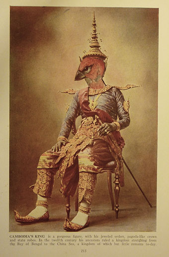
Catching up with more recent work, this was a quick collage for Fatality, a single by US musician OCTiV. This has been out for about a month. The main track—a kind of dubstep/metal hybrid—can be heard here. The request was for something on the cosmic horror spectrum which would also incorporate geometric elements, hence the swiping of a couple of polyhedra from Wenzel Jamnitzer’s wonderful Perspectiva Corporum Regularium (1568).

Among the other things which have yet to materialise there’s a book cover design for Tor, and the Ghosts in Gaslight, Monsters in Steam anthology which features some of my fiction as well as my cover design. I’m very pleased that the latter has achieved its Kickstarter funding. More about these projects later.

Weekend links 160

floyd.jpg

Collage by Jeneleen Floyd.

• “…slowly, block-by-block, pedestrians are starting to take back the streets.” Wayne Curtis on the hazards of being a pedestrian in a world of cars.

• Michael Hann looks back at LA’s Paisley Underground, and also talks to some of its key members.

• Meighan O’Toole interviews JL Schnabel about her Blood Milk jewellery designs.

My central thesis is that camp was always a kind of signifying practice invented out of necessity (both for survival and for sheer creative pleasure) by “queer” (in the classic sense) outsiders – fags, drag queens, transsexuals, deviants, sexual renegades – and that it was always by its very nature deeply political and committed: Some people dedicated their entire lives to it! Sontag’s interpretation always seemed a bit dismissive to me somehow.

The seldom unprovocative Bruce LaBruce talking to Mark Allen about camp in the 21st century.

• Studiocanal launches an appeal to find the lost materials of The Wicker Man.

• At Flickr: Tales from a Parallel Universe and London’s Lost Music Venues.

• Michael Wood tells us what we learn when we read Italo Calvino’s letters.

• Fragments of a Portrait: Francis Bacon and David Sylvester in 1966.

• An extract of a live session from Adrian Sherwood and Pinch.

• In Baba Yaga’s Hut: Amelia Glaser on Russian folk tales.

• Buckminster Fuller Book Covers from the 1970s.

• A Century of Proust.

• The Real World (1982) by The Bangles | With A Cantaloupe Girlfriend (1982) by The Three O’Clock | Medicine Show (1984) by The Dream Syndicate | No Easy Way Down (live in Tokyo, 1984) by The Rain Parade

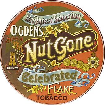
Ogdens’ Nut Gone Flake

ogdens1.jpg

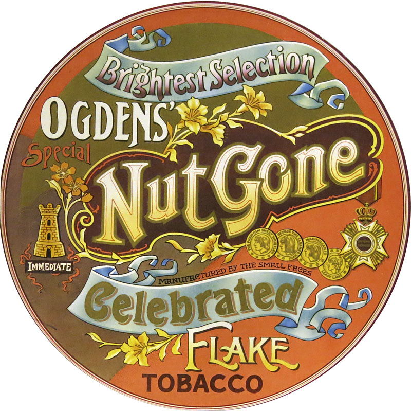
More psychedelia (there’s always more psychedelia). Listening to this Small Faces album this week I couldn’t remember whether my vinyl reissue from the 1980s had survived the vinyl purge I instituted a few years ago. It turns out I do still have the vinyl copy, a facsimile of the original circular sleeve. Ogdens’ Nut Gone Flake was released in 1968. Despite the innovative sleeve design and the generally tripped-out atmosphere (especially on side two) it seldom gets included in retrospectives of psychedelic album art. This is surprising since for design and execution it’s far better than the sleeves for Their Satanic Majesties Request and Magical Mystery Tour, the latter a great album with a really awful cover. I suspect the Small Faces’ album gets overlooked because the most typically psychedelic aspect of the artwork—the drawing/collage below—is hidden inside, the rest of the cover being a careful imitation of an “Ogdens’ Nut-brown Flake” tobacco tin. XTC borrowed the circular sleeve idea for their 1984 album The Big Express.

ogdens2.jpg

Interior panel. Illustration by P. Brown.

The drawing is credited to one “P. Brown”; the sleeve design, we’re told, was the work of Mick Swan who did nothing else in this area. If I’m vague about the details it’s because my copies of the album (CD and vinyl) contain no information other than the label copy. I imagine recent reissues which have had booklet notes will are more enlightening. This page has some comments from the band as to how the tobacco tin idea came about.

ogdens3.jpg

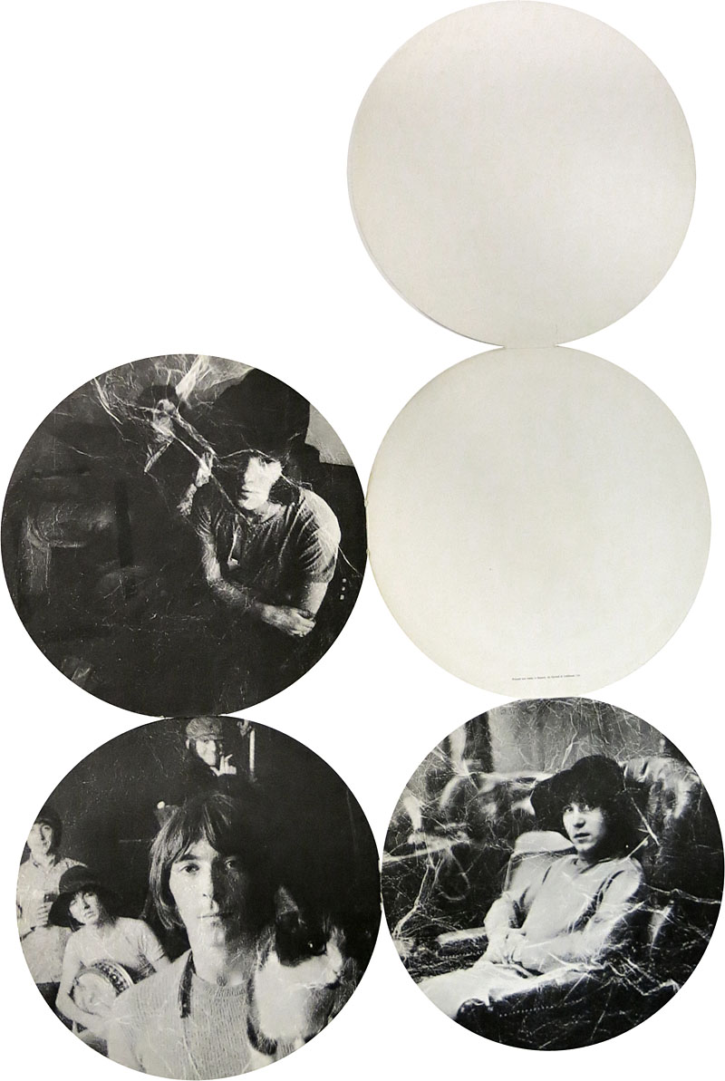
The opened-out sleeve.

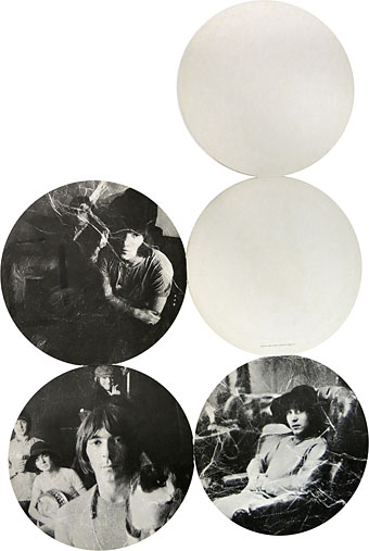
Original copies of this album used to command high prices (so to speak) since the fragile nature of the hinges holding together each part of the sleeve meant they rapidly wore out. Subsequent editions tended to be in regular square sleeves. My CD edition from 1989 was the first to make the most of the tobacco tin concept by packaging the whole thing in a tin. Inside you get a small reproduction of the fold-out sleeve and six somewhat redundant beer mats or coasters.

The band played two-thirds of the album on the BBC’s Colour Me Pop in 1968, complete with an appearance by Stan “The Man” Unwin who provides the “loony links” on the second side of Ogdens’ Nut Gone Flake. Most editions of Colour Me Pop are lost but that episode survived, and may be watched here.
ogdens4.jpg

The opened-out sleeve (obverse).

Elsewhere on { feuilleton }
• The album covers archive
Tadanori Yokoo album covers

yokoo01.jpg

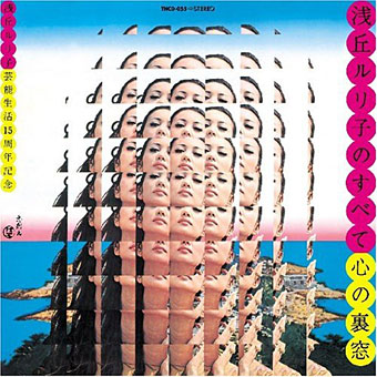
Kokoro No Uramado (1969) by Asaoka Ruriko.

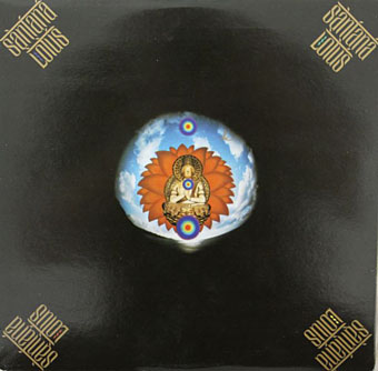
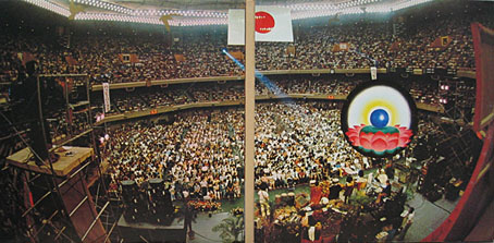
A few examples of Tadanori Yokoo’s earlier cover designs which are the ones I prefer. Although he’s continued to produce collage art for music releases, the CD format does his work few favours. I lose interest musically in Santana after about 1970 so I’d not looked properly at their triple-live set Lotus before, an album which is one of those worth having for the cover alone. Worth having for the cover and the music is Miles Davis’s thundering jazz-rock monolith Agharta which for some reason was given a different cover by Elena Pavlov on its US and European release. For Yokoo’s more recent cover art see his Discogs page.

yokoo02.jpg

Lotus (1974) by Santana.

yokoo03.jpg

Lotus (1974) by Santana.

yokoo04.jpg

Lotus (1974) by Santana.

Continue reading “Tadanori Yokoo album covers”

La femme qui se poudre

bokanowski1.jpg

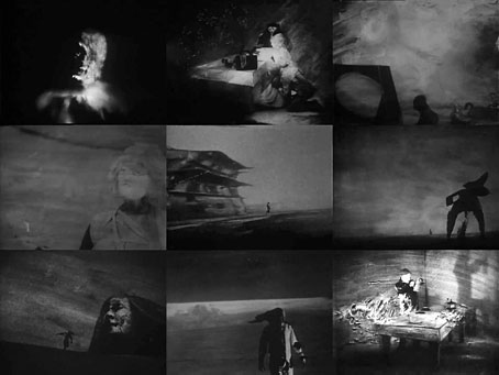
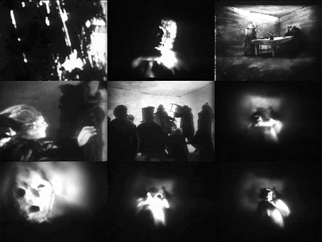
The DVD collection of films by Piotr Kamler turned up last week so I’ve been alternating viewing of that with shorts by Patrick Bokanowski. The latter is less an animator than a filmmaker who uses animation or film effects to achieve his aims, together with masks and very stylised performances. Bokanowski’s early film La femme qui se poudre (The Woman Who Powders Herself, 1972) runs for 15 minutes, and is as remarkable in its own way as his feature-length L’Ange (1982). La femme qui se poudre has the same masked figures engaged in activities which often lack easy interpretation; in both films the atmosphere can shift from absurdity to the edge of horror and back again. For me what’s most remarkable about this particular short is the way it anticipates both Eraserhead and the early films of the Brothers Quay yet still seems little known. The Quays are on record as admiring L’Ange but I’ve yet to see any sign that David Lynch knew of this film in the 1970s. I’d be wary of assuming that Lynch was imitating Bokanowski, artists are quite capable of finding themselves working in similar areas independently.

bokanowski2.jpg

Films of this nature always benefit from well-matched soundtracks: Piotr Kamler uses recordings by different electronic composers; Eraserhead had Fats Waller and the rumblings and hissings of Alan Splet; the Quays have unique compositions by Lech Jankowski. La femme qui se poudre and L’Ange have outstanding soundtracks by Michèle Bokanowski, the director’s wife and an accomplished avant-garde composer. Her work is as deserving of further attention as that of her husband. DVDs of L’Ange and a collection of Patrick Bokanowski’s short films may be purchased here.

Previously on { feuilleton }
• Le labyrinthe and Coeur de secours
• Chronopolis by Piotr Kamler
• Brothers Quay scarcities
• Patrick Bokanowski again
• L’Ange by Patrick Bokanowski