Fizeek Art

fizeek.jpg

Baccant (1956) by George Quaintance.

Fizeek Art Quarterly was an American magazine of gay art and erotica which ran for 26 issues from 1961 to 1969. Artists included Tom of Finland and—as can be seen above—George Quaintance. The Fizeek Art Weblog continues the tradition of the magazine by posting extracts from old issues as well as more contemporary material (below) in a similar vein. “Vein” is perhaps an apt choice of description given the quantity of tumescent penises on display. Most of the images are quite gleefully hardcore (and often deliciously silly with it); as usual, if that’s not your thing then don’t look. Perfectly fine for the rest of us, however.

fizeek2.jpg

Virgo by Kit.

Elsewhere on { feuilleton }
The gay artists archive

Previously on { feuilleton }
Let’s get physical: Bruce of Los Angeles and Tom of Finland
Philip Core and George Quaintance

Cocteau’s sword

cocteau1.jpg

Jean Cocteau looking nothing less than fabulous in what I guess is 1955 since the writer is sporting his Académie française medal, an award bestowed upon him that year. The ceremonial sword is his own design, needless to say, and the curiously-tinted photographs are by Frank Scherschel for LIFE. The colours and lavish decor—those metallic palm trees—aren’t so far removed from the photographs of James Bidgood although the milieu certainly is. I doubt Cocteau would mind who the photographer was if Bidgood’s favourite model, Bobby Kendall, was in the picture with him.

cocteau2.jpg

cocteau3.jpg

Elsewhere on { feuilleton }
The men with swords archive

Previously on { feuilleton }
Cristalophonics: searching for the Cocteau sound
Cocteau at the Louvre des Antiquaires
James Bidgood
La Villa Santo Sospir by Jean Cocteau

Steampunk Horror Shortcuts

steampunk.jpg

steampunk2.jpg
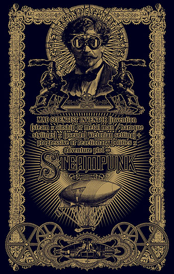
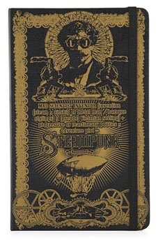
Time again for some work updates and other news. I mentioned in August that this Steampunk design—created to illustrate a formula definition of the genre by Jeff VanderMeer—was originally going to be a T-shirt. That idea fell by the wayside when an opportunity arose to submit it to Modofly who were asking for Steampunk-related work for a new line of their laser-etched Molekin books.

I’m pleased to announce that the books are now done and on sale at the Modofly store. These are available in two sizes, large (5.25ins x 8.25ins; 13.3cm x 20.9cm) and small (3.5ins x 5.5ins; 8.9cm x 13.9cm), $36 USD and $22 USD respectively.

penny_blood.jpg

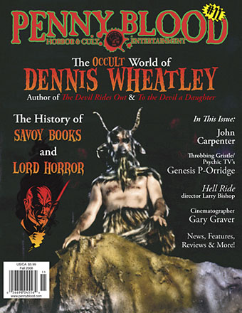
Next up is issue 11 of Penny Blood, an American horror magazine due out shortly which includes a feature on David Britton’s Lord Horror character and runs through the often tormented history of Savoy Books. Savoy’s Mike Butterworth and I were both interviewed and the piece should also include some comments from Keith Seward whose Savoy title, Horror Panegyric, examines the Lord Horror mythos. They don’t say yet when the magazine is out but it’s available for pre-order now.

While we’re on the subject of his lordship, I recently updated my pages for the Reverbstorm comics with a lot more samples taken from the re-scanned and re-lettered artwork. Work is still progressing on assembling the definitive single-volume edition of Reverbstorm as time permits. I’ve finished work on all seven published issues and am now engaged with the eighth and final section. More about that, and Reverbstorm itself, at a later date.

shortcuts.jpg

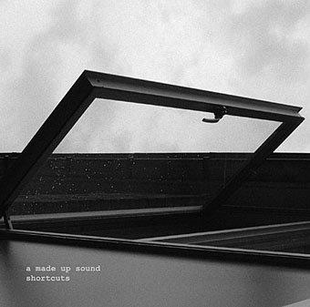
Finally, there’s another new CD design out, my fourth this year and there are more on the way; I’m starting to feel prolific. As can be seen from the cover, this was a very minimal job. A Made Up Sound is a pseudonym of Dave Huismans, aka 2562, whose excellent Aerial album I also designed. Shorctuts is a collection of electronic sketches and Dave took the moodily anonymous photographs himself.

The recurrent pose 23

flandrin1.jpg

These latest examples of the postural idée fixe come via The Other Andrew (again…thanks, Andrew), courtesy of his eye for the vintage male. The first one isn’t quite the Flandrin pose (although that rule has been broken here before) while the second is even more vague but the Jack Baker ad was something that turned up while searching the newly unveiled LIFE magazine photo archive with the keywords “homosexuality 1970s”. In case you’re wondering, the picture is captioned “Campaign poster for admitted homosexual, Jack Baker, running for President of University of Minnesota Student Association”.

flandrin2.jpg

Elsewhere on { feuilleton }
The recurrent pose archive

Design as virus 7: eyes and triangles

eye0.jpg

Continuing this occasional series. The above motif is the Golden Dawn’s Wedjat or Eye of Horus emblem as reproduced in the hardback edition of The Confessions of Aleister Crowley, an “autohagiography”. Crowley was under discussion here a few days ago and the eye in a triangle symbol can also be seen on the sleeve of the single featured in that posting, forming a part of the seal of the Ordo Templi Orientis, the occult order which Crowley joined in 1910. Crowley’s use of the eye in a triangle caught the attention of writer Robert Anton Wilson and the first part of his Illuminatus! trilogy (written with Robert Shea) is titled The Eye in the Pyramid. That latter symbol appears on the reverse of the American dollar bill, of course, and some of the conspiracy theories surrounding that usage are explored in the novel. Wilson went on to make the eye in a triangle something of a personal symbol and his obsessive use of the motif caught my attention in turn when I began reading his books.

All of which leads us to Hawkwind and a person whose name keeps turning up on these pages, designer Barney Bubbles.

eye1.jpg

Hawklog cover (detail) by Barney Bubbles.

The booklet which BB designed for Hawkwind’s second album, In Search of Space (1971), featured a version of the dollar bill symbol on its cover. This is the only eye in a triangle design I’ve seen among Barney Bubbles’ work although he was so prolific there may well be others. When I began producing my own significantly inferior Hawkwind graphics in the late Seventies I incorporated eyes in triangles partly as a way of avoiding having to draw hawks all the time but mainly because of Robert Anton Wilson. BB had already established a precedent and it so happens that the eye in the Golden Dawn/Crowley version is the eye of a hawk-headed Egyptian god.

Continue reading “Design as virus 7: eyes and triangles”