Ver Sacrum, 1898

vs-1898-01.jpg

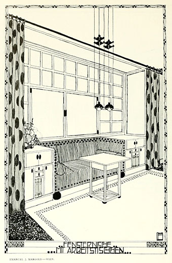
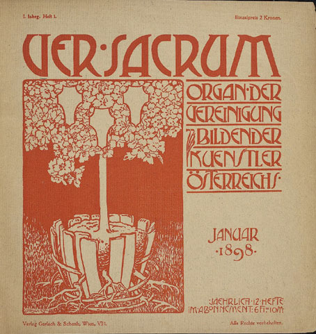
There are art magazines, and then there’s Ver Sacrum. I’m tempted to say there are magazines, and then there’s Ver Sacrum but that’s going a little far. Suffice to say that among the many fine art magazines of the period 1890 to 1910, a number of which have been featured here already, Ver Sacrum stands apart for its design and the consistent quality of its contents. Having seen back numbers of Jugend and Pan made available at the University of Heidelberg I’d been hoping the archivists there would eventually turn their attention to the art journal of the Viennese Secession, and they finally have, with the first bound number digitised here.
vs-1898-01.jpg

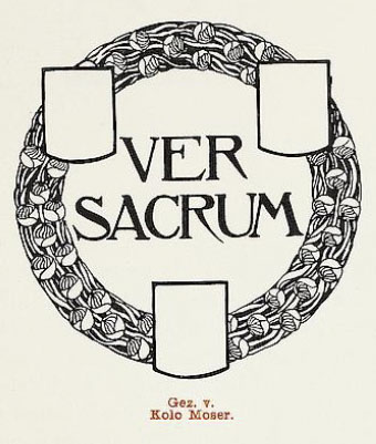
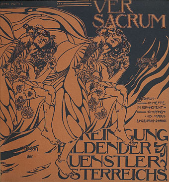
The volume for 1898 collects the first year of the journal cum manifesto of the Union of Austrian Artists, as the Secession group called themselves. That union is represented by the triple shield symbol which recurs in different forms across all the media produced by the group, the shields representing painting, sculpture and architecture. (On the cover of the first issue, the shields are shown growing from a tree whose roots have burst the confines of their container.) Ver Sacrum was a team effort with design contributions by Koloman Moser, Alfred Roller, Josef Hoffmann and Gustav Klimt, and what really sets it apart for me is its striking square format and the wide margins which provided a very flexible template for presenting a variety of graphic content. Other magazines of the period such as Pan shared some of the content but their presentation didn’t greatly differ from the more staid magazines of the era. Ver Sacrum was a break with the style of 19th century journals, and its graphic design points the way to much of the magazine and book design which would follow. It’s also a superb showcase for the Austrian development of the Art Nouveau style, and the overlap between Art Nouveau and the final flourishes of the Symbolist movement.
vs-1898-01.jpg

There’s far too much in this first volume to easily select, all I can do is advise that anyone interested has a browse through the entire book. As with Deutsche Kunst und Dekoration some of the art is the typically conservative fare of the period but the presentation makes up for that, and there’s enough of interest elsewhere to prevent things from getting dull. Here’s hoping the other volumes are made available very soon.

Update: Paul in the comments draws my attention to additional scans of Ver Sacrum at the Österreichische Nationalbibliothek. Heidelberg does a better job of making the issues browsable but it’s still great to have more than one source for this material.
Continue reading “Ver Sacrum, 1898”

Deutsche Kunst und Dekoration #20

dkd20-01.jpg

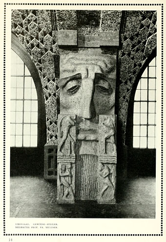
More sculptual work by Franz Metzner for a building whose interiors are in that ponderous Teutonic style which resembles designs for a fantasy film.

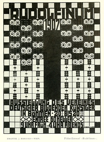
Continuing the delve into back numbers of Deutsche Kunst und Dekoration, the German periodical of art and decoration. Volume 20 covers the period from April 1907 to September 1907, and this is where this fascinating publication starts to run out of steam. A few more editions are worth looking at but after volume 25 the content collapses into the same welter of excessively dull genre painting and academic work that was plaguing Jugend magazine at this time. More about that later.

As usual, anyone wishing to see these samples in greater detail is advised to download the entire number at the Internet Archive. There’ll be more DK&D next week.

dkd20-02.jpg

dkd20-03.jpg

Continue reading “Deutsche Kunst und Dekoration #20”

Robert Anning Bell’s Herodias

herodias.jpg

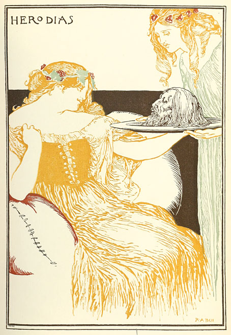
Artist Robert Anning Bell (1863–1933) chooses to depict Salomé’s mother rather than the more usual daughter in a slightly Pre-Raphaelite take on the familiar theme. This print appears in volumes 8–10 of Studio International, and seeems to have been a one-off although I’ll be happy to be hear of any other depictions of the story by Mr Bell.

Elsewhere on { feuilleton }
• The illustrators archive

Previously on { feuilleton }
• The Tempest illustrated
• Book-plates of To-day
• Robert Anning Bell’s Tempest

Dreamweapon: The Art and Life of Angus MacLise, 1938–1979

maclise.jpg

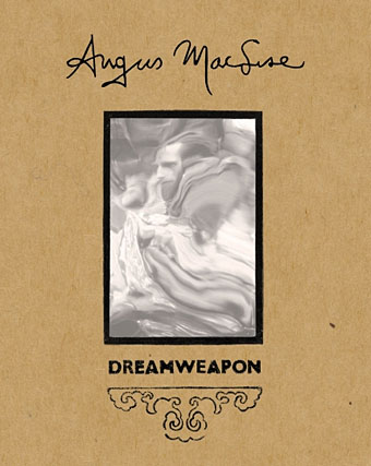
Artist, poet, percussionist and composer Angus MacLise receives the first proper overview of his work in a series of events presented in New York City throughout May. MacLise has too often been mentioned merely as the original drummer for The Velvet Underground—he famously quit when informed that being in a rock band meant you had to stop playing—but anyone familiar with the history of American underground culture will know that there was a lot more to his life than this. Johan Kugelberg and Will Swofford Cameron are the curators of Dreamweapon: The Art and Life of Angus MacLise, and this page has more detail about the events.

For those unable to get to NYC (that would be most of us) there’s always the indispensable Ubuweb where one may find a page of MacLise recordings, and also issue 9 of the amazing Aspen magazine, “the psychedelic issue”, edited by Angus MacLise and Hetty MacLise in 1971.

Previously on { feuilleton }
• The Invasion of Thunderbolt Pagoda

Weekend links 55

shah1.jpg

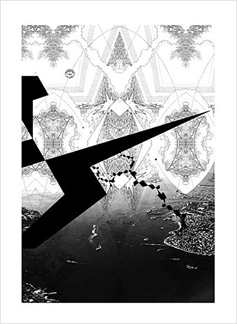
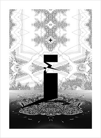
From the Ornamental Age series (2009) by Seher Shah.

Seher Shah has recently updated her website giving us a better view of her extraordinary art.

• The Demon Regent Asmodeus, my short film of Alan Moore’s reading from the first Moon & Serpent CD, has been posted to YouTube. In other self-promotion news, Mahakala, a drawing of mine from 1984, finds an audience on Tumblr.

• Yet more Moore: Alan Moore & Iain Sinclair “explore psychogeography” at the Cheltenham Festival in June. Alan will also be discussing science and fiction with Robin Ince. Then in July he’s performing with fine fellow Stephen O’Malley at Alexandra Palace as part of Portishead’s I’ll Be Your Mirror festival. They’ll be providing text and music for Harry Smith’s Heaven and Earth Magic.

In most countries, parents can tell their kids that if they work hard and do everything right, they could grow up to be the head of state and symbol of their nation. Not us. Our head of state is decided by one factor, and one factor alone: did he pass through the womb of one aristocratic Windsor woman living in a golden palace? The US head of state grew up with a mother on food stamps. The British head of state grew up with a mother on postage stamps. Is that a contrast that fills you with pride? (…) Earlier this month, David Cameron lamented that too many people in Britain get ahead because of who their parents are. A few minutes later, without missing a beat, he praised the monarchy as the best of British. Nobody laughed.

Johann Hari kicks the royals.

• Related to the above: Lydia Leith’s royal wedding sick bag.

• Beautiful Century relates a dispiriting (and very common) encounter with Google’s blog prudery. The new Beautiful Century is now at Tumblr.

• In the future, everything will be on Tumblr for fifteen minutes. Among this week’s discoveries there’s Writers and Kitties, attractive men and vintage photos at Stuff Doer, and all manner of things at Maggs Counterculture including a picture by Jim Leon I hadn’t seen before.

shah2.jpg

From the Ornamental Age series (2009) by Seher Shah.

“Sidewalk cafés, free from conservative business attire…” Film of groovy Greenwich Village in the late 1960s. Related: groovier fashions in Art Nouveau Barcelona.

• Ai Weiwei’s Blog: Writings, Interviews, and Digital Rants, 2006-2009, a book from MIT Press.

• The Delian Mode, a film about electronic musician Delia Derbyshire by Kara Blake.

• Austin Osman Spare, a biography of the artist and occultist by Phil Baker.

• Lando Jones is giving away three limited edition prints of his artwork.

• Plano Creativo, a blog (in Spanish) by Alejandro Jodorowsky.

• B Magazine is a new publication for gay Americans.

• Diaghilev gets his due at Coilhouse.

• Baby’s On Fire (1973) by Brian Eno | Baby’s On Fire (1976) by 801 | Baby’s On Fire (from Velvet Goldmine) (1998) by The Venus In Furs.