Weekend links 58

delpozo1.jpg

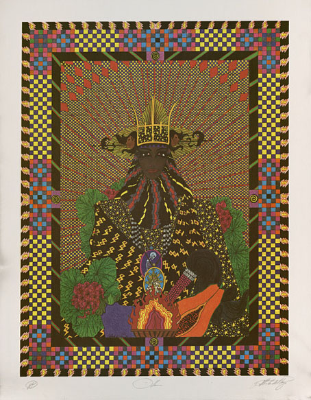
Oya by Alberto del Pozo (1945–1992). Also known as Yansa, Oya is Changó’s third wife. She is the goddess of the winds and of lightning and is mistress of the cemetery gates. Passionate and brave she fights by her husband’s side if needed. Her favorite offerings are papaya, eggplant and geraniums. From Santeria at BibliOdyssey.

Austin Osman Spare is a good example of the dictum that quality will out in the end, no matter how long it remains buried. Overlooked by the art establishment after he retreated into his private mythologies, a substantial portion of his output was equally ignored by occultists who wanted to preserve him as a weird and scary working-class magus. One group dismissed his deeply-felt spiritual interests in a manner they wouldn’t dare employ if he’d been a follower of Santeria, say (or even a devout Christian), while the other group seemed to regard his superb portraits as too mundane to be worthy of attention. Now that Phil Baker’s Spare biography has been published by Strange Attractor we might have reached the end of such short-sighted appraisals and can finally see a more rounded picture of the man and his work:

[Kenneth] Grant preserved and magnified Spare’s own tendency to confabulation, giving him the starring role in stories further influenced by Grant’s own reading of visionary and pulp writers such as Arthur Machen, HP Lovecraft, and Fu Manchu creator Sax Rohmer. Grant’s Spare seems to inhabit a parallel London; a city with an alchemist in Islington, a mysterious Chinese dream-control cult in Stockwell, and a small shop with a labyrinthine basement complex, its grottoes decorated by Spare, where a magical lodge holds meetings. This shop – then a furrier, now an Islamic bookshop, near Baker Street – really existed, and part of the fascination of Grant’s version of Spare’s London is its misty overlap with reality.

Austin Osman Spare: Cockney visionary by Phil Baker.

Austin Osman Spare: The man art history left behind | A Flickr set: Austin Osman Spare at the Cuming Museum | HV Morton meets Austin Spare (1927).

• More quality rising from obscurity: Jerzy Skolimowski’s Deep End. Skolimowski’s drama is one of unpleasant characters behaving badly towards each other. Anglo-American cinema featured a great deal of this in the 1970s when filmmakers disregarded the sympathies of their audience in a manner that would be difficult today. John Patterson looks at another example which is also given a re-release this month, the “feral, minatory and menacing masterwork” that is Taxi Driver.

delpozo2.jpg

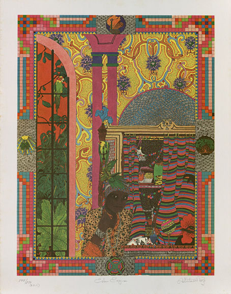
Echú Eleguá by Alberto del Pozo. Among the most ancient of the orishas Echú Eleguá is the messenger of the gods, who forges roads, protects the house, and is heaven’s gate-keeper. In any ceremony he is invoked first. He owns all cowrie shells and is the god of luck. A prankster, Echú Eleguá frequently has a monkey and a black rooster by his side. Like a mischievous boy he enjoys gossip and must be pampered with offerings of toys, fruit, and candy.

Minutes, a compilation on the LTM label from 1987: William Burroughs, Jean Cocteau, Tuxedomoon, Jacques Derrida, The Monochrome Set, and er…Richard Jobson. Thomi Wroblewski designed covers for a number of Burroughs titles in the 1980s, and he also provided the cover art for this release.

Mikel Marton Photography: a Tumblr of erotic photography and self-portraits.

From Death Factory To Norfolk Fens: Chris & Cosey interviewed.

NASA announces results of epic space-time experiment.

Oritsunagumono by Takayuki Hori: origami x-rays.

Plexus magazine at 50 Watts.

Mother Sky (1970) by Can | Late For The Sky (1974) by Jackson Browne.

Deutsche Kunst und Dekoration #21

dkd21-01.jpg

The Eternal Idol by Auguste Rodin.

Continuing the delve into back numbers of Deutsche Kunst und Dekoration, the German periodical of art and decoration. Volume 21 covers the period from October 1907 to March 1908, and the highlight of this issue is a feature on the black-and-white art of Julius Klinger, an artist whose drawings appeared regularly in Jugend.

If you’ve been following this series it’s worth noting that volume 3 which is missing from the collection at the Internet Archive can be found at the University of Heidelberg. I would have featured it here but it turns out to be surprisingly dull compared to the other early editions. As before, anyone wishing to see these samples in greater detail is advised to download the entire number at the Internet Archive. There’ll be more DK&D next week.

dkd21-02.jpg

dkd21-03.jpg

Continue reading “Deutsche Kunst und Dekoration #21”

Ver Sacrum, 1898

vs-1898-01.jpg

There are art magazines, and then there’s Ver Sacrum. I’m tempted to say there are magazines, and then there’s Ver Sacrum but that’s going a little far. Suffice to say that among the many fine art magazines of the period 1890 to 1910, a number of which have been featured here already, Ver Sacrum stands apart for its design and the consistent quality of its contents. Having seen back numbers of Jugend and Pan made available at the University of Heidelberg I’d been hoping the archivists there would eventually turn their attention to the art journal of the Viennese Secession, and they finally have, with the first bound number digitised here.

vs-1898-01.jpg

The volume for 1898 collects the first year of the journal cum manifesto of the Union of Austrian Artists, as the Secession group called themselves. That union is represented by the triple shield symbol which recurs in different forms across all the media produced by the group, the shields representing painting, sculpture and architecture. (On the cover of the first issue, the shields are shown growing from a tree whose roots have burst the confines of their container.) Ver Sacrum was a team effort with design contributions by Koloman Moser, Alfred Roller, Josef Hoffmann and Gustav Klimt, and what really sets it apart for me is its striking square format and the wide margins which provided a very flexible template for presenting a variety of graphic content. Other magazines of the period such as Pan shared some of the content but their presentation didn’t greatly differ from the more staid magazines of the era. Ver Sacrum was a break with the style of 19th century journals, and its graphic design points the way to much of the magazine and book design which would follow. It’s also a superb showcase for the Austrian development of the Art Nouveau style, and the overlap between Art Nouveau and the final flourishes of the Symbolist movement.

vs-1898-01.jpg

There’s far too much in this first volume to easily select, all I can do is advise that anyone interested has a browse through the entire book. As with Deutsche Kunst und Dekoration some of the art is the typically conservative fare of the period but the presentation makes up for that, and there’s enough of interest elsewhere to prevent things from getting dull. Here’s hoping the other volumes are made available very soon.

Update: Paul in the comments draws my attention to additional scans of Ver Sacrum at the Österreichische Nationalbibliothek. Heidelberg does a better job of making the issues browsable but it’s still great to have more than one source for this material.

Continue reading “Ver Sacrum, 1898”

Deutsche Kunst und Dekoration #20

dkd20-01.jpg

More sculptual work by Franz Metzner for a building whose interiors are in that ponderous Teutonic style which resembles designs for a fantasy film.

Continuing the delve into back numbers of Deutsche Kunst und Dekoration, the German periodical of art and decoration. Volume 20 covers the period from April 1907 to September 1907, and this is where this fascinating publication starts to run out of steam. A few more editions are worth looking at but after volume 25 the content collapses into the same welter of excessively dull genre painting and academic work that was plaguing Jugend magazine at this time. More about that later.

As usual, anyone wishing to see these samples in greater detail is advised to download the entire number at the Internet Archive. There’ll be more DK&D next week.

dkd20-02.jpg

dkd20-03.jpg

Continue reading “Deutsche Kunst und Dekoration #20”

Robert Anning Bell’s Herodias

herodias.jpg

Artist Robert Anning Bell (1863–1933) chooses to depict Salomé’s mother rather than the more usual daughter in a slightly Pre-Raphaelite take on the familiar theme. This print appears in volumes 8–10 of Studio International, and seeems to have been a one-off although I’ll be happy to be hear of any other depictions of the story by Mr Bell.

Elsewhere on { feuilleton }
The illustrators archive

Previously on { feuilleton }
The Tempest illustrated
Book-plates of To-day
Robert Anning Bell’s Tempest