Lust, from the Seven Deadly Sins (circa 1550–55) by Léon Davent, after Luca Penni.
• At Dennis Cooper’s: Bill Hsu presents…High Anxiety: tense, dark films from 2010–2019 (for fans of Robert Aickman and Brian Evenson) (restored).
• New music: Ever No Way by Seefeel; In A Few Places Along The River by Abul Mogard; Displaces by Francesco Fabris.
• At Inconspicuous Consumption: Paul Lukas investigates a Frank Lloyd Wright typographic mystery.
In the late 19th century, Rops created a vast oeuvre of drawings, etchings, prints and paintings of such breathtaking fruitiness—often laced with satanic elements—that even Picasso responded to him in awe (in homage, the Spaniard drew a cartoon of a man in the form of a pig performing cunnilingus on a woman). Rops’ works depicted naked witches riding brooms, voyeurs in top hats and courtesans riding penis-shaped bicycles. The French art critic Félix Fénéon called him an artist “who paints phalluses the way others paint landscapes”.
Christian House on a new exhibition, Laboratory of Lust, showcasing the erotic art of Félicien Rops
• At Public Domain Review: Wayang Kulit: Raden Soelardi’s Illustrations of Javanese Puppets (1919).
• At Criterion Current: David Hudson explores the fantastic realism of Georges Franju.
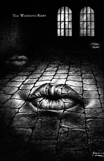
• At Unquiet Things: The Nocturnal Visions of Nona Limmen.
• Steven Heller’s font of the month is Curve Display.
• RIP TV producer Kenith Trodd.
• Lust (1954) by Les Baxter Featuring Bas Sheva | Monster Lust (1989) by Helios Creed | Keine Lust (2004) by Rammstein