Diamonds

coils.jpg

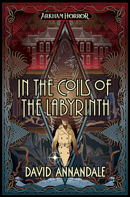
I’ve finally found time to update the website a little so here are the last two book covers I was working on last year. In the Coils of the Labyrinth by David Annandale is another tale of Lovecraftian horror for Aconyte:

Professor Miranda Ventham is having bad dreams—nothing new in 1920s Arkham—but hers are horrifying glimpses of a dark future. Now seriously ill, she books herself into the new sanatorium, Stroud Home. With luck, the town’s eldritch taint won’t reach her there. And yet the nightmares worsen. Aided by her friend, Agatha Crane, they delve into the background of the sanatorium’s enigmatic director, Donovan Stroud. Plagued by doubts, delusions, and terrifying visions, Christine must unravel the shrouded history of the Strouds before she is trapped in a labyrinthine nightmare. Something sinister lurks at its heart, and it longs to be set free.

otzi.jpg

Otzi’s Odyssey by Neil Perry Gordon is a metaphysical drama which posits a fictional life and afterlife for the neolithic iceman whose body was discovered in the Alps:

Ötzi’s Odyssey – The Troubled Soul of a Neolithic Iceman, opens in the year 1991 with the remarkable sighting of a mummified man, half frozen in glacial ice, whom two hikers stumble upon. Along with this profound archeological discovery, the soul of this five-thousand-year-old iceman is awakened.

?Ötzi the iceman’s adventure takes him to the modern era, where his observant soul tries to comprehend why it remains tethered to the frozen mummy, as well as to make sense of a technologically advanced world. The story then returns to 3300 BCE, to the life and times of clan chief Bhark as he lives with his family in a peaceful village upon stilt homes clinging to the shore of the great Lake Neith, located in the shadows of ominous Similaun Mountain.

Both these covers use an elongated diamond shape in their designs, a repetition that I wasn’t intending. I did this first on Otzi’s Odyssey since the story has four infernal realms that the character’s soul travels through. A diamond shape subsequently became necessary for In the Coils of the Labyrinth when a central panel was required that wouldn’t cover too much of the background imagery while also connecting the upper and lower levels and providing a graphic link with my previous covers in this series. There’s a similar shape on my cover for The Voice of the Fire so I should probably avoid doing this for a while…

Still to be announced from last year is an album cover design that I managed to fit in despite several months of serious overwork. This was my first proper album cover for some time (as opposed to the layout I’m usually doing on albums where the artists provide their own art) but the release seems to have been delayed for some reason. More about that one when/if it appears.

Elsewhere on { feuilleton }
The Lovecraft archive

Previously on { feuilleton }
The Devourer Below
Litany of Dreams
The Last Ritual

Luminous Procuress

luminous01.jpg

How to describe this one? Inauguration of the Pleasure Dome, pt 2? Bargain-basement Satyricon? The latter is probably more apt, Kenneth Anger’s longer films are more formal than Luminous Procuress. Steven Arnold’s only feature film resembles something made by the extras from a Fellini extravaganza after they’ve stayed overnight at Cinecittà; a series of artfully-arranged tableaux (artful arrangement being Arnold’s forte), together with a hardcore sex-scene (hetero) that seems out of place beside the relatively chaste antics elsewhere:

Luminous Procuress is an altogether extraordinary, individualistic phantasmagoria. It was filmed entirely in San Francisco over a two-year period, and describes the adventures of two wandering youths in San Francisco who visit the home of a mysterious woman, the Procuress. She is an elegant emblem of sorcery, her vivid features glowing under bizarre, striking maquillage, and one is not certain who she is or where she intends to lead the protagonists. Although the language she speaks is vaguely Russian, it appears that the Procuress has psychic powers. She discerns a sympathetic response to her on the part of the youths, and by magical means, conducts them through fantastic rooms, on a psychic journey. Through strange passageways, one voyages with the Procuress and her charges, glimpsing hidden nightmares and panoplied chambers of revelry, where celebrants, ornately festooned, dance and make love before unseen gods… (more)

luminous02.jpg

Arnold’s film follows the low-budget form by being shot without synchronised sound, so the dialogue, such as it is, has been dubbed on later. Rather than try and match words to the improvised scenes Arnold instead gives his characters foreign voices, most of which are mumbling and may not even be saying anything intelligible in their own language. This spares us any Warhol-like amateur theatricals while augmenting the dream-like atmosphere. The music by Warner Jepson is the icing on a very unusual cake. Jepson was a serious electronic composer whose rather abrasive debut album, Totentanz, was included in the Creel Pone catalogue of electronic obscurities in 2005. For the film Jepson provides swathes of synthesizer doodling interspersed with arrangements for keyboards and voices. All this and the Cockettes too. Salvador Dalí loved it.

luminous03.jpg

luminous04.jpg

luminous05.jpg

Continue reading “Luminous Procuress”

Weekend links 624

griffiths.jpg

An alphabet designed by Ben Griffiths. Via.

• “From the cellular to the galactic, via Paleolithic cave markings to the trace impressions left by drone photography on our mind’s eye, incorporating dancing plagues, communist psychedelic witches, hyper-sexual fungi, chthonic descents, and skyward ascents, The Neon Hieroglyph weaves together a series of painterly and poetic considerations on a feminized history of the rye fungus Ergot, the chemical basis of LSD.” Coming soon from Strange Attractor: The Neon Hieroglyph, a book, LP and folio of prints by Tai Shani.

• “3rd From The Sun was the last album of Chrome’s imperial phase, and it cemented their status as one of the most inhuman and superhuman rock bands that America ever produced. More people need to recognize.” Agreed. (previously)

• “People often say, ‘How can you be so disciplined?’ It’s easy. Otherwise, I would have to go work for somebody else!” John Waters (again). Also here.

I’ve always thought that literature should be entertaining as well as instructive—a very old-fashioned idea but one that I adhere to. When I set out to write in this way—particularly in this way, a political way, if you want to call it that—I intend to make a donation, to try to give something. There doesn’t seem to me to be any point in giving more misery or exacerbating unhappiness through some kind of hyper-intellectual, pyrotechnical writing about unhappiness and the shit that we all find ourselves in. That’s been done plenty. I think first of all that it doesn’t need to be done any more and second of all there’s a kind of reactionary aspect to it which is that the emphasizing of misery without any anti-pessimism, as you put it, would be simply seduction into inactivity and political despair. In other words, to do politics at all on any level, especially on a revolutionary or on an insurrectionary level, there has to be some anti-pessimism—I won’t say optimism because that sounds so fatuous, futile; but anti-pessimism is a nice phrase. And there’s a deliberate attempt at that in the writing. Then again it’s a matter of my personality, I guess, inclined towards the notion of the healing laugh to some extent. We have an anarchist thinker in America, John Zerzan, who wrote an essay against humour which maybe is one of the things I was reacting against. Even if irony is counter-revolutionary which I think it might be to a certain extent I don’t see any way in which you could say that laughter itself is counter-revolutionary. This doesn’t make any sense to me unless you mean to get rid of language and thought altogether, which is just another form of nihilism. So as long as you’re going to accept culture on some level you’re certainly going to have to accept humour. And as long as you’re going to have to accept humour you might as well see humour as potentially revolutionary.

Peter Lamborn Wilson aka Hakim Bey, who died last month. Many of Wilson’s writings are available at The Anarchist Library. From 2008: A poem for Leonora Carrington

• “It’s such a fundamental question,” says Midori Takada, “why do humans need to make rhythm, and the space that structure creates?”

• “14 Warning Signs That You Are Living in a Society Without a Counterculture” by Ted Gioia.

• A trailer for Earwig, the new film from Lucile Hadžihalilović, based on a story by Brian Catling.

• New music: Aura by Hatis Noit, and Warmth Of The Sun by Pye Corner Audio.

• At Dennis Cooper’s: Spotlight on…SE Hinton Rumble Fish (1975).

• “Hear tracks from the 1980s Peruvian electronic underground”.

Intermittent Eyeball Fodder at Unquiet Things.

West Tulsa Story (1983) by Stewart Copeland | Kála/Assassins Of Hakim Bey (1997) by Coil | Neon Lights (2000) by Señor Coconut Y Su Conjunto

Weekend links 620

varo

Premonition (1953) by Remedios Varo.

• “Classical mythology, Arcadian idylls, occult speculation, and an interest in cultural curiosities coexisted in the grotto, allowing for the playful exploration of a new tension emerging between Nature and Artifice.” Laura Tradii explores the artificial grottoes of the Renaissance and beyond.

• “Some of the symbols and signs seem like bridges to nowhere, and perhaps Nabokov was lovingly teasing our endless quest to find patterns and generate meaning.” David M. Rubin on writing a response to a Nabokov short story.

• New music: “KMRU & Aho Ssan erupt in post-apocalyptic extremity with Resurgence“. I did the layout for this latest release on the Subtext label but I still haven’t got round to updating my web pages so you’ll have to take my word for it.

• Powell & Pressburger’s Black Narcissus “unleashes a level of eroticism that’s surprising for 1940s British cinema,” says Adam Scovell.

• “Premonitions are impossible, and they come true all the time.” Fiona Sturges reviews The Premonitions Bureau by Sam Knight.

• Between Hell and Paradise: paintings by Hieronymus Bosch and his followers at the Museum of Fine Arts, Budapest.

• At The Collector: Olivia Barrett on the Voodoo Queens of New Orleans.

• Steven Heller’s font of the month is Astronef Super.

• Mix of the week: Isolatedmix 118 by Pan American.

TMP-01 Vintage Synth TV Series from Benge.

• Vale, A Year In The Country.

Premonition (1979) by Simple Minds | Premonition (1980) by Cabaret Voltaire | Premonition (Giant Empty Iron Vessel) (1987) by David Sylvian & Holger Czukay

Virgil Finlay’s magazine illustrations

finlay1.jpg

The Time Machine by HG Wells; Famous Fantastic Mysteries, August 1950.

This one will be popular, I’m sure. One of the recent uploads at the Internet Archive is a massive collection of Virgil Finlay’s interior illustrations from the magazines that published most of his work—Weird Tales, Famous Fantastic Mysteries, Amazing Stories, etc, etc—together with the astrological illustrations he created later in his career, plus other material, including a few pieces that never appeared in print. Pencil drawings, lithographs and hundreds of meticulous renderings in ink on paper or scratchboard; 1888 illustrations in all. Whoever put the haul together has been much more thorough than I’d have expected. Rather than a stash of random drawings you get 10 separate folders (best appreciated in the cbz format; see the note below) with each illustration tagged with the name of the story it was illustrating, and the date of publication. The contents are a mix of reproductions from later reprints, together with cropped pages from magazine scans. Taken together, this must comprise almost all of Finlay’s published work excluding his magazine covers and other paintings.

finlay3.jpg

Earth’s Last Citadel by Henry Kuttner and CL Moore; Fantastic Novels Magazine, July 1950.

Virgil Finlay (1914–1971) can be a frustrating artist for anyone who admires his work. He was massively prolific, and maintained a high level of quality for almost 40 years; but his interior illustrations were often printed on pulp stock, the kind of paper that offers the worst kind of print reproduction, and which darkens and eventually crumbles into dust unless it’s carefully stored. Descriptions of his illustrations often note that his drawing style evolved to compensate for the deficiencies of the printing but much of his artwork was very finely rendered, and I’m not sure his minute stipple effects would have printed any better (or worse) than the traditional cross-hatching which he used from time to time. His drawings have at least been well-served by reprint collections, where the white art paper makes his striking compositions leap off the page. Inevitably, the best of these—Gerry de la Ree’s seven-volume collection from the 1970s, and a four-volume set from the 1990s—are all out of print. The sheer quantity of illustrations also presents a problem for any reprint collection: what to include…or leave out? All of which is a roundabout way of saying that this accumulation of his interior art may be unauthorised, and even frowned upon by some, but it benefits Finlay by keeping his work in circulation and showing the full range of his career.

finlay5.jpg

The Faceless God by Robert Bloch; Weird Tales, May 1936.

With 1888 illustrations to choose from, picking out a representative selection is a hopeless task, so what you see here are a few favourites. I said that Finlay maintained a high level of quality but there are unsuccessful Finlays, especially in the early years when his style was still evolving. (It should be noted that he was in his early twenties when he was creating pieces such as these. His errors are a lot less grievous than mine were at the same age.) One of the hallmarks of the Finlay style is a frequent use of photo-reference, especially for faces, and it’s the disjunction between faces and bodies which occasionally jars. Disparities between the size or angle of a head and a body are common in photo-collage but you don’t expect to see them in a drawing. Occasionally the disparities worked for him, as in his illustration for The Faceless God by Robert Bloch, a drawing that so impressed HP Lovecraft that he responded with a short poem praising both picture and artist. The reference images used for his later work are much more seamlessly integrated, and in the 1940s and 50s he seemed to be using posed models as frequently as the illustrators for the big American magazines.

finlay4.jpg

The Man Who Mastered Time by Ray Cummings; Fantastic Novels Magazine, March 1950. Remove the fungi from this illustration and you’d have an almost abstract image.

Regarding cbz or cbr files: these are simply folders filled with jpegs or pngs which have been zipped then given a new suffix. They can be browsed using a suitable comics-reader application; I use Simple Comic for the iMac and ComiCat for the tablet. The files can also be opened with any unzipping software to give you access to the images inside. I find these files so much easier to use than pdfs, especially for image-heavy publications, that I’ve taken to exporting pdf pages as jpegs then zipping a folder of the images into a cbr. One of the advantages of the cbr format is that the readers allow you to extract an image without unzipping the whole file. The only drawback with the Finlay files is that ComiCat doesn’t let you see the file name the way that Simple Comic does.

finlay6.jpg

Full Moon by Talbot Mundy; Famous Fantastic Mysteries, February 1953.

Elsewhere on { feuilleton }
The illustrators archive
The Lovecraft archive

Previously on { feuilleton }
Virgil Finlay’s Tarzan
Virgil Finlay’s Salomé
The monstrous tome