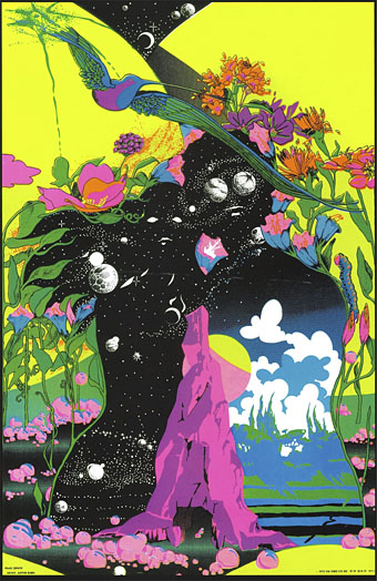
Pierrot le Fleur by Marina Mika.
• I’ve been saying for years that Andrzej Żuławski’s On the Silver Globe should be given a proper blu-ray release, and that’s what Region B viewers will receive soon courtesy of Eureka. Andrzej Żuławski: Three Films will be released in May, a set that comprises the director’s unfinished SF film, his debut feature, The Third Part of the Night (1971)—which I still haven’t seen—and also The Devil (1972), which I have seen but only as a poor copy that’s been circulating via illicit channels for many years.
• “The album’s 18-minute, multi-section standout Jenny Ondioline acquired a crucial role. It became the first track I’d play whenever I boarded a train, slipped on my headphones, and settled in beside an anonymous rail rider.” Hayden Merrick on travelling across the USA to the sounds of Transient Random-Noise Bursts With Announcements by Stereolab.
• At Aquarium Drunkard: E. Hehr explores musical exotica via Technicolor Paradise: Rhum Rhapsodies & Other Exotic Delights, “…a compilation that touches upon the noir side of exotica, far more gritty and raw compared to the lavish production on the esteemed exotica albums from Capitol and Liberty.” I own this collection. It’s a good one.
“My own experience,” Leda muses “tells me that more love goes into the thought of homosexuality than the practice.” Other gays are neither radical heroes nor the pathetic, self-hating fairies of, say, Mart Crowley’s Boys in the Band. This frankness makes Love, Leda a singular work; a contemporary portrait of working-class gay London in the years running up to decriminalisation that neither flatters nor sensationalises. In doing so, Hyatt transforms gay sex and love from an abject taboo to a deeply human intimacy.
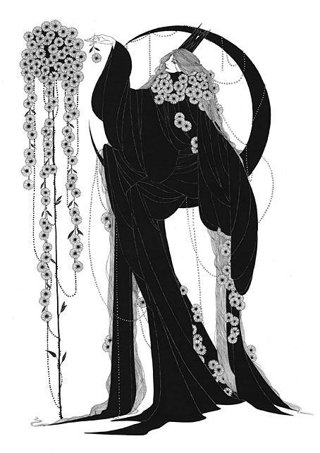
Huw Lemmey on Love, Leda by Mark Hyatt, a candid tale of gay life in the Britain of the 1960s
• “It became something like a ritual, an exhumation of long-unheard music reanimated as glacial drones and ghostly symphonic movements—the sound of the cathedral transmuted into an enveloping shadow of pulsation, echo and glitch.” Orgelwerk by Ted Reichman.
• Max Richter answers 50 questions. Sleep, Richter’s 8-hour ambient epic, is still my favourite among his compositions that I’ve heard to date: 8 CDs and a blu-ray disc from Deutsche Grammophon.
• RIP Alastair Brotchie, publisher of books at Atlas Press, and biographer of Alfred Jarry. Also a commenter here on one occasion when he corrected an erroneous photograph caption.
• A trailer for Suzume, a new feature film by Makoto Shinkai. Related: A Gathering of Cats.
• The story behind Jack Pierson’s homoerotic new photo book.
• The Strange World of…Phew.
• Why Do I Still Sleep (1983) by Popol Vuh | Sleep I (1995) by Paul Schütze | The Dreamer Is Still Asleep (1999) by Coil