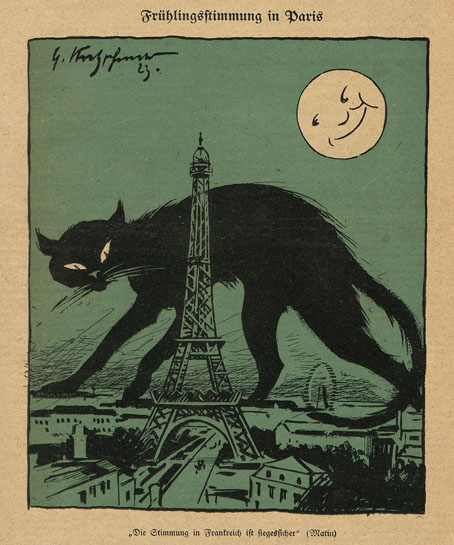
Springtime in Paris (1923) by Georg Kretzschmar.
• I’ve been asked to mention that the tribute book put together for Alan Moore’s 70th birthday, Alan Moore: Portraits of an Extraordinary Gentleman, is still available. As before, the book features contributions from many well-known comic artists, a foreword by Iain Sinclair, and this piece of my own.
• “I never posted any lecture of mine on Tumblr, even though Tumblr would seem to have plenty of elbow-room for hour-long, learned, European public lectures (with many lecture slides).” Utopian Realism, a speech by Bruce Sterling.
• Reading the Signs: John Kenny in conversation with Mark Valentine about Mark’s new collection Lost Estates.
There remains something suspect about blotter, a stain that is both a blessing and a curse. As the blotter producer Matthew Rick, who started selling sheets as non-dipped ‘art’ collectables at festivals in 1998, puts it: ‘[B]lotter is the last underground art form that’s going to stay underground, simply because you’re creating something that looks like and functions like a felony.’ In other words, blotter is ontologically illicit; it is, as Rick says, ‘drug paraphernalia by its very existence’.
Erik Davis (again) on LSD and the cultural history of the printed blotter
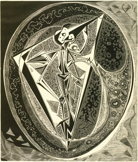
• At Colossal: Uncanny phenomena derail domestic bliss in Marisa Adesman’s luminous paintings.
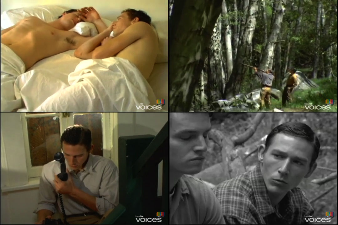
• Standing stones, urban hellscapes and male nudes: Andrew Pulver on Derek Jarman’s Super-8 films.
• “ [breaking news] An anomaly on earth has brought the cats to over 150 meters. Please be patient.”
• At We Are The Mutants: Alien Renaissance: An interview with illustrator Bob Fowke.
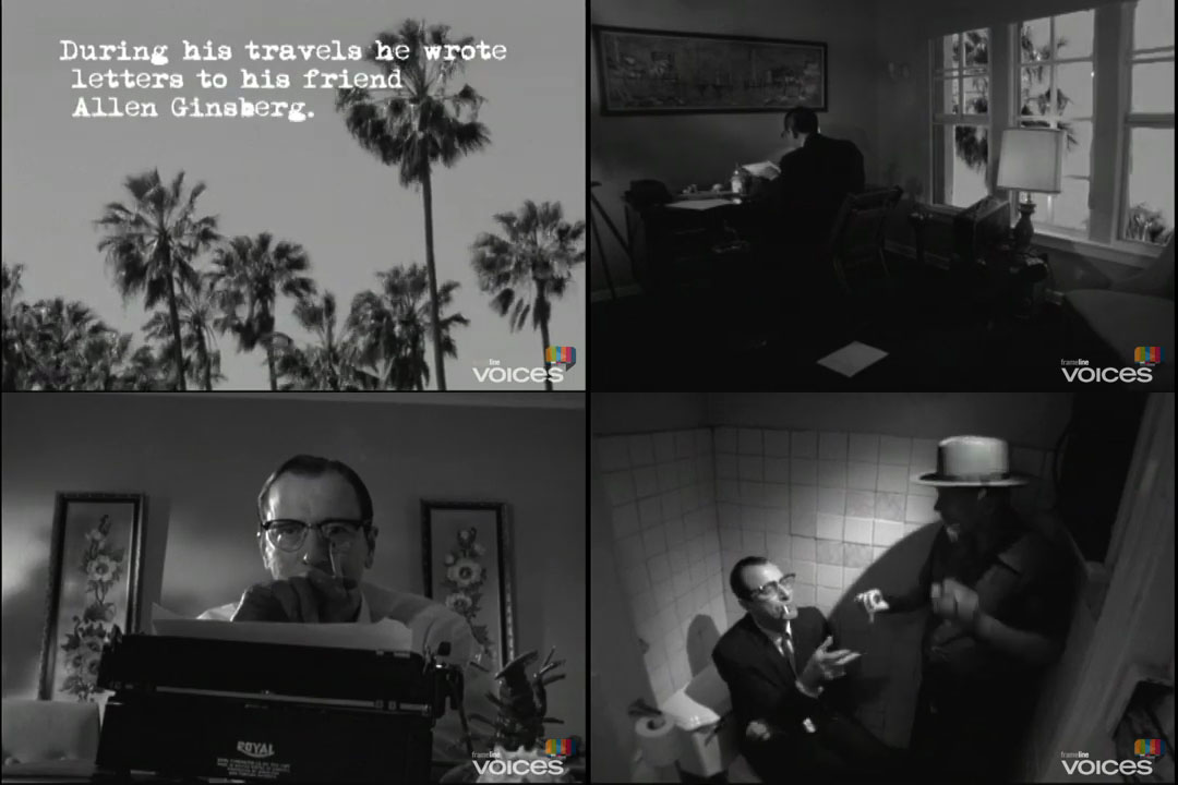
• At Dennis Cooper’s: Spotlight on…René Crevel My Body and I (1926).
• At Public Domain Review: The Little Journal of Rejects (1896).
• Steven Heller’s font of the month is Sandhouse.
• RIP Steve Albini.
• Sandoz In The Rain (1970) by Amon Düül II | Bon Voyage Au LSD (2001) by Acid Mothers Temple & The Melting Paraiso U.F.O. | Careful With That Sheet Of Acid, Eugene (2019) by Jenzeits