Elaine Hanelock’s Hollywood stars

hanelock04.jpg

The essay I wrote about psychedelic art for Communication Arts earlier this year had a word limit so there was little mention of the way the psychedelic style was swiftly co-opted by advertising and commercial art as a means of reaching a youthful audience. This is a really a subject in itself, the way in which an aesthetic that was countercultural in 1965 was becoming mainstream by 1968, and was still rippling through the world of graphic design in the early 1970s.

Elaine Hanelock’s posters of Hollywood stars of the 1920s and 30s were published by Royal Screen Craft Inc, Los Angeles, in 1968, and combine two trends: psychedelic art and the nostalgia for old Hollywood that emerged in the mid-60s. There are ten posters in the set: The Marx Brothers, Clara Bow (the “It Girl”), Mae West & WC Fields, Laurel & Hardy, John Barrymore, Charlie Chaplin, Clark Gable, Jean Harlow, Will Rogers, and Wallace Beery & Marie Dressler. Nobody seems to know anything about Elaine Hanelock’s career elsewhere but her posters continue to find an audience among collectors.

hanelock07.jpg

hanelock01.jpg

Continue reading “Elaine Hanelock’s Hollywood stars”

George Barbier’s Le Bonheur du Jour

barbier11.jpg

French artist and designer George Barbier was born on 16th October, 1882, so here’s a post for his birthday. Barbier’s work has appeared here in the past but there’s still more to be seen, especially his book illustrations. Le Bonheur du Jour; ou, Les Graces a la Mode is a series of prints from 1924, some of which turn up in collections of Art Deco graphics. Those tend to be the society scenes but I’m always more interested in Barbier’s decorative or decadent work examples of which are also represented here. Of note is a Sapphic scene in an opium den (a common theme in the 1920s), a great deal of Chinoiserie, and more of a homoerotic flavour than usual: the languid blue Cupid is like a male equivalent of Saga in Saga de Xam, while the scene au lido features a surprisingly naked man on the left who may be eyeing the bare breast of one of the women nearby but could also be capturing the gaze of the swimmer in the black cap on the right. More of these prints may be seen at the Metropolitan Museum of Art.

barbier12.jpg

barbier02.jpg

Continue reading “George Barbier’s Le Bonheur du Jour”

The Chronicle of the Cursed Sleeve

blacksword7.jpg

A copy of the cover art that I attempted to colour-correct some years ago to compensate for the poor print reproduction.

This month I’m in Record Collector magazine talking in a sidebar feature about my work on the Hawkwind album The Chronicle of the Black Sword. The issue is Hawkwind-heavy, with a Nik Turner interview, a history of Flicknife Records (the label that released COTBS), and a retrospective feature on the Black Sword album which was released in December 1985. My words were slightly cut to fit the allotted space but I can run the full text here in which I describe my ambivalent feelings towards this particular cover.

blacksword8.jpg

The Black Sword album for me has always been a combination of pleasure and disappointment. I was very pleased initially to hear that Hawkwind were writing a concept based on the Elric books, a series I’d enjoyed for many years. Cover discussions were a little more detailed than usual since this design was sketched out beforehand then approved by the Dave Brock and co. Prior to this I’d been creating something vague after equally vague requests; communication back then was all done via post and call box as I didn’t own a phone.

This was the first album where I was able to create an integrated front and back cover design. A friend had recently found me a copy of George Bain’s Celtic Art: Its Methods of Construction (1951), a study of the creation of Celtic knotwork, and I was keen to use this somehow. Rather than do a cover that looked like a fantasy paperback the idea was to use the knotwork style to create something that was suitably Hawkish whilst also fitting the Elric theme. The front cover has some nods back to earlier Hawkart in the winged sphere—which goes back to Barney Bubbles and his obsession with Ancient Egypt—and the eye-in-a-triangle, a symbol which first appeared on the cover of the Hawklog booklet in the In Search of Space album, and which I scattered throughout many of my Hawkwind designs.

All the lettering on the album was hand-drawn (not very well in places) using letterforms based on Bain’s examples from the books of Kells and Lindisfarne. I drew the track listing onto the artwork for the back cover, a decision that later proved to be a bad one when the band decided to change the running order of the songs, hence the large purple square that spoils the design. My lack of any direct contact with the record company made problems like this inevitable; I was trying to do graphic design at a distance without having any communication at all with the printers responsible for the sleeve. Before digital design, the creation of an album cover could be a complicated business involving photo-mechanical transfers, knockout areas, overlays, typesetters and more; if you weren’t in direct contact with the printer (or somebody who was) then you simply had to hope for the best.

This process of design-at-a-distance led to the disaster with the cover printing, the front of which has an unwarranted blue cast that dulled the impact of the sleeve and, for me, ruined the whole thing. You can see how the cover should have looked by comparing the background colours of front and back; the front was also printed in its true colours on the back page of the 1985 tour programme. It was this, and the messy appearance of the lettering on the back, that pushed me further towards ending my involvement with Hawkwind and doing something of my own over which I’d have complete control.

blacksword1.jpg

The retrospective feature in the magazine includes a picture of the back cover of the tour programme (above) so those familiar with the album can see the difference in reproduction. The difference isn’t so noticeable on the copies posted here after I tried altering the tones of the cover. Over the years I’ve grown used to the blueness but the back cover remains blighted by its purple boxes.

Continue reading “The Chronicle of the Cursed Sleeve”

Weekend links 278

sanmartin.jpg

El Hotel Satina (2006) by Oscar Sanmartin.

Andrew Kötting’s By Our Selves is “a melancholy, maverick film” says David Jays. With Toby Jones following in the footsteps of poet John Clare, Iain Sinclair in a goat mask, and Alan Moore warning about the “vision sump” of Northampton.

• “Shunga means ‘spring pictures’. They depict sometimes spectacular sexual contortions and come imbued with the power of taboo. For years they have largely been out of sight—until now.” Related: shunga prints at Ukiyoe Gallery.

• “Who else could link Smokey Robinson and JG Ballard, Iggy Pop and Josephine Baker, James Bond and Stephen Sondheim, Gary Numan and Johnny Cash, Tricky and Tom Moulton…” Grace Jones is the best, says Joe Muggs.

Ballardian space – what he called “inner space” to differentiate it from the science fiction that concerned itself with distant planets and space rockets – is in fact a fusion of inner and outer space. There is no “out there” totally separate from his characters; just as there is no exclusively private, isolated inner life. His most psychologically fulfilled characters look to transcend their physical surroundings, however hostile, by embracing them.

Chris Hall on High-Rise by JG Ballard

• “In March 1984, Jorge Luis Borges began a series of radio ‘dialogues’ with the Argentinian poet and essayist Osvaldo Ferrari, which have now been translated into English for the first time.”

• “I came up with a couple of tunes, literally in my bedroom. People think of bedroom recordings as a modern, laptop invention. It wasn’t.” Daniel Miller on the accidental success of Mute Records.

• “It was in Prague that I first awoke.” Strange Flowers on Gustav Meyrink’s life in Prague.

• At 50 Watts: Stencilled ornament and illustration by William Addison Dwiggins.

• Mix of the week: The Ivy-Strangled Path Vol. X by David Colohan.

Wyrd Daze, Lvl2 Issue 4, is free and brimming with the weird.

Mythology, a new series of drawings by Howard Hardiman.

Spike Jones is the best, says MetaFilter.

Peacocks at National Geographic.

Warm Leatherette (1980) by Grace Jones | Warm Leatherette (1998) by Chicks On Speed | Warm Leatherette (2013) by Foetus

Weekend links 277

elledge.jpg

Sunday by Amanda Elledge.

• Coming from Strange Attractor this November: The Moons at Your Door, an anthology of strange tales selected by David Tibet. “The Moons At Your Door collects over 30 tales, both familiar and unknown from: Robert Aickman, Algernon Blackwood,  DK Broster, AM Burrage, RW Chambers,  Aleister Crowley, Sheridan Le Fanu, Elizabeth Gaskell, WW Jacobs, MR James, Vernon Lee, LA Lewis, Thomas Ligotti, Arthur Machen, Guy de Maupassant, Perrault, Thomas De Quincey, Saki, Count Stenbock, Montague Summers, HR Wakefield and Edith Wharton. The volume also includes extracts and translations by the author from Babylonian, Coptic and Biblical texts alongside poems and fairy tales.”

Gay-rights activists give their verdict on Stonewall: “This film is no credit to the history it purports to portray”. The only surprise about this episode is that anyone expected Roland Emmerich to make a historically accurate film in the first place. Related: Edmund White’s first-hand report written a few days after the riots.

• “If you hate [Boom!], I hate you, and I could never be your friend or your boyfriend. Divine and I had seen Boom! right before we made Pink Flamingos, and it’s about Elizabeth Taylor, retired, writing her memoirs, which is what Pink Flamingos was too, in a way.” John Waters (again) gives Hayley Campbell some dating tips.

• “We moderns may too-often suffer from a mixing up of historical sequences, but better that, surely, than risk raising a population that is entirely not-arsed about its past.” Julian Cope explores the Celts: Art and Identity exhibition at the British Museum, London.

• “But I am talking about psychedelic music, and obviously some of that comes from early psychedelic rituals, which are all about losing yourself…and I did come back into the world in a different way.” Natasha Khan on her new musical project, SEXWITCH.

• At Dangerous Minds: Vincent Price teaches the dark arts on his 1969 album An Adventure in Demonology.

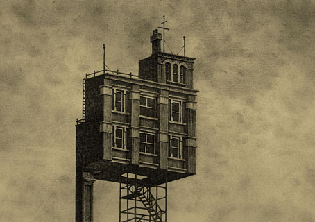
• A trailer for Salthouse Marshes, “a short, landscape obsessed ghost story” by Adam Scovell.

• Rare video of Young Marble Giants playing for 45 minutes in Vancouver, 1980.

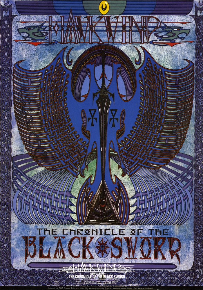
• A collection of Ghost Box posters and flyers designed by Julian House.

• Mix of the week: Secret Thirteen Mix 163 by Ssleeping desiresS.
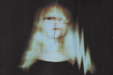
Ministry, a new photo series by Ellen Rogers.

Julia Holter‘s favourite albums.

Boom Stix (1962) by Curley & the Jades | Things That Go Boom In The Night (1981) by Bush Tetras | Boom! (1991) by The Grid