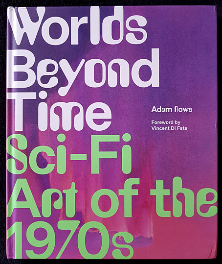
Or yesterday’s tomorrow today. Adam Rowe’s book arrived in the post this weekend, a little bumped at the corners (art books often suffer at the hands of the postal services) but very welcome all the same.
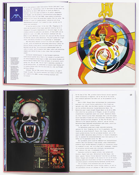
In the 1970s, mass-produced, cheaply printed science-fiction novels were thriving. The paper was rough, the titles outrageous, and the cover art astounding. Over the course of the decade, a stable of talented painters, comic-book artists, and designers produced thousands of the most eye-catching book covers to ever grace bookstore shelves (or spinner racks). Curiously, the pieces commissioned for these covers often had very little to do with the contents of the books they were selling, but by leaning heavily on psychedelic imagery, far-out landscapes, and trippy surrealism, the art was able to satisfy the same space race–fuelled appetite for the big ideas and brave new worlds that sci-fi writers were boldly pushing forward.
In Worlds Beyond Time: Sci-Fi Art of the 1970s, Adam Rowe—who has been curating, championing, and resurrecting the best and most obscure art that 1970s sci-fi has to offer on his blog 70s Sci-Fi Art—introduces readers to the biggest names in the genre, including Chris Foss, Peter Elson, Tim White, Jack Gaughan, and Virgil Finlay, as well as their influences.
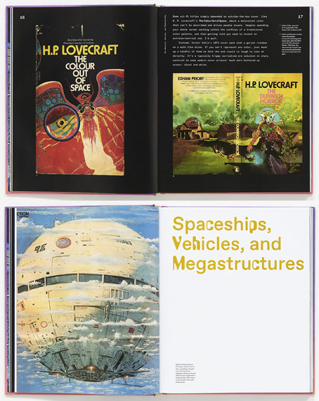
One of my own formative influences was Visions of the Future (1976), a large-format book edited by Janet Sacks that recycled material from NEL’s Science Fiction Monthly magazine to present a guide to British SF art in the 1970s. In many ways the book was a rather poor collection—the reproductions aren’t good, not all the artists are first-rate, and a few have nothing to do with SF or “the future” at all—but it was important to me for the many artist interviews which confirmed that you could make some kind of living producing this type of art. Adam Rowe’s book is like a superior sequel to Visions of the Future, with miniature biographies for many of the artists, plus a look at the recurrent themes he’s explored on his 70s Sci-fi Art Tumblr. There’s a lot in here I hadn’t seen before. I’m grateful he’s found space for Paul Kirchner’s Dope Rider, a typically Surrealist Kirchner comic strip, and one I never got to see when it was running in the pages of High Times. Kirchner’s The Bus was a favourite, however, being a regular in the pages of Heavy Metal magazine. Kirchner has never been very science fictional either but Worlds Beyond Time is a more flexible title than Visions of the Future, one that can embrace imaginative possibilities that aren’t limited to spaceships, planets and futuristic cities.
Elsewhere on { feuilleton }
• The book covers archive
• The illustrators archive
Previously on { feuilleton }
• Corgi SF Collector’s Library
• Foss, Jodorowsky and low-flying spacecraft
• Crank book covers
• Do You Have The Force?
• The artists of Future Life
• Science Fiction Monthly
• The fantastic and apocalyptic art of Bruce Pennington
• Roger Dean: artist and designer