
Weekend links 146

snake.jpg

A Chinese postage stamp celebrating the Year of the Snake.

Cyclopean is a collaboration from Burnt Friedman, Jono Podmore and Can founding members Jaki Liebezeit, and Irmin Schmidt. The Quietus has a preview of all the tracks from their forthcoming EP. Great stuff.

Ten Things You (Possibly) Don’t Know About Kraftwerk. Related: a Speak & Spell emulator, and Atomium, a new single by Karl Bartos.

• In 1975 Barney Bubbles designed an inner sleeve for Hawkwind’s Warrior on the Edge of Time album, and this scarce recipe booklet.

• “We should all use language carefully. That is an obligation on the literate. But carefully doesn’t mean fearfully,” says Jenny Diski.

• Faber’s car-crash of a cover design for the 50th anniversary edition of The Bell Jar by Sylvia Plath caused an outbreak of parodies.

• At Strange Flowers: Ancient dreams and antique corruptions, Salomé via Gustave Moreau and Huysmans.

• FACT Mix 368 is a very varied collection of recent music and older pieces curated by Holly Herndon.

• At Ubuweb: eleven out-of-print recordings of Harry Bertoia’s sound sculptures.

Laurie Anderson and Brian Eno in conversation at Interview magazine.

Michael Chabon on Wes Anderson’s Worlds.

Snake Rag (1923) by King Oliver’s Creole Jazz Band | Rattlesnake Shake (1969) by Fleetwood Mac | Snakes Crawl (1980) by Bush Tetras | Ananta Snake Dance (1980) by Suns of Arqa | Snakeblood (2000) by Leftfield
Escher and Schrofer

schrofer5.jpg

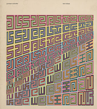
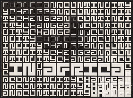
Design by Jurriaan Schrofer.

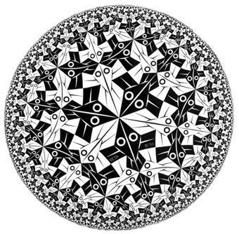
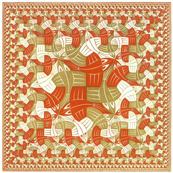
That’s Maurits Cornelis Escher (1898–1972), the Dutch artist, and Jurriaan Schrofer (1926–90), the Dutch typographer and graphic designer. Aside from a shared nationality the pair had a similar interest in periodicity and incremental metamorphosis, something that’s strikingly apparent when you compare their works. I don’t know much about Schrofer so I can’t say whether he was consciously following Escher’s example or whether this is coincidence. Some of the gradations and distortions also bear comparison with the Op Art paintings of Bridget Riley, Victor Vasarely and others.

escher8.jpg

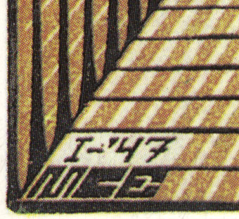
MC Escher signed most of his works with three square “MCE” letters which are remarkably similar to Schrofer’s type designs.

There’s an opportunity to find out more about Schrofer’s distinctive approach to graphic design in a forthcoming book from Unit Editions (currently available at a reduced pre-order price). More of his work can be seen at But Does It Float and scattered around Tumblr. MC Escher is well-represented on the web; I’d suggest starting at WikiPaintings.

escher1.jpg

Circle Limit I (1958) by MC Escher.

schrofer1.jpg

Design by Jurriaan Schrofer.

escher2.jpg

Square Limit (colour, 1964) by MC Escher.

Continue reading “Escher and Schrofer”

Nothing Is

sunra.jpg

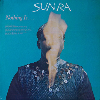
1: Nothing Is… (1966), an album of science fiction jazz by Sun Ra.

What does the empty space of that ellipsis imply?

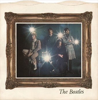
beatles.jpg

2: Strawberry Fields Forever (1967), a single by The Beatles.

“Strawberry Fields / Nothing is real”

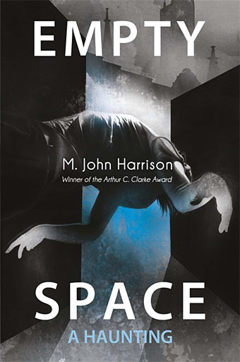
harrison1.jpg

Cover art by Sam Green.

3: Empty Space (2012), a science fiction novel by M. John Harrison.

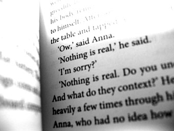
Chapter 1: “Nothing is real,” he said.

harrison2.jpg

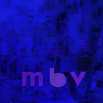
mbv.jpg

4: MBV (2013), an album by My Bloody Valentine which emerged from empty space at the weekend.

Track 8: Nothing Is.

Previously on { feuilleton }
Golden apples and silver apples

Covering Joyce

joyce1.jpg

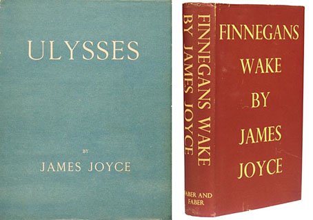
First editions of Ulysses (1922) and Finnegans Wake (1939).

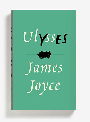
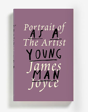
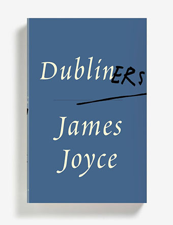
I like Peter Mendelsund’s book cover designs so it’s good to find the designer given the opportunity to provide new covers for James Joyce. Mendelsund’s blog post announcing the news mentions nothing about his intentions, instead we have a reminiscence about Ireland à la Molly Bloom, and pictures of the three covers below.

joyce2.jpg

I’ve never felt a pictorial treatment works with Joyce; his books, especially the Big Two, concentrate so much on words and the labyrinths made by language that anything other than a purely typographic treatment seems superfluous. Art directors going the pictorial route generally end up using familiar photos of the author or views of Dublin circa 1900. The first editions of Ulysses and Finnegans Wake set the pattern for many later editions, and I’ll guess it’s that pattern which Peter Mendelsund has followed here. The typeface used is Poetica, a Robert Slimbach design from 1992, completed by what may be Joyce’s own hand (I’m guessing again) in the manner of the author’s corrected typescripts. The amendments for Dubliners and Portrait of the Artist don’t require explanation but what about the title of Ulysses? I’d read this (so to speak) as representing the novel’s two main characters—Stephen Dedalus: the cold and precise man of letters, and Leopold Bloom: the all-too-human Everyman—who in their circumambulation and eventual meeting comprise the twin poles of the story. There’s also a subtle and clever allusion to Molly Bloom but I’ll let you find that…

The three new books will be published by Vintage but I’ve not managed to find a publication date.

joyce3.jpg

In other Joyce news, the first Chinese translation of Finnegans Wake has proved to be a surprising bestseller. And I ought to mention that Lord Horror: Reverbstorm, my own Joycean excursion (among other things) with David Britton, is now available at Amazon. You can, of course, still buy the book direct from the publishers.

joyce4.jpg

Elsewhere on { feuilleton }
The book covers archive

Previously on { feuilleton }
James Joyce in Reverbstorm
Joyce in Time
Happy Bloomsday
Passages from James Joyce’s Finnegans Wake
Books for Bloomsday

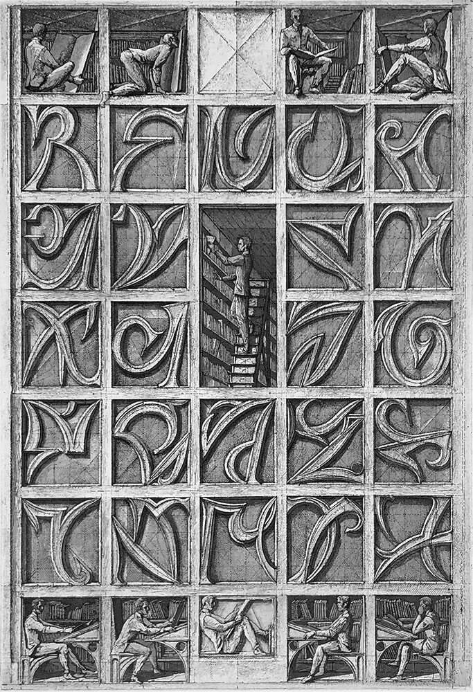
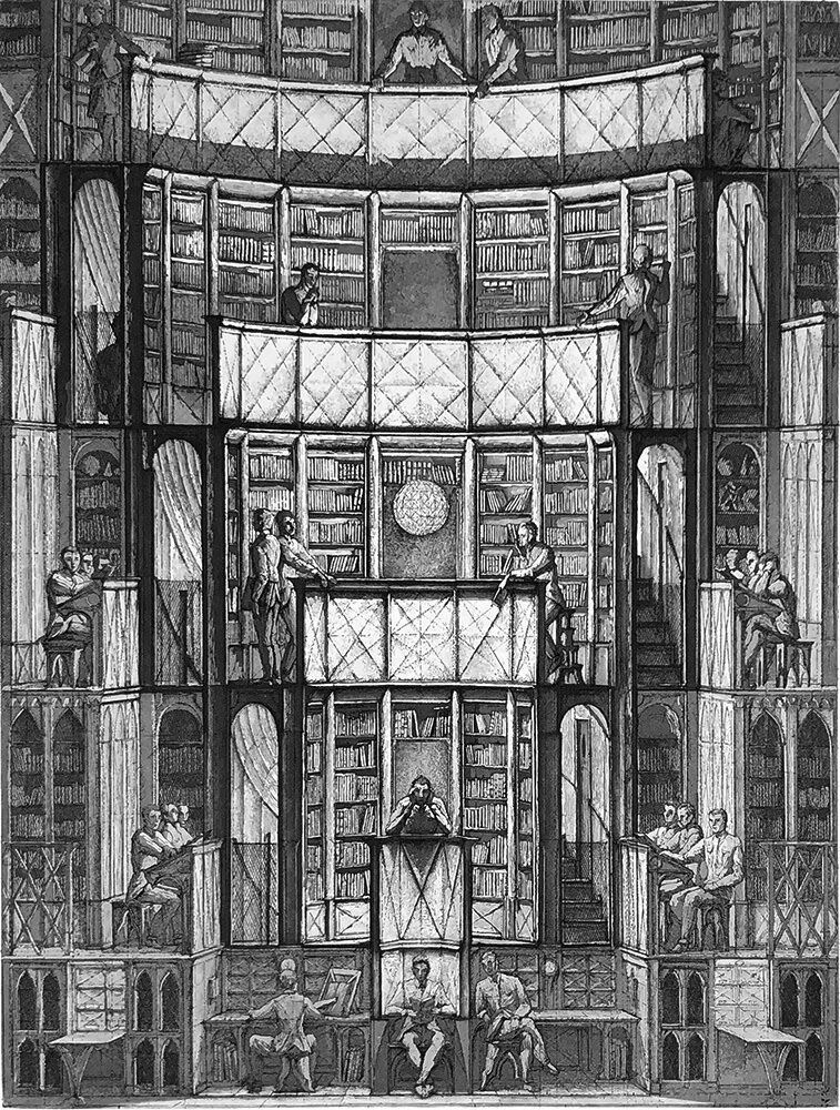
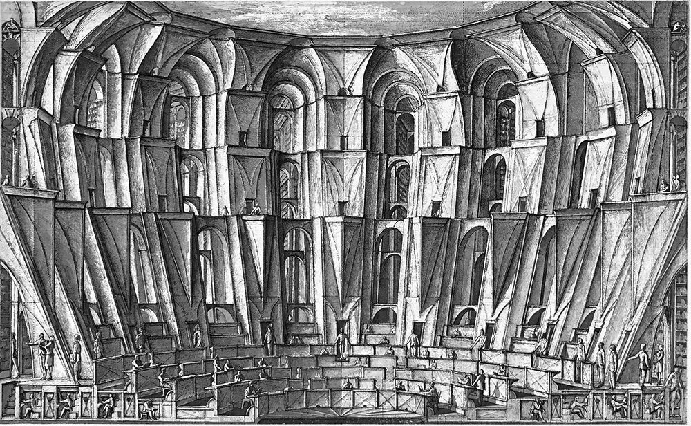
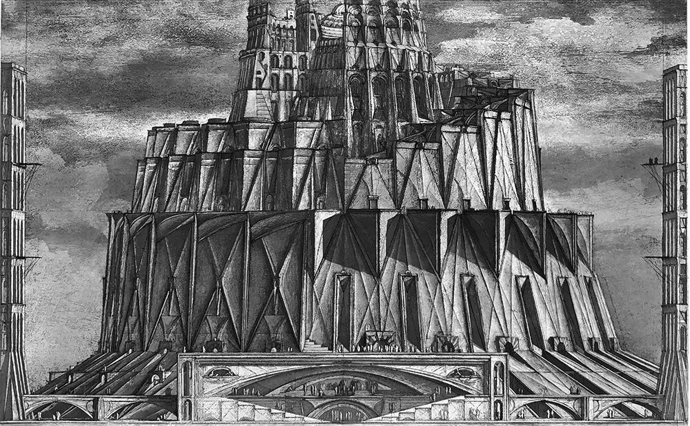
The Library of Babel by Érik Desmazières

library1.jpg

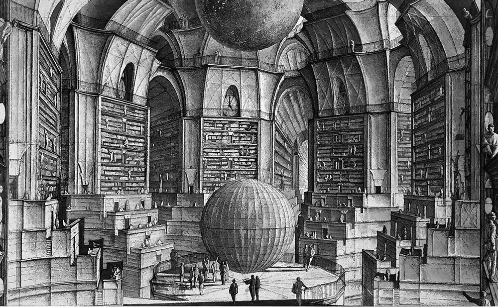
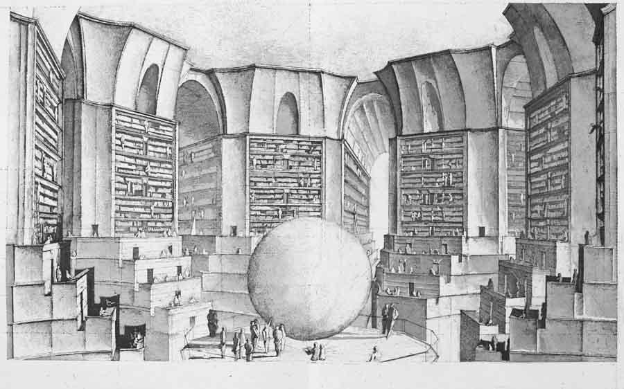
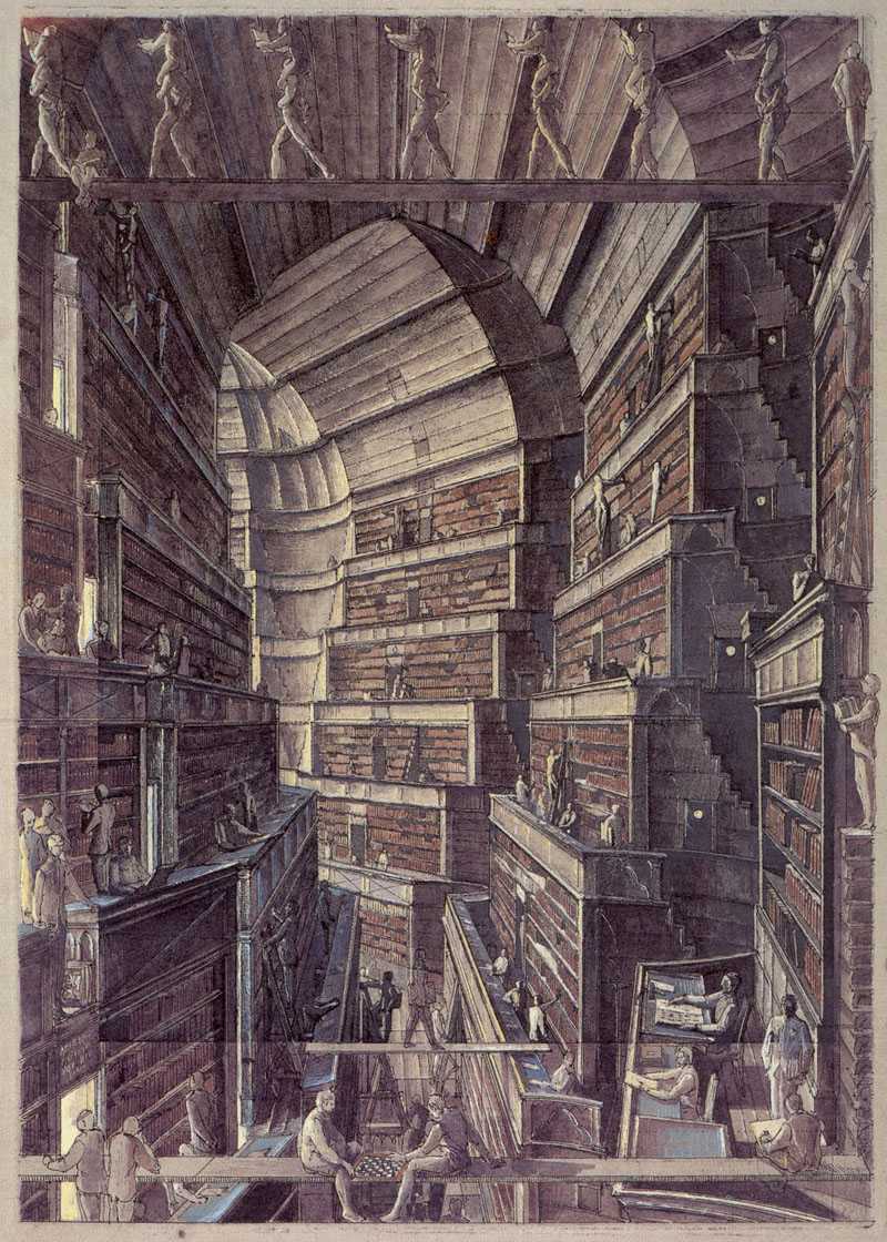
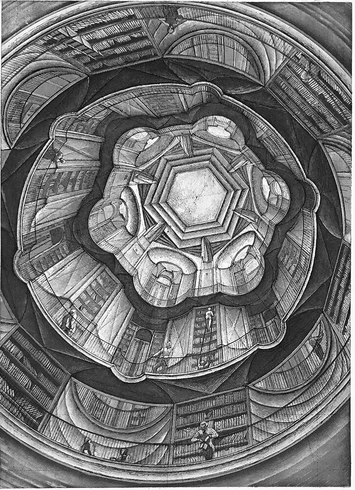
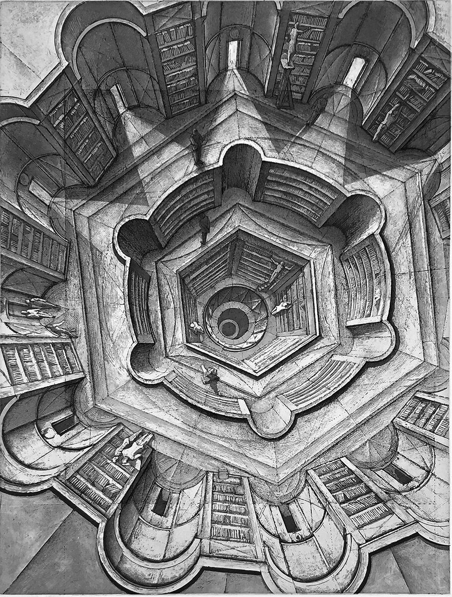
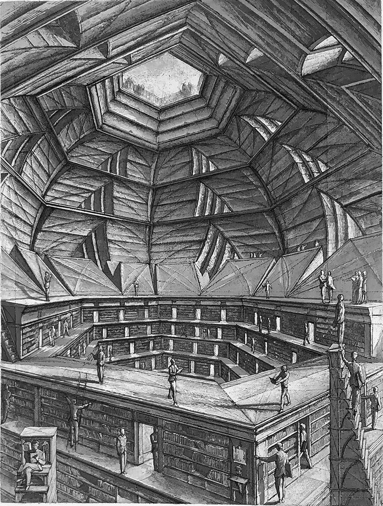
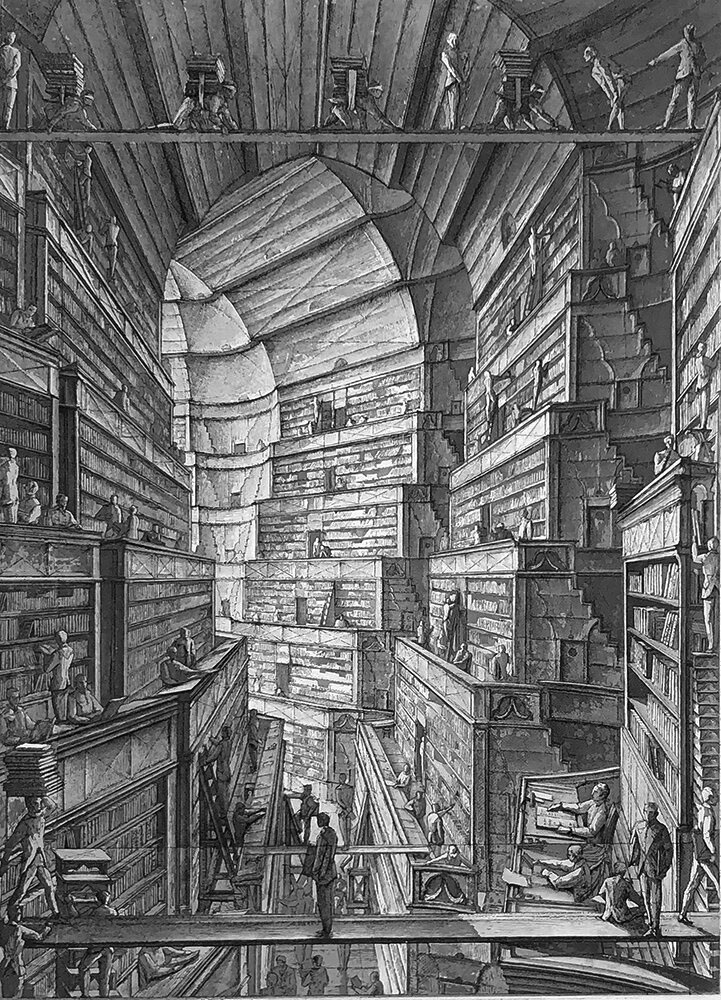
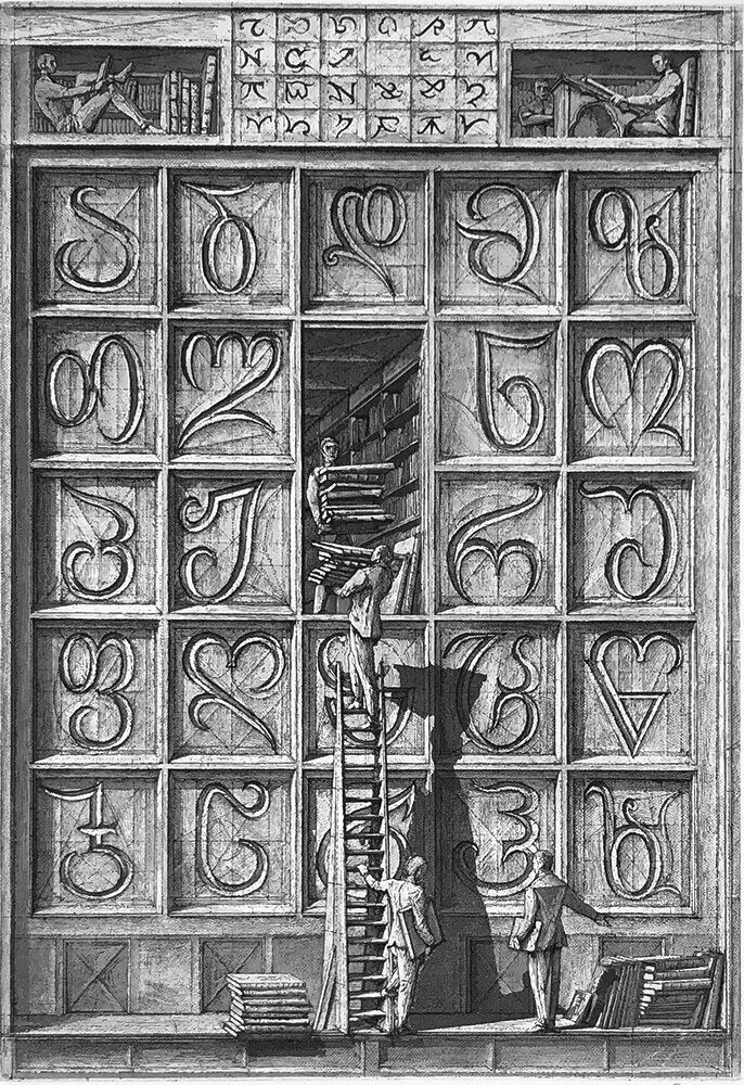
The print work of French artist Érik Desmazières has featured here on several occasions, and I’ve also had reason to mention more than once his aquatints and etchings which illustrate Jorge Luis Borges’ celebrated short story The Library of Babel (1941). The prints were produced in 1997, with a small book edition being published in 2000. Copies of the volume now sell for upwards of $100, and at a mere 36 pages this somewhat exceeds my acquisitiveness threshold; hence this post which gathers some of the better online reproductions, one or two of which have only come to light in the past couple of years.

library2.jpg

Borges’ description of the architecture of the Universe-size Library is sketchy so Desmazières opens out some of the spaces to give a Piranesian sense of space to what would otherwise be little more than views of the same small rooms and corridors, endlessly repeating. MC Escher could have made something of those infinite perspectives—the hexagonal chambers are the closest to the story descriptions—but the larger rooms convey without words an impression of colossal spaces filled with nothing but people and an infinitude of books. The volumes that Borges describes contain few illustrations but one of them at least would describe this very book. Another would describe this book with a minor variation in one of the plates; another would describe MC Escher’s depictions of the Library, and Piranesi’s, and Salvador Dalí’s, and yours, and mine, and on and on…

library3.jpg

library4.jpg

library5.jpg

library6.jpg

library7.jpg

library8.jpg

library9.jpg

library10.jpg

library11.jpg

library12.jpg

Elsewhere on { feuilleton }
The etching and engraving archive

Previously on { feuilleton }
Les lieux imaginaires d’Érik Desmazières
The art of Érik Desmazières