Lovecraft’s Monsters unleashed

lm1.jpg

I posted my illustrations for this anthology back in December, after which Tachyon also asked me to create a cover for the book, something that hadn’t been planned at the outset. Lovecraft’s Monsters, edited by Ellen Datlow, is in the shops this month so here’s the cover and a few of my page layouts from the interior. I’m very pleased with this one so it’s been good to hear it’s been selling well already, and picking up positive reviews. My illustrations may be seen at large size here while the book itself should be available via all the usual outlets. If you insist on shopping in a river filled with piranhas then here’s a link. (That fish head on the cover is based on a piranha as it happens.)

The big Lovecraft collection from Centipede Press, A Mountain Walked, was also supposed to be out this month but the release has been bumped (again) to May 2014. It’s a huge volume so I’m not surprised if it’s taking longer than expected.

lm2.jpg

lm3.jpg

lm4.jpg

Elsewhere on { feuilleton }
The Lovecraft archive

Weekend links 205

lin.jpg

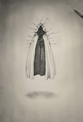
King’s Cloak (2012) by Alice Lin.

• The week in Finnegans Wake: illustrations by John Vernon Lord for a new Folio Society edition; The Guardian‘s review from 1939; Christina Scholz explores Joyce’s use of the Ant and the Grasshopper fable; Sheng Yun wonders when Dai Congrong will compete the first Chinese translation of the book; Stephanie Boland on riverrun, the latest theatrical adaptation.

• It’s Robert Aickman‘s centenary year so Faber are reissuing several volumes of his peerless “strange stories”. And it’s good to see the great Clark Ashton Smith finally receive the blessing of Penguin Classics.

• The Teenage Boyfriend of the Beat Generation: Marcus Ewart slept with Allen Ginsberg (who showed him how to give a proper blowjob), and had an eight-year relationship with William Burroughs.

Yet another advocate of shorter work time was JS Mill. He dismissed the ‘gospel of work’ proposed by Thomas Carlyle in part because it drew a veil over the real costs of work, including slave work that Carlyle sought to defend. Instead, Mill advocated a ‘gospel of leisure’, arguing that technology should be used to curtail work time as far as possible. This stress on technology as a means to shorten work time was later to feature in Bert­rand Russell’s 1932 essay, ‘In Praise of Idleness’.

David Spencer on The Case for Working Less

• More Steve Moore memorials: Mitch Jenkins put the pages from Unearthing online, while Pádraig Ó Méalóid posted a personal appreciation at The Beat.

Linda Marsa on how psychedelics are helping cancer patients deal with their illness.

• The Weird Album: art by Enrique Alcatena (including some Lovecraftian pieces).

• Didgeridoom: Director Ted Kotcheff talks to Robert Barry about Wake in Fright.

The Jealous God (1985), a comic strip by Alejandro Jodorowsky & Silvio Cadelo.

• The Dune in Your Head: Ethan Gilsdorf on the greatest SF film never made.

50 minutes of Kraftwerk on Rockpalast in 1970. Astonishing.

• At 50 Watts: Sheet-music covers from Sweden in the 1920s.

Harvard discovers old library books bound in human skin.

Same-sex marriage is now legal in England and Wales.

Wyrd Daze has reached issue 5.

Kaleidoscopes at Pinterest.

Flight From Ashiya (live on TV! 1967?) by Kaleidoscope (UK) | Lie To Me (1969) by Kaleidoscope (US) | Kaleidoscope (1984) by The Rain Parade

Dürer’s Instruction of Measurement

durer01.jpg

Underweysung der Messung (1525), a book of drawing instruction by the great Albrecht Dürer, predates Hieronymus Rodler’s “useful booklet” by six years. This also includes some perspective work although the lessons here are mostly concerned with the careful construction of various shapes, tesselated patterns and solid figures. Two of the illustrations at the end showing an artist using drawings guides are very familiar from reproduction in numerous art books; once again it’s good to see these pictures in their original context. This is also the book in which Dürer demonstrates the construction of letters of the alphabet. His lettering guides are almost as familiar as the illustrations, they often turn up in histories of typography, and now form the basis of several font designs. Durer Caps from P22, and Durer Initials from GLC, both give you an option of construction lines or solid fills; they also supply the letter U which is missing from the artist’s alphabet. Elsewhere there’s a free font, Duerer (sic) Latin Constructions and Capitals, available from l’Abécédarienne although this design lacks the U. Dürer’s book may be browsed here or downloaded here.

durer02.jpg

durer03.jpg

durer04.jpg

durer05.jpg

Continue reading “Dürer’s Instruction of Measurement”

Rodler’s Fine, Useful Booklet

rodler01.jpg

Another treatise on perspective, and an older one than Pozzo’s so the drawings are somewhat cruder. Eyn schön nützlich büchlin und underweisung der kunst des Messens (A Fine, Useful Booklet and Instruction in the Art of Measurement) by Hieronymus Rodler was published in 1531, and features a number of full-page views where the perspective is accurate but also alarmingly severe in places. The emptiness and unusual appearance of the scenes has an unintentional charm, they remind me of the illustrations from The Dumas Club (1993) by Arturo Pérez-Reverte where the mysterious drawings—based on old alchemical illustrations—contain subtle variations. Rodler’s book made an appearance at Giornale Nuovo in 2005 so I’ll point you there for further discussion of its technical qualities. The book itself may be browsed here or downloaded here.

rodler02.jpg

rodler03.jpg

rodler04.jpg

rodler05.jpg

Continue reading “Rodler’s Fine, Useful Booklet”

Rules and Examples of Perspective Proper, 1693

perspective01.jpg

I’m working on more engraving collage at the moment so I’ve been delving into the scanned books at the Internet Archive once more in search of raw material. I still tend to use things scanned from paper volumes but the Internet Archive is useful for small details, and searches there also have the advantage of turning up things you might not otherwise see. This is one such book, an English guide to perspective for painters and architects adapted from the two-volume Perspectiva pictorum et architectorum by Andrea Pozzo (1642–1709). The title page declares the instruction to be “wholly free from the confusion of occult lines” which it certainly is, the plates would still serve as guides to the trickier aspects of perspective today. The engravings in this edition are by John Sturt.

Pozzo was a master of trompe l’oeil painting, and when you see ceilings such as this it’s no surprise that he might have a thing or two to say about perspective. The plates begin with simple shapes then graduate to the construction of the columns and capitals used in Classical architecture; at the end you have some intimidatingly complex pediments and porticoes. The University of Heidelberg has copies of Pozzo’s original books, including the second volume where things become even more elaborate.

perspective02.jpg

perspective03.jpg

perspective04.jpg

perspective05.jpg

Continue reading “Rules and Examples of Perspective Proper, 1693”